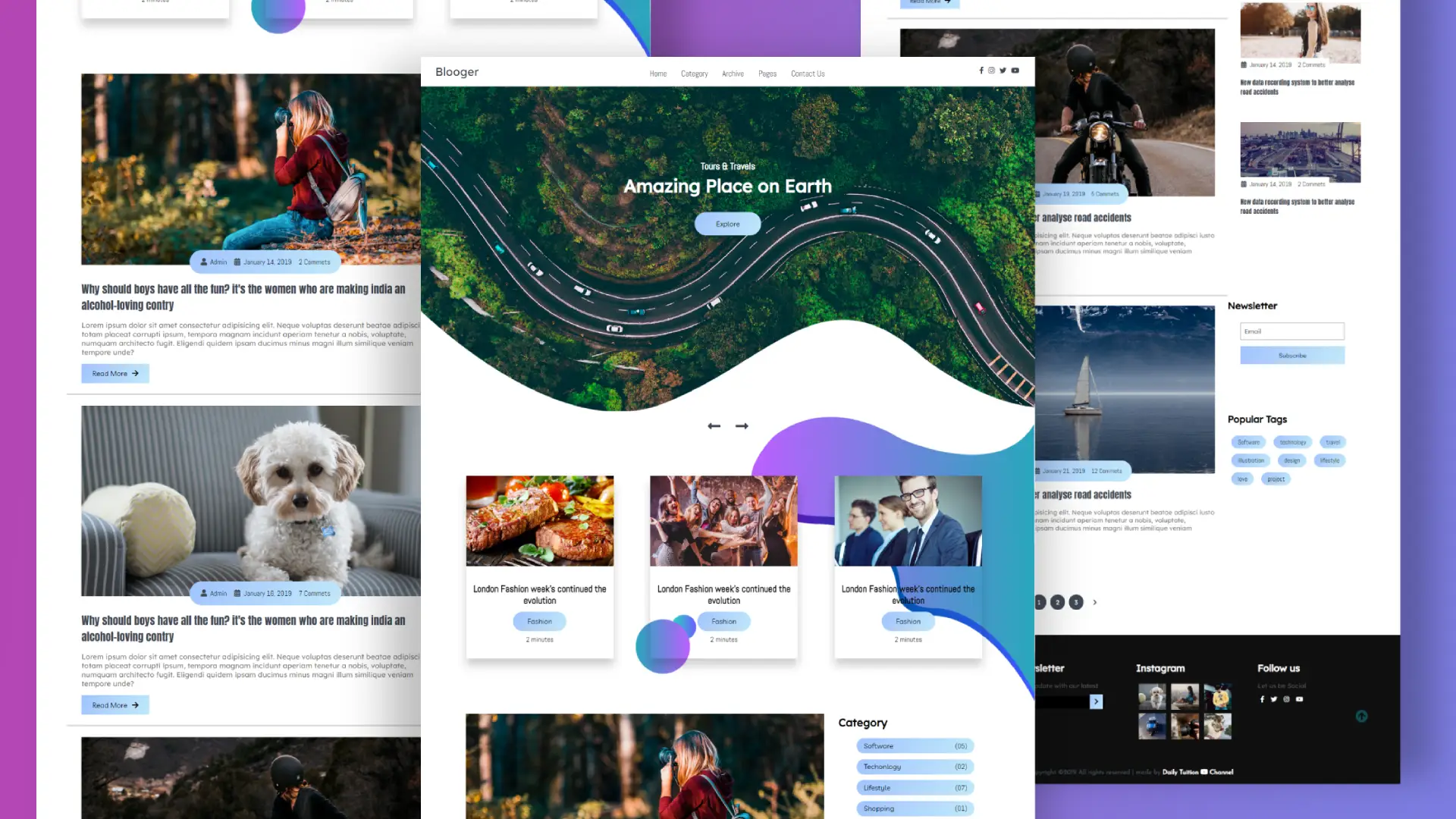
Responsive Blogger Website Using HTML CSS
This post is all about using HTML and CSS to design the front end of a blog website. Also we will use JavaScript for adding some functionalities.
Here, I’ll go over how to create a blog’s home page with a preview of its posts as well as what a blog page looks like. After that, we’ll design a template for a blog post page where we can put our blog content and link them to the main page. This is not for expert web designers, but for newbie web developers.
Complete Responsive Blogger Website Using HTML and CSS. For creating a blog website we need,
- Code editor.
- HTML.
- CSS.
- JavaScript.
Im using Visual Studio Code as my code editor.
Source Code:
HTML
Using HTML, we will build the structure of the website. Lets create a index.html file. Remember, you have to create a text file with a .html file extension.
<!DOCTYPE html>
<html lang="en">
<head>
<meta charset="UTF-8" />
<meta name="viewport" content="width=device-width, initial-scale=1.0" />
<meta http-equiv="X-UA-Compatible" content="ie=edge" />
<title>Blooger</title>
<!-- Font Awesome Icons -->
<link rel="stylesheet" href="./css/all.css" />
<!-- --------- Owl-Carousel ------------------->
<link rel="stylesheet" href="./css/owl.carousel.min.css" />
<link rel="stylesheet" href="./css/owl.theme.default.min.css" />
<!-- ------------ AOS Library ------------------------- -->
<link rel="stylesheet" href="./css/aos.css" />
<!-- Custom Style -->
<link rel="stylesheet" href="./css/Style.css" />
</head>
<body>
<!-- ------------- Navigation ------------------ -->
<nav class="nav">
<div class="nav-menu flex-row">
<div class="nav-brand">
<a href="#" class="text-gray">Blooger</a>
</div>
<div class="toggle-collapse">
<div class="toggle-icons">
<i class="fas fa-bars"></i>
</div>
</div>
<div>
<ul class="nav-items">
<li class="nav-link">
<a href="#">Home</a>
</li>
<li class="nav-link">
<a href="#">Category</a>
</li>
<li class="nav-link">
<a href="#">Archive</a>
</li>
<li class="nav-link">
<a href="#">Pages</a>
</li>
<li class="nav-link">
<a href="#">Contact Us</a>
</li>
</ul>
</div>
<div class="social text-gray">
<a href="#"><i class="fab fa-facebook-f"></i></a>
<a href="#"><i class="fab fa-instagram"></i></a>
<a href="#"><i class="fab fa-twitter"></i></a>
<a href="#"><i class="fab fa-youtube"></i></a>
</div>
</div>
</nav>
<!-- x----- Navigation ------- -->
<!-------- Main Site Section ---------->
<main>
<!-------------- Site Title ---------->
<section class="site-title">
<div class="site-background" data-aos="fade-up" data-aos-delay="100">
<h3>Tours & Travels</h3>
<h1>Amazing Place on Earth</h1>
<button class="btn">Explore</button>
</div>
</section>
<!------------x- Site Title ---x----------->
<!-- -------- Blog Carousel ----- -->
<section>
<div class="blog">
<div class="container">
<div class="owl-carousel owl-theme blog-post">
<div
class="blog-content"
data-aos="fade-right"
data-aos-delay="200"
>
<img src="./assets/Blog-post/post-1.jpg" alt="post-1" />
<div class="blog-title">
<h3>London Fashion week's continued the evolution</h3>
<button class="btn btn-blog">Fashion</button>
<span>2 minutes</span>
</div>
</div>
<div class="blog-content" data-aos="fade-in" data-aos-delay="200">
<img src="./assets/Blog-post/post-3.jpg" alt="post-1" />
<div class="blog-title">
<h3>London Fashion week's continued the evolution</h3>
<button class="btn btn-blog">Fashion</button>
<span>2 minutes</span>
</div>
</div>
<div
class="blog-content"
data-aos="fade-left"
data-aos-delay="200"
>
<img src="./assets/Blog-post/post-2.jpg" alt="post-1" />
<div class="blog-title">
<h3>London Fashion week's continued the evolution</h3>
<button class="btn btn-blog">Fashion</button>
<span>2 minutes</span>
</div>
</div>
<div
class="blog-content"
data-aos="fade-right"
data-aos-delay="200"
>
<img src="./assets/Blog-post/post-5.png" alt="post-1" />
<div class="blog-title">
<h3>London Fashion week's continued the evolution</h3>
<button class="btn btn-blog">Fashion</button>
<span>2 minutes</span>
</div>
</div>
</div>
<div class="owl-navigation">
<span class="owl-nav-prev"
><i class="fas fa-long-arrow-alt-left"></i
></span>
<span class="owl-nav-next"
><i class="fas fa-long-arrow-alt-right"></i
></span>
</div>
</div>
</div>
</section>
<!-- ----------x-- Blog Carousel -x-------- -->
<!-- ----------- Site Content -------------->
<section class="container">
<div class="site-content">
<div class="posts">
<div class="post-content" data-aos="zoom-in" data-aos-delay="200">
<div class="post-image">
<div>
<img
src="./assets/Blog-post/blog1.png"
class="img"
alt="blog1"
/>
</div>
<div class="post-info flex-row">
<span
><i class="fas fa-user text-gray"></i
> Admin</span
>
<span
><i class="fas fa-calendar-alt text-gray"></i
> January 14, 2019</span
>
<span>2 Commets</span>
</div>
</div>
<div class="post-title">
<a href="#"
>Why should boys have all the fun? it's the women who are
making india an alcohol-loving contry</a
>
<p>
Lorem ipsum dolor sit amet consectetur adipisicing elit. Neque
voluptas deserunt beatae adipisci iusto totam placeat corrupti
ipsum, tempora magnam incidunt aperiam tenetur a nobis,
voluptate, numquam architecto fugit. Eligendi quidem ipsam
ducimus minus magni illum similique veniam tempore unde?
</p>
<button class="btn post-btn">
Read More <i class="fas fa-arrow-right"></i>
</button>
</div>
</div>
<hr />
<div class="post-content" data-aos="zoom-in" data-aos-delay="200">
<div class="post-image">
<div>
<img
src="./assets/Blog-post/blog2.png"
class="img"
alt="blog1"
/>
</div>
<div class="post-info flex-row">
<span
><i class="fas fa-user text-gray"></i
> Admin</span
>
<span
><i class="fas fa-calendar-alt text-gray"></i
> January 16, 2019</span
>
<span>7 Commets</span>
</div>
</div>
<div class="post-title">
<a href="#"
>Why should boys have all the fun? it's the women who are
making india an alcohol-loving contry</a
>
<p>
Lorem ipsum dolor sit amet consectetur adipisicing elit. Neque
voluptas deserunt beatae adipisci iusto totam placeat corrupti
ipsum, tempora magnam incidunt aperiam tenetur a nobis,
voluptate, numquam architecto fugit. Eligendi quidem ipsam
ducimus minus magni illum similique veniam tempore unde?
</p>
<button class="btn post-btn">
Read More <i class="fas fa-arrow-right"></i>
</button>
</div>
</div>
<hr />
<div class="post-content" data-aos="zoom-in" data-aos-delay="200">
<div class="post-image">
<div>
<img
src="./assets/Blog-post/blog3.png"
class="img"
alt="blog1"
/>
</div>
<div class="post-info flex-row">
<span
><i class="fas fa-user text-gray"></i
> Admin</span
>
<span
><i class="fas fa-calendar-alt text-gray"></i
> January 19, 2019</span
>
<span>5 Commets</span>
</div>
</div>
<div class="post-title">
<a href="#"
>New data recording system to better analyse road accidents</a
>
<p>
Lorem ipsum dolor sit amet consectetur adipisicing elit. Neque
voluptas deserunt beatae adipisci iusto totam placeat corrupti
ipsum, tempora magnam incidunt aperiam tenetur a nobis,
voluptate, numquam architecto fugit. Eligendi quidem ipsam
ducimus minus magni illum similique veniam tempore unde?
</p>
<button class="btn post-btn">
Read More <i class="fas fa-arrow-right"></i>
</button>
</div>
</div>
<hr />
<div class="post-content" data-aos="zoom-in" data-aos-delay="200">
<div class="post-image">
<div>
<img
src="./assets/Blog-post/blog4.png"
class="img"
alt="blog1"
/>
</div>
<div class="post-info flex-row">
<span
><i class="fas fa-user text-gray"></i
> Admin</span
>
<span
><i class="fas fa-calendar-alt text-gray"></i
> January 21, 2019</span
>
<span>12 Commets</span>
</div>
</div>
<div class="post-title">
<a href="#"
>New data recording system to better analyse road accidents</a
>
<p>
Lorem ipsum dolor sit amet consectetur adipisicing elit. Neque
voluptas deserunt beatae adipisci iusto totam placeat corrupti
ipsum, tempora magnam incidunt aperiam tenetur a nobis,
voluptate, numquam architecto fugit. Eligendi quidem ipsam
ducimus minus magni illum similique veniam tempore unde?
</p>
<button class="btn post-btn">
Read More <i class="fas fa-arrow-right"></i>
</button>
</div>
</div>
<div class="pagination flex-row">
<a href="#"><i class="fas fa-chevron-left"></i></a>
<a href="#" class="pages">1</a>
<a href="#" class="pages">2</a>
<a href="#" class="pages">3</a>
<a href="#"><i class="fas fa-chevron-right"></i></a>
</div>
</div>
<aside class="sidebar">
<div class="category">
<h2>Category</h2>
<ul class="category-list">
<li
class="list-items"
data-aos="fade-left"
data-aos-delay="100"
>
<a href="#">Software</a>
<span>(05)</span>
</li>
<li
class="list-items"
data-aos="fade-left"
data-aos-delay="200"
>
<a href="#">Techonlogy</a>
<span>(02)</span>
</li>
<li
class="list-items"
data-aos="fade-left"
data-aos-delay="300"
>
<a href="#">Lifestyle</a>
<span>(07)</span>
</li>
<li
class="list-items"
data-aos="fade-left"
data-aos-delay="400"
>
<a href="#">Shopping</a>
<span>(01)</span>
</li>
<li
class="list-items"
data-aos="fade-left"
data-aos-delay="500"
>
<a href="#">Food</a>
<span>(08)</span>
</li>
</ul>
</div>
<div class="popular-post">
<h2>Popular Post</h2>
<div class="post-content" data-aos="flip-up" data-aos-delay="200">
<div class="post-image">
<div>
<img
src="./assets/popular-post/m-blog-1.jpg"
class="img"
alt="blog1"
/>
</div>
<div class="post-info flex-row">
<span
><i class="fas fa-calendar-alt text-gray"></i
> January 14, 2019</span
>
<span>2 Commets</span>
</div>
</div>
<div class="post-title">
<a href="#"
>New data recording system to better analyse road
accidents</a
>
</div>
</div>
<div class="post-content" data-aos="flip-up" data-aos-delay="300">
<div class="post-image">
<div>
<img
src="./assets/popular-post/m-blog-2.jpg"
class="img"
alt="blog1"
/>
</div>
<div class="post-info flex-row">
<span
><i class="fas fa-calendar-alt text-gray"></i
> January 14, 2019</span
>
<span>2 Commets</span>
</div>
</div>
<div class="post-title">
<a href="#"
>New data recording system to better analyse road
accidents</a
>
</div>
</div>
<div class="post-content" data-aos="flip-up" data-aos-delay="400">
<div class="post-image">
<div>
<img
src="./assets/popular-post/m-blog-3.jpg"
class="img"
alt="blog1"
/>
</div>
<div class="post-info flex-row">
<span
><i class="fas fa-calendar-alt text-gray"></i
> January 14, 2019</span
>
<span>2 Commets</span>
</div>
</div>
<div class="post-title">
<a href="#"
>New data recording system to better analyse road
accidents</a
>
</div>
</div>
<div class="post-content" data-aos="flip-up" data-aos-delay="500">
<div class="post-image">
<div>
<img
src="./assets/popular-post/m-blog-4.jpg"
class="img"
alt="blog1"
/>
</div>
<div class="post-info flex-row">
<span
><i class="fas fa-calendar-alt text-gray"></i
> January 14, 2019</span
>
<span>2 Commets</span>
</div>
</div>
<div class="post-title">
<a href="#"
>New data recording system to better analyse road
accidents</a
>
</div>
</div>
<div class="post-content" data-aos="flip-up" data-aos-delay="600">
<div class="post-image">
<div>
<img
src="./assets/popular-post/m-blog-5.jpg"
class="img"
alt="blog1"
/>
</div>
<div class="post-info flex-row">
<span
><i class="fas fa-calendar-alt text-gray"></i
> January 14, 2019</span
>
<span>2 Commets</span>
</div>
</div>
<div class="post-title">
<a href="#"
>New data recording system to better analyse road
accidents</a
>
</div>
</div>
</div>
<div class="newsletter" data-aos="fade-up" data-aos-delay="300">
<h2>Newsletter</h2>
<div class="form-element">
<input type="text" class="input-element" placeholder="Email" />
<button class="btn form-btn">Subscribe</button>
</div>
</div>
<div class="popular-tags">
<h2>Popular Tags</h2>
<div class="tags flex-row">
<span class="tag" data-aos="flip-up" data-aos-delay="100"
>Software</span
>
<span class="tag" data-aos="flip-up" data-aos-delay="200"
>technology</span
>
<span class="tag" data-aos="flip-up" data-aos-delay="300"
>travel</span
>
<span class="tag" data-aos="flip-up" data-aos-delay="400"
>illustration</span
>
<span class="tag" data-aos="flip-up" data-aos-delay="500"
>design</span
>
<span class="tag" data-aos="flip-up" data-aos-delay="600"
>lifestyle</span
>
<span class="tag" data-aos="flip-up" data-aos-delay="700"
>love</span
>
<span class="tag" data-aos="flip-up" data-aos-delay="800"
>project</span
>
</div>
</div>
</aside>
</div>
</section>
<!-- -----------x--- Site Content ----x------------>
</main>
<!---------------x----- Main Site Section ------x-------------->
<!-- ---------------- Footer ----------- -->
<footer class="footer">
<div class="container">
<div class="about-us" data-aos="fade-right" data-aos-delay="200">
<h2>About us</h2>
<p>
Lorem ipsum dolor sit amet consectetur adipisicing elit. Accusantium
quia atque nemo ad modi officiis iure, autem nulla tenetur
repellendus.
</p>
</div>
<div class="newsletter" data-aos="fade-right" data-aos-delay="200">
<h2>Newsletter</h2>
<p>Stay update with our latest</p>
<div class="form-element">
<input type="text" placeholder="Email" /><span
><i class="fas fa-chevron-right"></i
></span>
</div>
</div>
<div class="instagram" data-aos="fade-left" data-aos-delay="200">
<h2>Instagram</h2>
<div class="flex-row">
<img src="./assets/instagram/thumb-card3.png" alt="insta1" />
<img src="./assets/instagram/thumb-card4.png" alt="insta2" />
<img src="./assets/instagram/thumb-card5.png" alt="insta3" />
</div>
<div class="flex-row">
<img src="./assets/instagram/thumb-card6.png" alt="insta4" />
<img src="./assets/instagram/thumb-card7.png" alt="insta5" />
<img src="./assets/instagram/thumb-card8.png" alt="insta6" />
</div>
</div>
<div class="follow" data-aos="fade-left" data-aos-delay="200">
<h2>Follow us</h2>
<p>Let us be Social</p>
<div>
<i class="fab fa-facebook-f"></i>
<i class="fab fa-twitter"></i>
<i class="fab fa-instagram"></i>
<i class="fab fa-youtube"></i>
</div>
</div>
</div>
<div class="rights flex-row">
<h4 class="text-gray">
Copyright ©2019 All rights reserved | made by
<a href="www.youtube.com/c/dailytuition" target="_black"
>Daily Tuition <i class="fab fa-youtube"></i> Channel</a
>
</h4>
</div>
<div class="move-up">
<span><i class="fas fa-arrow-circle-up fa-2x"></i></span>
</div>
</footer>
<!-- -------------x---- Footer -----x------------ -->
<!-- Jquery Library file -->
<script src="./js/Jquery3.4.1.min.js"></script>
<!-- --------- Owl-Carousel js ----------->
<script src="./js/owl.carousel.min.js"></script>
<!-- ------------ AOS js Library ----------- -->
<script src="./js/aos.js"></script>
<!-- Custom Javascript file -->
<script src="./js/main.js"></script>
</body>
</html>
CSS
Using CSS we will style our website interface. We will control the font size, color etc. using a style sheet. That’s why lets create another text file named as style.css. Remember, you have to create a text file with a .css extension.
@import url("../css/fonts.css");

html,
body {
  margin: 0%;
  box-sizing: border-box;
  overflow-x: hidden;
}

:root {
  /*      Theme colors        */
  --text-gray: #3f4954;
  --text-light: #686666da;
  --bg-color: #0f0f0f;
  --white: #ffffff;
  --midnight: #104f55;

  /* gradient color   */
  --sky: linear-gradient(120deg, #a1c4fd 0%, #c2e9fb 100%);

  /*      theme font-family   */
  --Abel: "Abel", cursive;
  --Anton: "Anton", cursive;
  --Josefin: "Josefin", cursive;
  --Lexend: "Lexend", cursive;
  --Livvic: "Livvic", cursive;
}

/* ---------------- Global Classes ---------------*/

a {
  text-decoration: none;
  color: var(--text-gray);
}

.flex-row {
  display: flex;
  flex-direction: row;
  flex-wrap: wrap;
}

ul {
  list-style-type: none;
}

h1 {
  font-family: var(--Lexend);
  font-size: 2.5rem;
}

h2 {
  font-family: var(--Lexend);
}

h3 {
  font-family: var(--Abel);
  font-size: 1.3rem;
}

button.btn {
  border: none;
  border-radius: 2rem;
  padding: 1rem 3rem;
  font-size: 1rem;
  font-family: var(--Livvic);
  cursor: pointer;
}

span {
  font-family: var(--Abel);
}

.container {
  margin: 0 5vw;
}

.text-gray {
  color: var(--text-gray);
}

p {
  font-family: var(--Lexend);
  color: var(--text-light);
}

/* ------x------- Global Classes -------x-------*/

/* --------------- navbar ----------------- */

.nav {
  background: white;
  padding: 0 2rem;
  height: 0rem;
  min-height: 10vh;
  overflow: hidden;
  transition: height 1s ease-in-out;
}

.nav .nav-menu {
  justify-content: space-between;
}

.nav .toggle-collapse {
  position: absolute;
  top: 0%;
  width: 90%;
  cursor: pointer;
  display: none;
}

.nav .toggle-collapse .toggle-icons {
  display: flex;
  justify-content: flex-end;
  padding: 1.7rem 0;
}

.nav .toggle-collapse .toggle-icons i {
  font-size: 1.4rem;
  color: var(--text-gray);
}

.collapse {
  height: 30rem;
}

.nav .nav-items {
  display: flex;
  margin: 0;
}

.nav .nav-items .nav-link {
  padding: 1.6rem 1rem;
  font-size: 1.1rem;
  position: relative;
  font-family: var(--Abel);
  font-size: 1.1rem;
}

.nav .nav-items .nav-link:hover {
  background-color: var(--midnight);
}

.nav .nav-items .nav-link:hover a {
  color: var(--white);
}

.nav .nav-brand a {
  font-size: 1.6rem;
  padding: 1rem 0;
  display: block;
  font-family: var(--Lexend);
  font-size: 1.6rem;
}

.nav .social {
  padding: 1.4rem 0;
}

.nav .social i {
  padding: 0 0.2rem;
}

.nav .social i:hover {
  color: #a1c4cf;
}

/* -------x------- navbar ---------x------- */

/* ----------------- Main Content----------- */

/* --------------- Site title ---------------- */
main .site-title {
  background: url("../assets/Background-image.png");
  background-size: cover;
  height: 110vh;
  display: flex;
  justify-content: center;
}

main .site-title .site-background {
  padding-top: 10rem;
  text-align: center;
  color: var(--white);
}

main .site-title h1,
h3 {
  margin: 0.3rem;
}

main .site-title .btn {
  margin: 1.8rem;
  background: var(--sky);
}

main .site-title .btn:hover {
  background: transparent;
  border: 1px solid var(--white);
  color: var(--white);
}

/* --------x------ Site title --------x------- */

/* --------------- Blog Carousel ------------ */

main .blog {
  background: url("../assets/Abract01.png");
  background-repeat: no-repeat;
  background-position: right;
  height: 100vh;
  width: 100%;
  background-size: 65%;
}

main .blog .blog-post {
  padding-top: 6rem;
}

main .blog-post .blog-content {
  display: flex;
  flex-direction: column;
  text-align: center;
  width: 80%;
  margin: 3rem 2rem;
  box-shadow: 0 15px 20px rgba(0, 0, 0, 0.2);
}

main .blog-content .blog-title {
  padding: 2rem 0;
}

main .blog-content .btn-blog {
  padding: 0.7rem 2rem;
  background: var(--sky);
  margin: 0.5rem;
}

main .blog-content span {
  display: block;
}

section .container .owl-nav {
  position: absolute;
  top: 0%;
  margin: 0 auto;
  width: 100%;
}

.owl-nav .owl-prev .owl-nav-prev,
.owl-nav .owl-next .owl-nav-next {
  color: var(--text-gray);
  background: transparent;
  font-size: 2rem;
}

.owl-theme .owl-nav [class*="owl-"]:hover {
  background: transparent;
  color: var(--midnight);
}

.owl-theme .owl-nav [class*="owl-"] {
  outline: none;
}

/* -------x------- Blog Carousel -----x------ */

/* ---------------- Site Content ----------------*/

main .site-content {
  display: grid;
  grid-template-columns: 70% 30%;
}

main .post-content {
  width: 100%;
}

main .site-content .post-content > .post-image,
.post-title {
  padding: 1rem 2rem;
  position: relative;
}

main .site-content .post-content > .post-image .post-info {
  background: var(--sky);
  padding: 1rem;
  position: absolute;
  bottom: 0%;
  left: 20vw;
  border-radius: 3rem;
}

main .site-content .post-content > .post-image > div {
  overflow: hidden;
}

main .site-content .post-content > .post-image .img {
  width: 100%;
  transition: all 1s ease;
}

main .site-content .post-content > .post-image .img:hover {
  transform: scale(1.3);
}

main .site-content .post-content > .post-image .post-info span {
  margin: 0 0.5rem;
}

main .post-content .post-title a {
  font-family: var(--Anton);
  font-size: 1.5rem;
}

.site-content .post-content .post-title .post-btn {
  border-radius: 0;
  padding: 0.7rem 1.5rem;
  background: var(--sky);
}

.site-content .pagination {
  justify-content: center;
  color: var(--text-gray);
  margin: 4rem 0;
}

.site-content .pagination a {
  padding: 0.6rem 0.9rem;
  border-radius: 2rem;
  margin: 0 0.3rem;
  font-family: var(--Lexend);
}

.site-content .pagination .pages {
  background: var(--text-gray);
  color: var(--white);
}

/* -------x-------- Site Content --------x-------*/

/* --------------- Sidebar ----------------------- */

.site-content > .sidebar .category-list {
  font-family: var(--Livvic);
}

.site-content > .sidebar .category-list .list-items {
  background: var(--sky);
  padding: 0.4rem 1rem;
  margin: 0.8rem 0;
  border-radius: 3rem;
  width: 70%;
  display: flex;
  justify-content: space-between;
}

.site-content > .sidebar .category-list .list-items a {
  color: black;
}

.site-content .sidebar .popular-post .post-content {
  padding: 1rem 0;
}

.site-content .sidebar .popular-post h2 {
  padding-top: 8rem;
}

.site-content .sidebar .popular-post .post-info {
  padding: 0.4rem 0.1rem !important;
  bottom: 0rem !important;
  left: 1.5rem !important;
  border-radius: 0rem !important;
  background: white !important;
}

.site-content .sidebar .popular-post .post-title a {
  font-size: 1rem;
}

.site-content .sidebar .newsletter {
  padding-top: 10rem;
}

.site-content .sidebar .newsletter .form-element {
  padding: 0.5rem 2rem;
}

.site-content .sidebar .newsletter .input-element {
  width: 80%;
  height: 1.9rem;
  padding: 0.3rem 0.5rem;
  font-family: var(--Lexend);
  font-size: 1rem;
}

.site-content .sidebar .newsletter .form-btn {
  border-radius: 0;
  padding: 0.8rem 32%;
  margin: 1rem 0;
  background: var(--sky);
}

.site-content .sidebar .popular-tags {
  padding: 5rem 0;
}

.site-content .sidebar .popular-tags .tags .tag {
  background: var(--sky);
  padding: 0.4rem 1rem;
  border-radius: 3rem;
  margin: 0.4rem 0.6rem;
}

/* -------x------- Sidebar -----------x----------- */

/* ---------x------- Main Content -----x----- */

/* ----------------- Footer --------------------- */

footer.footer {
  height: 100%;
  background: var(--bg-color);
  position: relative;
}

footer.footer .container {
  display: grid;
  grid-template-columns: repeat(4, 1fr);
}

footer.footer .container > div {
  flex-grow: 1;
  flex-basis: 0;
  padding: 3rem 0.9rem;
}

footer.footer .container h2 {
  color: var(--white);
}

footer.footer .newsletter .form-element {
  background: black;
  display: inline-block;
}

footer.footer .newsletter .form-element input {
  padding: 0.5rem 0.7rem;
  border: none;
  background: transparent;
  color: white;
  font-family: var(--Josefin);
  font-size: 1rem;
  width: 74%;
}

footer.footer .newsletter .form-element span {
  background: var(--sky);
  padding: 0.5rem 0.7rem;
  cursor: pointer;
}

footer.footer .instagram div > img {
  display: inline-block;
  width: 25%;
  height: 50%;
  margin: 0.3rem 0.4rem;
}

footer.footer .follow div i {
  color: var(--white);
  padding: 0 0.4rem;
}

footer.footer .rights {
  justify-content: center;
  font-family: var(--Josefin);
}

footer.footer .rights h4 a {
  color: var(--white);
}

footer.footer .move-up {
  position: absolute;
  right: 6%;
  top: 50%;
}

footer.footer .move-up span {
  color: var(--midnight);
}

footer.footer .move-up span:hover {
  color: var(--white);
  cursor: pointer;
}

/* ---------x------- Footer ----------x---------- */
Media Query (Responsive):
After create a website, it is important to make it responsive. Responsive means, the website will automatically change its contents according to the device screen size. Google also ranks responsive website at the top. Thats why we have to make our website responsive.
/*              Viewport less then or equal to 1130px            */

@media only screen and (max-width: 1130px) {
  .site-content .post-content > .post-image .post-info {
    left: 2rem !important;
    bottom: 1.2rem !important;
    border-radius: 0% !important;
  }

  .site-content .sidebar .popular-post .post-info {
    display: none !important;
  }

  footer.footer .container {
    grid-template-columns: repeat(2, 1fr);
  }
}

/*      x       Viewport less then or equal to 1130px    x     */

/*              Viewport less then or equal to 750px            */

@media only screen and (max-width: 750px) {
  .nav .nav-menu,
  .nav .nav-items {
    flex-direction: column;
  }

  .nav .toggle-collapse {
    display: initial;
  }

  main .site-content {
    grid-template-columns: 100%;
  }

  footer.footer .container {
    grid-template-columns: repeat(1, 1fr);
  }
}

/*        x      Viewport less then or equal to 750px       x     */

/*              Viewport less then or equal to 520px            */

@media only screen and (max-width: 520px) {
  main .blog {
    height: 125vh;
  }

  .site-content .post-content > .post-image .post-info {
    display: none;
  }

  footer.footer .container > div {
    padding: 1rem 0.9rem !important;
  }

  footer .rights {
    padding: 0 1.4rem;
    text-align: center;
  }

  nav .toggle-collapse {
    width: 80% !important;
  }
}

/*        x      Viewport less then or equal to 520px       x     */
Create Website Using CSS Grid 👇
JavaScript
After building the website structure & styling the website interface, now we have to add some functionalities to our website. It means we will make our website interactive. That’s why we have to create a script.js file. Remember, you have to add a .js extension.
const responsive = {
  0: {
    items: 1,
  },
  320: {
    items: 1,
  },
  560: {
    items: 2,
  },
  960: {
    items: 3,
  },
};

$(document).ready(function () {
  $nav = $(".nav");
  $toggleCollapse = $(".toggle-collapse");

  /** click event on toggle menu */
  $toggleCollapse.click(function () {
    $nav.toggleClass("collapse");
  });

  // owl-crousel for blog
  $(".owl-carousel").owlCarousel({
    loop: true,
    autoplay: false,
    autoplayTimeout: 3000,
    dots: false,
    nav: true,
    navText: [
      $(".owl-navigation .owl-nav-prev"),
      $(".owl-navigation .owl-nav-next"),
    ],
    responsive: responsive,
  });

  // click to scroll top
  $(".move-up span").click(function () {
    $("html, body").animate(
      {
        scrollTop: 0,
      },
      1000
    );
  });

  // AOS Instance
  AOS.init();
});
Get all the assets here.
More Queries: