Sliding Product Card UI Design using Html & CSS
Sliding Product Card UI Design using Html & CSS. CSS Only E-commerce Card.
Source Code
HTML
<!DOCTYPE html>
<html>
<head>
<title>Product Card UI Design</title>
<link rel="stylesheet" type="text/css" href="style.css">
</head>
<body>
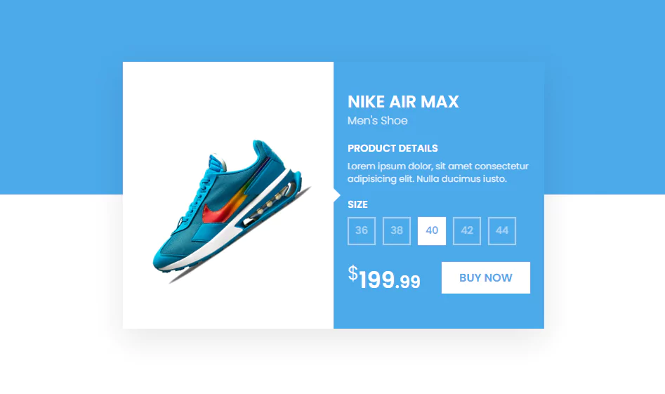
<div class="card">
<div class="imgBx">
<img src="shoe.jpg">
</div>
<div class="details">
<h3>Nike Air Max<br><span>Men's Shoe</span></h3>
<h4>Product Details</h4>
<p>Lorem ipsum dolor, sit amet consectetur adipisicing elit. Nulla ducimus iusto.</p>
<h4>Size</h4>
<ul class="size">
<li>36</li>
<li>38</li>
<li>40</li>
<li>42</li>
<li>44</li>
</ul>
<div class="group">
<h2><sup>$</sup>199<small>.99</small></h2>
<a href="#">Buy Now</a>
</div>
</div>
</div>
</body>
</html>CSS
@import url('https://fonts.googleapis.com/css?family=Poppins:200,300,400,500,600,700,800,900&display=swap');
*
{
	margin: 0;
	padding: 0;
	box-sizing: border-box;
	font-family: 'Poppins', sans-serif;
}
body
{
	display: flex;
	justify-content: center;
	align-items: center;
	background: linear-gradient(#4ba9e9 0,#4ba9e9 50%,#fff 50%,#fff 100%);
	min-height: 100vh;
}
.card
{
	position: relative;
	width: 300px;
	height: 380px;
	background: #0000;
	display: flex;
	box-shadow: 0 15px 45px rgba(0,0,0,0.1);
	overflow: hidden;
	transition: 0.5s ease-in-out;
}
.card:hover
{
	width: 600px;
}
.card .imgBx
{
	position: relative;
	min-width: 300px;
	height: 100%;
	background: #fff;
	display: flex;
	justify-content: center;
	align-items: center;
	z-index: 10;
}
.card .imgBx  img
{
	max-width: 250px;
	transition: 0.5s ease-in-out;
}
.card:hover .imgBx  img
{
	transform: rotate(-35deg) translateX(-20px);
}
.card .details
{
	position: absolute;
	left: 0;
	width: 300px;
	height: 100%;
	background: #4ba9e9;
	display: flex;
	justify-content: center;
	padding: 20px;
	flex-direction: column;
	transition: 0.5s ease-in-out;
}
.card:hover .details
{
	left: 300px;
}
.card .details::before
{
	content: '';
	position: absolute;
	left: 0px;
	width: 0;
  height: 0;
  border-top: 10px solid transparent;
  border-bottom: 10px solid transparent;
  border-left: 10px solid #fff;
	z-index: 1;
}
.card .details h3
{
	color: #fff;
	text-transform: uppercase;
	font-weight: 600;
	font-size: 1.5em;
	line-height: 1em;
}
.card .details h3 span
{
	font-size: 0.65em;
	font-weight: 300;
	opacity: 0.85;
	text-transform: none;
}
.card .details h4
{
	color: #fff;
	text-transform: uppercase;
	font-weight: 600;
	font-size: 0.9em;
	line-height: 1em;
	margin-top: 20px;
	margin-bottom: 10px;
}
p
{
	color: #fff;
	font-size: 0.8em;
	opacity: 0.85;
}
.size
{
	display: flex;
	gap: 10px;
}
.size li
{
	list-style: none;
	color: #fff;
	font-size: 0.9em;
	width: 40px;
	height: 40px;
	display: flex;
	justify-content: center;
	align-items: center;
	border: 2px solid #fff;
	cursor: pointer;
	font-weight: 500;
	opacity: 0.5;
}
.size li:hover
{
	background: #fff;
	color: #4ba9e9;
	opacity: 1;
}
.group
{
	position: relative;
	display: flex;
	justify-content: space-between;
	margin-top: 20px;
	align-items: center;
}
.card .details h2
{
	color: #fff;
	text-transform: uppercase;
	font-weight: 600;
	font-size: 2em;
}
.card .details h2 sup
{
	font-weight: 300;
}
.card .details h2 small
{
	font-size: 0.75em;
}
.card .details a
{
	display: inline-flex;
	padding: 10px 25px;
	background: #fff;
	font-weight: 500;
	text-decoration: none;
	text-transform: uppercase;
	font-weight: 600;
	color: #4ba9e9;
}
Image

Another HTML CSS JavaScript Article For You 👇