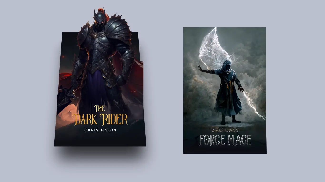
3D Card Design With HTML and CSS
“Are you looking to add a unique and visually striking element to your website? Look no further than 3D card design with HTML and CSS. In this article, we will guide you through the process of creating a 3D card effect using the power of HTML and CSS.
From creating the structure to adding animations, we will cover everything you need to know to make your own 3D card design. Whether you’re a beginner or an experienced developer, this article has something for everyone. Learn how to create a 3D card design that will make your website stand out and impress your visitors.”
For additional HTML, CSS, and JavaScript projects, see our website.
Source Code:
HTML:
<!DOCTYPE html>
<html lang="en" >
<head>
  <meta charset="UTF-8">
  <title>3D Card</title>
  <link rel="stylesheet" href="./style.css">

</head>
<body>

<!-- partial:index.partial.html -->

<a href="https://mythrillfiction.com/" alt="Mythrill" target="_blank">
  <div class="card">
    <div class="wrapper">
      <img src="https://ggayane.github.io/css-experiments/cards/dark_rider-cover.jpg" class="cover-image" />
    </div>
    <img src="https://ggayane.github.io/css-experiments/cards/dark_rider-title.png" class="title" />
    <img src="https://ggayane.github.io/css-experiments/cards/dark_rider-character.webp" class="character" />
  </div>
</a>

<a href="https://www.mythrillfiction.com/force-mage" alt="Mythrill" target="_blank">
  <div class="card">
    <div class="wrapper">
      <img src="https://ggayane.github.io/css-experiments/cards/force_mage-cover.jpg" class="cover-image" />
    </div>
    <img src="https://ggayane.github.io/css-experiments/cards/force_mage-title.png" class="title" />
    <img src="https://ggayane.github.io/css-experiments/cards/force_mage-character.webp" class="character" />
  </div>
</a>

<!-- partial -->

</body>
</html>
——————————
📂 Important Links:
——————————
>> Learn Graphics Design & Make A Successful Profession.
>> Canva Makes Graphics Design Easy.
>> Start Freelancing Today & Earn Money.
>> Make Video Editing As Your Profession.
CSS:
:root {
  --card-height: 300px;
  --card-width: calc(var(--card-height) / 1.5);
}
* {
  box-sizing: border-box;
}
body {
  width: 100vw;
  height: 100vh;
  margin: 0;
  display: flex;
  justify-content: center;
  align-items: center;
  background: #191c29;
}
.card {
  width: var(--card-width);
  height: var(--card-height);
  position: relative;
  display: flex;
  justify-content: center;
  align-items: flex-end;
  padding: 0 36px;
  perspective: 2500px;
  margin: 0 50px;
}

.cover-image {
  width: 100%;
  height: 100%;
  object-fit: cover;
}

.wrapper {
  transition: all 0.5s;
  position: absolute;
  width: 100%;
  z-index: -1;
}

.card:hover .wrapper {
  transform: perspective(900px) translateY(-5%) rotateX(25deg) translateZ(0);
  box-shadow: 2px 35px 32px -8px rgba(0, 0, 0, 0.75);
  -webkit-box-shadow: 2px 35px 32px -8px rgba(0, 0, 0, 0.75);
  -moz-box-shadow: 2px 35px 32px -8px rgba(0, 0, 0, 0.75);
}

.wrapper::before,
.wrapper::after {
  content: "";
  opacity: 0;
  width: 100%;
  height: 80px;
  transition: all 0.5s;
  position: absolute;
  left: 0;
}
.wrapper::before {
  top: 0;
  height: 100%;
  background-image: linear-gradient(
    to top,
    transparent 46%,
    rgba(12, 13, 19, 0.5) 68%,
    rgba(12, 13, 19) 97%
  );
}
.wrapper::after {
  bottom: 0;
  opacity: 1;
  background-image: linear-gradient(
    to bottom,
    transparent 46%,
    rgba(12, 13, 19, 0.5) 68%,
    rgba(12, 13, 19) 97%
  );
}

.card:hover .wrapper::before,
.wrapper::after {
  opacity: 1;
}

.card:hover .wrapper::after {
  height: 120px;
}
.title {
  width: 100%;
  transition: transform 0.5s;
}
.card:hover .title {
  transform: translate3d(0%, -50px, 100px);
}

.character {
  width: 100%;
  opacity: 0;
  transition: all 0.5s;
  position: absolute;
  z-index: -1;
}

.card:hover .character {
  opacity: 1;
  transform: translate3d(0%, -30%, 100px);
}
Another article for you.