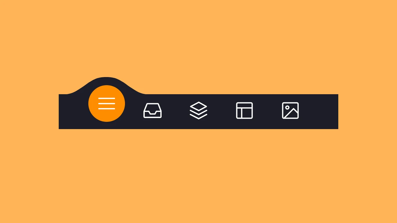
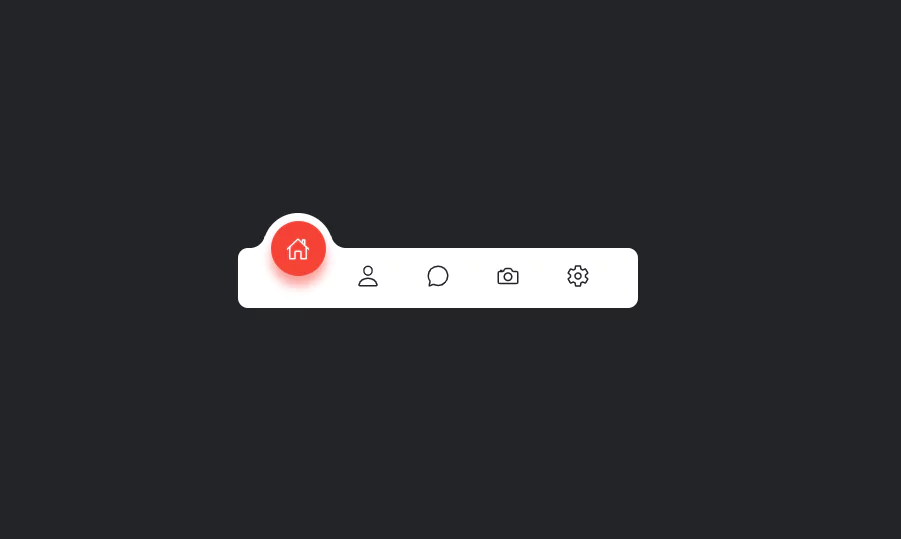
Animated tab bar/menu bar with HTML CSS JavaScript
Using HTML, CSS, and JavaScript, we will create an animated navigation bar/menu bar/tab bar. In this tutorial, I’ll show you how to make an animated menu bar using HTML, CSS, and JavaScript.
The structure will be created using HTML. The styling will be added using CSS, and JavaScript will be used for specific features. For additional HTML, CSS, and JavaScript projects, see our website.
Source Code:
HTML:
<!DOCTYPE html>
<html lang="en" >
<head>
  <meta charset="UTF-8">
  <title>Animated Tab Bar</title>
  <link rel="stylesheet" href="./style.css">

</head>
<body>
<!-- partial:index.partial.html -->
<menu class="menu">

  <button class="menu__item active" style="--bgColorItem: #ff8c00;">
    <svg class="icon" viewBox="0 0 24 24">
      <path d="M3.8,6.6h16.4" />
      <path d="M20.2,12.1H3.8" />
      <path d="M3.8,17.5h16.4" />
    </svg>
  </button>

  <button class="menu__item" style="--bgColorItem: #f54888;">
    <svg class="icon" viewBox="0 0 24 24">
      <path d="M6.7,4.8h10.7c0.3,0,0.6,0.2,0.7,0.5l2.8,7.3c0,0.1,0,0.2,0,0.3v5.6c0,0.4-0.4,0.8-0.8,0.8H3.8
        C3.4,19.3,3,19,3,18.5v-5.6c0-0.1,0-0.2,0.1-0.3L6,5.3C6.1,5,6.4,4.8,6.7,4.8z" />
      <path d="M3.4,12.9H8l1.6,2.8h4.9l1.5-2.8h4.6" />
    </svg>
  </button>

  <button class="menu__item" style="--bgColorItem: #4343f5;">
    <svg class="icon" viewBox="0 0 24 24">
      <path d="M3.4,11.9l8.8,4.4l8.4-4.4" />
      <path d="M3.4,16.2l8.8,4.5l8.4-4.5" />
      <path d="M3.7,7.8l8.6-4.5l8,4.5l-8,4.3L3.7,7.8z" />
  </button>

  <button class="menu__item" style="--bgColorItem: #e0b115;">
    <svg class="icon" viewBox="0 0 24 24">
      <path d="M5.1,3.9h13.9c0.6,0,1.2,0.5,1.2,1.2v13.9c0,0.6-0.5,1.2-1.2,1.2H5.1c-0.6,0-1.2-0.5-1.2-1.2V5.1
          C3.9,4.4,4.4,3.9,5.1,3.9z" />
      <path d="M4.2,9.3h15.6" />
      <path d="M9.1,9.5v10.3" />
  </button>

  <button class="menu__item" style="--bgColorItem:#65ddb7;">
    <svg class="icon" viewBox="0 0 24 24">
      <path d="M5.1,3.9h13.9c0.6,0,1.2,0.5,1.2,1.2v13.9c0,0.6-0.5,1.2-1.2,1.2H5.1c-0.6,0-1.2-0.5-1.2-1.2V5.1
          C3.9,4.4,4.4,3.9,5.1,3.9z" />
      <path d="M5.5,20l9.9-9.9l4.7,4.7" />
      <path d="M10.4,8.8c0,0.9-0.7,1.6-1.6,1.6c-0.9,0-1.6-0.7-1.6-1.6C7.3,8,8,7.3,8.9,7.3C9.7,7.3,10.4,8,10.4,8.8z" />
    </svg>
  </button>

  <div class="menu__border"></div>

</menu>

<div class="svg-container">
  <svg viewBox="0 0 202.9 45.5">
    <clipPath id="menu" clipPathUnits="objectBoundingBox" transform="scale(0.0049285362247413 0.021978021978022)">
      <path d="M6.7,45.5c5.7,0.1,14.1-0.4,23.3-4c5.7-2.3,9.9-5,18.1-10.5c10.7-7.1,11.8-9.2,20.6-14.3c5-2.9,9.2-5.2,15.2-7
          c7.1-2.1,13.3-2.3,17.6-2.1c4.2-0.2,10.5,0.1,17.6,2.1c6.1,1.8,10.2,4.1,15.2,7c8.8,5,9.9,7.1,20.6,14.3c8.3,5.5,12.4,8.2,18.1,10.5
          c9.2,3.6,17.6,4.2,23.3,4H6.7z" />
    </clipPath>
  </svg>
</div>
<!-- partial -->
  <script  src="./script.js"></script>

</body>
</html>
——————————
📂 Important Links:
——————————
>> Learn Graphics Design & Make A Successful Profession.
>> Canva Makes Graphics Design Easy.
>> Start Freelancing Today & Earn Money.
>> Make Video Editing As Your Profession.
CSS:
html {
  box-sizing: border-box;
  --bgColorMenu: #1d1d27;
  --duration: 0.7s;
}

html *,
html *::before,
html *::after {
  box-sizing: inherit;
}

body {
  margin: 0;
  display: flex;
  height: 100vh;
  overflow: hidden;
  align-items: center;
  justify-content: center;
  background-color: #ffb457;
  -webkit-tap-highlight-color: transparent;
  transition: background-color var(--duration);
}

.menu {
  margin: 0;
  display: flex;
  /* Works well with 100% width  */
  width: 32.05em;
  font-size: 1.5em;
  padding: 0 2.85em;
  position: relative;
  align-items: center;
  justify-content: center;
  background-color: var(--bgColorMenu);
}

.menu__item {
  all: unset;
  flex-grow: 1;
  z-index: 100;
  display: flex;
  cursor: pointer;
  position: relative;
  border-radius: 50%;
  align-items: center;
  will-change: transform;
  justify-content: center;
  padding: 0.55em 0 0.85em;
  transition: transform var(--timeOut, var(--duration));
}

.menu__item::before {
  content: "";
  z-index: -1;
  width: 4.2em;
  height: 4.2em;
  border-radius: 50%;
  position: absolute;
  transform: scale(0);
  transition: background-color var(--duration), transform var(--duration);
}

.menu__item.active {
  transform: translate3d(0, -0.8em, 0);
}

.menu__item.active::before {
  transform: scale(1);
  background-color: var(--bgColorItem);
}

.icon {
  width: 2.6em;
  height: 2.6em;
  stroke: white;
  fill: transparent;
  stroke-width: 1pt;
  stroke-miterlimit: 10;
  stroke-linecap: round;
  stroke-linejoin: round;
  stroke-dasharray: 400;
}

.menu__item.active .icon {
  animation: strok 1.5s reverse;
}

@keyframes strok {
  100% {
    stroke-dashoffset: 400;
  }
}

.menu__border {
  left: 0;
  bottom: 99%;
  width: 10.9em;
  height: 2.4em;
  position: absolute;
  clip-path: url(#menu);
  will-change: transform;
  background-color: var(--bgColorMenu);
  transition: transform var(--timeOut, var(--duration));
}

.svg-container {
  width: 0;
  height: 0;
}

@media screen and (max-width: 50em) {
  .menu {
    font-size: 0.8em;
  }
}
Another article for you.
JavaScript:
"use strict";

const body = document.body;
const bgColorsBody = ["#ffb457", "#ff96bd", "#9999fb", "#ffe797", "#cffff1"];
const menu = body.querySelector(".menu");
const menuItems = menu.querySelectorAll(".menu__item");
const menuBorder = menu.querySelector(".menu__border");
let activeItem = menu.querySelector(".active");

function clickItem(item, index) {
  menu.style.removeProperty("--timeOut");

  if (activeItem == item) return;

  if (activeItem) {
    activeItem.classList.remove("active");
  }

  item.classList.add("active");
  body.style.backgroundColor = bgColorsBody[index];
  activeItem = item;
  offsetMenuBorder(activeItem, menuBorder);
}

function offsetMenuBorder(element, menuBorder) {
  const offsetActiveItem = element.getBoundingClientRect();
  const left =
    Math.floor(
      offsetActiveItem.left -
        menu.offsetLeft -
        (menuBorder.offsetWidth - offsetActiveItem.width) / 2
    ) + "px";
  menuBorder.style.transform = `translate3d(${left}, 0 , 0)`;
}

offsetMenuBorder(activeItem, menuBorder);

menuItems.forEach((item, index) => {
  item.addEventListener("click", () => clickItem(item, index));
});

window.addEventListener("resize", () => {
  offsetMenuBorder(activeItem, menuBorder);
  menu.style.setProperty("--timeOut", "none");
});More Queries: