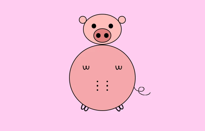
Draw An Animated Pig Using HTML CSS & JavaScript
This website provides you some incredible HTML CSS & JavaScript projects. Today we will see another interesting HTML, CSS & JavaScript project.
Today we will create an animated pig using html CSS & JavaScript. We will create the structure using HTML and using css we will do the stylings and last using JavaScript we will make our animations working. For More HTML, CSS & JavaScript projects visit our website.
Source Code:
HTML:
<!DOCTYPE html>
<html lang="en" >
<head>
  <meta charset="UTF-8">
  <title>CodePen - One Circle  - Pig</title>
  <link rel="stylesheet" href="./style.css">

</head>
<body>
<!-- partial:index.partial.html -->
<body>
    <audio id="pig-song" src="https://raw.githubusercontent.com/hicodersofficial/one-circle-pig/master/pig-song.mp3"></audio>
    <div class="one-circle-pig">
        <div class="one-big-circle-face d5 animate">
            <div class="one-circle-ear">
                <div class="one-circle-md d6 animate"></div>
                <div class="one-circle-md d7 animate"></div>
            </div>
            <div class="one-circle-eyes">
                <div class="one-circle-sm d3 animate"></div>
                <div class="one-circle-sm d4 animate"></div>
            </div>
            <div class="one-big-circle-mouth d2 animate">
                <div class="one-circle-sm d0 animate"></div>
                <div class="one-circle-sm d1 animate"></div>
            </div>
        </div>
        <div class="one-big-circle-tummy d8 animate">
            <div class="w-container">
                <div class="w d9 animate-op">W</div>
                <div class="w d10 animate-op">W</div>
            </div>
            <div class="nipples-container">
                <div class="nipple-container">
                    <div class="nipple d13 animate-op"></div>
                    <div class="nipple d14 animate-op"></div>
                </div>
                <div class="nipple-container">
                    <div class="nipple d15 animate-op"></div>
                    <div class="nipple d16 animate-op"></div>
                </div>
                <div class="nipple-container">
                    <div class="nipple d17 animate-op"></div>
                    <div class="nipple d18 animate-op"></div>
                </div>
            </div>
            <div class="e d19 animate-op">
                <svg style="width: 50px" viewBox="0 0 319 164" fill="none">
                    <path d="M2 9C19.9136 48.4593 21.5142 43.2904 46.5 65.5C58.875 76.5 144 97 167 81.5C181 70.0397 188.11 65.8641 195 49.5C200.232 37.0739 194.448 26.8022 185.5 15.5C179.528 7.95646 155.44 1.5 146.5 1.5C123.17 1.5 119.222 1.97233 101.5 19C85.5819 34.2946 86.1158 81.3472 91.6109 100.58C100.349 131.162 134.815 140.799 159.588 151.809C208.211 173.419 296.106 162.711 317.215 109.939" stroke="black" stroke-width="10" stroke-linecap="round" />
                </svg>
            </div>
        </div>
        <div class="feet-w-container">
            <div class="transform-left d11 animate-op">W</div>
            <div class="transform-right d12 animate-op">W</div>
        </div>
    </div>
    <button id="start">Start 🐷</button>
</body>
<!-- partial -->
  <script  src="./script.js"></script>

</body>
</html>
——————————
📂 Important Links:
——————————
>> Learn Graphics Design & Make A Successful Profession.
>> Canva Makes Graphics Design Easy.
>> Start Freelancing Today & Earn Money.
>> Make Video Editing As Your Profession.
Another CSS Animation for you.
CSS:
@import url("https://fonts.googleapis.com/css2?family=Gochi+Hand&display=swap");
body {
    display: flex;
    align-items: center;
    justify-content: center;
    height: 100vh;
    margin: 0;
    background: #ffccef;
    flex-direction: column;
    font-family: "Gochi Hand", cursive;
}

#start {
    padding: 0.8rem 4rem;
    border: none;
    font-size: 1.5rem;
    background: #ff0076;
    color: #ffffff;
    font-weight: bold;
    text-transform: uppercase;
    transition: 0.5s all;
    box-shadow: 0 5px 10px 10px rgba(0, 0, 0, 0.103);
    border-radius: 8px;
    cursor: pointer;
    -webkit-border-radius: 8px;
    -moz-border-radius: 8px;
    -ms-border-radius: 8px;
    -o-border-radius: 8px;
    -webkit-transition: 0.5s all;
    -moz-transition: 0.5s all;
    -ms-transition: 0.5s all;
    -o-transition: 0.5s all;
}

#start:hover {
    transform: scale(1.05) translateY(-2px);
    -webkit-transform: scale(1.05) translateY(-2px);
    -moz-transform: scale(1.05) translateY(-2px);
    -ms-transform: scale(1.05) translateY(-2px);
    -o-transform: scale(1.05) translateY(-2px);
}

#start:active {
    transform: scale(1) translateY(2px);
    -webkit-transform: scale(1) translateY(2px);
    -moz-transform: scale(1) translateY(2px);
    -ms-transform: scale(1) translateY(2px);
    -o-transform: scale(1) translateY(2px);
}

.one-circle-pig {
    display: none;
    flex-direction: column;
    align-items: center;
    justify-content: center;
}
.one-circle-sm {
    width: 10px;
    height: 10px;
    border-radius: 50%;
    /* border: 2px solid black;
  */
    -webkit-border-radius: 50%;
    -moz-border-radius: 50%;
    -ms-border-radius: 50%;
    -o-border-radius: 50%;
}

.one-circle-md {
    width: 20px;
    height: 20px;
    border-radius: 50%;
    /* background: black; */
    /* border: 2px solid black; */
    -webkit-border-radius: 50%;
    -moz-border-radius: 50%;
    -ms-border-radius: 50%;
    -o-border-radius: 50%;
}

.one-big-circle-mouth {
    display: flex;
    width: 50px;
    height: 40px;
    border-radius: 50%;
    /* border: 2px solid black; */
    align-items: center;
    justify-content: space-around;
}

.one-big-circle-face {
    display: flex;
    flex-direction: column;
    width: 115px;
    height: 90px;
    border-radius: 50%;
    /* border: 2px solid black; */
    align-items: center;
    justify-content: center;
}

.one-circle-eyes {
    display: flex;
    justify-content: space-around;
    width: 90%;
}

.one-circle-ear {
    display: flex;
    justify-content: space-between;
    width: 125%;
}

.one-big-circle-tummy {
    display: flex;
    flex-direction: column;
    justify-content: space-around;
    width: 200px;
    height: 200px;
    border-radius: 50%;
    /* border: 2px solid black; */
    align-items: center;
    justify-content: center;
    position: relative;
}

.w-container {
    display: flex;
    justify-content: space-around;
    width: 100%;
    margin-bottom: 20px;
}

.w {
    font-size: 25px;
    opacity: 0;
}
.nipples-container {
    display: flex;
    height: 20%;
    flex-direction: column;
    align-items: center;
    justify-content: space-around;
    width: 100%;
}
.nipple-container {
    display: flex;
    justify-content: space-around;
    width: 30%;
}

.nipple {
    width: 5px;
    height: 5px;
    border-radius: 50%;
    background: black;
    opacity: 0;
    -webkit-border-radius: 50%;
    -moz-border-radius: 50%;
    -ms-border-radius: 50%;
    -o-border-radius: 50%;
}

.feet-w-container {
    display: flex;
    justify-content: space-around;
    font-size: 30px;
    width: 220px;
    margin-top: -25px;
    /* margin-bottom: 20px; */
}

.transform-left {
    opacity: 0;
    transform: rotate(30deg);
    -webkit-transform: rotate(30deg);
    -moz-transform: rotate(30deg);
    -ms-transform: rotate(30deg);
    -o-transform: rotate(30deg);
}
.transform-right {
    opacity: 0;
    transform: rotate(-30deg);
    -webkit-transform: rotate(-30deg);
    -moz-transform: rotate(-30deg);
    -ms-transform: rotate(-30deg);
    -o-transform: rotate(-30deg);
}

.e {
    position: absolute;
    bottom: 20%;
    right: -47px;
    opacity: 0;
    z-index: 9;
}

.animate {
    animation-name: animate-border;
    animation-fill-mode: forwards;
    animation-duration: 0.4s;
}

.animate-op {
    animation-name: animate-opacity;
    animation-fill-mode: forwards;
    animation-duration: 0.4s;
}

.d0 {
    animation: bg1 0.4s forwards;
    animation-delay: 0s !important;
}

.d1 {
    animation: bg1 0.4s forwards;
    animation-delay: 1s !important;
}

.d2 {
    animation: bg2 0.4s forwards;
    animation-delay: 2s !important;
}

.d3 {
    animation: bg1 0.4s forwards;
    animation-delay: 3s !important;
}

.d4 {
    animation: bg1 0.4s forwards;
    animation-delay: 4s !important;
}

.d5 {
    animation: bg3 0.4s forwards;
    animation-delay: 5s !important;
}

.d6 {
    animation: bg4 0.4s forwards;
    animation-delay: 6s !important;
}

.d7 {
    animation: bg4 0.4s forwards;
    animation-delay: 7s !important;
}

.d8 {
    animation: bg5 0.4s forwards;
    animation-delay: 8s !important;
}

.d9 {
    animation-delay: 9s !important;
}

.d10 {
    animation-delay: 10s !important;
}

.d11 {
    animation-delay: 11s !important;
}
.d12 {
    animation-delay: 12s !important;
}

.d13 {
    animation-delay: 12.5s !important;
}

.d14 {
    animation-delay: 12.9s !important;
}

.d15 {
    animation-delay: 13.2s !important;
}

.d16 {
    animation-delay: 13.5s !important;
}

.d17 {
    animation-delay: 13.8s !important;
}

.d18 {
    animation-delay: 14.2s !important;
}

.d19 {
    animation-delay: 14.6s !important;
}

@keyframes animate-border {
    0% {
        border: 2px solid rgba(0, 0, 0, 0);
    }
    100% {
        border: 2px solid black;
    }
}

@keyframes animate-opacity {
    0% {
        opacity: 0;
    }
    100% {
        opacity: 1;
    }
}

@keyframes bg1 {
    to {
        background: #000;
        border: 2px solid black;
    }
}

@keyframes bg2 {
    to {
        background: #fbd5d4;
        border: 2px solid black;
    }
}

@keyframes bg2 {
    to {
        background: #e38180;
        border: 2px solid black;
    }
}
@keyframes bg3 {
    to {
        background: #ffbdbb;
        border: 2px solid black;
    }
}

@keyframes bg4 {
    to {
        background: #ffbdbb;
        border: 2px solid black;
    }
}

@keyframes bg5 {
    to {
        background: #f5a7ab;
        border: 2px solid black;
    }
}
JavaScript:
const btn = document.querySelector("#start");
const audio = document.querySelector("#pig-song");
const pig = document.querySelector(".one-circle-pig");
console.log(btn, audio, pig);
let canPlaySong = false;
let isStarted = false;

function start() {
    hideBtn();
    showRestartBtn();
    audio.play();
    pig.style.display = "flex";
}

btn.addEventListener("click", start);

function restart() {
    console.log("restarting...");
    hideBtn();
    showRestartBtn();
    pig.style.display = "none";
    setTimeout(() => {
        pig.style.display = "flex";
        audio.play();
    }, 1000);
}

function showRestartBtn() {
    setTimeout(() => {
        btn.addEventListener("click", restart);
        btn.style.display = "inline-block";
        btn.style.marginTop = "3rem";
        btn.innerText = "Restart 🐷";
    }, 16100);
}

function hideBtn() {
    btn.style.display = "none";
}