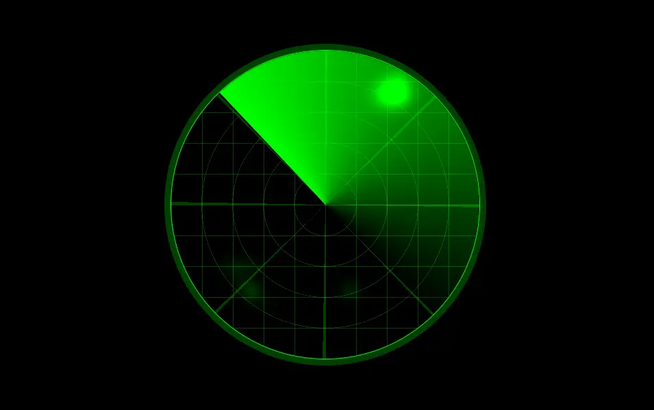
Conic Gradient Radar Using HTML CSS
Lets create something fun today using HTML and CSS. We have seen a lot of radar using in the movies. Can you imagine? using HTML and CSS we can create a radar.
Of course, we will use HTML for the structure and using CSS we will create the stylings. For more HTML and CSS projects visit our website.
Source Code:
HTML(PUG):
.radar
  .radar__trail
    - for (var x = 0; x < 625; x++)
      .trail__item
——————————
📂 Important Links:
——————————
>> Learn Graphics Design & Make A Successful Profession.
>> Canva Makes Graphics Design Easy.
>> Start Freelancing Today & Earn Money.
>> Make Video Editing As Your Profession.
Another article for you.
CSS(SCSS):
// Body stuff to center demo
body {
  height: 100vh;
  width: 100vw;
  margin: 0;
  display: flex;
  align-items: center;
  justify-content: center;
  background-color: black;
  overflow: auto;
}

// Radar and grid lines - using a variety of gradients
.radar {
  height: 500px;
  width: 500px;
  flex-shrink: 0;
  overflow: hidden;
  position: absolute;
  border-radius: 100%;
  border: 1px solid rgba(0, 255, 0, 1);
  box-shadow: 0 0 0px 10px rgba(0, 255, 0, 0.25);
  background-image:
    // vertical lines
    linear-gradient(90deg, rgba(0, 255, 0, 0.25) 1px, transparent 1px),
    // horizontal lines
    linear-gradient(rgba(0, 255, 0, 0.25) 1px, transparent 1px),
    // diagonal lines
    repeating-conic-gradient(
        rgba(0, 255, 0, 0.25) 0 1deg,
        rgba(0, 255, 0, 0) 0 45deg
      ),
    // circular lines
    repeating-radial-gradient(
        rgba(0, 255, 0, 0.25),
        rgba(0, 255, 0, 0.25) 1px,
        black 1px,
        black 50px
      );
  background-size: 50px 50px, 50px 50px, cover, cover;
  cursor: crosshair;

  // Scanner - using conic gradient and rotation animation
  &::before {
    content: "";
    position: absolute;
    height: 100%;
    width: 100%;
    border-radius: 100%;
    z-index: 0;
    animation: spin 5000ms linear infinite;
    background: conic-gradient(lime, transparent, transparent);
  }
}

// Invisible grid for placing trail items
.radar__trail {
  display: grid;
  grid-template-columns: repeat(25, 20px);
  grid-template-rows: repeat(25, 20px);
  overflow: hidden;
  border-radius: 100%;
  // Trail Mask - non-visible clip-path to prevent hovering outside the scanner
  &::before {
    content: "";
    position: absolute;
    height: 100%;
    width: 100%;
    border-radius: 100%;
    z-index: 2;
    animation: spin 5000ms linear infinite;
    clip-path: polygon(50% -50%, -100% 100%, 50% 100%);
  }
}

// Radar trails - grid background items to produce animation on hover
.trail__item {
  background: lime;
  filter: blur(10px);
  z-index: 1;
  border-radius: 100%;
  opacity: 0;
  transition: opacity 5000ms ease 200ms, transform 800ms ease;
  mix-blend-mode: plus-lighter;
  &:hover {
    opacity: 1;
    transition: opacity 0.2s ease;
    transform: scale(1.5);
  }
}

// Spin animation
@keyframes spin {
  0% {
    transform: rotate(360deg);
  }
  100% {
    transform: rotate(0deg);
  }
}