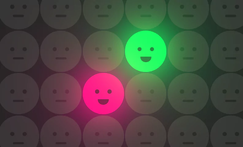
Only Two | Html CSS Glowing Smiley Face Effects (Source Code)
Only Two. Html CSS Glowing Smiley Face Effects (Source Code).
HTML
<!doctype html>
<html>
<head>
	<meta charset="utf-8">
	<title>CSS Smiley Face Effects</title>
	<link rel="stylesheet" href="style.css">
</head>
<body>
	<label>
		<input type="radio" name="pink">
		<div class="face"></div>
	</label>
	<label>
		<input type="radio" name="green">
		<div class="face"></div>
	</label>
	<label>
		<input type="radio" name="pink">
		<div class="face"></div>
	</label>
	<label>
		<input type="radio" name="green">
		<div class="face"></div>
	</label>
	<label>
		<input type="radio" name="pink">
		<div class="face"></div>
	</label>
	<label>
		<input type="radio" name="green">
		<div class="face"></div>
	</label>
	<label>
		<input type="radio" name="pink">
		<div class="face"></div>
	</label>
	<label>
		<input type="radio" name="green">
		<div class="face"></div>
	</label>
	<label>
		<input type="radio" name="pink">
		<div class="face"></div>
	</label>
	<label>
		<input type="radio" name="green">
		<div class="face"></div>
	</label>
	<label>
		<input type="radio" name="pink">
		<div class="face"></div>
	</label>
	<label>
		<input type="radio" name="green">
		<div class="face"></div>
	</label>
	<label>
		<input type="radio" name="pink">
		<div class="face"></div>
	</label>
	<label>
		<input type="radio" name="green">
		<div class="face"></div>
	</label>
	<label>
		<input type="radio" name="pink">
		<div class="face"></div>
	</label>
	<label>
		<input type="radio" name="green">
		<div class="face"></div>
	</label>
	<label>
		<input type="radio" name="pink">
		<div class="face"></div>
	</label>
	<label>
		<input type="radio" name="green">
		<div class="face"></div>
	</label>
	<label>
		<input type="radio" name="pink">
		<div class="face"></div>
	</label>
	<label>
		<input type="radio" name="green">
		<div class="face"></div>
	</label>
	<label>
		<input type="radio" name="pink">
		<div class="face"></div>
	</label>
	<label>
		<input type="radio" name="green">
		<div class="face"></div>
	</label>
	<label>
		<input type="radio" name="pink">
		<div class="face"></div>
	</label>
	<label>
		<input type="radio" name="green">
		<div class="face"></div>
	</label>
	<label>
		<input type="radio" name="pink">
		<div class="face"></div>
	</label>
	<label>
		<input type="radio" name="green">
		<div class="face"></div>
	</label>
	<label>
		<input type="radio" name="pink">
		<div class="face"></div>
	</label>
	<label>
		<input type="radio" name="green">
		<div class="face"></div>
	</label>
	<label>
		<input type="radio" name="pink">
		<div class="face"></div>
	</label>
	<label>
		<input type="radio" name="green">
		<div class="face"></div>
	</label>
	<label>
		<input type="radio" name="pink">
		<div class="face"></div>
	</label>
	<label>
		<input type="radio" name="green">
		<div class="face"></div>
	</label>
	<label>
		<input type="radio" name="pink">
		<div class="face"></div>
	</label>
	<label>
		<input type="radio" name="green">
		<div class="face"></div>
	</label>
	<label>
		<input type="radio" name="pink">
		<div class="face"></div>
	</label>
	<label>
		<input type="radio" name="green">
		<div class="face"></div>
	</label>
	<label>
		<input type="radio" name="pink">
		<div class="face"></div>
	</label>
	<label>
		<input type="radio" name="green">
		<div class="face"></div>
	</label>
	<label>
		<input type="radio" name="pink">
		<div class="face"></div>
	</label>
	<label>
		<input type="radio" name="green">
		<div class="face"></div>
	</label>
	<label>
		<input type="radio" name="pink">
		<div class="face"></div>
	</label>
	<label>
		<input type="radio" name="green">
		<div class="face"></div>
	</label>
	<label>
		<input type="radio" name="pink">
		<div class="face"></div>
	</label>
	<label>
		<input type="radio" name="green">
		<div class="face"></div>
	</label>
	<label>
		<input type="radio" name="pink">
		<div class="face"></div>
	</label>
	<label>
		<input type="radio" name="green">
		<div class="face"></div>
	</label>
	<label>
		<input type="radio" name="pink">
		<div class="face"></div>
	</label>
	<label>
		<input type="radio" name="green">
		<div class="face"></div>
	</label>
	<label>
		<input type="radio" name="pink">
		<div class="face"></div>
	</label>
	<label>
		<input type="radio" name="green">
		<div class="face"></div>
	</label>
	<label>
		<input type="radio" name="pink">
		<div class="face"></div>
	</label>
	<label>
		<input type="radio" name="green">
		<div class="face"></div>
	</label>
	<label>
		<input type="radio" name="pink">
		<div class="face"></div>
	</label>
	<label>
		<input type="radio" name="green">
		<div class="face"></div>
	</label>
	<label>
		<input type="radio" name="pink">
		<div class="face"></div>
	</label>
	<label>
		<input type="radio" name="green">
		<div class="face"></div>
	</label>
	<label>
		<input type="radio" name="pink">
		<div class="face"></div>
	</label>
	<label>
		<input type="radio" name="green">
		<div class="face"></div>
	</label>
</body>
</html>
CSS
@import url('https://fonts.googleapis.com/css?family=Poppins:400,500,600,700,800,900&display=swap');
*
{
  margin: 0;
  padding: 0;
  box-sizing: border-box;
  font-family: 'Poppins', sans-serif;
}
body
{
  display: flex;
  flex-wrap: wrap;
  gap: 4px;
  min-height: 100vh;
  background: #222;
  overflow: hidden;
}
:root
{
  --clr1: #ff0087;
  --clr2: #01ff5f;
}
label
{
  position: relative;
  width: 150px;
  height: 150px;
}
label input
{
  appearance: none;
}
.face
{
  position: absolute;
  inset: 0;
  background: #333;
  border-radius: 50%;
  cursor: pointer;
  transition: 0.5s;
  mix-blend-mode: lighten;
}
label input:checked ~ .face
{
  background: var(--clr1);
  filter: drop-shadow(0 0 50px var(--clr1)) drop-shadow(0 0 100px var(--clr1)) drop-shadow(0 0 200px var(--clr1));
  z-index: 10000;
}
label:nth-child(even) input:checked ~ .face
{
  background: var(--clr2);
  filter: drop-shadow(0 0 50px var(--clr2)) drop-shadow(0 0 100px var(--clr2)) drop-shadow(0 0 200px var(--clr2));
}
.face::before
{
  content: '';
  position: absolute;
  top: 60px;
  left: 45px;
  width: 15px;
  height: 15px;
  background: #111;
  box-shadow: 45px 0 0 #111;
  border-radius: 50%;
  opacity: 0.5;
}
.face::after
{
  content: '';
  position: absolute;
  bottom: 45px;
  left: 50%;
  transform: translateX(-50%);
  width: 40px;
  height: 8px;
  background: #111;
  border-radius: 8px;
  transition: 0.5s;
  opacity: 0.5;
}
label input:checked ~ .face::after
{
  width: 40px;
  height: 20px;
  transform: translateX(-50%) translateY(10px);
  border-radius: 0;
  border-bottom-left-radius: 20px;
  border-bottom-right-radius: 20px;
}Another HTML CSS JavaScript Article For You 👇
More Queries: