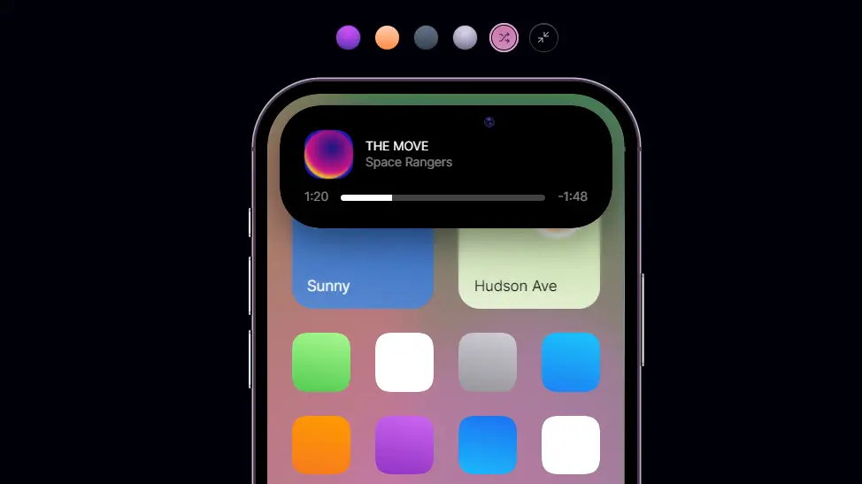
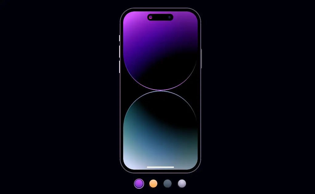
iPhone 14 Dynamic Island Using HTML CSS JavaScript
iPhone 14 Dynamic Island Using HTML CSS JavaScript. Using HTML, CSS & JavaScript we can create so many interesting thing.
Today in this article, we will see how to create iPhone 14 Dynamic Island animation using html css JavaScript. we will use HTML for structure, CSS for styling and JavaScript for animation.
Source Code:
HTML(Pug):
input#deep-purple(name="theme", type="radio", checked)
input#gold(name="theme", type="radio")
input#space-black(name="theme", type="radio")
input#silver(name="theme", type="radio")
input#random(name="theme", type="radio")
input#zoom(name="zoom", type="checkbox")

.scene
	.pallette
		label.swatch(tabIndex="0", for="deep-purple")
		label.swatch(tabIndex="0", for="gold")
		label.swatch(tabIndex="0", for="space-black")
		label.swatch(tabIndex="0", for="silver")
		label.swatch(tabIndex="0", for="random")
			.icon
			.tooltip CMD + click to save

	.zoom-con
		label.swatch(tabIndex="0", for="zoom")

	.phone-con
		.phone
			.buttons
				.left
					.button
					.button
					.button
				.right
					.button
			.camera
			.screen-container
				.bg
					.deep-purple
						.section
							.glow
						.section
							.glow
					.gold
						.section
							.glow
						.section
							.glow
					.space-black
						.section
							.glow
						.section
							.glow
					.silver
						.section
							.glow
						.section
							.glow
					.random.canvas
						.shapes
							.shape
							.shape
							.shape
							.shape
							.shape
							.shape
				.notch-container(tabIndex="0")
					.notch
						.content
							.left
								.tile
								.text
							.right
							.bar
								.duration
				.notch-blur
				.screen
					.app
						.weather
					.app
					.app
					.app
					.app
					.app
					.app
					.app
					.app
					.app
——————————
📂 Important Links:
——————————
>> Learn Graphics Design & Make A Successful Profession.
>> Canva Makes Graphics Design Easy.
>> Start Freelancing Today & Earn Money.
>> Make Video Editing As Your Profession.
CSS(SCSS):
@import url("https://fonts.googleapis.com/css2?family=Inter:wght@400&display=swap");

:root {
	--size: max(5px, 1vmin);
	--height: 80em;
	--pad: 1.25em;
	--border-radius: 6.666em;
	--gutter: calc(var(--pad) * 2);
	--scene-pad: 5vmin;
	--bg-blur: 0.333em;

	--button-width: 0.333em;

	--notch-height: 3.33em;
	--notch-width: 33.3%;
	--notch-radius: calc(var(--border-radius) - calc(var(--pad) * 2));
	--notch-duration: 0.333s;

	--ease: cubic-bezier(0.666, 0, 0.4, 1);
	--ease-spring: cubic-bezier(0.666, 0, 0.4, 1.2);
	--ease-out: cubic-bezier(0.15, 0, 0.333, 1);

	--border-width: 0.4em;

	--deep-purple: 284;
	--gold: 22.5;
	--space-black: 215;
	--silver: 254;

	--c-h: var(--deep-purple);
	--c-s: 100%;
	--c-l: 50%;
}

// Squircle effect
@function round-off() {
	@return url("data:image/svg+xml;utf8,<svg xmlns='http://www.w3.org/2000/svg' version='1.1'><defs><filter id='round'><feGaussianBlur in='SourceGraphic' stdDeviation='5' result='blur' /><feColorMatrix in='blur' mode='matrix' values='1 0 0 0 0  0 1 0 0 0  0 0 1 0 0  0 0 0 19 -9' result='goo'/><feComposite in='SourceGraphic' in2='goo' operator='atop'/></filter></defs></svg>#round");
}

// Smoother gradients
@function scrim-gradient(
	$startColor,
	$direction: "to bottom",
	$from: 0,
	$to: 100,
	$type: linear,
	$reverse: false,
	$debug: false
) {
	$scrimCoordinates: (
		0: 1,
		19: 0.738,
		34: 0.541,
		47: 0.382,
		56.5: 0.278,
		65: 0.194,
		73: 0.126,
		80.2: 0.075,
		86.1: 0.042,
		91: 0.021,
		95.2: 0.008,
		98.2: 0.002,
		100: 0
	);

	$hsl: "";

	@if type-of($startColor) == "list" {
		$hsl: $startColor;
	} @else {
		$hue: hue($startColor);
		$saturation: saturation($startColor);
		$lightness: lightness($startColor);
		$hsl: #{$hue}, #{$saturation}, #{$lightness};
	}

	$stops: ();

	@each $colorStop, $alpha in $scrimCoordinates {
		$stop: unquote("hsla(#{$hsl}, #{if($reverse, 1 - $alpha, $alpha)})")
			$from +
			($colorStop/($to/(100 - $from))) *
			1%;
		$stops: append($stops, $stop, comma);
	}

	@if $debug {
		@return "$startColor: #{$startColor},$direction: #{$direction}, $from: #{$from}, $to: #{$to}, $type: #{$type}, $reverse: #{$reverse}";
	} @else {
		@return #{$type}-gradient(unquote($direction), $stops);
	}
}

@keyframes appear {
	to {
		transform: scale3d(1, 1, 1);
		opacity: 1;
	}
}

body {
	background: darken(blue, 48);
}

.scene {
	display: flex;
	flex-wrap: wrap;
	gap: 3em 0;
	align-items: center;
	align-content: center;
	justify-content: center;
	min-height: 100vh;
	font-family: Inter;
	font-size: var(--size);
	padding: var(--scene-pad);
	box-sizing: border-box;
}

.phone-con {
	flex-basis: 100%;
	display: flex;
	justify-content: center;
}

.phone {
	position: relative;
	z-index: 1;

	aspect-ratio: 37/76;
	background: black;
	height: var(--height);
	border-radius: var(--border-radius);
	box-shadow: 0 0 0.1em 0.25em hsl(var(--c-h), 20%, 25%),
		0 0 0 var(--border-width) hsl(var(--c-h), 30%, 85%);
	box-sizing: border-box;

	opacity: 0;
	transform: scale3d(1.1, 1.1, 1);
	animation: appear 1s var(--ease-out) forwards;
	webkit-backface-visibility: hidden;

	&:before {
		content: "";
		position: absolute;
		top: var(--border-radius);
		right: calc(var(--border-width) * -1);
		bottom: var(--border-radius);
		left: calc(var(--border-width) * -1);
		border: 0.5em solid hsl(var(--c-h), 20%, 30%);
		border-left-width: 0;
		border-right-width: 0;
	}
}

.buttons {
	position: absolute;
	inset: calc(var(--border-width) * -1);
	pointer-events: none;

	.left,
	.right {
		position: absolute;
		width: var(--button-width);
		display: flex;
		flex-direction: column;
		align-items: stretch;
		gap: 1.5em;
	}

	.left {
		right: 100%;
		top: calc(var(--border-radius) * 2);

		.button {
			&:nth-child(1) {
				height: 3em;
				margin-bottom: 0.5em;
			}
		}
	}

	.right {
		left: 100%;
		transform: scale3d(-1, 1, 1);
		top: calc(var(--border-radius) * 3);

		.button {
			height: 9.5em;
		}
	}

	.button {
		background: hsl(var(--c-h), 20%, 95%);
		height: 6em;
		box-shadow: inset -0.15em 0 0.1em black,
			inset 0 0 0.1em hsl(var(--c-h), 30%, 90%),
			inset 0 0.2em 0.1em hsl(var(--c-h), 30%, 90%),
			inset 0 -0.2em 0.1em hsl(var(--c-h), 30%, 90%),
			inset -0.1em 0.333em 0.1em rgba(black, 0.5),
			inset -0.1em -0.333em 0.1em rgba(black, 0.5);

		border-top-left-radius: 0.2em;
		border-bottom-left-radius: 0.2em;
	}
}

.screen-container {
	position: absolute;
	// overflow: hidden;
	inset: 0;

	border-radius: var(--border-radius);
	border: var(--pad) solid black;

	display: flex;
	flex-direction: column;
	align-items: center;
	gap: calc(var(--pad) * 2);

	// Bottom thingy
	&:before {
		content: "";
		position: absolute;
		z-index: 2;
		background: white;
		width: 36.6%;
		bottom: calc(var(--pad) * 0.75);
		height: calc(var(--pad) * 0.5);
		border-radius: calc(var(--pad) * 0.25);
		filter: drop-shadow(0 0.1em 0.25em rgba(black, 0.1));
	}
}

.bg {
	position: absolute;
	inset: 0;
	background: black;
	border-radius: calc(var(--border-radius) - var(--pad));
	overflow: hidden;
	// filter: round-off();
	transform: translateZ(0);

	> * {
		position: absolute;
		inset: 0;
		display: flex;
		flex-direction: column;
		opacity: 0;
		transition: opacity 1s var(--ease-out) 0.5s;
		background: black;
	}

	.section {
		--g-h: var(--c-h);
		--g-s: var(--c-s);
		--g-l: var(--c-l);

		flex-grow: 1;
		position: relative;
		overflow: hidden;

		border-radius: calc(var(--border-radius) - var(--pad));
		border-bottom-left-radius: 20em;
		border-bottom-right-radius: 20em;

		&:before {
			content: "";
			position: absolute;
			inset: 0;
			border-radius: inherit;

			background: scrim-gradient(
					black,
					"120% 110% at 50% 92.5%",
					$from: 33.3,
					$type: radial
				),
				scrim-gradient(
					(calc(var(--g-h) - var(--g-hue-adjust-2, var(--g-hue-adjust))), 100%, 50%),
					"100% 66.6% at 110% var(--g-hue-adjust-2-y, 100%)",
					$from: 33.3,
					$type: radial
				),
				scrim-gradient(
					(calc(var(--g-h) - var(--g-hue-adjust-2, var(--g-hue-adjust))), 100%, 50%),
					"100% 66.6% at -10% var(--g-hue-adjust-2-y, 100%)",
					$from: 33.3,
					$type: radial
				),
				scrim-gradient(
					(calc(var(--g-h) + 33.3), 100%, var(--g-lightness, 82.5%)),
					"150% 100% at 50% 80%",
					$from: 35,
					$type: radial,
					$reverse: true
				);

			background-color: hsl(var(--g-h), var(--g-s), var(--g-l));

			transform: scale3d(1.1, 1.25, 1);
			transform-origin: bottom;
			transition: transform 1s var(--ease-out) 0.5s;
		}

		&:after {
			content: "";
			position: absolute;
			inset: 0;
			border: var(--border-width) solid rgba(white, 0.8);
			border-radius: inherit;
			filter: blur(0.05em);
			// backdrop-filter: blur(0.75em);

			mask-image: radial-gradient(
				100% 100% at 50% 70%,
				black 30%,
				transparent 50%
			);
			transform: translatez(2px);
		}

		.glow {
			position: absolute;
			inset: 0;
			border-radius: inherit;
			mix-blend-mode: overlay;
			z-index: 1;
			background: radial-gradient(
				80% 150% at 50% 100%,
				hsl(var(--g-h), 100%, var(--g-l)),
				transparent 70%
			);
		}
	}

	// Bottom bg section
	.section:last-of-type {
		--g-h: calc(var(--c-h) - var(--g-hue-adjust, 0));
		--g-l: calc(var(--c-l) + 40%);
		--g-lightness: 95%;

		transform: scale3d(1, -1, 1) translateZ(1px);
	}
}

.notch-container {
	position: absolute;
	z-index: 3;
	top: var(--pad);
	right: var(--pad);
	left: var(--pad);
	display: flex;
	justify-content: center;

	height: 100%;
	max-height: calc(var(--notch-radius) * 2);

	pointer-events: none;
	outline: none;

	transition: var(--notch-duration) var(--ease);
	transition-property: max-height, max-width, filter, transform;
	will-change: max-width, max-height, filter;

	// Stop transitions when resizing screen or zooming
	.is-resizing &,
	.is-resizing & * {
		transition: none;
	}

	&:hover,
	&:focus-within {
		--shadow-opacity: 0.5;
		transition-timing-function: var(--ease-spring);

		.content {
			--content-padding: 2em;

			.text {
				opacity: 1;
			}
		}

		.notch {
			max-width: 100%;
			max-height: 100%;
			// transition: max-width 0.3s ease-in-out, max-height 0.2s ease-in-out 0.1s;
			pointer-events: all;
			transform: scale3d(1, 1, 1);
		}

		~ .notch-blur {
			opacity: 1;
			max-height: calc(var(--notch-radius) * 3.333 + var(--pad));
		}
	}

	&:focus-within {
		max-height: calc(var(--notch-radius) * 3);

		--bar-height: 1em;
		--bar-opacity: 1;

		.left,
		.right {
			max-height: calc(100% - var(--bar-height, 0%) - var(--content-gap));
		}

		~ .notch-blur {
			max-height: calc(var(--notch-radius) * 5);
			opacity: 1;
		}
	}
}

// Blurred drop-shadow
.notch-blur {
	position: absolute;
	z-index: 2;
	top: calc(var(--pad) - 3px);
	right: calc(var(--pad) - 3px);
	left: calc(var(--pad) - 3px);
	height: 100%;
	max-height: calc(var(--notch-radius) * 1.5);
	backdrop-filter: blur(0.2em);
	mask-image: scrim-gradient(black, $from: 60);
	opacity: 0;

	border-radius: calc(var(--border-radius) - var(--pad));

	transition: var(--notch-duration) var(--ease);
	transition-property: max-height, max-width, opacity, transform;
	will-change: max-width, max-height;
}

.notch {
	position: relative;
	border-radius: var(--notch-radius);
	pointer-events: all;
	overflow: hidden;
	color: white;

	// max-height: var(--notch-height);
	// max-width: var(--notch-width);

	display: flex;

	cursor: pointer;

	width: 100%;
	// max-width: var(--notch-width);

	transition: inherit;
	transition-property: inherit;
	will-change: inherit;

	filter: drop-shadow(0 1em 2em hsla(0 0% 0% / var(--shadow-opacity, 0)));

	transform: scale3d(0.375, 0.4, 1);
	transform-origin: top;

	&:before {
		content: "";
		position: absolute;
		inset: 0;
		background: black;
		filter: round-off();
		border-radius: inherit;
	}
}

.content {
	--content-padding: 1.75em;
	--duration-height: 0.5em;
	--content-gap: 1em;

	width: 100%;
	display: flex;
	flex-wrap: wrap;
	align-items: stretch;
	justify-content: stretch;
	padding: var(--content-padding);
	gap: var(--content-gap);
	font-size: 125%;

	transition-property: padding;
	will-change: padding;

	position: relative;

	.left,
	.right {
		height: 100%;
		max-height: calc(100% - var(--bar-height, 0%));

		display: flex;
		align-items: center;
		gap: 1em;
	}

	&,
	.left,
	.right,
	.bar,
	.text {
		transition: var(--notch-duration) var(--ease-out);
	}

	.left,
	.right,
	.bar {
		transition-property: max-height, opacity;
		will-change: max-height;
	}

	.left {
		flex-grow: 2;
		// background: red;
	}

	.text {
		display: flex;
		flex-direction: column;
		gap: 0.333em;
		transition-property: opacity;

		opacity: var(--bar-opacity, 0);

		&:before {
			content: "The Move";
			order: 1;
			text-transform: uppercase;
		}

		&:after {
			order: 2;
			content: "Space Rangers";
			opacity: 0.5;
		}
	}

	.right {
		flex-grow: 1;
		// background: blue;
	}

	.tile {
		background: #{desaturate(darken(blue, 10), 25%)};
		height: 100%;
		aspect-ratio: 1;
		border-radius: 33.3%;
		position: relative;

		&:before {
			content: "";
			position: absolute;
			inset: 0;
			border-radius: 50%;

			background: radial-gradient(
					50% 50% at 55% 40%,
					desaturate(darken(blue, 20), 25%),
					#cd1385 75%,
					transparent
				)
				center / 133.3% 133.3%;
			background-color: yellow;
			filter: blur(0.05em);
		}
	}

	.bar {
		display: flex;
		align-items: center;
		gap: 1em;
		flex-basis: 100%;
		height: 100%;
		max-height: var(--bar-height, 0%);
		color: rgba(white, 0.5);

		opacity: var(--bar-opacity, 0);

		.duration {
			position: relative;
			height: var(--duration-height);
			background: rgba(white, 0.25);
			border-radius: calc(var(--duration-height) * 0.5);
			overflow: hidden;
			flex-grow: 1;

			&:before {
				content: "";
				height: 100%;
				background: white;
				width: 25%;
				position: absolute;
			}
		}

		&:before {
			content: "1:20";
		}

		&:after {
			content: "-1:48";
		}
	}
}

.camera {
	display: flex;
	justify-content: center;
	align-items: center;
	height: var(--notch-height);
	aspect-ratio: 1/1;
	border-radius: 50%;
	pointer-events: none;

	position: absolute;
	z-index: 4;
	top: calc(var(--pad) * 2);
	right: calc(50% - calc(var(--notch-width) * 0.5));
	margin-right: calc(var(--pad) * 0.333);

	&:before {
		content: "";
		height: 33.3%;
		aspect-ratio: 1;
		border-radius: inherit;
		box-shadow: inset 0 0 0.25em #4c4da3;
		background: radial-gradient(#6667ac, transparent 50%) no-repeat 33.3% 10% /
				75% 50%,
			radial-gradient(darken(#6667ac, 15), transparent 50%) no-repeat 60% 85% / 50%
				50%;
		background-color: #080928;
	}
}

.screen {
	// opacity: 0;
	display: flex;
	flex-wrap: wrap;
	align-content: flex-start;
	flex-grow: 1;
	gap: var(--gutter);

	box-sizing: border-box;
	width: 100%;
	position: relative;
	overflow: hidden;
	z-index: 1;

	padding: var(--gutter);
	padding-top: calc(var(--gutter) * 3);
	border-radius: calc(var(--border-radius) - var(--pad));

	transition: opacity 1s var(--ease-out) 0.25s;
}

.app {
	--col: 4;

	aspect-ratio: 1;
	border-radius: 20%;
	flex-basis: 15%;
	flex-grow: 1;

	display: flex;
	flex-direction: column;
	justify-content: space-between;
	gap: 2%;

	padding: 5%;
	box-sizing: border-box;
	font-size: 1.5em;

	--scale: 1.5;
	--duration: 0.8s;

	transform: scale3d(var(--scale), var(--scale), 1);
	animation: appear var(--duration) var(--ease-out) forwards;

	&:nth-child(1),
	&:nth-child(2) {
		flex-basis: 40%;
		border-radius: 15%;
		background: linear-gradient(
				190deg,
				var(--app-bg-s1, white) 33.3%,
				var(--app-bg-s2, var(--app-bg-s1, white))
			)
			top / 100% 125%;
	}

	&:not(:nth-child(1)):not(:nth-child(2)) {
		&:before {
			content: "";
			background: linear-gradient(
					190deg,
					var(--app-bg-s1, white),
					var(--app-bg-s2, var(--app-bg-s1, white))
				)
				top / 100% 125%;
			border-radius: inherit;
			position: absolute;
			inset: 0;
			filter: round-off();
		}
	}

	&:nth-child(1),
	&:nth-child(2),
	&:nth-child(3),
	&:nth-child(6),
	&:nth-child(7),
	&:nth-child(10) {
		--scale: 1.75;
		--duration: 1s;
	}

	&:nth-child(1) {
		--app-bg-s1: #{darken(#6490d2, 10)};
		--app-bg-s2: #6490d2;

		color: white;
		transform-origin: 125% 200%;

		&:after {
			content: "Sunny";
		}

		.weather {
			display: flex;
			flex-direction: column;
			gap: 2%;

			&:before {
				content: "Oakland";
			}

			&:after {
				font-size: 225%;
				content: "80°";
			}
		}
	}

	&:nth-child(2) {
		--app-bg-s1: #cbe2ae;
		--app-bg-s2: #{lighten(#cbe2ae, 15)};

		transform-origin: -25% 200%;

		&:before {
			content: "";
			align-self: flex-end;
			width: 40%;
			background: #f8d7a2;
			border: var(--border-width) solid white;
			aspect-ratio: 1;
			border-radius: 50%;
		}

		&:after {
			content: "Hudson Ave";
			font-weight: 500;
			margin-top: auto;
		}
	}

	&:nth-child(3) {
		--app-bg-s1: #a7f88f;
		--app-bg-s2: #41c144;

		transform-origin: 175% 200%;
	}

	&:nth-child(4) {
		transform-origin: 75% 230%;
	}

	&:nth-child(5) {
		--app-bg-s1: #cecdd5;
		--app-bg-s2: #89888d;

		transform-origin: -25% 230%;
	}

	&:nth-child(6) {
		--app-bg-s1: #1ac5fb;
		--app-bg-s2: #1d71f2;

		transform-origin: -125% 200%;
	}

	&:nth-child(7) {
		--app-bg-s1: #fe9b01;
		--app-bg-s2: #f67324;

		transform-origin: 175% 80%;
	}

	&:nth-child(8) {
		--app-bg-s1: #cb65f0;
		--app-bg-s2: #8628bb;

		transform-origin: 75% 100%;
	}

	&:nth-child(9) {
		--app-bg-s1: #1d71f2;
		--app-bg-s2: #1ac8fd;

		transform-origin: -25% 100%;
	}

	&:nth-child(10) {
		transform-origin: -125% 80%;
	}
}

.pallette {
	position: relative;
	z-index: 1;

	order: 1;
	display: flex;
	gap: 2em;
	margin-right: 2.25em;
	margin-bottom: -0.25em;

	&:hover ~ .phone-con .screen {
		transition-delay: 0.5s;
		opacity: 0;
	}
}

.zoom-con {
	order: 1;
}

// --------------
// Theme picker
// --------------

// Hide inputs
input[type="radio"],
input[type="checkbox"] {
	display: none;
}

.swatch {
	--swatch-size: max(30px, 5em);
	--border-opacity: 0;

	background: white;
	width: var(--swatch-size);
	height: var(--swatch-size);
	border-radius: 50%;
	position: relative;
	cursor: pointer;

	border: max(1.5px, var(--border-width)) solid black;
	box-sizing: border-box;
	// transform: scale3d(0.85, 0.85, 1);

	background: radial-gradient(
		100% 100% at 50% 30%,
		var(--swatch-s1),
		var(--swatch-s2)
	);

	opacity: 0;
	transform: translate3d(0, 20%, 0) scale3d(0.75, 0.75, 1);
	animation: appear 0.333s var(--ease-out) forwards 0.75s;

	display: flex;
	align-items: center;
	color: white;
	justify-content: center;

	outline: none;

	&:before {
		content: "";
		position: absolute;
		inset: -1px;
		border-radius: inherit;
		border: var(--border-width) solid black;
		background-image: radial-gradient(
			400% 300% at 50% 225%,
			transparent 20%,
			white
		);
		// filter: blur(0.2em);
		// box-shadow: inset 0 0 0.1em 0.1em black;
	}

	&:not([for="zoom"]) {
		&:after {
			content: "";
			position: absolute;
			inset: calc(var(--border-width) * -1);
			border-width: inherit;
			border-style: inherit;
			opacity: var(--border-opacity);
			transition: 0.25s var(--ease-out);
			transition-property: opacity;
			border-radius: inherit;
		}

		&:hover {
			--border-opacity: 0.666;
		}

		&:focus {
			--border-opacity: 1;
		}
	}

	&:nth-child(1) {
		transform-origin: 100% 200%;
	}

	&:nth-child(2) {
		animation-delay: 0.8s;
		transform-origin: 80% 200%;
	}

	&:nth-child(3) {
		animation-delay: 0.85s;
		transform-origin: 50% 200%;
	}

	&:nth-child(4) {
		animation-delay: 0.9s;
		transform-origin: 40% 200%;
	}

	&:nth-child(5) {
		animation-delay: 0.95s;
		transform-origin: 20% 200%;
	}

	&[for="deep-purple"] {
		--swatch-s1: hsl(var(--deep-purple), 100%, 50%);
		--swatch-s2: hsl(calc(var(--deep-purple) - 60), 100%, 20%);

		&:before {
			opacity: 0.5;
		}
	}

	&[for="gold"] {
		--swatch-s1: hsl(var(--gold), 100%, 50%);
		--swatch-s2: hsl(var(--gold), 100%, 50%);
	}

	&[for="space-black"] {
		--swatch-s1: hsl(var(--space-black), 50%, 20%);
		--swatch-s2: hsl(var(--space-black), 50%, 10%);

		&:before {
			opacity: 0.5;
		}
	}

	&[for="silver"] {
		--swatch-s1: hsl(var(--silver), 50%, 80%);
		--swatch-s2: hsl(var(--silver), 50%, 10%);

		&:before {
			opacity: 0.75;
		}
	}

	&[for="random"] {
		&:before {
			background: none;
		}

		border-color: rgba(white, 0.25);
		transition: border-color 0.2s var(--ease-out);

		&:hover {
			border-color: rgba(white, 0.75);

			.icon {
				opacity: 1;
			}
		}

		.icon {
			position: absolute;
			inset: 22.5%;
			background: url("data:image/svg+xml,%3Csvg width='24' height='24' fill='none' xmlns='http://www.w3.org/2000/svg'%3E%3Cpath d='m18 15 3 3m0 0-3 3m3-3h-4l-1-1-1-1h-1m4-13 3 3m0 0-3 3m3-3h-4l-1 1-1 1-6 8-1 1-1 1H3M3 6h4l1 1 1 1 1 1' stroke='%23fff' stroke-width='1.5' stroke-linecap='round' stroke-linejoin='round'/%3E%3C/svg%3E")
				no-repeat center / contain;
			opacity: 0.75;
			transition: opacity 0.2s var(--ease-out);
		}

		#random:not(:checked) ~ .scene &:after {
			border: none;
		}

		#random:checked ~ .scene & {
			--swatch-s1: hsl(var(--r-h), var(--r-s), var(--r-l));
			--swatch-s2: hsl(var(--r-h), var(--r-s), calc(min(98%, var(--r-l) + 10%)));

			&:after {
				border-color: hsl(var(--r-h), 50%, 75%);
			}

			.icon {
				background: url("data:image/svg+xml,%3Csvg width='24' height='24' fill='none' xmlns='http://www.w3.org/2000/svg'%3E%3Cpath d='m18 15 3 3m0 0-3 3m3-3h-4l-1-1-1-1h-1m4-13 3 3m0 0-3 3m3-3h-4l-1 1-1 1-6 8-1 1-1 1H3M3 6h4l1 1 1 1 1 1' stroke='%23000' stroke-width='1.5' stroke-linecap='round' stroke-linejoin='round'/%3E%3C/svg%3E")
					no-repeat center / contain;
			}

			&:hover,
			&:focus {
				.tooltip {
					pointer-events: all;
					opacity: 1;
				}
			}
		}
	}

	&[for="zoom"] {
		--zoom-icon: url("data:image/svg+xml,%3Csvg width='32' height='32' fill='none' xmlns='http://www.w3.org/2000/svg'%3E%3Cpath d='m5 27 9-9m-9 9v-9m0 9h9M27 5l-9 9m9-9v9m0-9h-9' stroke='%23fff' stroke-width='2' stroke-linecap='round' stroke-linejoin='round'/%3E%3C/svg%3E");
		animation-delay: 1s;
		transform-origin: 40% 200%;

		border-color: rgba(white, 0.25);
		transition: border-color 0.2s var(--ease-out);

		&:before {
			background: none;
		}

		&:after {
			content: "";
			position: absolute;
			inset: 22.5%;
			background: var(--zoom-icon) center / cover;
			opacity: 0.75;
			transition: opacity 0.2s var(--ease-out);
		}

		&:hover {
			border-color: rgba(white, 0.5);

			&:after {
				opacity: 1;
			}
		}

		&:focus {
			border-color: rgba(white, 0.75);

			&:after {
				opacity: 1;
			}
		}
	}
}

// Deep Purple theme
.deep-purple {
	--c-h: var(--deep-purple);
	--g-hue-adjust: 40;
	--g-hue-adjust-2: 45;

	.section:last-of-type {
		--g-hue-adjust-2-y: 85%;
	}
}

// Gold theme
.gold {
	--c-h: var(--gold);
	--g-hue-adjust: 0;

	.section:last-of-type {
		--g-hue-adjust: 15;
		--g-hue-adjust-2: -190;
		--g-lightness: 82.5%;
	}
}

// Space Black theme
.space-black {
	--c-h: var(--space-black);
	--g-hue-adjust: 0;
	--g-lightness: 95%;

	.section:last-of-type {
		--g-hue-adjust: 215;
		--g-hue-adjust-2: -215;
	}
}

// Silver theme
.silver {
	--c-h: var(--silver);
	--c-s: 10%;
	--g-hue-adjust: 40;
	--g-lightness: 95%;
	--g-hue-adjust-2-y: 85%;

	.section:last-of-type {
		--g-hue-adjust-2: 15;
	}

	.glow {
		opacity: 0.25;
	}
}

$themes: "deep-purple", "gold", "space-black", "silver", "random";

@each $theme in $themes {
	label[for="#{$theme}"]:after {
		border-color: hsl(var(--#{$theme}), 50%, 75%);
	}

	##{$theme}:checked {
		~ .scene .phone .bg .#{$theme} {
			opacity: 1;
			z-index: 1;
			transition-delay: 0s;

			.section:before {
				transition-delay: 0s;
				transform: scale3d(1, 1, 1) translate3d(0, 0, 0);
			}
		}

		~ .scene .pallette label[for="#{$theme}"] {
			--border-opacity: 1 !important;
		}
	}
}

// Zoom
#zoom:checked ~ .scene {
	--size: max(5px, 2vmin);

	opacity: 0;
	animation: appear 0.5s var(--ease-out) forwards;

	.phone {
		order: 1;
	}

	.pallette,
	.zoom-con {
		order: 0;
		font-size: 50%;
	}

	label[for="zoom"] {
		--zoom-icon: url("data:image/svg+xml,%3Csvg width='32' height='32' fill='none' xmlns='http://www.w3.org/2000/svg'%3E%3Cpath d='m14 18-9 9m9-9v9m0-9H5M18 14l9-9m-9 9V5m0 9h9' stroke='%23fff' stroke-width='2' stroke-linecap='round' stroke-linejoin='round'/%3E%3C/svg%3E");
	}
}

#zoom:not(:checked) ~ .scene {
	opacity: 0;
	animation: appear-again 0.5s var(--ease-out) forwards;

	@keyframes appear-again {
		to {
			transform: scale3d(1, 1, 1);
			opacity: 1;
		}
	}
}

// Random gradient
.random {
	background: hsl(var(--r-h), var(--r-s), var(--r-l));

	&--colourful {
		--bm-outer: overlay;
		--bm-inner: difference;
	}

	&--moody {
		--bm-outer: exclusion;
		--bm-inner: multiply;
	}

	&--neon {
		--bm-outer: hue;
		--bm-inner: multiply;
	}

	&--abstract {
		--bm-outer: color-burn;
		--bm-inner: difference;
	}

	&--grayscale {
		--bm-outer: color-burn;
		--bm-inner: difference;
		filter: brightness(1.2) grayscale(100%) contrast(2);
	}

	&--light-leak {
		--bm-outer: color-burn;
		--bm-inner: multiply;
	}
}

.shapes {
	mix-blend-mode: var(--bm-outer, overlay);
	background: hsl(var(--r-h), var(--r-s), 85%);
	position: absolute;
	inset: 0%;
	z-index: 1;
	backface-visibility: hidden;
}

.shape {
	position: absolute;
	pointer-events: none;
	transition-property: background, inset, border-radius, filter, transform;
	will-change: inset, border-radius, filter;
	mix-blend-mode: var(--bm-inner, difference);
	top: 50%;
	left: 50%;
	aspect-ratio: 1/1;

	background: hsl(var(--r-h), var(--r-s), var(--r-l));
	width: var(--w, 99%);
	border-radius: var(--b-r, 55%);
	filter: blur(var(--b));
	transform: translate3d(calc(var(--x, -1%) - 50%), calc(var(--y, -8%) - 50%), 0)
		scale3d(var(--s-x, 1.9), var(--s-y, 1.15), 1) rotate(var(--r, 260deg));
}

.tooltip {
	--t-caret: 0.5em;

	position: absolute;
	z-index: 1;
	top: calc(100% + var(--t-caret) + 0.5em);
	white-space: nowrap;
	background: black;
	color: rgba(white, 0.75);
	padding: 0.25em;
	font-size: max(11px, 1em);
	border-radius: 0.25em;
	border: 1px solid lighten(black, 25);

	pointer-events: none;
	opacity: 0;
	transition: opacity 0.25s var(--ease);

	&:after {
		content: "";
		position: absolute;
		bottom: calc(100% - calc(var(--t-caret) / 2) - 1px);
		left: calc(50% - calc(var(--t-caret) / 2));
		border-radius: inherit;
		height: var(--t-caret);
		width: var(--t-caret);
		background: inherit;
		border: inherit;
		border-top-color: transparent;
		border-left-color: transparent;
		transform: rotate(-135deg);
	}

	#zoom:checked ~ .scene & {
		top: unset;
		bottom: calc(100% + var(--t-caret) + 0.5em);

		&:after {
			transform: rotate(45deg);
			top: calc(100% - calc(var(--t-caret) / 2) - 1px);
			bottom: unset;
		}
	}
}
Another article for you.
JavaScript(Babel):
const delay = 300;
let afterResize;
let currentStyle;

window.onresize = function () {
	document.body.classList.add("is-resizing");
	clearTimeout(afterResize);
	afterResize = setTimeout(
		() => document.body.classList.remove("is-resizing"),
		delay
	);
};

document.getElementById("zoom").addEventListener("click", () => {
	document.body.classList.add("is-resizing");
	setTimeout(() => document.body.classList.remove("is-resizing"), delay);
});

// Generating random gradient

let dimension = 1000; // Size of tile to be download px

const styles = [
	"colourful",
	"moody",
	"neon",
	"abstract",
	"grayscale",
	"light-leak"
];

const generateBtn = document.querySelector('[for="random"]');
const canvas = document.querySelector(".canvas");

const random = (min, max) => Math.floor(Math.random() * (max - min + 1) + min);

// Generate randomised gradients

generateBtn.addEventListener("click", generateOrSave);

function generateOrSave(e) {
	if (e.metaKey) {
		saveGradient(e);
	} else {
		generateGradient();
	}
}

function generateGradient() {
	// Assign style
	const newStyle = styles[Math.floor(Math.random() * styles.length)];

	// console.log(styles, styles[Math.floor(Math.random() * styles.length)]);

	if (currentStyle) canvas.classList.remove(`random--${currentStyle}`);

	currentStyle = newStyle;
	canvas.classList.add(`random--${newStyle}`);

	// Loop through each canvas and assign a bunch of random CSS variables
	const shapes = canvas.getElementsByClassName("shape");

	document.body.style.setProperty("--r-h", `${random(0, 360)}deg`);
	document.body.style.setProperty("--r-s", `${random(40, 90)}%`);
	document.body.style.setProperty("--r-l", `${random(55, 90)}%`);

	Object.values(shapes).forEach((shape) => {
		shape.style.setProperty("--r-h", `${random(0, 360)}deg`);
		shape.style.setProperty("--r-s", `${random(40, 90)}%`);
		shape.style.setProperty("--r-l", `${random(55, 90)}%`);

		shape.style.setProperty("--w", `${random(0, 30) + 85}%`);
		shape.style.setProperty("--b-r", `${random(20, 60)}%`);
		shape.style.setProperty("--b", `${random(5, 75) / 10}em`);
		shape.style.setProperty("--x", `${random(0, 100) - 50}%`);
		shape.style.setProperty("--y", `${random(0, 100) - 50}%`);
		shape.style.setProperty("--s-x", `${1 + (random(0, 130) - 30) / 100}`);
		shape.style.setProperty("--s-y", `${1 + (random(0, 130) - 30) / 100}`);
		shape.style.setProperty("--r", `${random(0, 720) - 360}deg`);
	});
}

// Convert RGB colour to Hex
// Needed for api.color.pizza call
const rgba2hex = (rgba) =>
	`#${rgba
		.match(/^rgba?\((\d+),\s*(\d+),\s*(\d+)(?:,\s*(\d+\.{0,1}\d*))?\)$/)
		.slice(1)
		.map((n, i) =>
			(i === 3 ? Math.round(parseFloat(n) * 255) : parseFloat(n))
				.toString(16)
				.padStart(2, "0")
				.replace("NaN", "")
		)
		.join("")}`;

// Save gradient
function saveGradient(e) {
	const gradient = canvas;
	const rect = gradient.getBoundingClientRect();
	const scale = dimension / rect.width;

	//	Get canvas background color
	const color = rgba2hex(
		window.getComputedStyle(gradient, null).getPropertyValue("background-color")
	);

	console.log(color, scale, rect);

	// Get name of color for use in file name
	fetch(`https://api.color.pizza/v1/${color.substring(1)}`)
		.then((c) => c.json())
		.then((c) => {
			// console.log(c);

			// Convert DOM to canvas
			domtoimage
				.toPng(gradient, {
					bgColor: "#ffffff",
					width: rect.width * scale,
					height: rect.height * scale,
					style: {
						transform: `scale(${scale})`,
						"transform-origin": "top left"
					}
				})
				// Download image
				.then(function (dataUrl) {
					// const img = new Image();
					// img.src = dataUrl;
					// document.body.appendChild(img);

					// Render canvas as a link and click dat
					const link = document.createElement("a");
					link.download = `${currentStyle}-${c["paletteTitle"]
						.toLowerCase()
						.replaceAll(" ", "-")}-gradient`;
					link.href = dataUrl;
					link.click();
				});
		});
}
More Queries: