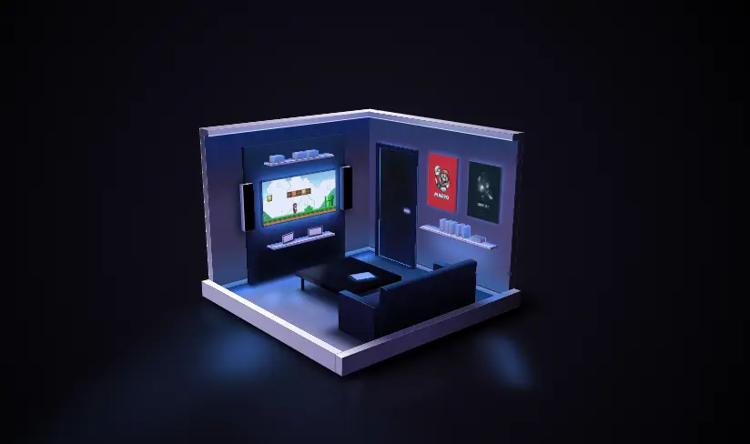
3D Room – Pure CSS Animation
3D Room – Pure CSS Animation. Using CSS we can create so many interesting thing.
Today in this article, we will see how to create a 3d room animation using css. we will use HTML for structure, CSS for styling animation and JavaScript for animation start.
Source Code:
HTML(pug):
#h.house
	.h-lights
		.h-light
		.h-light
		.h-light
		.h-light
		.h-light
		.h-light

	.h-shadow
	//---------------------
	.alt
		.alt__front.face
		.alt__back.face
		.alt__right.face
		.alt__left.face
		.alt__top.face
			.light
			.light
			.light
			.light
			.light
			.light
			.light
			.light
			.light
		.alt__bottom.face
	.alb
		.alb__front.face
		.alb__back.face
		.alb__right.face
		.alb__left.face
		.alb__top.face
		.alb__bottom.face
	.arb
		.arb__front.face
		.arb__back.face
		.arb__right.face
		.arb__left.face
		.arb__top.face
		.arb__bottom.face
	//---------------------
	.blt
		.blt__front.face
		.blt__back.face
		.blt__right.face
		.blt__left.face
		.blt__top.face
		.blt__bottom.face
	.blt2
		.blt2__front.face
		.blt2__back.face
		.blt2__right.face
		.blt2__left.face
		.blt2__top.face
		.blt2__bottom.face
	.blb
		.blb__front.face
		.blb__back.face
		.blb__right.face
		.blb__left.face
		.blb__top.face
		.blb__bottom.face
	.blb2
		.blb2__front.face
		.blb2__back.face
		.blb2__right.face
		.blb2__left.face
		.blb2__top.face
		.blb2__bottom.face
	//---------------------
	.puerta-c
		.puerta
			.puerta__front.face
			.puerta__back.face
			.puerta__right.face
			.puerta__left.face
			.puerta__top.face
			.puerta__bottom.face
		.puerta-l
			.puerta-l__front.face
			.puerta-l__back.face
			.puerta-l__right.face
			.puerta-l__left.face
			.puerta-l__top.face
			.puerta-l__bottom.face
		.puerta-r
			.puerta-r__front.face
			.puerta-r__back.face
			.puerta-r__right.face
			.puerta-r__left.face
			.puerta-r__top.face
			.puerta-r__bottom.face
		.puerta-t
			.puerta-t__front.face
			.puerta-t__back.face
			.puerta-t__right.face
			.puerta-t__left.face
			.puerta-t__top.face
			.puerta-t__bottom.face
	.cuadro-l
		.cuadro-l__front.face
		.cuadro-l__back.face
		.cuadro-l__right.face
		.cuadro-l__left.face
		.cuadro-l__top.face
		.cuadro-l__bottom.face
	.cuadro-r
		.cuadro-r__front.face
		.cuadro-r__back.face
		.cuadro-r__right.face
		.cuadro-r__left.face
		.cuadro-r__top.face
		.cuadro-r__bottom.face
	.librero
		.librero__front.face
		.librero__back.face
		.librero__right.face
		.librero__left.face
		.librero__top.face
		.librero__bottom.face
	.libros
		- let lb = 0;
		while lb < 6
			.libro
				.libro__front.face
				.libro__back.face
				.libro__right.face
				.libro__left.face
				.libro__top.face
				.libro__bottom.face
			- lb++;
	.fotos
		- let ft = 0;
		while ft < 2
			.foto
				.foto__front.face
				.foto__back.face
				.foto__right.face
				.foto__left.face
				.foto__top.face
				.foto__bottom.face
			- ft++;
	.cajas
		- let cj = 0;
		while cj < 3
			.caja
				.caja__front.face
				.caja__back.face
				.caja__right.face
				.caja__left.face
				.caja__top.face
				.caja__bottom.face
			- cj++;
	.tv
		.tv__front.face
		.tv__back.face
		.tv__right.face
		.tv__left.face
		.tv__top.face
		.tv__bottom.face
	.repisa-t
		.repisa-t__front.face
		.repisa-t__back.face
		.repisa-t__right.face
		.repisa-t__left.face
		.repisa-t__top.face
		.repisa-t__bottom.face
	.repisa-b
		.repisa-b__front.face
		.repisa-b__back.face
		.repisa-b__right.face
		.repisa-b__left.face
		.repisa-b__top.face
		.repisa-b__bottom.face
	.bocina-l
		.bocina-l__front.face
		.bocina-l__back.face
		.bocina-l__right.face
		.bocina-l__left.face
		.bocina-l__top.face
		.bocina-l__bottom.face
	.bocina-r
		.bocina-r__front.face
		.bocina-r__back.face
		.bocina-r__right.face
		.bocina-r__left.face
		.bocina-r__top.face
		.bocina-r__bottom.face
	.muro
		.muro__front.face
		.muro__back.face
		.muro__right.face
		.muro__left.face
		.muro__top.face
		.muro__bottom.face
	.sillon-c
		.sillon-b
			.sillon-b__front.face
			.sillon-b__back.face
			.sillon-b__right.face
			.sillon-b__left.face
			.sillon-b__top.face
			.sillon-b__bottom.face
		.sillon-t
			.sillon-t__front.face
			.sillon-t__back.face
			.sillon-t__right.face
			.sillon-t__left.face
			.sillon-t__top.face
			.sillon-t__bottom.face
		.sillon-l
			.sillon-l__front.face
			.sillon-l__back.face
			.sillon-l__right.face
			.sillon-l__left.face
			.sillon-l__top.face
			.sillon-l__bottom.face
		.sillon-r
			.sillon-r__front.face
			.sillon-r__back.face
			.sillon-r__right.face
			.sillon-r__left.face
			.sillon-r__top.face
			.sillon-r__bottom.face
	.mesa-c
		.mesa
			.mesa__front.face
			.mesa__back.face
			.mesa__right.face
			.mesa__left.face
			.mesa__top.face
			.mesa__bottom.face

		- let np = 0;
		while np < 4
			.mesa-p
				.mesa-p__front.face
				.mesa-p__back.face
				.mesa-p__right.face
				.mesa-p__left.face
				.mesa-p__top.face
				.mesa-p__bottom.face
			- np++;

		.mesa-shadow
	.tablet
		.tablet__front.face
		.tablet__back.face
		.tablet__right.face
		.tablet__left.face
		.tablet__top.face
		.tablet__bottom.face
——————————
📂 Important Links:
——————————
>> Learn Graphics Design & Make A Successful Profession.
>> Canva Makes Graphics Design Easy.
>> Start Freelancing Today & Earn Money.
>> Make Video Editing As Your Profession.
CSS:
// $bg-1: #322e4a;
$bg-1: hsl(250, 28%, 11%);
$bg-2: darken($bg-1, 15);

$white-1: #fbfafe;
$white-2: #9e99c1;
$white-3: #383358;
$white-4: #282347;

$black-1: #1f2158;
$black-2: darken($black-1, 10);
$black-3: darken($black-2, 5);

// $neon-1: #5474FB;
// $neon-2: #283CD2;
$neon-1: hsl(220, 95%, 65%);
$neon-2: hsl(210, 68%, 49%);

$cuadro-1: #d51e24;
$cuadro-2: #0f1110;

/***********************/
/***********************/
@mixin cube($width, $height, $depth) {
	&__front {
		@include cube-front($width, $height, $depth);
	}
	&__back {
		@include cube-back($width, $height, $depth);
	}
	&__right {
		@include cube-right($width, $height, $depth);
	}
	&__left {
		@include cube-left($width, $height, $depth);
	}
	&__top {
		@include cube-top($width, $height, $depth);
	}
	&__bottom {
		@include cube-bottom($width, $height, $depth);
	}
}
/************************/
/* Mixin para crear cubo ( Caras siempre al frente ) */
/************************/
@mixin cube-front($width, $height, $depth) {
	width: $width;
	height: $height;
	transform-origin: bottom left;
	transform: rotateX(-90deg) translateZ(-($height - ($depth * 2)));
}
@mixin cube-back($width, $height, $depth) {
	width: $width;
	height: $height;
	transform-origin: top left;
	transform: rotateX(-90deg) rotateY(180deg) translateX(-$width)
		translateY(-$height);
}
@mixin cube-right($width, $height, $depth) {
	width: $depth * 2;
	height: $height;
	transform-origin: top left;
	transform: rotateY(90deg) rotateZ(-90deg) translateZ($width)
		translateX(-$depth * 2) translateY(-$height);
}
@mixin cube-left($width, $height, $depth) {
	width: $depth * 2;
	height: $height;
	transform-origin: top left;
	transform: rotateY(-90deg) rotateZ(90deg) translateY(-$height);
}
@mixin cube-top($width, $height, $depth) {
	width: $width;
	height: $depth * 2;
	transform-origin: top left;
	transform: translateZ($height);
}
@mixin cube-bottom($width, $height, $depth) {
	width: $width;
	height: $depth * 2;
	transform-origin: top left;
	transform: rotateY(180deg) translateX(-$width);
}
/***********************/
/***********************/
@mixin face-ani($animation, $time, $side, $width-el, $height-el, $depth-el) {
	animation: #{$animation} #{$time} infinite ease;

	@keyframes #{$animation} {
		0%,
		15%,
		45%,
		60%,
		62%,
		68% {
			@if $side == "cube-front" {
				@include cube-front($width-el, $height-el, $depth-el);
			} @else if $side == "cube-back" {
				@include cube-back($width-el, $height-el, $depth-el);
			} @else if $side == "cube-right" {
				@include cube-right($width-el, $height-el, $depth-el);
			} @else if $side == "cube-left" {
				@include cube-left($width-el, $height-el, $depth-el);
			} @else if $side == "cube-top" {
				@include cube-top($width-el, $height-el, $depth-el);
			}
		}
		20%,
		40%,
		58%,
		64%,
		70%,
		100% {
			@if $side == "cube-front" {
				@include cube-front($width-el, $height-finish, $depth-el);
			} @else if $side == "cube-back" {
				@include cube-back($width-el, $height-finish, $depth-el);
			} @else if $side == "cube-right" {
				@include cube-right($width-el, $height-finish, $depth-el);
			} @else if $side == "cube-left" {
				@include cube-left($width-el, $height-finish, $depth-el);
			} @else if $side == "cube-top" {
				@include cube-top($width-el, $height-finish, $depth-el);
			}
		}
	}
}
/**/
*,
*::after,
*::before {
	margin: 0;
	padding: 0;
	box-sizing: border-box;
	user-select: none;
	transform-style: preserve-3d;
	-webkit-tap-highlight-color: transparent;
}
/* Generic */
body {
	display: flex;
	justify-content: center;
	align-items: center;

	width: 100%;
	height: 100vh;
	overflow: hidden;
	cursor: pointer;
	background-image: radial-gradient(circle, $bg-1, darken($bg-1, 20));
}

.face {
	position: absolute;
}

/***************/
.house {
	position: absolute;
	width: 28vw;
	height: 28vw;

	transform: perspective(90vw) rotateX(75deg) rotateZ(45deg) translateZ(-9vw);
}
.h-shadow {
	position: absolute;
	top: 0;
	left: 0;
	width: 100%;
	height: 100%;
	box-shadow: 1.5vw -3vw 3vw $bg-2, 1.5vw 0.5vw 1.5vw $bg-2;
}
.h-lights {
	position: absolute;
	top: 50%;
	left: 50%;
	transform: translateX(-50%) translateY(-50%);
	width: 45vw;
	height: 45vw;
}
.h-light {
	position: absolute;
	&:nth-of-type(1) {
		bottom: 5vw;
		right: 0;
		width: 14vw;
		height: 14vw;
		border-radius: 50%;
		background-image: radial-gradient(lighten($bg-1, 2), transparent);
		filter: blur(1vw);
	}
	&:nth-of-type(2) {
		bottom: 18vw;
		right: -1vw;
		width: 2vw;
		height: 12vw;
		border-radius: 50%;
		transform: rotateZ(-50deg);
		background-image: radial-gradient(
			rgba($neon-1, 0.45) 50%,
			rgba($neon-2, 0.45),
			transparent
		);
		box-shadow: -1vw -1vw 2vw 1vw rgba(lighten($neon-1, 10), 0.1);
		filter: blur(1vw);
	}
	&:nth-of-type(3) {
		bottom: -2vw;
		right: 17vw;
		width: 5vw;
		height: 12vw;
		border-radius: 50%;
		transform: rotateZ(-50deg);

		background-image: radial-gradient(
			rgba($neon-1, 0.5) 50%,
			rgba($neon-2, 0.5),
			transparent
		);
		filter: blur(2vw);

		&::before,
		&::after {
			content: "";
			position: absolute;
			width: 200%;
			top: -6vw;
			height: 400%;
			background-image: linear-gradient(
				to bottom,
				rgba($neon-2, 0.1),
				rgba($neon-1, 0.1),
				transparent
			);
			border-top-left-radius: 10vw;
			border-top-right-radius: 10vw;
			filter: blur(1.5vw);
		}
		&::before {
			right: -50%;
			transform-origin: top right;
			transform: rotateZ(15deg);
			box-shadow: -2vw -2vw 0 rgba($neon-1, 0.075);
		}
		&::after {
			left: -50%;
			transform-origin: top left;
			transform: rotateZ(-15deg);
			box-shadow: 2vw -2vw 0 rgba($neon-1, 0.075);
		}
	}
	&:nth-of-type(4) {
		bottom: 5vw;
		left: 8vw;
		width: 28vw;
		height: 4vw;
		transform-origin: top left;
		transform: skewX(58deg);
		background-image: linear-gradient(
			to right,
			rgba($neon-1, 0.075) 10%,
			transparent 25%,
			transparent,
			rgba($bg-2, 0.15)
		);
		filter: blur(0.25vw);
	}
	&:nth-of-type(6) {
		bottom: 14vw;
		right: 2vw;
		width: 8vw;
		height: 16vw;
		transform-origin: bottom left;
		transform: skewY(49deg);
		background-image: linear-gradient(
			to left,
			rgba(darken(red, 50), 0.1),
			rgba(darken(red, 50), 0.7)
		);
		filter: blur(0.35vw);
	}
}
/***************/
/***************/
.alt {
	$width-el: 27vw;
	$height-el: 0.5vw;
	$depth-el: 13.5vw;

	@include cube($width-el, $height-el, $depth-el);
	position: absolute;
	left: 0;
	top: 0;
	width: 27vw;
	height: 27vw;

	&__front {
		background-color: $white-2;
	}
	&__back {
		background-color: $white-3;
	}
	&__right {
		background-color: $white-3;
	}
	&__left {
		background-color: $white-1;
	}
	&__top {
		background-image: linear-gradient(to bottom, $black-3, $white-3, $white-2);

		.light:nth-of-type(1) {
			position: absolute;
			height: 100%;
			width: 100%;
			background-image: linear-gradient(
				to bottom,
				rgba(darken($neon-2, 25), 0.75),
				rgba($neon-1, 0.75),
				transparent
			);
		}
		.light:nth-of-type(2) {
			position: absolute;
			left: 4vw;
			height: 100%;
			width: 6vw;
			background-image: linear-gradient(
				to bottom,
				transparent 20%,
				rgba($neon-2, 0.75),
				rgba($neon-1, 0.25) 80%
			);
			filter: blur(0.1vw);
		}
		.light:nth-of-type(3) {
			position: absolute;
			bottom: 10vw;
			left: 5vw;
			width: 6vw;
			height: 3vw;
			border-radius: 50%;
			transform: rotateZ(42deg);
			background-image: radial-gradient(
				rgba(lighten($neon-1, 10), 0.75) 50%,
				rgba(darken($neon-2, 10), 0.75)
			);
			filter: blur(0.55vw);
		}
		.light:nth-of-type(4) {
			position: absolute;
			bottom: 7vw;
			left: 4vw;
			width: 8.5vw;
			height: 2vw;
			border-radius: 50%;
			transform: rotateZ(40deg);
			background-image: radial-gradient(
				rgba(lighten($neon-1, 10), 0.75) 50%,
				rgba(darken($neon-2, 10), 0.75)
			);
			filter: blur(0.55vw);
		}
		.light:nth-of-type(5) {
			position: absolute;
			bottom: 3.5vw;
			left: 4.5vw;
			width: 6vw;
			height: 2vw;
			border-radius: 50%;
			transform: rotateZ(40deg);
			background-image: radial-gradient(
				rgba(lighten($neon-1, 12), 0.75) 50%,
				rgba(darken($neon-2, 10), 0.75)
			);
			filter: blur(0.75vw);
		}
		.light:nth-of-type(6) {
			position: absolute;
			bottom: 3vw;
			left: 0.5vw;
			width: 4vw;
			height: 2vw;
			border-radius: 50%;
			transform: rotateZ(40deg);
			background-image: radial-gradient(
				rgba(lighten($neon-1, 12), 0.75) 50%,
				rgba(darken($neon-2, 10), 0.75)
			);
			filter: blur(0.35vw);
		}
		.light:nth-of-type(7) {
			position: absolute;
			bottom: 0;
			left: 0;
			width: 100%;
			height: 100%;
			background-image: linear-gradient(
				to right,
				darken($black-3, 10),
				$neon-1 10%,
				transparent 20%
			);
			&::before {
				content: "";
				position: absolute;
				width: 20%;
				height: 100%;
				background-image: linear-gradient(
					to right,
					rgba(darken($neon-1, 25), 0.6),
					transparent 60%
				);
			}
			&::after {
				content: "";
				position: absolute;
				width: 100%;
				height: 20%;
				background-image: linear-gradient(
					to bottom,
					rgba(darken($neon-1, 20), 0.5),
					transparent 60%
				);
			}
		}
		.light:nth-of-type(8) {
			position: absolute;
			bottom: 5vw;
			left: 10vw;
			width: 6vw;
			height: 4vw;
			border-radius: 50%;
			transform: rotateZ(40deg);
			background-image: radial-gradient(
				rgba(lighten($white-1, 12), 0.1) 50%,
				rgba(darken($white-2, 10), 0.1)
			);
			filter: blur(0.8vw);
		}
	}
	&__bottom {
		background-color: $white-3;
	}
}
.alb {
	$width-el: 27vw;
	$height-el: 2vw;
	$depth-el: 0.5vw;

	@include cube($width-el, $height-el, $depth-el);
	position: absolute;
	left: 0;
	bottom: 0;
	width: 27vw;
	height: 1vw;

	&__front {
		background-image: linear-gradient(
			to right,
			$white-2 40%,
			darken($white-2, 5)
		);
	}
	&__back {
		background-color: $white-3;
	}
	&__right {
		background-color: $white-3;
	}
	&__left {
		background-color: $white-1;
	}
	&__top {
		background-image: linear-gradient(
			to right,
			$white-1 40%,
			darken($white-1, 5)
		);
	}
	&__bottom {
		background-color: $white-3;
	}
}
.arb {
	$width-el: 1vw;
	$height-el: 2vw;
	$depth-el: 14vw;

	@include cube($width-el, $height-el, $depth-el);
	position: absolute;
	right: 0;
	bottom: 0;
	width: 1vw;
	height: 28vw;

	&__front {
		background-color: darken($white-2, 5);
	}
	&__back {
		background-color: $white-3;
	}
	&__right {
		background-image: linear-gradient(
			to right,
			$white-4 40%,
			darken($white-3, 20)
		);
	}
	&__left {
		background-color: $white-2;
	}
	&__top {
		background-image: linear-gradient(
			to top,
			$white-1,
			lighten($white-4, 10) 25%,
			darken($white-3, 5) 75%,
			$white-2
		);
		&::before {
			content: "";
			position: absolute;
			width: 100%;
			height: 30%;
			top: 0;
			background-image: linear-gradient(
				to bottom,
				transparent,
				rgba($neon-1, 0.85),
				transparent
			);
		}
	}
	&__bottom {
		background-color: $white-3;
	}
}
/***************/
/***************/
.blt {
	$width-el: 1vw;
	$height-el: 20vw;
	$depth-el: 13.5vw;

	@include cube($width-el, $height-el, $depth-el);
	position: absolute;
	left: 0;
	top: 0;
	width: 1vw;
	height: 27vw;

	transform: translateZ(0.5vw);

	&__front {
		background-image: linear-gradient(to bottom, $white-3, $white-2);
	}
	&__back {
		background-color: $white-3;
	}
	&__right {
		background-image: linear-gradient(
			to bottom,
			darken($white-4, 10),
			$white-3,
			$white-3 90%,
			darken($white-4, 2)
		);
		&::before {
			content: "";
			position: absolute;
			bottom: 0;
			width: 100%;
			height: 0.75vw;
			background-image: linear-gradient(to bottom, darken($white-2, 5), $neon-2);
			border-top: 0.1vw solid $white-4;
			border-bottom: 0.1vw solid $white-4;
		}
		&::after {
			content: "";
			position: absolute;
			width: 100%;
			height: 100%;
			background-image: linear-gradient(
				to bottom,
				rgba(darken($neon-1, 20), 0.35),
				transparent 30%,
				transparent 70%,
				rgba($neon-2, 0.35)
			);
		}
	}
	&__left {
		background-color: $white-1;
	}
	// &__top{ background-color: $white-1; }
	&__bottom {
		background-color: $white-3;
	}
}
.blt2 {
	$width-el: 2vw;
	$height-el: 0.75vw;
	$depth-el: 13.5vw;

	@include cube($width-el, $height-el, $depth-el);
	position: absolute;
	left: 0;
	top: 0;
	width: 2vw;
	height: 27vw;

	transform: translateZ(20.5vw);

	&__front {
		background-color: $white-3;
	}
	&__back {
		background-color: $white-3;
	}
	&__right {
		background-image: linear-gradient(
			to right,
			darken($white-2, 5),
			$white-2,
			darken($white-2, 15)
		);

		&::before {
			content: "";
			position: absolute;
			width: 100%;
			height: 100%;
			bottom: 0;
			border-bottom: 0.1vw solid rgba($white-1, 0.75);
			background-image: linear-gradient(to top, rgba($neon-1, 0.35), transparent);
		}
	}
	&__left {
		background-color: $white-1;
	}
	&__top {
		background-image: linear-gradient(to top, $white-2, $white-1);
	}
	&__bottom {
		background-color: $white-3;
	}
}
.blb {
	$width-el: 26vw;
	$height-el: 20vw;
	$depth-el: 0.5vw;

	@include cube($width-el, $height-el, $depth-el);
	position: absolute;
	left: 1vw;
	top: 0;
	width: 26vw;
	height: 1vw;

	transform: translateZ(0.5vw);

	&__front {
		background-image: linear-gradient(
			to bottom,
			darken($white-2, 32),
			darken($white-2, 25) 20%,
			darken($white-2, 32)
		);
		&::before {
			content: "";
			position: absolute;
			width: 100%;
			height: 100%;
			background-image: linear-gradient(
					to bottom,
					rgba($neon-2, 0.25),
					transparent 20%,
					transparent 80%,
					rgba($neon-2, 0.5)
				),
				linear-gradient(to right, rgba($black-1, 0.35), transparent),
				linear-gradient(to bottom, rgba($black-1, 0.35), transparent),
				linear-gradient(
					to bottom,
					rgba(darken($neon-2, 50), 0.5),
					transparent 20%,
					transparent 80%,
					rgba($neon-2, 0.25)
				);
		}
		&::after {
			content: "";
			position: absolute;
			bottom: 0;
			width: 100%;
			height: 0.75vw;
			background-image: linear-gradient(to bottom, darken($white-2, 5), $neon-2);
			border-top: 0.1vw solid $white-4;
			border-bottom: 0.1vw solid $white-4;
		}
	}
	&__back {
		background-color: $white-3;
	}
	&__right {
		background-image: linear-gradient(
			to bottom,
			darken($white-4, 10),
			darken($white-3, 20) 80%,
			darken($white-4, 10)
		);
	}
	// &__left{ background-color: $white-2; }
	// &__top{ background-color: $white-1; }
	&__bottom {
		background-color: $white-3;
	}
}
.blb2 {
	$width-el: 25vw;
	$height-el: 0.75vw;
	$depth-el: 1vw;

	@include cube($width-el, $height-el, $depth-el);
	position: absolute;
	left: 2vw;
	top: 0;
	width: 25vw;
	height: 1vw;

	transform: translateZ(20.5vw);

	&__front {
		background-image: linear-gradient(
			to right,
			darken($white-2, 15),
			$white-2,
			darken($white-2, 5)
		);
		&::before {
			content: "";
			position: absolute;
			width: 100%;
			height: 100%;
			bottom: 0;
			border-bottom: 0.1vw solid rgba($white-1, 0.75);
			background-image: linear-gradient(to top, rgba($neon-2, 0.25), transparent);
		}
	}
	&__back {
		background-color: $white-3;
	}
	&__right {
		background-color: darken($white-4, 10);
	}
	&__left {
		background-color: $white-2;
	}
	&__top {
		background-image: linear-gradient(to left, $white-2, $white-1);
	}
	&__bottom {
		background-color: $white-3;
	}
}
/***************/
/***************/
.bocina-l,
.bocina-r {
	$width-el: 0.75vw;
	$height-el: 6vw;
	$depth-el: 0.75vw;

	@include cube($width-el, $height-el, $depth-el);

	position: absolute;
	left: 1.5vw;
	bottom: 5.25vw;
	width: 0.75vw;
	height: 1.5vw;

	transform: translateZ(8vw);

	&__right {
		background-image: radial-gradient(darken($black-3, 10), darken($black-3, 15));
	}
	&__top {
		background-image: linear-gradient(
			to left,
			darken($white-1, 10),
			$white-2,
			darken($white-2, 15)
		);
	}
	&__bottom {
		background-color: $white-3;
	}
}
.bocina-l {
	&__front {
		background-image: linear-gradient(
			to right,
			$neon-1,
			darken($white-2, 25) 30%,
			darken($white-1, 20)
		);
	}
	&__back {
		background-image: linear-gradient(to right, $white-3, darken($white-3, 10));
		&::before {
			content: "";
			position: absolute;
			width: 100%;
			height: 100%;
			background-image: linear-gradient(
				to right,
				rgba($neon-1, 0.35) 65%,
				rgba($neon-1, 0.95)
			);
		}
	}
	&__left {
		background-color: $white-4;
		&::before {
			content: "";
			position: absolute;
			top: -10%;
			left: 20%;
			width: 120%;
			height: 120%;
			background-image: linear-gradient(
				to left,
				rgba(darken($neon-2, 40), 0.75),
				rgba(darken($black-3, 15), 0.75)
			);
			filter: blur(0.5vw);
		}
	}
}
.bocina-r {
	top: 5.25vw;

	&__front {
		background-image: linear-gradient(to right, $white-3, darken($white-3, 20));
		&::before {
			content: "";
			position: absolute;
			width: 100%;
			height: 100%;
			background-image: linear-gradient(
				to left,
				rgba($neon-1, 0.35) 65%,
				rgba($neon-1, 0.95)
			);
		}
	}
	&__back {
		background-image: linear-gradient(
			to right,
			darken($white-2, 25),
			darken($white-1, 20)
		);
	}
	&__left {
		background-color: $white-4;
		&::before {
			content: "";
			position: absolute;
			top: -10%;
			left: -20%;
			width: 120%;
			height: 120%;
			background-image: linear-gradient(
				to right,
				rgba(darken($neon-2, 40), 0.75),
				rgba(darken($black-3, 15), 0.75)
			);
			filter: blur(0.5vw);
		}
	}
}
.repisa-t,
.repisa-b {
	$width-el: 1.5vw;
	$height-el: 0.25vw;
	$depth-el: 5vw;

	@include cube($width-el, $height-el, $depth-el);
	position: absolute;
	left: 1.5vw;
	top: 9vw;
	width: 1.5vw;
	height: 10vw;

	transform: translateZ(16vw);

	&__front {
		background-color: $white-2;
	}
	&__back {
		background-color: $white-1;
	}
	&__right {
		background-color: darken($white-2, 10);
	}
	&__left {
		background-color: $white-1;
	}
	&__top {
		background-color: darken($white-1, 10);
		&::before {
			content: "";
			position: absolute;
			width: 100%;
			height: 100%;
			background-image: linear-gradient(
				to right,
				rgba(darken($neon-1, 20), 0.75),
				transparent
			);
		}
	}
	&__bottom {
		background-color: $white-3;
		&::before {
			content: "";
			position: absolute;
			width: 100%;
			height: 100%;
			background-image: linear-gradient(
				to right,
				rgba(darken($neon-1, 20), 0.75),
				transparent
			);
		}
	}
}
.repisa-b {
	transform: translateZ(5vw);
}
.tv {
	$width-el: 0.5vw;
	$height-el: 6vw;
	$depth-el: 6vw;

	@include cube($width-el, $height-el, $depth-el);
	position: absolute;
	left: 1.51vw;
	top: 8vw;
	width: 0.5vw;
	height: 12vw;

	transform: translateZ(8vw);

	&__front {
		background-color: $black-3;
	}
	&__back {
		background-color: $black-3;
	}
	&__right {
		background-color: lighten($neon-1, 15);
		border: 0.125vw solid darken($black-3, 10);
		&::before {
			content: "";
			position: absolute;
			width: 100%;
			height: 100%;
			box-shadow: 0.125vw 0.125vw 1vw rgba($neon-1, 0.5),
				-0.125vw 0.125vw 1vw rgba($neon-1, 0.5),
				0.125vw -0.125vw 1vw rgba($neon-1, 0.5),
				-0.125vw -0.125vw 1vw rgba($neon-1, 0.5);

			background-image: url("https://rawcdn.githack.com/ricardoolivaalonso/Codepen/43200238c3177b02a97423fa6cc23f8bfcc5c105/Room/gif.gif");
			background-size: cover;
			background-repeat: no-repeat;
			background-position: bottom;
			opacity: 0.8;
		}
		animation: pantalla-tv 0.25s infinite alternate;
	}
	&__left {
		display: flex;
		justify-content: center;
		align-items: center;
		background-color: $black-3;

		&::before {
			content: "";
			position: absolute;
			width: 13vw;
			height: 7vw;
			background-image: radial-gradient(
				rgba(darken($neon-2, 5), 0.95),
				rgba(darken($neon-1, 5), 0.95)
			);
			filter: blur(1.25vw);

			animation: luz-tv 0.25s infinite alternate;
		}
	}
	&__top {
		background-color: $black-3;
	}
	&__bottom {
		background-color: $black-3;
	}
}
.librero {
	$width-el: 12vw;
	$height-el: 0.25vw;
	$depth-el: 0.75vw;

	@include cube($width-el, $height-el, $depth-el);
	position: absolute;
	left: 13vw;
	top: 1vw;
	width: 12vw;
	height: 0.5vw;

	transform: translateZ(7vw);

	&__front {
		background-color: $white-2;
	}
	&__back {
		background-color: $white-3;
		&::before {
			content: "";
			position: absolute;
			width: 100%;
			height: 4vw;
			border-radius: 50%;
			background-image: radial-gradient(
				rgba(lighten($neon-1, 5), 0.7) 50%,
				rgba(darken($neon-2, 10), 0.6),
				transparent
			);
			filter: blur(1.25vw);
		}
	}
	&__right {
		background-color: $white-3;
	}
	&__left {
		background-color: $white-2;
	}
	&__top {
		background-color: darken($white-1, 10);
		&::before {
			content: "";
			position: absolute;
			width: 100%;
			height: 100%;
			background-image: linear-gradient(
				to bottom,
				rgba(darken($neon-1, 10), 0.75),
				transparent
			);
		}
	}
	&__bottom {
		background-color: $white-3;

		&::before {
			content: "";
			position: absolute;
			width: 100%;
			height: 100%;
			background-image: linear-gradient(
				to bottom,
				rgba(darken($neon-1, 10), 0.75),
				transparent
			);
		}
	}
}
.libros {
	position: absolute;
}
.libro {
	$width-el: 0.5vw;
	$height-el: 1.5vw;
	$depth-el: 0.5vw;

	@include cube($width-el, $height-el, $depth-el);
	position: absolute;
	top: 1vw;
	width: 0.5vw;
	height: 1vw;

	transform: translateZ(7.25vw);

	&__front {
		background-image: linear-gradient(to bottom, $white-2, darken($white-2, 10));
		&::before {
			content: "";
			position: absolute;
			width: 100%;
			height: 100%;
			background-image: linear-gradient(
				to bottom,
				rgba($neon-1, 0.4),
				transparent
			);
		}
	}
	&__back {
		background-color: $white-1;
	}
	&__right {
		background-color: darken($white-2, 20);
		&::before {
			content: "";
			position: absolute;
			width: 100%;
			height: 100%;
			background-image: linear-gradient(
				to bottom,
				rgba($neon-1, 0.85),
				rgba($neon-2, 0.35)
			);
		}
	}
	&__left {
		background-color: $white-2;
	}
	&__top {
		background-color: darken($white-1, 10);
		&::before {
			content: "";
			position: absolute;
			width: 100%;
			height: 100%;
			background-image: linear-gradient(
				to bottom,
				rgba($neon-1, 0.85),
				rgba($neon-2, 0.35)
			);
		}
	}
	&__bottom {
		background-color: lighten($white-3, 14);
	}

	&:nth-of-type(1) {
		left: 16vw;
		transform-origin: left;
		transform: translateZ(7.25vw) rotateZ(-10deg);
	}
	&:nth-of-type(2) {
		left: 17vw;
		transform: translateZ(7.25vw) rotateZ(2deg);
	}
	&:nth-of-type(3) {
		left: 17.75vw;
		transform: translateZ(7.25vw) rotateZ(5deg);
	}
	&:nth-of-type(4) {
		left: 19vw;
		transform-origin: left;
		transform: translateZ(7.25vw) rotateZ(10deg);
	}
	&:nth-of-type(5) {
		left: 20vw;
		transform-origin: left;
		transform: translateZ(7.25vw) rotateZ(10deg);
	}
	&:nth-of-type(6) {
		left: 23vw;
		transform-origin: left;
		transform: translateZ(7.25vw) rotateY(-90deg);
	}
}
.fotos {
	position: absolute;
}
.foto {
	$width-el: 0.125vw;
	$height-el: 1.125vw;
	$depth-el: 1.125vw;

	@include cube($width-el, $height-el, $depth-el);
	position: absolute;
	width: 0.125vw;
	height: 2vw;
	left: 2vw;
	top: 11vw;

	transform: translateZ(5.26vw);

	&__front {
		background-image: linear-gradient(to bottom, $white-2, darken($white-2, 10));
		&::before {
			content: "";
			position: absolute;
			width: 100%;
			height: 100%;
			background-image: linear-gradient(
				to bottom,
				rgba($neon-1, 0.4),
				transparent
			);
		}
	}
	&__back {
		background-color: $white-1;
	}
	&__right {
		display: flex;
		justify-content: center;
		align-items: center;
		background-color: darken($white-2, 5);
		border: 0.15vw solid $black-1;
		&::before {
			content: "";
			position: absolute;
			width: 100%;
			height: 100%;
			background-image: repeating-linear-gradient(
				to bottom,
				$white-2 0.1vw,
				darken($white-1, 20) 0.2vw
			);
		}
	}
	&__left {
		background-color: $white-2;
	}
	&__top {
		background-color: darken($white-1, 10);
		&::before {
			content: "";
			position: absolute;
			width: 100%;
			height: 100%;
			background-image: linear-gradient(
				to bottom,
				rgba($neon-1, 0.85),
				rgba($neon-2, 0.35)
			);
		}
	}
	&__bottom {
		background-color: darken($white-2, 25);

		&::before {
			content: "";
			position: absolute;
			right: -100%;
			width: 400%;
			height: 100%;
			background-color: rgba($black-3, 0.75);
			filter: blur(0.15vw);
		}
	}
	&:nth-of-type(1) {
		top: 10.5vw;
		transform: translateZ(5.26vw) rotateZ(5deg);
	}
	&:nth-of-type(2) {
		top: 15vw;
		transform: translateZ(5.26vw) rotateZ(-15deg);
	}
}

.cajas {
	position: absolute;
}
.caja {
	$width-el: 1vw;
	$height-el: 0.75vw;
	$depth-el: 0.75vw;

	@include cube($width-el, $height-el, $depth-el);
	position: absolute;
	width: 1vw;
	height: 1.5vw;
	left: 2vw;

	transform: translateZ(16.35vw);

	&__front {
		background-image: linear-gradient(to bottom, $white-2, darken($white-2, 10));
		&::before {
			content: "";
			position: absolute;
			width: 100%;
			height: 100%;
			background-image: linear-gradient(
				to bottom,
				rgba($neon-1, 0.4),
				transparent
			);
		}
	}
	&__back {
		background-color: $white-2;
	}
	&__right {
		background-color: darken($white-2, 20);
		&::before {
			content: "";
			position: absolute;
			width: 100%;
			height: 100%;
			background-image: linear-gradient(
				to bottom,
				rgba($neon-1, 0.85),
				rgba($neon-2, 0.35)
			);
		}
	}
	&__left {
		background-color: $white-2;
	}
	&__top {
		background-color: darken($white-1, 10);
		&::before {
			content: "";
			position: absolute;
			width: 100%;
			height: 100%;
			background-image: linear-gradient(
				to bottom,
				rgba($neon-1, 0.85),
				rgba($neon-2, 0.35)
			);
		}
	}
	&__bottom {
		background-color: darken($white-2, 25);

		&::before {
			content: "";
			position: absolute;
			right: -50%;
			width: 150%;
			height: 120%;
			background-color: rgba($black-1, 0.5);
			filter: blur(0.15vw);
		}
	}
	&:nth-of-type(1) {
		top: 11.6vw;
	}
	&:nth-of-type(2) {
		top: 13.5vw;
	}
	&:nth-of-type(3) {
		top: 17vw;
	}
}
.cuadro-l,
.cuadro-r {
	$width-el: 5vw;
	$height-el: 7vw;
	$depth-el: 0.125vw;

	@include cube($width-el, $height-el, $depth-el);
	position: absolute;
	left: 13vw;
	top: 1vw;
	width: 5vw;
	height: 0.5vw;

	transform: translateZ(10vw);

	&__front {
		background-repeat: no-repeat;
		background-size: contain;
		background-position: center;
	}
	&__back {
		background-color: $white-3;
		box-shadow: 0.35vw 0.35vw 0.35vw rgba($neon-1, 0.2),
			-0.35vw 0.35vw 0.35vw rgba($neon-1, 0.2),
			-0.35vw -0.35vw 0.35vw rgba($neon-1, 0.2),
			0.35vw -0.35vw 0.35vw rgba($neon-1, 0.2);
	}
	&__right {
		background-color: $white-3;
	}
	&__left {
		background-color: $white-2;
	}
	&__top {
		background-color: $white-2;
	}
	&__bottom {
		background-color: $white-3;
	}
}
.cuadro-l {
	&__front {
		background-image: url("https://rawcdn.githack.com/ricardoolivaalonso/Codepen/43200238c3177b02a97423fa6cc23f8bfcc5c105/Room/cuadro-1.jpg");
		background-color: $cuadro-1;
		border: 1vw solid $cuadro-1;

		&::before {
			content: "";
			position: absolute;
			top: -1vw;
			left: -1vw;
			width: 5vw;
			height: 7vw;
			background-origin: padding-box;
			background-image: linear-gradient(
				to bottom,
				rgba($neon-2, 0.15),
				rgba($neon-2, 0.15)
			);
		}
	}
}
.cuadro-r {
	left: 20vw;
	&__front {
		background-image: url("https://rawcdn.githack.com/ricardoolivaalonso/Codepen/43200238c3177b02a97423fa6cc23f8bfcc5c105/Room/cuadro-2.jpg");
		background-color: $cuadro-2;
		border: 0.5vw solid $cuadro-2;
		&::before {
			content: "";
			position: absolute;
			top: -0.5vw;
			left: -0.5vw;
			width: 5vw;
			height: 7vw;
			background-origin: padding-box;
			background-image: linear-gradient(
				to bottom,
				rgba($neon-2, 0.15),
				rgba($neon-2, 0.15)
			);
		}
	}
}
.puerta-c {
	position: absolute;
	left: 3vw;
	top: 1vw;
	width: 8vw;
	height: 0.5vw;
	transform: translateZ(0.5vw);

	&::before {
		content: "";
		position: absolute;
		width: 100%;
		height: 200%;
		background-color: rgba(darken($black-3, 10), 0.65);
		filter: blur(0.5vw);
	}
}
.puerta {
	$width-el: 7vw;
	$height-el: 16vw;
	$depth-el: 0.125vw;

	@include cube($width-el, $height-el, $depth-el);
	position: absolute;
	left: 0.5vw;
	top: 0;
	width: 7vw;
	height: 0.5vw;

	&__front {
		background-image: linear-gradient(to bottom, $cuadro-2, $black-2);
		border: 0.125vw solid $neon-1;
		&::before {
			content: "";
			position: absolute;
			width: 100%;
			height: 100%;
			background-image: radial-gradient(
				transparent 50%,
				rgba(darken($neon-1, 30), 0.25)
			);

			box-shadow: 0.65vw 0.65vw 0.5vw rgba($neon-1, 0.6),
				-0.65vw 0.65vw 0.5vw rgba($neon-1, 0.6),
				-0.65vw -0.65vw 0.5vw rgba($neon-1, 0.6),
				0.65vw -0.65vw 0.5vw rgba($neon-1, 0.6);
		}
		&::after {
			content: "";
			position: absolute;
			top: 50%;
			right: 0.75vw;
			width: 1vw;
			height: 0.25vw;
			background-color: $white-2;
			box-shadow: 0.125vw 0.125vw 0.25vw rgba($neon-1, 0.6),
				-0.125vw 0.125vw 0.25vw rgba($neon-1, 0.6),
				-0.125vw -0.125vw 0.25vw rgba($neon-1, 0.6),
				0.125vw -0.125vw 0.25vw rgba($neon-1, 0.6);
		}
	}
	// &__back{ background-color: $white-3; }
	// &__right{ background-color: $white-3; }
	// &__left{ background-color: $white-2; }
	// &__top{ background-color: $white-1; }
	// &__bottom{ background-color: $white-3; }
}
.puerta-l,
.puerta-r {
	$width-el: 0.5vw;
	$height-el: 16vw;
	$depth-el: 0.25vw;

	@include cube($width-el, $height-el, $depth-el);
	position: absolute;
	left: 0;
	top: 0;
	width: 0.5vw;
	height: 0.5vw;

	&__front {
		background-color: darken($black-1, 10);
	}
	&__back {
		background-color: $black-3;
	}
	&__right {
		background-color: $black-3;
	}
	&__left {
		background-color: $black-2;
	}
	// &__top{ background-color: $white-1; }
	&__bottom {
		background-color: $black-3;
	}
}
.puerta-r {
	left: calc(100% - 0.5vw);
}
.puerta-t {
	$width-el: 8vw;
	$height-el: 0.5vw;
	$depth-el: 0.25vw;

	@include cube($width-el, $height-el, $depth-el);

	left: 0;
	top: 0;
	width: 8vw;
	height: 0.5vw;

	transform: translateZ(16vw);

	&__front {
		background-color: darken($black-1, 10);
	}
	&__back {
		background-color: $black-3;
	}
	&__right {
		background-color: $black-3;
	}
	&__left {
		background-color: $black-2;
	}
	&__top {
		background-color: $black-1;
	}
	&__bottom {
		background-color: $black-3;
	}
}
.muro {
	$width-el: 0.5vw;
	$height-el: 18vw;
	$depth-el: 8vw;

	@include cube($width-el, $height-el, $depth-el);
	position: absolute;
	left: 1vw;
	top: 6vw;
	width: 0.5vw;
	height: 16vw;

	transform: translateZ(0.51vw);

	&__front {
		background-color: $black-3;
	}
	&__back {
		background-color: $black-3;
	}
	&__right {
		display: flex;
		justify-content: center;
		background-image: radial-gradient(circle, $black-1, darken($black-1, 15));
		overflow: hidden;

		&::before {
			content: "";
			position: absolute;
			width: 100%;
			height: 100%;
			background-image: linear-gradient(
				to bottom,
				rgba($neon-2, 0.25),
				transparent 30%,
				transparent 70%,
				rgba($neon-2, 0.15)
			);
		}
		&::after {
			content: "";
			position: absolute;
			bottom: 0;
			left: 5%;
			width: 90%;
			height: 25%;
			background-image: linear-gradient(
				to bottom,
				rgba(darken($black-3, 5), 0.75),
				rgba(darken($black-3, 5), 0.95)
			);
			filter: blur(0.75vw);
		}
	}
	&__left {
		background-color: $black-3;
		box-shadow: 0.5vw 0.5vw 0.6vw rgba($neon-1, 0.3),
			0.5vw -0.5vw 0.6vw rgba($neon-1, 0.3), -0.5vw 0.5vw 0.6vw rgba($neon-1, 0.3),
			-0.5vw -0.5vw 0.6vw rgba($neon-1, 0.3);
	}
	&__top {
		background-color: $black-3;
		&::before {
			content: "";
			position: absolute;
			width: 100%;
			height: 100%;
			bottom: 0;
			background-image: linear-gradient(
				to left,
				rgba($neon-2, 0.5),
				rgba($neon-1, 0.25)
			);
		}
	}
	&__bottom {
		background-color: $black-3;
		&::before {
			content: "";
			position: absolute;
			top: 0;
			right: 0;
			width: 5vw;
			height: 100%;
			background-image: linear-gradient(to left, $black-3, transparent 50%);
			transform-origin: right bottom;
			transform: skewY(-20deg);
			filter: blur(0.25vw);
		}
	}
}
.sillon-c {
	position: absolute;
	right: 2vw;
	bottom: 6vw;
	width: 6vw;
	height: 16vw;

	transform: translateZ(0.5vw);

	&::before {
		content: "";
		position: absolute;
		top: -10%;
		left: -10%;
		width: 120%;
		height: 120%;
		background-color: rgba($black-3, 0.85);
		filter: blur(0.75vw);
	}
}
.sillon-b {
	$width-el: 6vw;
	$height-el: 3vw;
	$depth-el: 7vw;

	@include cube($width-el, $height-el, $depth-el);
	position: absolute;
	left: 0;
	top: 1vw;
	width: 6vw;
	height: 14vw;

	&__front {
		background-color: $black-2;
	}
	&__back {
		background-color: $black-3;
	}
	&__right {
		background-color: $black-3;
	}
	&__left {
		background-image: linear-gradient(to bottom, $black-2, darken($black-2, 5));
		&::before {
			content: "";
			position: absolute;
			width: 100%;
			height: 100%;
			background-image: linear-gradient(
				to bottom,
				rgba($neon-2, 0.1),
				transparent
			);
		}
	}
	&__top {
		background-image: linear-gradient(to right, $black-1, $black-2);
		border-left: 0.1vw solid rgba($white-2, 0.5);

		&::before {
			content: "";
			position: absolute;
			width: 100%;
			height: 100%;
			background-image: linear-gradient(
				to right,
				rgba($neon-2, 0.25),
				transparent
			);
		}
	}
	&__bottom {
		background-color: $black-3;
	}
}
.sillon-l,
.sillon-r {
	$width-el: 6vw;
	$height-el: 4.5vw;
	$depth-el: 0.5vw;

	@include cube($width-el, $height-el, $depth-el);
	position: absolute;
	left: 0;
	bottom: 0;
	width: 6vw;
	height: 1vw;

	&__front {
		background-image: linear-gradient(to bottom, $black-2, $black-3);
	}
	&__back {
		background-color: $black-3;
	}
	&__right {
		background-image: linear-gradient(to bottom, $black-3, darken($black-3, 20));
	}
	&__left {
		background-image: linear-gradient(to bottom, $black-2, darken($black-2, 5));
	}
	&__top {
		background-image: linear-gradient(to right, $black-1, darken($black-2, 2));
		border-bottom: 0.1vw solid rgba($white-2, 0.5);

		&::before {
			content: "";
			position: absolute;
			width: 100%;
			height: 100%;
			background-image: linear-gradient(
				to right,
				rgba($neon-2, 0.75),
				transparent
			);
		}
	}
	&__bottom {
		background-color: $black-3;
	}
}
.sillon-r {
	top: 0;
}
.sillon-t {
	$width-el: 1vw;
	$height-el: 6.5vw;
	$depth-el: 7vw;

	@include cube($width-el, $height-el, $depth-el);
	position: absolute;
	right: 0;
	top: 1vw;
	width: 1vw;
	height: 1vw;

	transform-origin: right;
	transform: rotateY(7deg);

	&__front {
		background-image: linear-gradient(to bottom, $black-3, darken($black-2, 8));
	}
	&__back {
		background-image: linear-gradient(to bottom, darken($black-2, 5), $black-3);
	}
	&__right {
		background-image: linear-gradient(
			to bottom,
			darken($black-2, 5),
			darken($black-3, 20)
		);
	}
	&__left {
		background-color: $black-2;
	}
	&__top {
		background-image: linear-gradient(to right, $black-1, darken($black-2, 2));
		border-bottom: 0.1vw solid rgba($white-2, 0.5);

		&::before {
			content: "";
			position: absolute;
			width: 100%;
			height: 100%;
			background-image: linear-gradient(to right, rgba($neon-2, 0.5), transparent);
		}
	}
	&__bottom {
		background-color: $black-3;
	}
}
.mesa-c {
	position: absolute;
	left: 7vw;
	top: 9.5vw;
	width: 10vw;
	height: 9vw;

	transform: translateZ(0.5vw);
}
.mesa-shadow {
	position: absolute;
	width: 100%;
	height: 100%;

	border-radius: 10%;
	background-color: rgba($black-3, 0.95);
	filter: blur(1vw);
	transform: translateZ(0);
}
.mesa {
	$width-el: 10vw;
	$height-el: 0.5vw;
	$depth-el: 4.5vw;

	@include cube($width-el, $height-el, $depth-el);
	position: absolute;
	left: 0;
	top: 0;
	width: 10vw;
	height: 9vw;

	transform: translateZ(2vw);

	&__front {
		background-image: linear-gradient(
			to right,
			darken($black-2, 5),
			darken($black-2, 20)
		);
		&::before {
			content: "";
			position: absolute;
			width: 100%;
			height: 100%;
			background-image: linear-gradient(
				45deg,
				rgba($neon-1, 0.125),
				rgba(lighten($neon-1, 20), 0.25),
				transparent 55%
			);
		}
	}
	&__back {
		background-color: $black-3;
	}
	&__right {
		background-color: darken($black-3, 20);
	}
	&__left {
		background-color: $black-2;
	}
	&__top {
		background-image: linear-gradient(
			45deg,
			darken($black-2, 3),
			darken($black-3, 5)
		);
		overflow: hidden;

		&::before {
			content: "";
			position: absolute;
			bottom: 0;
			width: 50%;
			height: 50%;
			background-image: linear-gradient(
				45deg,
				rgba($neon-1, 0.5),
				rgba($white-1, 0.125) 50%,
				transparent 55%
			);
			filter: blur(0.5vw);
		}
		&::after {
			content: "";
			position: absolute;
			left: 2vw;
			top: 2vw;
			width: 20%;
			height: 50%;
			border-radius: 50%;
			background-color: rgba($neon-2, 0.079);
			transform: rotateZ(-40deg);
			filter: blur(0.75vw);
		}
	}
	&__bottom {
		background-color: $black-3;
	}
}
.mesa-p {
	$width-el: 0.25vw;
	$height-el: 1.75vw;
	$depth-el: 0.125vw;

	@include cube($width-el, $height-el, $depth-el);
	position: absolute;
	width: 0.25vw;
	height: 0.25vw;

	&__front {
		background-color: $black-3;
	}
	&__back {
		background-color: $black-3;
	}
	&__right {
		background-color: darken($black-3, 20);
	}
	&__left {
		background-color: $black-2;
	}
	&__top {
		background-color: $black-1;
	}
	&__bottom {
		background-color: $black-3;
		&::before {
			content: "";
			position: absolute;
			width: 600%;
			height: 200%;
			top: 0;
			right: 0;
			border-radius: 10%;
			transform: translateZ(-0.1vw);
			background-color: rgba(darken($black-3, 30), 0.75);
			filter: blur(0.35vw);
		}
	}
	&:nth-of-type(1) {
		left: 0.5vw;
		top: 0.5vw;
	}
	&:nth-of-type(2) {
		right: 0.5vw;
		top: 0.5vw;
	}
	&:nth-of-type(3) {
		left: 0.5vw;
		bottom: 0.5vw;
	}
	&:nth-of-type(4) {
		right: 0.5vw;
		bottom: 0.5vw;
	}
}
.tablet {
	$width-el: 2vw;
	$height-el: 0.125vw;
	$depth-el: 1.25vw;

	@include cube($width-el, $height-el, $depth-el);
	position: absolute;
	left: 13vw;
	top: 12vw;
	width: 2vw;
	height: 2.5vw;

	transform: translateZ(3.01vw) rotateZ(15deg);

	&__front {
		background-color: darken($white-2, 10);
	}
	&__back {
		background-color: $white-3;
	}
	&__right {
		background-color: $white-3;
	}
	&__left {
		background-color: $white-2;
	}
	&__top {
		background-color: lighten($neon-1, 10);
		border: 0.2vw solid rgba($neon-1, 0.25);
		animation: pantalla-tablet 0.25s infinite;
	}
	&__bottom {
		background-color: darken($black-3, 40);
		box-shadow: 0.25vw 0.25vw 0.5vw rgba(darken($neon-2, 20), 0.75),
			-0.25vw 0.25vw 0.5vw rgba(darken($neon-2, 20), 0.75),
			-0.25vw -0.25vw 0.5vw rgba(darken($neon-2, 20), 0.75),
			0.25vw -0.25vw 0.5vw rgba(darken($neon-2, 20), 0.75);
	}
}
/**********************/
/**********************/
@keyframes pantalla-tablet {
	from {
		background-color: lighten($neon-1, 5);
	}
}
@keyframes pantalla-tv {
	from {
		background-color: lighten($neon-1, 5);
		box-shadow: 0.125vw 0.125vw 0vw rgba($neon-1, 0),
			-0.125vw 0.125vw 0vw rgba($neon-1, 0), 0.125vw -0.125vw 0vw rgba($neon-1, 0),
			-0.125vw -0.125vw 0vw rgba($neon-1, 0);
	}
}
@keyframes luz-tv {
	from {
		background-image: radial-gradient(
			rgba(darken($neon-2, 5), 0.8),
			rgba(darken($neon-1, 5), 0.8)
		);
	}
}
Another article for you.
JavaScript:
const h = document.querySelector("#h");
const b = document.body;

let base = (e) => {
	var x = e.pageX / window.innerWidth - 0.5;
	var y = e.pageY / window.innerHeight - 0.5;
	h.style.transform = `
        perspective(90vw)
        rotateX(${y * 4 + 75}deg)
        rotateZ(${-x * 12 + 45}deg)
        translateZ(-9vw)
    `;
};

b.addEventListener("pointermove", base);