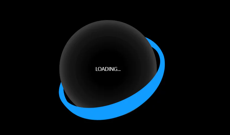
CSS Loading Animation – ZigZag Striped Cube
In today’s fast-paced digital world, the first impression of a website can make or break a user’s experience. A slow-loading website can be frustrating and drive potential customers away. A simple solution to this problem is the use of CSS loading animations. By implementing an animation while the website loads, it not only keeps the user entertained but also gives the illusion of a faster loading process.
For additional HTML, CSS, and JavaScript projects, see our website.
One such animation is the “zigzag cube.” This animation is a creative and modern twist on the traditional loading spinner. It adds a fun and dynamic element to your website while also keeping users engaged. In this article, we’ll be diving into the details of creating a CSS loading animation zigzag cube for your website. We’ll cover the process from start to finish, including the design and code implementation. Whether you’re a beginner or an experienced developer, this guide will help you bring your website to life with an eye-catching loading animation
Source Code:
HTML:
<!DOCTYPE html>
<html lang="en" >
<head>
  <meta charset="UTF-8">
  <title>ZigZag Striped Cube CSS</title>
  <link rel="stylesheet" href="./style.css">

</head>
<body>

<div class="cube"></div>

</body>
</html>
——————————
📂 Important Links:
——————————
>> Learn Graphics Design & Make A Successful Profession.
>> Canva Makes Graphics Design Easy.
>> Start Freelancing Today & Earn Money.
>> Make Video Editing As Your Profession.
CSS:
:root {
	--size: 50;
	--speed: 5;
	--trans: linear;
	--hole: #121212;
	--start: #ff7500;
	--line: #46433f;
	--ini: from 90deg at;
	--end: 0 25%, #fff0 0 100%;
	--bg: conic-gradient(var(--ini) 97.5% 97.5%, var(--hole) var(--end)),
		conic-gradient(var(--ini) 95% 95%, var(--line) var(--end)),
		conic-gradient(var(--ini) 92.5% 92.5%, var(--hole) var(--end)),
		conic-gradient(var(--ini) 90% 90%, var(--line) var(--end)),
		conic-gradient(var(--ini) 87.5% 87.5%, var(--hole) var(--end)),
		conic-gradient(var(--ini) 85% 85%, var(--line) var(--end)),
		conic-gradient(var(--ini) 82.5% 82.5%, var(--hole) var(--end)),
		conic-gradient(var(--ini) 80% 80%, var(--line) var(--end)),
		conic-gradient(var(--ini) 77.5% 77.5%, var(--hole) var(--end)),
		conic-gradient(var(--ini) 75% 75%, var(--line) var(--end)),
		conic-gradient(var(--ini) 72.5% 72.5%, var(--hole) var(--end)),
		conic-gradient(var(--ini) 70% 70%, var(--line) var(--end)),
		conic-gradient(var(--ini) 67.5% 67.5%, var(--hole) var(--end)),
		conic-gradient(var(--ini) 65% 65%, var(--line) var(--end)),
		conic-gradient(var(--ini) 62.5% 62.5%, var(--hole) var(--end)),
		conic-gradient(var(--ini) 60% 60%, var(--line) var(--end)),
		conic-gradient(var(--ini) 57.5% 57.5%, var(--hole) var(--end)),
		conic-gradient(var(--ini) 55% 55%, var(--line) var(--end)),
		conic-gradient(var(--ini) 52.5% 52.5%, var(--hole) var(--end)),
		conic-gradient(var(--ini) 50% 50%, var(--start) var(--end)),
		conic-gradient(var(--ini) 47.5% 47.5%, var(--hole) var(--end)),
		conic-gradient(var(--ini) 45% 45%, var(--line) var(--end)),
		conic-gradient(var(--ini) 42.5% 42.5%, var(--hole) var(--end)),
		conic-gradient(var(--ini) 40% 40%, var(--line) var(--end)),
		conic-gradient(var(--ini) 37.5% 37.5%, var(--hole) var(--end)),
		conic-gradient(var(--ini) 35% 35%, var(--line) var(--end)),
		conic-gradient(var(--ini) 32.5% 32.5%, var(--hole) var(--end)),
		conic-gradient(var(--ini) 30% 30%, var(--line) var(--end)),
		conic-gradient(var(--ini) 27.5% 27.5%, var(--hole) var(--end)),
		conic-gradient(var(--ini) 25% 25%, var(--line) var(--end)),
		conic-gradient(var(--ini) 22.5% 22.5%, var(--hole) var(--end)),
		conic-gradient(var(--ini) 20% 20%, var(--line) var(--end)),
		conic-gradient(var(--ini) 17.5% 17.5%, var(--hole) var(--end)),
		conic-gradient(var(--ini) 15% 15%, var(--line) var(--end)),
		conic-gradient(var(--ini) 12.5% 12.5%, var(--hole) var(--end)),
		conic-gradient(var(--ini) 10% 10%, var(--line) var(--end)),
		conic-gradient(var(--ini) 7.5% 7.5%, var(--hole) var(--end)),
		conic-gradient(var(--ini) 5% 5%, var(--line) var(--end)),
		conic-gradient(var(--ini) 2.5% 2.5%, var(--hole) var(--end)),
		conic-gradient(var(--ini) 0% 0%, var(--start) var(--end));
}

body {
	margin: 0;
	padding: 0;
	width: 100vw;
	height: 100vh;
	overflow: hidden;
	display: flex;
	align-items: center;
	justify-content: center;
	perspective: 1000vmin;
	background: var(--hole);
}

.cube {
	width: calc(var(--size) * 1vmin);
	height: calc(var(--size) * 1vmin);
	background: var(--bg), var(--hole);
	background-size: 200% 200%;
	background-position: 0% 0%;
	background-repeat: no-repeat;
	transform: rotateX(45deg) rotateZ(45deg)
		translateZ(calc(calc(var(--size) * 1vmin) / 2));
	transform-style: preserve-3d;
	animation: move-top calc(var(--speed) * 1s) var(--trans) 0s infinite;
}

.cube:before,
.cube:after {
	content: "";
	background: var(--bg), var(--hole);
	background-size: 200% 200%;
	background-position: 100% 100%;
	background-repeat: no-repeat;
	position: absolute;
	width: 100%;
	height: 100%;
	transform: rotate(180deg) rotateY(-90deg) translateY(calc(var(--size) * 1vmin));
	transform-origin: right bottom;
	animation: move-side calc(var(--speed) * 1s) var(--trans)
		calc(var(--speed) * -0.95s) infinite;
	opacity: 0.65;
}

.cube:after {
	transform: rotate(180deg) rotateY(-90deg) rotateX(-90deg)
		translateY(calc(var(--size) * 1vmin));
	opacity: 0.35;
}

@keyframes move-top {
	100% {
		background-position: 100% 100%;
	}
}
@keyframes move-side {
	100% {
		background-position: 0% 0%;
	}
}

.cube:hover,
.cube:hover:before,
.cube:hover:after {
	animation-play-state: paused;
}
Another article for you.