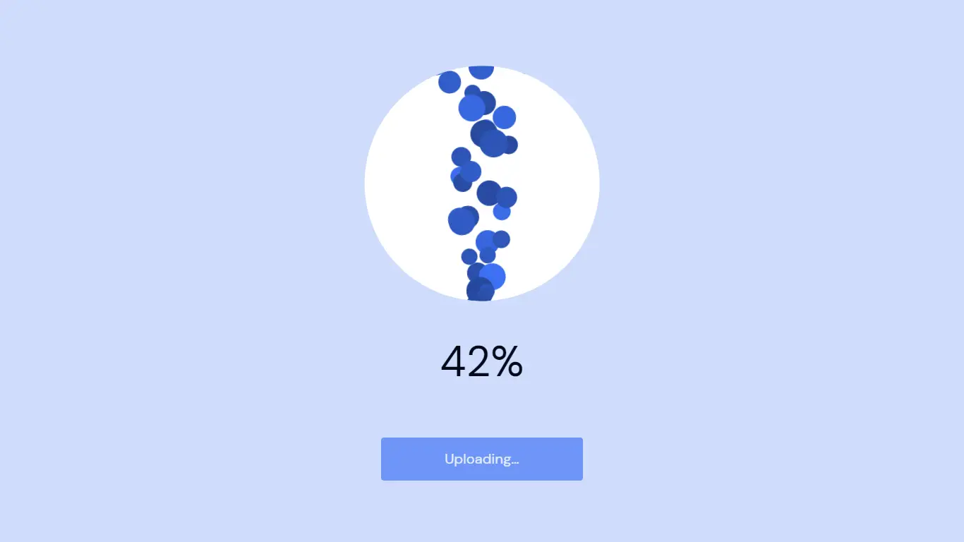
File Upload Cloud Animation With HTML CSS and JavaScript
We will build an animated File Upload Cloud Animation With HTML, CSS and JavaScript. In this tutorial, I’ll demonstrate how to use HTML, CSS, and JavaScript to create an animated file upload animation.
The HTML will be used to build the structure. The styling will be added using CSS, and for some functionalities thanks to JavaScript. Visit our website for more HTML, CSS, and JavaScript projects.
Source Code:
HTML:
<main>
	<div class="upload">
		<div class="upload__bubbles">
			<div class="upload__cloud-explode">
				<div class="upload__finish">
					<svg role="img" aria-label="Checkmark in circle" class="upload__check" viewBox="0 0 128 128" width="128" height="128">
						<g fill="none" stroke="hsl(223,90%,50%)" stroke-width="4" stroke-linecap="round" stroke-linejoin="round">
							<circle class="upload__check-ring" r="62" cx="64" cy="64" stroke-dasharray="389.56 389.56" stroke-dashoffset="389.56" transform="rotate(-90,64,64)" />
							<polyline class="upload__check-line" points="40,64 56,80 88,48" stroke-dasharray="68 68" stroke-dashoffset="68" />
						</g>
					</svg>
					<p class="upload__feedback">File has been uploaded successfully!</p>
					<button class="upload__button" type="button" data-reset>OK</button>
				</div>
			</div>
			<div class="upload__cloud-left"></div>
			<div class="upload__cloud-middle" data-circle></div>
			<div class="upload__cloud-right"></div>
		</div>
		<div aria-hidden="false">
			<div class="upload__progress" data-progress></div>
			<button class="upload__button" type="button" data-upload>Upload</button>
		</div>
	</div>
</main>
——————————
📂 Important Links:
——————————
>> Learn Graphics Design & Make A Successful Profession.
>> Canva Makes Graphics Design Easy.
>> Start Freelancing Today & Earn Money.
>> Make Video Editing As Your Profession.
CSS:
* {
	border: 0;
	box-sizing: border-box;
	margin: 0;
	padding: 0;
}
:root {
	--hue: 223;
	--primary1: hsl(var(--hue), 90%, 5%);
	--primary9: hsl(var(--hue), 90%, 40%);
	--primary10: hsl(var(--hue), 90%, 50%);
	--primary11: hsl(var(--hue), 90%, 60%);
	--primary18: hsl(var(--hue), 90%, 90%);
	--trans-dur: 0.3s;
	font-size: calc(16px + (20 - 16) * (100vw - 320px) / (1280 - 320));
}
body,
button {
	font: 1em/1.5 "DM Sans", sans-serif;
}
body {
	background-color: var(--primary18);
	color: var(--primary1);
	height: 100vh;
	transition: background-color var(--trans-dur), color var(--trans-dur);
}
main {
	display: grid;
	overflow: hidden;
	place-items: center;
	height: 100%;
	min-height: 24.5em;
}
.upload,
.upload__finish {
	max-width: 17em;
}
.upload {
	padding: 1.5em;
	text-align: center;
	width: 100%;
}
.upload__button {
	background-color: var(--primary10);
	border-radius: 0.2em;
	color: hsl(0, 0%, 100%);
	padding: 0.75em 1.5em;
	width: 100%;
	transition: background-color 0.15s ease-in-out;
}
.upload__button:disabled {
	cursor: not-allowed;
	opacity: 0.5;
}
.upload__button:focus {
	outline: transparent;
}
.upload__button:not(:disabled):focus-visible,
.upload__button:not(:disabled):hover {
	background-color: var(--primary9);
}
.upload__bubbles {
	margin: 0 auto 3em auto;
	position: relative;
	height: 8em;
	width: 8em;
	z-index: 1;
}
.upload__bubble {
	--dur: 3s; /* to be overridden by JavaScript */
	position: absolute;
	top: 100%;
	left: 50%;
	width: 2em;
	height: 2em;
	transform: translateX(-50%);
	transform-origin: 50% 100%;
}
.upload__bubble:before {
	background-color: var(--primary11);
	border-radius: 50%;
	content: "";
	display: block;
	width: 100%;
	height: 100%;
}
.upload__check {
	display: block;
	margin: 0 auto 3em auto;
	width: 8em;
	height: 8em;
}
.upload__cloud-explode,
.upload__cloud-left,
.upload__cloud-middle,
.upload__cloud-right {
	background-color: hsl(0, 0%, 100%);
	position: absolute;
}
.upload__cloud-explode,
.upload__cloud-middle {
	border-radius: 50%;
}
.upload__cloud-explode {
	display: none;
	bottom: 0;
	left: 50%;
	width: 69em;
	height: 69em;
	transform: translate(-50%, 1em) scale(0);
	transform-origin: 50% 100%;
	z-index: 1;
}
.upload__cloud-left,
.upload__cloud-middle,
.upload__cloud-right {
	bottom: 0;
}
.upload__cloud-left,
.upload__cloud-right {
	width: 6em;
}
.upload__cloud-left {
	border-radius: 2.5em 0 0 2.5em;
	right: 50%;
	height: 5em;
}
.upload__cloud-middle {
	overflow: hidden;
	position: absolute;
	left: 50%;
	width: 13em;
	height: 13em;
	transform: translate(-50%, 0) scale(0.6);
	transform-origin: 50% 100%;
	z-index: 2;
}
.upload__cloud-right {
	border-radius: 0 3em 3em 0;
	left: 50%;
	height: 6em;
}
.upload__feedback {
	color: hsl(var(--hue), 10%, 5%);
	margin-bottom: 4.5em;
}
.upload__feedback,
.upload__feedback + .upload__button {
	opacity: 0;
	transform: translateY(100%);
}
.upload__finish {
	margin: auto;
	padding: 1.5em;
}
.upload__progress {
	opacity: 0;
}
.upload__progress {
	font-size: 3em;
	margin-bottom: 3rem;
	min-height: 4.5rem;
	transform: translateY(25%);
}
/* running state */
.upload--running .upload__cloud-left,
.upload--running .upload__cloud-middle,
.upload--running .upload__cloud-right {
	transition: all 0.5s ease-in-out;
}
.upload--running .upload__cloud-left {
	transform: translateX(2.5em);
}
.upload--running .upload__cloud-middle {
	transform: translate(-50%, 1em) scale(1);
}
.upload--running .upload__cloud-right {
	transform: translateX(-2.5em);
}
.upload--running .upload__bubble:before {
	animation: rise var(--dur) linear forwards;
}
.upload--running .upload__progress {
	opacity: 1;
	transform: translateY(0);
	transition: all 0.3s ease-in-out;
}
/* done state */
.upload--done .upload__cloud-explode {
	animation: expand 1s 0.5s ease-in-out forwards;
	display: flex;
}
.upload--done .upload__cloud-middle {
	animation: slideUp 1.5s 0.5s ease-in-out forwards;
}
.upload--done .upload__feedback,
.upload--done .upload__feedback + .upload__button {
	animation: fadeSlideUp 0.5s 1.25s ease-in-out forwards;
}
.upload--done .upload__feedback + .upload__button {
	animation-delay: 1.4s;
}
.upload--done .upload__check-ring,
.upload--done .upload__check-line {
	animation: strokeIn 0.5s 1.25s ease-in-out forwards;
}

/* Animations */
@keyframes expand {
	from {
		transform: translate(-50%, 1em) scale(0.3333); /* 23/69 */
	}
	to {
		transform: translate(-50%, 37.25em) scale(1);
	}
}
@keyframes fadeSlideUp {
	to {
		opacity: 1;
		transform: translateY(0);
	}
}
@keyframes rise {
	to {
		transform: translateY(-25em);
	}
}
@keyframes strokeIn {
	to {
		stroke-dashoffset: 0;
	}
}
@keyframes slideUp {
	from {
		transform: translate(-50%, 1em);
	}
	to {
		transform: translate(-50%, -23em);
	}
}
Another article for you.
JavaScript:
window.addEventListener("DOMContentLoaded", () => {
	const component = new FileUpload(".upload");
});

class FileUpload {
	bubbles = [];
	isUploading = false;
	progress = 0;
	timeout = null;
	uploadClass = "upload--running";
	doneClass = "upload--done";

	constructor(el) {
		this.el = document.querySelector(el);
		this.el?.addEventListener("click", this.upload.bind(this));
		this.circle = this.el?.querySelector("[data-circle]");
		this.uploadButton = this.el?.querySelector("[data-upload]");
	}
	progressDim() {
		this.uploadButton.parentElement.setAttribute("aria-hidden", "true");
	}
	progressLoop() {
		// update the progress
		this.progress += 0.01;
		this.progressUpdateDisplay();

		// spawn a bubble
		const bubble = document.createElement("div");
		const duration = Utils.randomFloat(2, 3);
		const brightneess = Utils.randomFloat(0.6, 1);
		const rotate = Utils.randomFloat(-15, 15);
		const size = Utils.randomFloat(1, 2);

		bubble.classList.add("upload__bubble");
		bubble.style.setProperty("--dur", `${duration}s`);
		bubble.style.filter = `brightness(${brightneess})`;
		bubble.style.transform = `translateX(-50%) rotate(${rotate}deg)`;
		bubble.style.width = `${size}em`;
		bubble.style.height = `${size}em`;
		this.bubbles.push(bubble);
		this.circle?.appendChild(bubble);

		// loop until finished
		if (this.progress < 1) {
			this.timeout = setTimeout(this.progressLoop.bind(this), 50);
		} else {
			this.timeout = setTimeout(this.progressDim.bind(this), 500);
			this.el.classList.add(this.doneClass);
		}
	}
	progressUpdateDisplay(clear) {
		const progress = this.el.querySelector("[data-progress]");

		if (this.circle && !clear) {
			const startSize = 13;
			const enlargeBy = 10;
			const size = startSize + enlargeBy * this.progress;

			this.circle.style.width = `${size}em`;
			this.circle.style.height = `${size}em`;
		}
		if (progress) {
			progress.innerText =
				clear === true ? "" : `${Math.floor(this.progress * 100)}%`;
		}
	}
	reset() {
		if (this.isUploading) {
			while (this.circle.firstChild) {
				this.circle.removeChild(this.circle.lastChild);
			}
			this.circle.removeAttribute("style");

			this.bubbles = [];
			this.el.classList.remove(this.uploadClass);
			this.el.classList.remove(this.doneClass);
			this.isUploading = false;
			this.progress = 0;
			this.progressUpdateDisplay(true);
			this.uploadButton.parentElement.setAttribute("aria-hidden", "false");
			this.uploadButton.disabled = false;
			this.uploadButton.textContent = "Upload";
		}
	}
	upload(e) {
		const { target } = e;

		if (!this.isUploading && target.hasAttribute("data-upload")) {
			this.isUploading = true;
			this.el.classList.add(this.uploadClass);

			target.disabled = true;
			target.textContent = "Uploading…";

			this.progressUpdateDisplay();
			this.timeout = setTimeout(() => {
				if (this.circle) this.circle.style.transitionTimingFunction = "linear";

				this.progressLoop();
			}, 500);
		} else if (target.hasAttribute("data-reset")) {
			this.reset();
		}
	}
}

class Utils {
	static randomFloat(min = 0, max = 2 ** 32) {
		const percent = crypto.getRandomValues(new Uint32Array(1))[0] / 2 ** 32;
		const relativeValue = (max - min) * percent;

		return min + relativeValue;
	}
}