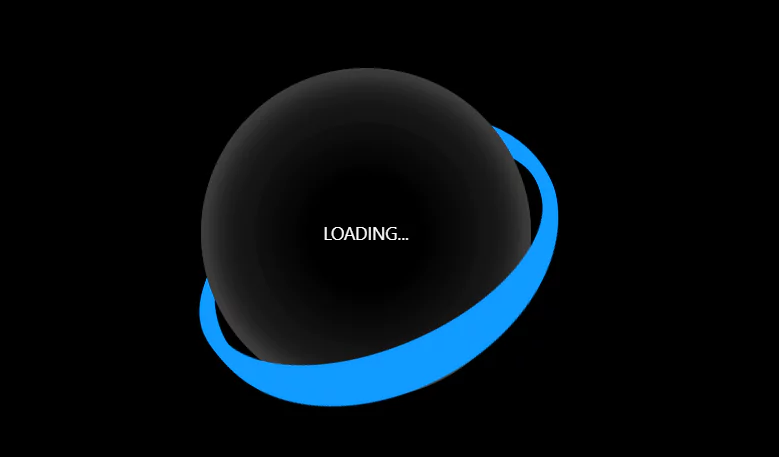
CSS Loading Animation With JavaScript
Visitors anticipate seeing some sort of response when they click a link or button on your website. However, if nothing occurs, the majority will assume that something is wrong. Before customers realize that your website has been processing their request, they will rapidly move away.
By letting users know that their request has been received and is being processed, loading animations can help avoid these kinds of bounces and offer a significantly better user experience (UX).
In this article, we will create a loading animation with CSS & JavaScript.
Source Code:
CSS:
  * {
        box-sizing: border-box;
        margin: 0;
        padding: 0;
      }
      body {
        background-color: black;
        display: flex;
        justify-content: center;
        align-items: center;
        height: 100vh;
        perspective: 500px;
        color: rgb(42, 145, 205);
      }
      .sphere {
        background-image: radial-gradient(
          circle,
          #000000,
          #000000,
          #111111,
          #111111,
          #2d2d2d
        );
        height: 300px;
        width: 300px;
        border-radius: 50%;
        display: flex;
        justify-content: center;
        align-items: center;
        transform-style: preserve-3d;
        box-shadow: inset 0 0 10px 1px rgba(51, 51, 51, 0.508),
          inset 0 0 20px 3px rgba(122, 122, 122, 0.408),
          inset 0 0 40px 6px rgba(147, 147, 147, 0.232),
          inset 0 0 40px 10px rgba(178, 178, 178, 0.104);
      }
      .border {
        position: absolute;
        height: 330px;
        width: 330px;
        border-radius: 50%;
        border: 10px solid rgba(16, 155, 255, 0.988);

        animation: spin 10s linear;
        transform: rotateX(0deg) rotateY(0deg) rotateZ(0deg);
      }

      @keyframes spin {
        0% {
          transform: rotateX(0deg) rotateY(20deg) rotateZ(0deg);
        }
        25% {
          transform: rotateX(360deg) rotateY(20deg) rotateZ(90deg);
        }
        50% {
          transform: rotateX(0deg) rotateY(20deg) rotateZ(180deg);
        }
        75% {
          transform: rotateX(-360deg) rotateY(20deg) rotateZ(270deg);
        }

        100% {
          transform: rotateX(0deg) rotateY(0deg) rotateZ(360deg);
        }
      }

      .loadtext {
        position: absolute;
        display: grid;
        place-content: center;
        color: white;
        font-family: 'Segoe UI', Tahoma, Geneva, Verdana, sans-serif;
        height: 100px;
        width: 200px;
      }
Another Article For You 👇
JavaScript:
   const body = document.querySelector('body')
      const sphere = document.createElement('div')
      const loadingtext = document.createElement('div')

      sphere.appendChild(loadingtext)
      loadingtext.className = 'loadtext'
      loadingtext.textContent = 'LOADING...'
      body.appendChild(sphere)

      var w = 0
      while (w <= 10) {
        const border = document.createElement('div')
        sphere.className = 'sphere'
        border.className = 'border'
        sphere.appendChild(border)
        w++
      }
      var border = document.querySelectorAll('.border')
      for (var x = 0; x < border.length; x++) {
        plus = x * 0.01

        border[x].setAttribute('style', 'animation-delay:' + plus + 's;  ')
      }