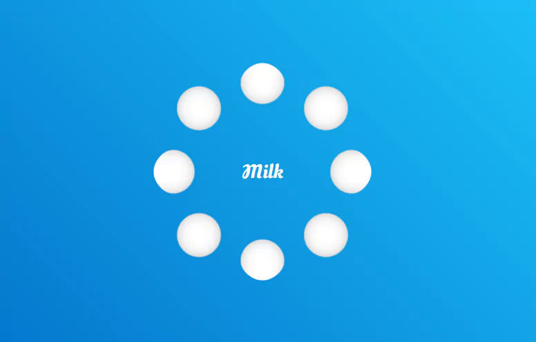
CSS Only Animation Effects Liquid Loader Html CSS
CSS Only Animation Effects | Liquid Loader Html CSS.
Source Code:
HTML
<!doctype html>
<html>
<head>
	<meta charset="utf-8">
	<title>Milk | Liquid Loader Animation</title>
	<link rel="stylesheet" href="style.css">
</head>
<body>
	<div class="container">
		<h2>Milk</h2>
		<div class="loader">
			<span style="--i:0;"></span>
			<span style="--i:1;"></span>
			<span style="--i:2;"></span>
			<span style="--i:3;"></span>
			<span style="--i:4;"></span>
			<span style="--i:5;"></span>
			<span style="--i:6;"></span>
			<span style="--i:7;"></span>
		</div>
	</div>

	<svg>
		<filter id="gooey">
			<feGaussianBlur in="SourceGraphic" stdDeviation="10" />
			<feColorMatrix values="
														1 0 0 0 0
														0 1 0 0 0
														0 0 1 0 0
														0 0 0 20 -10"
											/>
		</filter>
	</svg>
</body>
</html>
CSS
@import url('https://fonts.googleapis.com/css2?family=Oleo+Script+Swash+Caps&display=swap');
*
{
  margin: 0;
  padding: 0;
  box-sizing: border-box;
  font-family: 'Oleo Script Swash Caps', cursive;
}
body
{
  display: flex;
  justify-content: center;
  align-items: center;
  min-height: 100vh;
  background: linear-gradient(45deg,#006bc6,#1ecafc);
}
.container
{
  position: relative;
  display: flex;
  justify-content: center;
  align-items: center;
}
.container h2
{
  position: absolute;
  color: #fff;
  font-size: 1.75em;
  font-weight: 500;
}
.loader
{
  position: relative;
  width: 300px;
  height: 300px;
  display: flex;
  justify-content: center;
  align-items: center;
  background: rgba(0,0,0,0.25);
  filter: url(#gooey);
}
.loader span
{
  position: absolute;
  left: 0px;
  transform-origin: 150px;
  width: 60px;
  height: 60px;
  background: #fff;
  border-radius: 50%;
  animation: animate 5s ease-in-out infinite;
  animation-delay: calc(0.15s * var(--i));
}
@keyframes animate
{
  0%,10%
  {
    width: 100px;
    height: 100px;
    transform: rotate(0deg) translateX(120px);
  }
  40%,70%
  {
    width: 40px;
    height: 40px;
    transform: rotate(calc(360deg / 8 * var(--i)));
    box-shadow: 0 0 0 10px #fff;
  }
  90%,100%
  {
    width: 100px;
    height: 100px;
    transform: rotate(0deg) translateX(120px);
  }
}
svg
{
    width: 0;
    height: 0;
}
Another HTML CSS JavaScript Article For You 👇

More Queries: