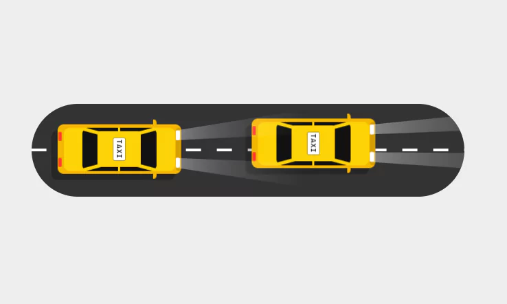
CSS Only Taxi Animation Effects | Html CSS Moving Car Animation Effect
CSS Only Taxi Animation Effects. Html CSS Moving Car Animation Effect(Source Code).
Source Code:
HTML
<!DOCTYPE html>
<html>
<head>
<title>CSS Taxi Animation Effects</title>
<link rel="stylesheet" type="text/css" href="style.css">
</head>
<body>
	<div class="road">
		<div class="taxi">
			<div class="light_beam"></div>
			<div class="side_mirror"></div>
			<span>
				<b></b>
				<i></i>
			</span>
		</div>
		<div class="taxi">
			<div class="light_beam"></div>
			<div class="side_mirror"></div>
			<span>
				<b></b>
				<i></i>
			</span>
		</div>
	</div>
</body>
</html>
CSS
*
{
	margin: 0;
	padding: 0;
	box-sizing: border-box;
	font-family: consolas;
}
body
{
	display: flex;
	justify-content: center;
	align-items: center;
	min-height: 100vh;
	background: #ededed;
}
.road
{
	position: relative;
	width: 700px;
	height: 150px;
	background: #333;
	display: flex;
	justify-content: center;
	align-items: center;
	border-radius: 150px;
	transform-style: preserve-3d;
	perspective: 500px;
	overflow: hidden;
}
.road::before
{
	content: '';
	position: absolute;
	width: 100%;
	height: 4px;
	background: linear-gradient(90deg,#fff,#fff 50%,transparent 50%,transparent 100%);
	background-size: 50px;
	animation: animate_road 0.125s linear infinite;
}
@keyframes animate_road
{
	0%
	{
		background-position: 50px 0px;
	}
	100%
	{
		background-position: 0px 0px;
	}
}
.taxi:nth-child(2)
{
	left: initial;
	right: 150px;
	animation-delay: -1s;
	animation: animate_taxi 4s linear infinite;
	z-index: 1;
}
.taxi
{
	position: absolute;
	left: 50px;
	width: 200px;
	height: 80px;
	background: #f4b603;
	border-radius: 10px;
	box-shadow: -10px 10px rgba(0,0,0,0.25);
	animation: animate_taxi 2s linear infinite;
	transform-style: preserve-3d;
	perspective: 800px;
	z-index: 2;
}
@keyframes animate_taxi
{
	0%
	{
		transform: translateY(-20px) translateX(20px);
	}
	25%
	{
		transform: translateY(0px) translateX(-10px);
	}
	50%
	{
		transform: translateY(20px) translateX(20px);
	}
	75%
	{
		transform: translateY(0px) translateX(-10px);
	}
  100%
	{
		transform: translateY(-20px) translateX(20px);
	}
}
.taxi::before
{
	content: '';
	position: absolute;
	top: 12px;
	left: 2px;
	width: 5px;
	height: 15px;
	background: #fc3c25;
	box-shadow: 0 42px #fc3c25;
	border-radius: 2px;
}
.taxi::after
{
	content: '';
	position: absolute;
	top: 10px;
	right: 2px;
	width: 6px;
	height: 16px;
	background: #fff;
	box-shadow: 0 44px #fff;
	border-radius: 2px;
}
.taxi span
{
	position: absolute;
	inset: 5px 10px;
	background: #fdd206;
	border-radius: 10px;
	overflow: hidden;
}
.taxi span::before
{
	content: 'Taxi';
	position: absolute;
	top: 50%;
	left: 50%;
	transform: translate(-50%,-50%) rotate(90deg);
	padding: 2px 2px;
	font-size: 0.75em;
	font-weight: 1000;
	border-radius: 2px;
	background: #fff;
	box-shadow: 0 0 0 1px #0005;
	text-transform: uppercase;
	letter-spacing: 0.1em;
	z-index: 10;
}
.taxi span b
{
	position: absolute;
	inset: 0 30px;
	background: #111;
	border-radius: 10px;
}
.taxi span b::before
{
	content: '';
	position: absolute;
	inset: 6px 25px;
	background: #fdd206;
	border-radius: 5px;
}
.taxi span b::after
{
	content: '';
	position: absolute;
	inset: 0 58px;
	background: #fdd206;
}
.taxi span i
{
	position: absolute;
	inset: 0;
}
.taxi span i::before
{
	content: '';
	position: absolute;
	top: 7px;
	left: 20px;
	width: 40px;
	height: 5px;
	background: #fdd206;
	transform-origin: right;
	transform: rotate(15deg);
	box-shadow: 110px 34px #fdd206;
}
.taxi span i::after
{
	content: '';
	position: absolute;
	bottom: 7px;
	left: 20px;
	width: 40px;
	height: 5px;
	background: #fdd206;
	transform-origin: right;
	transform: rotate(-15deg);
	box-shadow: 110px -34px #fdd206;
}
.light_beam
{
	position: absolute;
	top: 5px;
	right: -2px;
	width: 10px;
	height: 70px;
	border-radius: 15px;
	background: #0002;
	transform-style: preserve-3d;
}
.light_beam::before
{
	content: '';
	position: absolute;
	top: 5px;
	left: 0;
	width: 150px;
	height: 16px;
	background: linear-gradient(90deg,#fff6,transparent);
	transform-origin: left;
	transform-origin: left;
	left: 0;
	transform: perspective(500px) rotateY(-50deg);
}
.light_beam::after
{
	content: '';
	position: absolute;
	bottom: 5px;
	left: 0;
	width: 150px;
	height: 16px;
	background: linear-gradient(90deg,#fff6,transparent);
	transform-origin: left;
	transform-origin: left;
	left: 0;
	transform: perspective(500px) rotateY(-50deg);
}
.taxi .side_mirror
{
	position: absolute;
	inset: 0;
}
.taxi .side_mirror::before
{
	content: '';
	position: absolute;
	top: -8px;
	right: 40px;
	width: 5px;
	height: 10px;
	background: #f4b603;
	border-top-right-radius: 10px;
}
.taxi .side_mirror::after
{
	content: '';
	position: absolute;
	bottom: -8px;
	right: 40px;
	width: 5px;
	height: 10px;
	background: #f4b603;
	border-bottom-right-radius: 10px;
}
Get More Source Code here.
Another HTML CSS JavaScript Article For You 👇
More Queries: