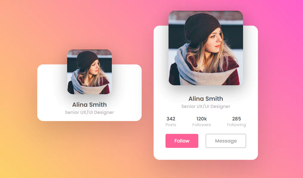
Animated Profile Card UI Design using Html & CSS
Animated Profile Card UI Design using Html & CSS | CSS Card Hover Effects.
Source Code:
HTML:
<!DOCTYPE html>
<html>
<head>
<title>Image Hover Effects</title>
<link rel="stylesheet" type="text/css" href="style.css">
</head>
<body>
	<div class="card">
		<div class="imgBx">
			<img src="img.jpg">
		</div>
		<div class="content">
			<div class="details">
				<h2>Alina Smith<br><span>Senior UX/UI Designer</span></h2>
				<div class="data">
					<h3>342<br><span>Posts</span></h3>
					<h3>120k<br><span>Followers</span></h3>
					<h3>285<br><span>Following</span></h3>
				</div>
				<div class="actionBtn">
					<button>Follow</button>
					<button>Message</button>
				</div>
			</div>
		</div>
	</div>
</body>
</html>
CSS:
@import url('https://fonts.googleapis.com/css?family=Poppins:100,200,300,400,500,600,700,800,900');
*
{
	margin: 0;
	padding: 0;
	box-sizing: border-box;
	font-family: 'Poppins', sans-serif;
}
body
{
	display: flex;
	justify-content: center;
	align-items: center;
	min-height: 100vh;
	background: #efefef;
	background: linear-gradient(45deg,#FBDA61,#FF5ACD);
}
.card
{
	position: relative;
	width: 350px;
	height: 190px;
	background: #fff;
	border-radius: 20px;
	transition: 0.5s;
	box-shadow: 0 35px 80px rgba(0,0,0,0.15);
}
.card:hover
{
	height: 450px;
}
.card .imgBx
{
	position: absolute;
	left: 50%;
	top: -50px;
	transform: translateX(-50%);
	width: 150px;
	height: 150px;
	border-radius: 20px;
	box-shadow: 0 15px 50px rgba(0,0,0,0.35);
	overflow: hidden;
	transition: 0.5s;
	z-index: 10;
}
.card:hover .imgBx
{
	width: 250px;
	height: 250px;
}
.card .imgBx img
{
	position: absolute;
	top: 0;
	left: 0;
	width: 100%;
	height: 100%;
	object-fit: cover;
}
.card .content
{
	position: absolute;
	width: 100%;
	height: 100%;
	display: flex;
	justify-content: center;
	align-items: flex-end;
	overflow: hidden;
}
.card .details
{
	padding: 40px 40px;
	text-align: center;
	width: 100%;
	transition: 0.5s;
	transform: translateY(150px);
}
.card:hover .details
{
	transform: translateY(0px);
}
.card .details h2
{
	font-size: 1.25em;
	font-weight: 600;
	color: #555;
	line-height: 1.2em;
}
.card .details h2 span
{
	font-size: 0.75em;
	font-weight: 500;
	opacity: 0.5;
}
.card .details .data
{
	display: flex;
	justify-content: space-between;
	margin: 20px 0;
}
.card .details .data h3
{
	font-size: 1em;
	color: #555;
	line-height: 1.2em;
	font-weight: 600;
}
.card .details .data h3 span
{
	font-size: 0.85em;
	font-weight: 400;
	opacity: 0.5;
}
.card .details .actionBtn
{
	display: flex;
	justify-content: space-between;
	gap: 20px;
}
.card .details .actionBtn button
{
	padding: 10px 30px;
	border: none;
	outline: none;
	border-radius: 5px;
	font-size: 1em;
	font-weight: 500;
	background: #ff5f95;
	color: #fff;
	cursor: pointer;
}
.card .details .actionBtn button:nth-child(2)
{
	border: 1px solid #999;
	color: #999;
	background: #fff;
}
Images:

Another HTML CSS JavaScript Article For You 👇
More Queries: