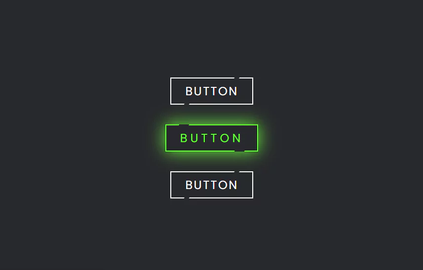
Modern CSS Glowing Button Hover Effects | Html CSS Tutorial
Modern CSS Glowing Button Hover Effects. Html CSS Tutorial.
Source Code
HTML
<!DOCTYPE html>
<html>
<head>
	<title>CSS Modern Button</title>
	<link rel="stylesheet" type="text/css" href="style.css">
</head>
<body>
	<a href="#" style="--clr:#1e9bff"><span>Button</span><i></i></a>
	<a href="#" style="--clr:#6eff3e"><span>Button</span><i></i></a>

	<a href="#" style="--clr:#ff1867"><span>Button</span><i></i></a>
</body>
</html>
——————————
📂 Important Links:
——————————
>> Learn Graphics Design & Make A Successful Profession.
>> Canva Makes Graphics Design Easy.
>> Start Freelancing Today & Earn Money.
>> Make Video Editing As Your Profession.
CSS
@import url('https://fonts.googleapis.com/css2?family=Poppins:wght@300;400;500;600;700;800;900&display=swap');
*
{
	margin: 0;
	padding: 0;
	box-sizing: border-box;
  font-family: 'Poppins', sans-serif;
}
body
{
	display: flex;
	justify-content: center;
	align-items: center;
	min-height: 100vh;
	background: #27282c;
	flex-direction: column;
	gap: 40px
}
a
{
	position: relative;
	background: #fff;
	color: #fff;
	text-decoration: none;
	text-transform: uppercase;
	font-size: 1.5em;
	letter-spacing: 0.1em;
	font-weight: 400;
	padding: 10px 30px;
	transition: 0.5s;
}
a:hover
{
	background: var(--clr);
	color: var(--clr);
	letter-spacing: 0.25em;
	box-shadow: 0 0 35px var(--clr);
}
a:before
{
	content: '';
	position: absolute;
	inset: 2px;
	background: #27282c;
}
span
{
	position: relative;
	z-index: 1;
}
i
{
	position: absolute;
	inset: 0;
	display: block;
}
i::before
{
	content: '';
	position: absolute;
	top: 0;
	left: 80%;
	width: 10px;
	height: 4px;
	background: #27282c;
	transform: translateX(-50%) skewX(325deg);
	transition: 0.5s;
}
a:hover i::before
{
	width: 20px;
	left: 20%;
}
i::after
{
	content: '';
	position: absolute;
	bottom: 0;
	left: 20%;
	width: 10px;
	height: 4px;
	background: #27282c;
	transform: translateX(-50%) skewX(325deg);
	transition: 0.5s;
}
a:hover i::after
{
	width: 20px;
	left: 80%;
}Another HTML CSS JavaScript Article For You 👇

More Queries: