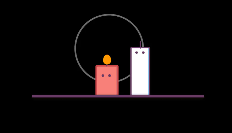
Pure CSS Animation – Funny Candle Pure CSS Animation
Using pure CSS, we can create some realistic animation. In this article we will create funny Candle using Pure CSS Animation.
Structure will be created with HTML. And animation will be created with pure CSS.
Source Code:
HTML:
<!DOCTYPE html>
<html lang="en">

<head>
  <meta charset="UTF-8">
  <title>Candle Fun (Pure CSS Animation)</title>
  <link rel="stylesheet" href="./style.css">

</head>

<body>
  <!-- partial:index.partial.html -->
  <div class="wrapper">
    <div class="candles">
      <div class="light__wave"></div>
      <div class="candle1">
        <div class="candle1__body">
          <div class="candle1__eyes">
            <span class="candle1__eyes-one"></span>
            <span class="candle1__eyes-two"></span>
          </div>
          <div class="candle1__mouth"></div>
        </div>
        <div class="candle1__stick"></div>
      </div>

      <div class="candle2">
        <div class="candle2__body">
          <div class="candle2__eyes">
            <div class="candle2__eyes-one"></div>
            <div class="candle2__eyes-two"></div>
          </div>
        </div>
        <div class="candle2__stick"></div>
      </div>
      <div class="candle2__fire"></div>
      <div class="sparkles-one"></div>
      <div class="sparkles-two"></div>
      <div class="candle__smoke-one">

      </div>
      <div class="candle__smoke-two">

      </div>

    </div>
    <div class="floor">
    </div>

  </div>
  <!-- partial -->

</body>

</html>
——————————
📂 Important Links:
——————————
>> Learn Graphics Design & Make A Successful Profession.
>> Canva Makes Graphics Design Easy.
>> Start Freelancing Today & Earn Money.
>> Make Video Editing As Your Profession.
Another css animation for you.
CSS:
body {
  background-color: #fff;
  animation: change-background 3s infinite linear;
}

.wrapper {
  position: absolute;
  left: 50%;
  top: 70%;
  transform: scale(1.5, 1.5) translate(-50%, -50%);
}

.floor {
  position: absolute;
  left: 50%;
  top: 50%;
  width: 350px;
  height: 5px;
  background: #673c63;
  transform: translate(-50%, -50%);
  box-shadow: 0px 2px 5px #111;
  z-index: 2;
}

.candles {
  position: absolute;
  left: 50%;
  top: 50%;
  width: 250px;
  height: 150px;
  transform: translate(-50%, -100%);
  z-index: 1;
}

.candle1 {
  position: absolute;
  left: 50%;
  top: 50%;
  width: 35px;
  height: 100px;
  background: #fff;
  border: 3px solid #673c63;
  border-bottom: 0px;
  border-radius: 3px;
  transform-origin: center right;
  transform: translate(60%, -25%);
  box-shadow: -2px 0px 0px #95c6f2 inset;
  animation: expand-body 3s infinite linear;
}

.candle1__stick,
.candle2__stick {
  position: absolute;
  left: 50%;
  top: 0%;
  width: 3px;
  height: 15px;
  background: #673c63;
  border-radius: 8px;
  transform: translate(-50%, -100%);
}

.candle2__stick {
  height: 12px;
  transform-origin: bottom center;
  animation: stick-animation 3s infinite linear;
}

.candle1__eyes,
.candle2__eyes {
  position: absolute;
  left: 50%;
  top: 0%;
  width: 35px;
  height: 30px;
  transform: translate(-50%, 0%);
}

.candle1__eyes-one {
  position: absolute;
  left: 30%;
  top: 20%;
  width: 5px;
  height: 5px;
  border-radius: 100%;
  background: #673c63;
  transform: translate(-70%, 0%);
  animation: blink-eyes 3s infinite linear;
}

.candle1__eyes-two {
  position: absolute;
  left: 70%;
  top: 20%;
  width: 5px;
  height: 5px;
  border-radius: 100%;
  background: #673c63;
  transform: translate(-70%, 0%);
  animation: blink-eyes 3s infinite linear;
}

.candle1__mouth {
  position: absolute;
  left: 40%;
  top: 20%;
  width: 0px;
  height: 0px;
  border-radius: 20px;
  background: #673c63;
  transform: translate(-50%, -50%);
  animation: uff 3s infinite linear;
}

.candle__smoke-one {
  position: absolute;
  left: 30%;
  top: 50%;
  width: 30px;
  height: 3px;
  background: grey;
  transform: translate(-50%, -50%);
  animation: move-left 3s infinite linear;
}

.candle__smoke-two {
  position: absolute;
  left: 30%;
  top: 40%;
  width: 10px;
  height: 10px;
  border-radius: 10px;
  background: grey;
  transform: translate(-50%, -50%);
  animation: move-top 3s infinite linear;
}

.candle2 {
  position: absolute;
  left: 20%;
  top: 65%;
  width: 42px;
  height: 60px;
  background: #fff;
  border: 3px solid #673c63;
  border-bottom: 0px;
  border-radius: 3px;
  transform: translate(60%, -15%);
  transform-origin: center right;
  box-shadow: -2px 0px 0px #95c6f2 inset;
  animation: shake-left 3s infinite linear;
}

.candle2__eyes-one {
  position: absolute;
  left: 30%;
  top: 50%;
  width: 5px;
  height: 5px;
  display: inline-block;
  border: 0px solid #673c63;
  border-radius: 100%;
  float: left;
  background: #673c63;
  transform: translate(-80%, 0%);
  animation: changeto-lower 3s infinite linear;
}

.candle2__eyes-two {
  position: absolute;
  left: 70%;
  top: 50%;
  width: 5px;
  height: 5px;
  display: inline-block;
  border: 0px solid #673c63;
  border-radius: 100%;
  float: left;
  background: #673c63;
  transform: translate(-80%, 0%);
  animation: changeto-greater 3s infinite linear;
}

.light__wave {
  position: absolute;
  top: 35%;
  left: 35%;
  width: 75px;
  height: 75px;
  border-radius: 100%;
  z-index: 0;
  transform: translate(-25%, -50%) scale(2.5, 2.5);
  border: 2px solid rgba(255, 255, 255, 0.2);
  animation: expand-light 3s infinite linear;
}

.candle2__fire {
  position: absolute;
  top: 50%;
  left: 40%;
  display: block;
  width: 16px;
  height: 20px;
  background-color: red;
  border-radius: 50% 50% 50% 50% / 60% 60% 40% 40%;
  background: #ff9800;
  transform: translate(-50%, -50%);
  animation: dance-fire 3s infinite linear;
}

@keyframes blink-eyes {
  0%,
  35% {
    opacity: 1;
    transform: translate(-70%, 0%);
  }
  36%,
  39% {
    opacity: 0;
    transform: translate(-70%, 0%);
  }
  40% {
    opacity: 1;
    transform: translate(-70%, 0%);
  }
  50%,
  65% {
    transform: translate(-140%, 0%);
  }
  66% {
    transform: translate(-70%, 0%);
  }
}
@keyframes expand-body {
  0%,
  40% {
    transform: scale(1, 1) translate(60%, -25%);
  }
  45%,
  55% {
    transform: scale(1.1, 1.1) translate(60%, -28%);
  }
  60% {
    transform: scale(0.89, 0.89) translate(60%, -25%);
  }
  65% {
    transform: scale(1, 1) translate(60%, -25%);
  }
  70% {
    transform: scale(0.95, 0.95) translate(60%, -25%);
  }
  75% {
    transform: scale(1, 1) translate(60%, -25%);
  }
}
@keyframes uff {
  0%,
  40% {
    width: 0px;
    height: 0px;
  }
  50%,
  54% {
    width: 15px;
    height: 15px;
    left: 30%;
  }
  59% {
    width: 5px;
    height: 5px;
    left: 20%;
  }
  62% {
    width: 2px;
    height: 2px;
    left: 20%;
  }
  67% {
    width: 0px;
    height: 0px;
    left: 30%;
  }
}
@keyframes change-background {
  0%,
  59%,
  98%,
  100% {
    background: #fff;
  }
  61%,
  97% {
    background: #000;
  }
}
@keyframes move-left {
  0%,
  59%,
  100% {
    width: 0px;
    left: 40%;
  }
  60% {
    width: 30px;
    left: 30%;
  }
  68% {
    width: 0px;
    left: 20%;
  }
}
@keyframes move-top {
  0%,
  64%,
  100% {
    width: 0px;
    height: 0px;
    top: 0%;
  }
  65% {
    width: 10px;
    height: 10px;
    top: 40%;
    left: 40%;
  }
  80% {
    width: 0px;
    height: 0px;
    top: 20%;
  }
}
@keyframes shake-left {
  0%,
  40% {
    left: 20%;
    transform: translate(60%, -15%);
  }
  50%,
  54% {
    left: 20%;
    transform: translate(60%, -15%);
  }
  59% {
    left: 20%;
    transform: translate(60%, -15%);
  }
  62% {
    left: 18%;
    transform: translate(60%, -15%);
  }
  65% {
    left: 21%;
    transform: translate(60%, -15%);
  }
  67% {
    left: 20%;
    transform: translate(60%, -15%);
  }
  75% {
    left: 20%;
    transform: scale(1.15, 0.85) translate(60%, -15%);
    background: #fff;
    border-color: #673c63;
  }
  91% {
    left: 20%;
    transform: scale(1.18, 0.82) translate(60%, -10%);
    background: #f44336;
    border-color: #f44336;
    box-shadow: -2px 0px 0px #f44336 inset;
  }
  92% {
    left: 20%;
    transform: scale(0.85, 1.15) translate(60%, -15%);
  }
  95% {
    left: 20%;
    transform: scale(1.05, 0.95) translate(60%, -15%);
  }
  97% {
    left: 20%;
    transform: scale(1, 1) translate(60%, -15%);
  }
}
@keyframes stick-animation {
  0%,
  40% {
    left: 50%;
    top: 0%;
    transform: translate(-50%, -100%);
  }
  50%,
  54% {
    left: 50%;
    top: 0%;
    transform: translate(-50%, -100%);
  }
  59% {
    left: 50%;
    top: 0%;
    transform: translate(-50%, -100%);
  }
  62% {
    left: 50%;
    top: 0%;
    transform: rotateZ(-15deg) translate(-50%, -100%);
  }
  65% {
    left: 50%;
    top: 0%;
    transform: rotateZ(15deg) translate(-50%, -100%);
  }
  70% {
    left: 50%;
    top: 0%;
    transform: rotateZ(-5deg) translate(-50%, -100%);
  }
  72% {
    left: 50%;
    top: 0%;
    transform: rotateZ(5deg) translate(-50%, -100%);
  }
  74%,
  84% {
    left: 50%;
    top: 0%;
    transform: rotateZ(0deg) translate(-50%, -100%);
  }
  85% {
    transform: rotateZ(180deg) translate(0%, 120%);
  }
  92% {
    left: 50%;
    top: 0%;
    transform: translate(-50%, -100%);
  }
}
@keyframes expand-light {
  10%,
  29%,
  59%,
  89% {
    transform: translate(-25%, -50%) scale(0, 0);
    border: 2px solid rgba(255, 255, 255, 0);
  }
  90%,
  20%,
  50% {
    transform: translate(-25%, -50%) scale(1, 1);
  }
  95%,
  96%,
  26%,
  27%,
  56%,
  57% {
    transform: translate(-25%, -50%) scale(2, 2);
    border: 2px solid rgba(255, 255, 255, 0.5);
  }
  0%,
  28%,
  58%,
  100% {
    transform: translate(-25%, -50%) scale(2.5, 2.5);
    border: 2px solid rgba(255, 255, 255, 0.2);
  }
}
@keyframes dance-fire {
  59%,
  89% {
    left: 40%;
    width: 0px;
    height: 0px;
  }
  90%,
  0%,
  7%,
  15%,
  23%,
  31%,
  39%,
  47%,
  55% {
    left: 40.8%;
    width: 16px;
    height: 20px;
    background: #ffc107;
  }
  94%,
  3%,
  11%,
  19%,
  27%,
  35%,
  43%,
  51%,
  58% {
    left: 41.2%;
    width: 16px;
    height: 20px;
    background: #ff9800;
  }
}
@keyframes changeto-lower {
  0%,
  70%,
  90% {
    padding: 0px;
    display: inline-block;
    border-radius: 100%;
    background: #673c63;
    border-width: 0 0 0 0;
    border: 0px solid #673c63;
    transform: translate(-90%, 0%);
  }
  71%,
  89% {
    background: none;
    border: solid #673c63;
    border-radius: 0px;
    border-width: 0 2px 2px 0;
    display: inline-block;
    padding: 1px;
    float: left;
    transform-origin: bottom left;
    transform: rotate(-45deg) translate(-50%, -65%);
    -webkit-transform: rotate(-45deg) translate(-50%, -65%);
  }
}
@keyframes changeto-greater {
  0%,
  70%,
  90% {
    top: 50%;
    padding: 0px;
    display: inline-block;
    border-radius: 100%;
    background: #673c63;
    border-width: 0 0 0 0;
    border: 0px solid #673c63;
    transform: translate(-80%, 0%);
  }
  71%,
  89% {
    top: 30%;
    background: none;
    border: solid #673c63;
    border-radius: 0px;
    border-width: 0 2px 2px 0;
    display: inline-block;
    padding: 1px;
    float: left;
    transform-origin: bottom left;
    transform: rotate(135deg) translate(-80%, 20%);
    -webkit-transform: rotate(135deg) translate(-80%, 20%);
  }
}