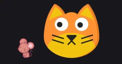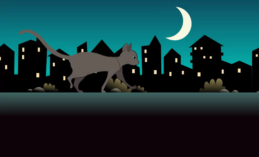
Pure CSS Animation – CSS Walking Cat
In this article we will create another css animation project. Yes using Pure CSS Animation – we will create a CSS Walking Cat.
We will use HTML for the structure and CSS for the styling.
Source Code:
HTML:
<html>
    <body>
    <div id="marco">
      <div id="cielo"></div>
			<div id="luna"></div>
			<div id="gato"></div>
			<div id="muro"></div>
			<div id="edificios"></div>
</div>
	</body>

</html>
——————————
📂 Important Links:
——————————
>> Learn Graphics Design & Make A Successful Profession.
>> Canva Makes Graphics Design Easy.
>> Start Freelancing Today & Earn Money.
>> Make Video Editing As Your Profession.
Another css animation project.
CSS:
html{
    font-size:20px;
    margin:0;
    background: #0c0207;
    }
#marco{
    width: 1325px;
    height: 500px;
    margin: 0 auto;
    overflow: hidden;
    border-radius: 16px;
    margin-top: 2em;
    }

#cielo{
    border-radius: 16px;
    width: 1325px;
    height: 500px;
    background: linear-gradient(to bottom,  #0B4C5F 0%,#04B4AE 52%,#0c0207 100%);
    position: absolute;
    z-index: -30;
    top: 0;
    margin-top: 2em;
    }

#edificios{
    background: url('https://res.cloudinary.com/pastelitos/image/upload/v1610526533/eva/edificiosOne_fsg7nx.svg');
    height: 500px;
    width: 1325px;
    z-index: -10;
    top: 6.5em;
    background-position: 0px 0px;
    background-repeat: repeat-x;
    -webkit-animation: animar_edificios 120s linear infinite;
    -ms-animation: animar_edificios 120s linear infinite;
    -moz-animation: animar_edificios 120s linear infinite;
    position: absolute;
    }

/* Animacion edificios */

   @keyframes  animar_edificios {
        from { background-position: 0 0; }
        to { background-position: 100% 0; }
    }
    @-webkit-keyframes  animar_edificios {
        from { background-position: 0 0; }
        to { background-position: 100% 0; }
    }
    @-ms-keyframes  animar_edificios {
        from { background-position: 0 0; }
        to { background-position: 100% 0; }
    }
    @-moz-keyframes  animar_edificios {
        from { background-position: 0 0; }
        to { background-position: 100% 0; }
    }

#luna {
    width: 6em;
    height: 6em;
    -moz-border-radius: 50%;
    -webkit-border-radius: 50%;
    border-radius: 50%;
    -moz-box-shadow: 30px 10px 0 #F7F8E0;
    -webkit-box-shadow: 30px 10px 0 #F7F8E0;
    box-shadow: 30px 10px 0 #F7F8E0;
    margin-top: 1em;
    margin-left: 50%;
    position: absolute;
    z-index: -19;
    }

#muro{
    height: 23em;
    width: 100%;
    background: -moz-linear-gradient(top,  #416663 0%, #0c0207 19%);
    background: -webkit-linear-gradient(top,  #416663 0%,#0c0207 19%);
    background: linear-gradient(to bottom,  #416663 0%,#0c0207 19%);
    bottom:0px;
    }

#gato{
    background: url('https://res.cloudinary.com/pastelitos/image/upload/v1610526571/eva/gatito_pushui.svg');
    height: 297px;
    width: 507.5px;
    margin-top: 2em;
    margin-left: 2em;
    z-index: 10;
    -webkit-animation: sprite-animation 1.2s steps(16,end) infinite;
    -moz-animation: sprite-animation 1.2s steps(16,end) infinite;
    -ms-animation: sprite-animation 1.2s steps(16,end) infinite;
    animation: sprite-animation 1.2s steps(16,end) infinite;
    }

@-webkit-keyframes sprite-animation {
        from { background-position: 0 0; }
        to { background-position: -8120px 0; }
    }

@-ms-keyframes sprite-animation {
        from { background-position: 0 0; }
        to { background-position: -8120px 0; }
    }

@-moz-keyframes sprite-animation {
        from { background-position: 0 0; }
        to { background-position: -8120px 0; }
    }

@keyframes sprite-animation {
        from { background-position: 0 0; }
        to { background-position: -8120px 0; }
    }