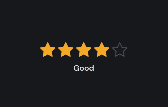
Animated star rating with HTML CSS and JavaScript.
An animated star rating can be made using HTML, CSS, and JavaScript. In this article, I’ll demonstrate how to use HTML, CSS, and JavaScript to create a fun animated star rating.
HTML will be used to build the structure. The styling will be added using CSS, and the functionality of our animated star rating will be added using JavaScript. Visit our website for more HTML, CSS, and JavaScript projects.
Source Code:
HTML:
<form class="rating">
	<div class="rating__stars">
		<input id="rating-1" class="rating__input rating__input-1" type="radio" name="rating" value="1">
		<input id="rating-2" class="rating__input rating__input-2" type="radio" name="rating" value="2">
		<input id="rating-3" class="rating__input rating__input-3" type="radio" name="rating" value="3">
		<input id="rating-4" class="rating__input rating__input-4" type="radio" name="rating" value="4">
		<input id="rating-5" class="rating__input rating__input-5" type="radio" name="rating" value="5">
		<label class="rating__label" for="rating-1">
			<svg class="rating__star" width="32" height="32" viewBox="0 0 32 32" aria-hidden="true">
				<g transform="translate(16,16)">
					<circle class="rating__star-ring" fill="none" stroke="#000" stroke-width="16" r="8" transform="scale(0)" />
				</g>
				<g stroke="#000" stroke-width="2" stroke-linecap="round" stroke-linejoin="round">
					<g transform="translate(16,16) rotate(180)">
						<polygon class="rating__star-stroke" points="0,15 4.41,6.07 14.27,4.64 7.13,-2.32 8.82,-12.14 0,-7.5 -8.82,-12.14 -7.13,-2.32 -14.27,4.64 -4.41,6.07" fill="none" />
						<polygon class="rating__star-fill" points="0,15 4.41,6.07 14.27,4.64 7.13,-2.32 8.82,-12.14 0,-7.5 -8.82,-12.14 -7.13,-2.32 -14.27,4.64 -4.41,6.07" fill="#000" />
					</g>
					<g transform="translate(16,16)" stroke-dasharray="12 12" stroke-dashoffset="12">
						<polyline class="rating__star-line" transform="rotate(0)" points="0 4,0 16" />
						<polyline class="rating__star-line" transform="rotate(72)" points="0 4,0 16" />
						<polyline class="rating__star-line" transform="rotate(144)" points="0 4,0 16" />
						<polyline class="rating__star-line" transform="rotate(216)" points="0 4,0 16" />
						<polyline class="rating__star-line" transform="rotate(288)" points="0 4,0 16" />
					</g>
				</g>
			</svg>
			<span class="rating__sr">1 star—Terrible</span>
		</label>
		<label class="rating__label" for="rating-2">
			<svg class="rating__star" width="32" height="32" viewBox="0 0 32 32" aria-hidden="true">
				<g transform="translate(16,16)">
					<circle class="rating__star-ring" fill="none" stroke="#000" stroke-width="16" r="8" transform="scale(0)" />
				</g>
				<g stroke="#000" stroke-width="2" stroke-linecap="round" stroke-linejoin="round">
					<g transform="translate(16,16) rotate(180)">
						<polygon class="rating__star-stroke" points="0,15 4.41,6.07 14.27,4.64 7.13,-2.32 8.82,-12.14 0,-7.5 -8.82,-12.14 -7.13,-2.32 -14.27,4.64 -4.41,6.07" fill="none" />
						<polygon class="rating__star-fill" points="0,15 4.41,6.07 14.27,4.64 7.13,-2.32 8.82,-12.14 0,-7.5 -8.82,-12.14 -7.13,-2.32 -14.27,4.64 -4.41,6.07" fill="#000" />
					</g>
					<g transform="translate(16,16)" stroke-dasharray="12 12" stroke-dashoffset="12">
						<polyline class="rating__star-line" transform="rotate(0)" points="0 4,0 16" />
						<polyline class="rating__star-line" transform="rotate(72)" points="0 4,0 16" />
						<polyline class="rating__star-line" transform="rotate(144)" points="0 4,0 16" />
						<polyline class="rating__star-line" transform="rotate(216)" points="0 4,0 16" />
						<polyline class="rating__star-line" transform="rotate(288)" points="0 4,0 16" />
					</g>
				</g>
			</svg>
			<span class="rating__sr">2 stars—Bad</span>
		</label>
		<label class="rating__label" for="rating-3">
			<svg class="rating__star" width="32" height="32" viewBox="0 0 32 32" aria-hidden="true">
				<g transform="translate(16,16)">
					<circle class="rating__star-ring" fill="none" stroke="#000" stroke-width="16" r="8" transform="scale(0)" />
				</g>
				<g stroke="#000" stroke-width="2" stroke-linecap="round" stroke-linejoin="round">
					<g transform="translate(16,16) rotate(180)">
						<polygon class="rating__star-stroke" points="0,15 4.41,6.07 14.27,4.64 7.13,-2.32 8.82,-12.14 0,-7.5 -8.82,-12.14 -7.13,-2.32 -14.27,4.64 -4.41,6.07" fill="none" />
						<polygon class="rating__star-fill" points="0,15 4.41,6.07 14.27,4.64 7.13,-2.32 8.82,-12.14 0,-7.5 -8.82,-12.14 -7.13,-2.32 -14.27,4.64 -4.41,6.07" fill="#000" />
					</g>
					<g transform="translate(16,16)" stroke-dasharray="12 12" stroke-dashoffset="12">
						<polyline class="rating__star-line" transform="rotate(0)" points="0 4,0 16" />
						<polyline class="rating__star-line" transform="rotate(72)" points="0 4,0 16" />
						<polyline class="rating__star-line" transform="rotate(144)" points="0 4,0 16" />
						<polyline class="rating__star-line" transform="rotate(216)" points="0 4,0 16" />
						<polyline class="rating__star-line" transform="rotate(288)" points="0 4,0 16" />
					</g>
				</g>
			</svg>
			<span class="rating__sr">3 stars—OK</span>
		</label>
		<label class="rating__label" for="rating-4">
			<svg class="rating__star" width="32" height="32" viewBox="0 0 32 32" aria-hidden="true">
				<g transform="translate(16,16)">
					<circle class="rating__star-ring" fill="none" stroke="#000" stroke-width="16" r="8" transform="scale(0)" />
				</g>
				<g stroke="#000" stroke-width="2" stroke-linecap="round" stroke-linejoin="round">
					<g transform="translate(16,16) rotate(180)">
						<polygon class="rating__star-stroke" points="0,15 4.41,6.07 14.27,4.64 7.13,-2.32 8.82,-12.14 0,-7.5 -8.82,-12.14 -7.13,-2.32 -14.27,4.64 -4.41,6.07" fill="none" />
						<polygon class="rating__star-fill" points="0,15 4.41,6.07 14.27,4.64 7.13,-2.32 8.82,-12.14 0,-7.5 -8.82,-12.14 -7.13,-2.32 -14.27,4.64 -4.41,6.07" fill="#000" />
					</g>
					<g transform="translate(16,16)" stroke-dasharray="12 12" stroke-dashoffset="12">
						<polyline class="rating__star-line" transform="rotate(0)" points="0 4,0 16" />
						<polyline class="rating__star-line" transform="rotate(72)" points="0 4,0 16" />
						<polyline class="rating__star-line" transform="rotate(144)" points="0 4,0 16" />
						<polyline class="rating__star-line" transform="rotate(216)" points="0 4,0 16" />
						<polyline class="rating__star-line" transform="rotate(288)" points="0 4,0 16" />
					</g>
				</g>
			</svg>
			<span class="rating__sr">4 stars—Good</span>
		</label>
		<label class="rating__label" for="rating-5">
			<svg class="rating__star" width="32" height="32" viewBox="0 0 32 32" aria-hidden="true">
				<g transform="translate(16,16)">
					<circle class="rating__star-ring" fill="none" stroke="#000" stroke-width="16" r="8" transform="scale(0)" />
				</g>
				<g stroke="#000" stroke-width="2" stroke-linecap="round" stroke-linejoin="round">
					<g transform="translate(16,16) rotate(180)">
						<polygon class="rating__star-stroke" points="0,15 4.41,6.07 14.27,4.64 7.13,-2.32 8.82,-12.14 0,-7.5 -8.82,-12.14 -7.13,-2.32 -14.27,4.64 -4.41,6.07" fill="none" />
						<polygon class="rating__star-fill" points="0,15 4.41,6.07 14.27,4.64 7.13,-2.32 8.82,-12.14 0,-7.5 -8.82,-12.14 -7.13,-2.32 -14.27,4.64 -4.41,6.07" fill="#000" />
					</g>
					<g transform="translate(16,16)" stroke-dasharray="12 12" stroke-dashoffset="12">
						<polyline class="rating__star-line" transform="rotate(0)" points="0 4,0 16" />
						<polyline class="rating__star-line" transform="rotate(72)" points="0 4,0 16" />
						<polyline class="rating__star-line" transform="rotate(144)" points="0 4,0 16" />
						<polyline class="rating__star-line" transform="rotate(216)" points="0 4,0 16" />
						<polyline class="rating__star-line" transform="rotate(288)" points="0 4,0 16" />
					</g>
				</g>
			</svg>
			<span class="rating__sr">5 stars—Excellent</span>
		</label>
		<p class="rating__display" data-rating="1" hidden>Terrible</p>
		<p class="rating__display" data-rating="2" hidden>Bad</p>
		<p class="rating__display" data-rating="3" hidden>OK</p>
		<p class="rating__display" data-rating="4" hidden>Good</p>
		<p class="rating__display" data-rating="5" hidden>Excellent</p>
	</div>
</form>
——————————
📂 Important Links:
——————————
>> Learn Graphics Design & Make A Successful Profession.
>> Canva Makes Graphics Design Easy.
>> Start Freelancing Today & Earn Money.
>> Make Video Editing As Your Profession.
CSS(SCSS):
* {
	border: 0;
	box-sizing: border-box;
	margin: 0;
	padding: 0;
}

$hue: 223;
$starHue: 38;

:root {
	--bg: #{hsl($hue, 10%, 90%)};
	--fg: #{hsl($hue, 10%, 10%)};
	--primary: #{hsl($hue, 90%, 55%)};
	--yellow: #{hsl($starHue, 90%, 55%)};
	--yellow-t: #{hsla($starHue, 90%, 55%, 0)};
	--bezier: cubic-bezier(0.42, 0, 0.58, 1);
	--trans-dur: 0.3s;
	font-size: calc(24px + (30 - 24) * (100vw - 320px) / (1280 - 320));
}
body {
	background-color: var(--bg);
	color: var(--fg);
	font: 1em/1.5 "DM Sans", sans-serif;
	display: flex;
	height: 100vh;
	transition: background-color var(--trans-dur), color var(--trans-dur);
}

.rating {
	margin: auto;

	&__display {
		font-size: 1em;
		font-weight: 500;
		min-height: 1.25em;
		position: absolute;
		top: 100%;
		width: 100%;
		text-align: center;
	}
	&__stars {
		display: flex;
		padding-bottom: 0.375em;
		position: relative;
	}
	&__star {
		display: block;
		overflow: visible;
		pointer-events: none;
		width: 2em;
		height: 2em;

		&-ring,
		&-fill,
		&-line,
		&-stroke {
			animation-duration: 1s;
			animation-timing-function: ease-in-out;
			animation-fill-mode: forwards;
		}
		&-ring,
		&-fill,
		&-line {
			stroke: var(--yellow);
		}
		&-fill {
			fill: var(--yellow);
			transform: scale(0);
			transition: fill var(--trans-dur) var(--bezier),
				transform var(--trans-dur) var(--bezier);
		}
		&-stroke {
			stroke: hsl($hue, 10%, 80%);
			transition: stroke var(--trans-dur);
		}
	}
	&__label {
		cursor: pointer;
		padding: 0.125em;
	}
	@for $s from 1 through 4 {
		&__label--delay#{$s} &__star-ring,
		&__label--delay#{$s} &__star-fill,
		&__label--delay#{$s} &__star-line,
		&__label--delay#{$s} &__star-stroke {
			animation-delay: 0.05s * $s;
		}
	}
	&__input {
		-webkit-appearance: none;
		appearance: none;
	}
	// display
	&__input:hover ~ [data-rating]:not([hidden]) {
		display: none;
	}

	&__input-1:hover ~ [data-rating="1"][hidden],
	&__input-2:hover ~ [data-rating="2"][hidden],
	&__input-3:hover ~ [data-rating="3"][hidden],
	&__input-4:hover ~ [data-rating="4"][hidden],
	&__input-5:hover ~ [data-rating="5"][hidden],
	&__input:checked:hover ~ [data-rating]:not([hidden]) {
		display: block;
	}
	// stars
	&__input-1:hover ~ &__label:first-of-type &__star-stroke,
	&__input-2:hover ~ &__label:nth-of-type(-n + 2) &__star-stroke,
	&__input-3:hover ~ &__label:nth-of-type(-n + 3) &__star-stroke,
	&__input-4:hover ~ &__label:nth-of-type(-n + 4) &__star-stroke,
	&__input-5:hover ~ &__label:nth-of-type(-n + 5) &__star-stroke {
		stroke: var(--yellow);
		transform: scale(1);
	}
	&__input-1:checked ~ &__label:first-of-type &__star-ring,
	&__input-2:checked ~ &__label:nth-of-type(-n + 2) &__star-ring,
	&__input-3:checked ~ &__label:nth-of-type(-n + 3) &__star-ring,
	&__input-4:checked ~ &__label:nth-of-type(-n + 4) &__star-ring,
	&__input-5:checked ~ &__label:nth-of-type(-n + 5) &__star-ring {
		animation-name: starRing;
	}
	&__input-1:checked ~ &__label:first-of-type &__star-stroke,
	&__input-2:checked ~ &__label:nth-of-type(-n + 2) &__star-stroke,
	&__input-3:checked ~ &__label:nth-of-type(-n + 3) &__star-stroke,
	&__input-4:checked ~ &__label:nth-of-type(-n + 4) &__star-stroke,
	&__input-5:checked ~ &__label:nth-of-type(-n + 5) &__star-stroke {
		animation-name: starStroke;
	}
	&__input-1:checked ~ &__label:first-of-type &__star-line,
	&__input-2:checked ~ &__label:nth-of-type(-n + 2) &__star-line,
	&__input-3:checked ~ &__label:nth-of-type(-n + 3) &__star-line,
	&__input-4:checked ~ &__label:nth-of-type(-n + 4) &__star-line,
	&__input-5:checked ~ &__label:nth-of-type(-n + 5) &__star-line {
		animation-name: starLine;
	}
	&__input-1:checked ~ &__label:first-of-type &__star-fill,
	&__input-2:checked ~ &__label:nth-of-type(-n + 2) &__star-fill,
	&__input-3:checked ~ &__label:nth-of-type(-n + 3) &__star-fill,
	&__input-4:checked ~ &__label:nth-of-type(-n + 4) &__star-fill,
	&__input-5:checked ~ &__label:nth-of-type(-n + 5) &__star-fill {
		animation-name: starFill;
	}
	&__input-1:not(:checked):hover ~ &__label:first-of-type &__star-fill,
	&__input-2:not(:checked):hover ~ &__label:nth-of-type(2) &__star-fill,
	&__input-3:not(:checked):hover ~ &__label:nth-of-type(3) &__star-fill,
	&__input-4:not(:checked):hover ~ &__label:nth-of-type(4) &__star-fill,
	&__input-5:not(:checked):hover ~ &__label:nth-of-type(5) &__star-fill {
		fill: var(--yellow-t);
	}
	// screen reader text
	&__sr {
		clip: rect(1px, 1px, 1px, 1px);
		overflow: hidden;
		position: absolute;
		width: 1px;
		height: 1px;
	}
}

// Dark theme
@media (prefers-color-scheme: dark) {
	:root {
		--bg: #{hsl($hue, 10%, 10%)};
		--fg: #{hsl($hue, 10%, 90%)};
	}
	.rating {
		margin: auto;

		&__star {
			&-stroke {
				stroke: hsl($hue, 10%, 30%);
			}
		}
	}
}

// Animations
@keyframes starRing {
	from,
	20% {
		animation-timing-function: ease-in;
		opacity: 1;
		r: 8px;
		stroke-width: 16px;
		transform: scale(0);
	}
	35% {
		animation-timing-function: ease-out;
		opacity: 0.5;
		r: 8px;
		stroke-width: 16px;
		transform: scale(1);
	}
	50%,
	to {
		opacity: 0;
		r: 16px;
		stroke-width: 0;
		transform: scale(1);
	}
}
@keyframes starFill {
	from,
	40% {
		animation-timing-function: ease-out;
		transform: scale(0);
	}
	60% {
		animation-timing-function: ease-in-out;
		transform: scale(1.2);
	}
	80% {
		transform: scale(0.9);
	}
	to {
		transform: scale(1);
	}
}
@keyframes starStroke {
	from {
		transform: scale(1);
	}
	20%,
	to {
		transform: scale(0);
	}
}
@keyframes starLine {
	from,
	40% {
		animation-timing-function: ease-out;
		stroke-dasharray: 1 23;
		stroke-dashoffset: 1;
	}
	60%,
	to {
		stroke-dasharray: 12 12;
		stroke-dashoffset: -12;
	}
}
Another Article for you.
JavaScript:
window.addEventListener("DOMContentLoaded", () => {
	const starRating = new StarRating("form");
});

class StarRating {
	constructor(qs) {
		this.ratings = [
			{ id: 1, name: "Terrible" },
			{ id: 2, name: "Bad" },
			{ id: 3, name: "OK" },
			{ id: 4, name: "Good" },
			{ id: 5, name: "Excellent" }
		];
		this.rating = null;
		this.el = document.querySelector(qs);

		this.init();
	}
	init() {
		this.el?.addEventListener("change", this.updateRating.bind(this));

		// stop Firefox from preserving form data between refreshes
		try {
			this.el?.reset();
		} catch (err) {
			console.error("Element isn’t a form.");
		}
	}
	updateRating(e) {
		// clear animation delays
		Array.from(this.el.querySelectorAll(`[for*="rating"]`)).forEach((el) => {
			el.className = "rating__label";
		});

		const ratingObject = this.ratings.find((r) => r.id === +e.target.value);
		const prevRatingID = this.rating?.id || 0;

		let delay = 0;
		this.rating = ratingObject;
		this.ratings.forEach((rating) => {
			const { id } = rating;

			// add the delays
			const ratingLabel = this.el.querySelector(`[for="rating-${id}"]`);

			if (id > prevRatingID + 1 && id <= this.rating.id) {
				++delay;
				ratingLabel.classList.add(`rating__label--delay${delay}`);
			}

			// hide ratings to not read, show the one to read
			const ratingTextEl = this.el.querySelector(`[data-rating="${id}"]`);

			if (this.rating.id !== id) ratingTextEl.setAttribute("hidden", true);
			else ratingTextEl.removeAttribute("hidden");
		});
	}
}