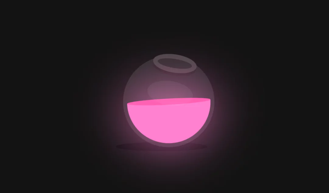
Colorful Glowing Liquid Bowl Animation Effects | Html CSS Animation Effects
Colorful Glowing Liquid Bowl Animation Effects. Html CSS Animation Effects.
Source Code:
HTML:
<!DOCTYPE html>
<html>
<head>
<title>Colorful Glowing Liquid</title>
<link rel="stylesheet" type="text/css" href="style.css">
</head>
<body>
	<section>
		<div class="shadow"></div>
		<div class="bowl">
			<div class="liquid"></div>
		</div>
	</section>
</body>
</html>
CSS:
*
{
    margin: 0;
    padding: 0;
    box-sizing: border-box;
}
section
{
    display: flex;
    justify-content: center;
    align-items: center;
    min-height: 100vh;
    background: #121212;
}
.bowl
{
    position: relative;
    width: 300px;
    height: 300px;
    background: rgba(255,255,255,0.1);
    border-radius: 50%;
    border: 8px solid transparent;
    transform-origin: bottom center;
    animation: animate 5s linear infinite;
}
@keyframes animate
{
    0%
    {
        filter: hue-rotate(0deg);
        transform: rotate(0deg);
    }
    25%
    {
        transform: rotate(15deg);
    }
    50%
    {
        transform: rotate(0deg);
    }
    75%
    {
        transform: rotate(-15deg);
    }
    100%
    {
        filter: hue-rotate(360deg);
        transform: rotate(0deg);
    }
}
.bowl::before
{
    content: '';
    position: absolute;
    top: -15px;
    left: 50%;
    transform: translateX(-50%);
    width: 40%;
    height: 30px;
    border: 15px solid #444;
    border-radius: 50%;
    box-shadow: 0 10px #222;
}
.bowl::after
{
    content: '';
    position: absolute;
    top: 40%;
    left: 50%;
    transform: translate(-50%,-50%);
    border-radius: 50%;
    width: 150px;
    height: 80px;
    background: rgba(255,255,255,0.05);
}
.liquid
{
    position: absolute;
    top: 50%;
    left: 5px;
    right: 5px;
    bottom: 5px;
    background: #41c1fb;
    border-bottom-left-radius: 150px;
    border-bottom-right-radius: 150px;
    filter: drop-shadow(0 0 80px #41c1fb);
    transform-origin: top center;
    animation: animateLiquid 5s linear infinite;
}
@keyframes animateLiquid
{
    0%
    {
        transform: rotate(0deg);
    }
    25%
    {
        transform: rotate(-20deg);
    }
    50%
    {
        transform: rotate(0deg);
    }
    75%
    {
        transform: rotate(20deg);
    }
    100%
    {
        transform: rotate(0deg);
    }
}
.liquid::before
{
    content: '';
    position: absolute;
    top: -10px;
    width: 100%;
    height: 20px;
    background: #1fa4e0;
    border-radius: 50%;
    filter: drop-shadow(0 0 80px #41c1fb);
}
.shadow
{
    position: absolute;
    top: calc(50% + 150px);
    left: 50%;
    transform: translate(-50%,-50%);
    width: 300px;
    height: 30px;
    background: rgba(0,0,0,0.5);
    border-radius: 50%;
}More Queries: