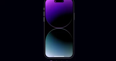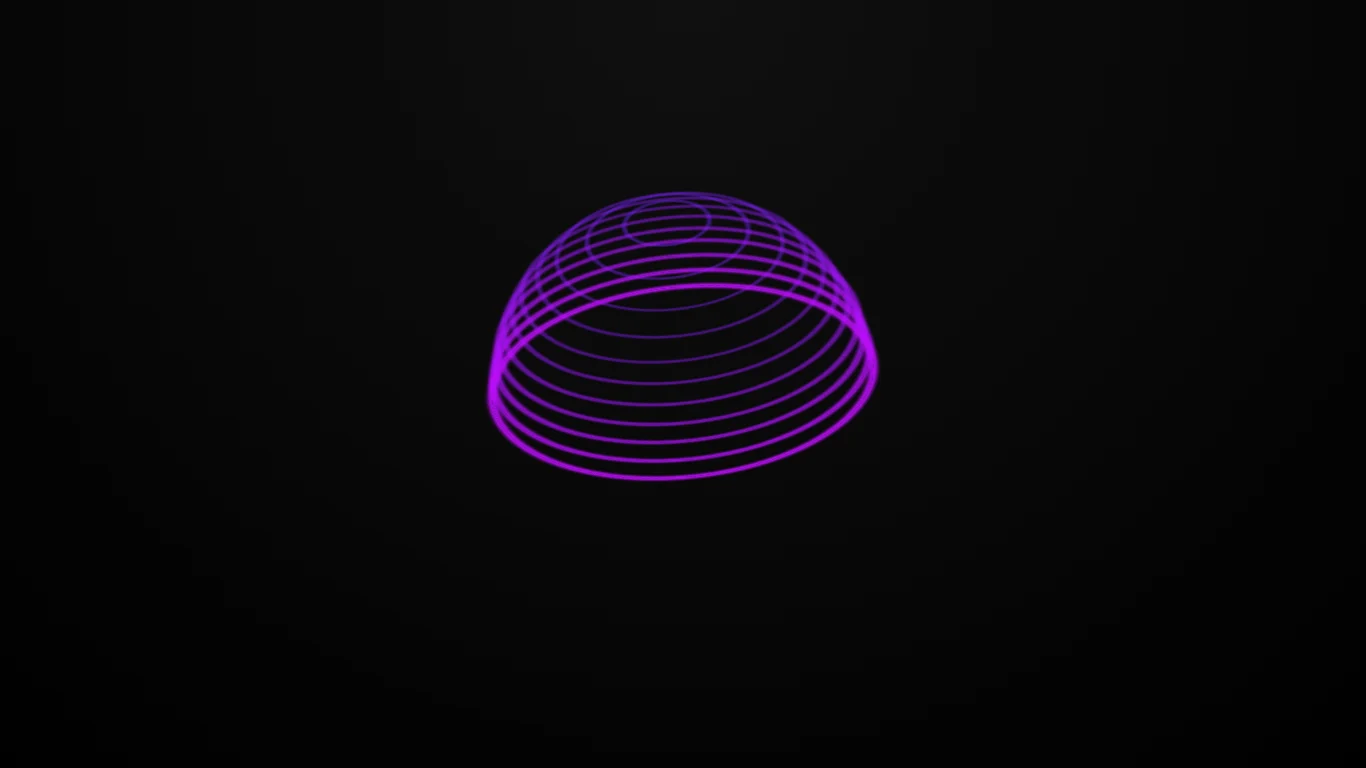
CSS Light Sphere – CSS Animation
Using HTML and CSS, we will create an animated light sphere. In this tutorial, I’ll show you how to make an animated light sphere using HTML and CSS.
The structure will be created using HTML. The styling will be added using CSS, and JavaScript will be used for specific features. Thought this project does not need any JavaScript. For additional HTML, CSS, and JavaScript projects, see our website.
Source Code:
HTML:
<!DOCTYPE html>
<html lang="en" >
<head>
  <meta charset="UTF-8">
  <title>CSS Light Sphere</title>
  <link rel="stylesheet" href="./style.css">

</head>
<body>
<!-- partial:index.partial.html -->
<div class="sphere">
	<div></div>
	<div></div>
	<div></div>
	<div></div>
	<div></div>
	<div></div>
	<div></div>
	<div></div>
	<div></div>
	<div></div>
	<div></div>
	<div></div>
	<div></div>
	<div></div>
	<div></div>
	<div></div>
	<div></div>
	<div></div>
	<div></div>
	<div></div>
	<div></div>
</div>


</body>
</html>
——————————
📂 Important Links:
——————————
>> Learn Graphics Design & Make A Successful Profession.
>> Canva Makes Graphics Design Easy.
>> Start Freelancing Today & Earn Money.
>> Make Video Editing As Your Profession.
CSS:
:root {
	--s: 4s; /*speed*/
	--d: 40; /*delay*/
	--c: #ff00e2; /*color*/
}

* {
	transform-style: preserve-3d;
	box-sizing: border-box;
}

body {
	margin: 0;
	padding: 0;
	width: 100vw;
	height: 100vh;
	overflow: hidden;
	display: flex;
	align-items: center;
	justify-content: center;
	perspective: 1000vmin;
	background: radial-gradient(circle at 50% 100%, #101010, #000);
}

.sphere {
	width: 50vmin;
	height: 50vmin;
	background: #fff0;
	position: relative;
	animation: spin 5s linear 0s infinite;
	animation-play-state: running;
	display: flex;
	align-items: center;
	justify-content: center;
	cursor: none;
}

.sphere:hover {
	animation-play-state: paused;
}

@keyframes spin {
	0% {
		transform: rotateX(-210deg) rotateY(0deg) rotatez(185deg);
	}
	100% {
		transform: rotateX(-210deg) rotateY(360deg) rotatez(185deg);
	}
}

.sphere div {
	--sz: 23%;
	--dv: calc(var(--s) / var(--d));
	--dl: calc(var(--dv) * -1);
	width: var(--sz);
	height: var(--sz);
	position: absolute;
	border: 0.25vmin solid var(--c);
	border-radius: 100%;
	transform: rotateX(90deg) translateZ(24.5vmin);
	box-shadow: 0 0 0.5vmin 0.5vmin var(--c), 0 0 0.5vmin 0.5vmin var(--c) inset;
	animation: shine var(--s) linear var(--dl) infinite reverse;
	background: #fff0;
	display: flex;
	align-items: center;
	justify-content: center;
}

@keyframes shine {
	33%,
	100% {
		border-color: #10101000;
		box-shadow: 0 0 1px 1px #10101000, 0 0 1px 1px #10101000 inset;
	}
}

.sphere div:before {
	content: "";
	width: 100%;
	height: 100%;
	position: absolute;
	border: 0.25vmin solid var(--c);
	border-radius: 100%;
	box-shadow: 0 0 0.5vmin 0.5vmin var(--c), 0 0 0.5vmin 0.5vmin var(--c) inset;
	animation: shine var(--s) linear calc(var(--dl) * -1) infinite reverse;
}

.sphere div:nth-child(2) {
	transform: rotateX(90deg) translateZ(22.5vmin);
	--sz: 43%;
	--dl: calc(var(--dv) * -2);
	filter: hue-rotate(-2deg);
}

.sphere div:nth-child(3) {
	transform: rotateX(90deg) translateZ(20vmin);
	--sz: 60%;
	--dl: calc(var(--dv) * -3);
	filter: hue-rotate(-4deg);
}

.sphere div:nth-child(4) {
	transform: rotateX(90deg) translateZ(17.5vmin);
	--sz: 71%;
	--dl: calc(var(--dv) * -4);
	filter: hue-rotate(-6deg);
}

.sphere div:nth-child(5) {
	transform: rotateX(90deg) translateZ(15vmin);
	--sz: 80%;
	--dl: calc(var(--dv) * -5);
	filter: hue-rotate(-8deg);
}

.sphere div:nth-child(6) {
	transform: rotateX(90deg) translateZ(12.5vmin);
	--sz: 86%;
	--dl: calc(var(--dv) * -6);
	filter: hue-rotate(-10deg);
}

.sphere div:nth-child(7) {
	transform: rotateX(90deg) translateZ(10vmin);
	--sz: 91%;
	--dl: calc(var(--dv) * -7);
	filter: hue-rotate(-12deg);
}

.sphere div:nth-child(8) {
	transform: rotateX(90deg) translateZ(7.5vmin);
	--sz: 95%;
	--dl: calc(var(--dv) * -8);
	filter: hue-rotate(-14deg);
}

.sphere div:nth-child(9) {
	transform: rotateX(90deg) translateZ(5vmin);
	--sz: 97%;
	--dl: calc(var(--dv) * -9);
	filter: hue-rotate(-16deg);
}

.sphere div:nth-child(10) {
	transform: rotateX(90deg) translateZ(2.5vmin);
	--sz: 99%;
	--dl: calc(var(--dv) * -10);
	filter: hue-rotate(-18deg);
}

.sphere div:nth-child(11) {
	transform: rotateX(90deg);
	--sz: 100%;
	--dl: calc(var(--dv) * -11);
	filter: hue-rotate(-20deg);
}

.sphere div:nth-child(12) {
	transform: rotateX(90deg) translateZ(-2.5vmin);
	--sz: 99%;
	--dl: calc(var(--dv) * -12);
	filter: hue-rotate(-22deg);
}

.sphere div:nth-child(13) {
	transform: rotateX(90deg) translateZ(-5vmin);
	--sz: 97%;
	--dl: calc(var(--dv) * -13);
	filter: hue-rotate(-24deg);
}

.sphere div:nth-child(14) {
	transform: rotateX(90deg) translateZ(-7.5vmin);
	--sz: 95%;
	--dl: calc(var(--dv) * -14);
	filter: hue-rotate(-26deg);
}

.sphere div:nth-child(15) {
	transform: rotateX(90deg) translateZ(-10vmin);
	--sz: 91%;
	--dl: calc(var(--dv) * -15);
	filter: hue-rotate(-28deg);
}

.sphere div:nth-child(16) {
	transform: rotateX(90deg) translateZ(-12.5vmin);
	--sz: 86%;
	--dl: calc(var(--dv) * -16);
	filter: hue-rotate(-30deg);
}

.sphere div:nth-child(17) {
	transform: rotateX(90deg) translateZ(-15vmin);
	--sz: 80%;
	--dl: calc(var(--dv) * -17);
	filter: hue-rotate(-32deg);
}

.sphere div:nth-child(18) {
	transform: rotateX(90deg) translateZ(-17.5vmin);
	--sz: 71%;
	--dl: calc(var(--dv) * -18);
	filter: hue-rotate(-34deg);
}

.sphere div:nth-child(19) {
	transform: rotateX(90deg) translateZ(-20vmin);
	--sz: 60%;
	--dl: calc(var(--dv) * -19);
	filter: hue-rotate(-36deg);
}

.sphere div:nth-child(20) {
	transform: rotateX(90deg) translateZ(-22.5vmin);
	--sz: 43%;
	--dl: calc(var(--dv) * -20);
	filter: hue-rotate(-38deg);
}

.sphere div:nth-child(21) {
	transform: rotateX(90deg) translateZ(-24.5vmin);
	--sz: 23%;
	--dl: calc(var(--dv) * -21);
	filter: hue-rotate(-40deg);
}

a {
	position: absolute;
	bottom: 1vmin;
	padding: 1vmin;
	color: var(--c);
	font-family: Arial, Helvetica, serif;
	text-decoration: none;
	font-size: 0.75em;
}

a:before {
	content: "CHECK OUT MY ";
	color: #666;
}

a:after {
	content: " COLLECTION";
	color: #666;
}

a:hover {
	color: #fff;
}