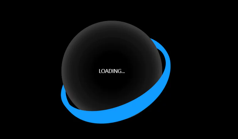
CSS Infinity Preloader
Preloaders are UI components that inform users that a website is still processing data and has not crashed. CSS loaders aid in retaining visitors to a website. Users are entertained while loading faster.
A CSS animation stays away from the image request, unlike a.gif. As a result, the loading process is sped up and less bandwidth is consumed.
We will create the structure using HTML and using CSS we will create the loading animation.
Source Code:
HTML:
<main>
	<svg class="ip" viewBox="0 0 256 128" width="256px" height="128px" xmlns="http://www.w3.org/2000/svg">
		<defs>
			<linearGradient id="grad1" x1="0" y1="0" x2="1" y2="0">
				<stop offset="0%" stop-color="#5ebd3e" />
				<stop offset="33%" stop-color="#ffb900" />
				<stop offset="67%" stop-color="#f78200" />
				<stop offset="100%" stop-color="#e23838" />
			</linearGradient>
			<linearGradient id="grad2" x1="1" y1="0" x2="0" y2="0">
				<stop offset="0%" stop-color="#e23838" />
				<stop offset="33%" stop-color="#973999" />
				<stop offset="67%" stop-color="#009cdf" />
				<stop offset="100%" stop-color="#5ebd3e" />
			</linearGradient>
		</defs>
		<g fill="none" stroke-linecap="round" stroke-width="16">
			<g class="ip__track" stroke="#ddd">
				<path d="M8,64s0-56,60-56,60,112,120,112,60-56,60-56"/>
				<path d="M248,64s0-56-60-56-60,112-120,112S8,64,8,64"/>
			</g>
			<g stroke-dasharray="180 656">
				<path class="ip__worm1" stroke="url(#grad1)" stroke-dashoffset="0" d="M8,64s0-56,60-56,60,112,120,112,60-56,60-56"/>
				<path class="ip__worm2" stroke="url(#grad2)" stroke-dashoffset="358" d="M248,64s0-56-60-56-60,112-120,112S8,64,8,64"/>
			</g>
		</g>
	</svg>
</main>
——————————
📂 Important Links:
——————————
>> Learn Graphics Design & Make A Successful Profession.
>> Canva Makes Graphics Design Easy.
>> Start Freelancing Today & Earn Money.
>> Make Video Editing As Your Profession.
Another article for you
CSS:
* {
	border: 0;
	box-sizing: border-box;
	margin: 0;
	padding: 0;
}
:root {
	--hue: 223;
	--bg: hsl(var(--hue),90%,95%);
	--fg: hsl(var(--hue),90%,5%);
	--trans-dur: 0.3s;
	font-size: calc(16px + (24 - 16) * (100vw - 320px) / (1280 - 320));
}
body {
	background-color: var(--bg);
	color: var(--fg);
	font: 1em/1.5 sans-serif;
	height: 100vh;
	display: grid;
	place-items: center;
	transition: background-color var(--trans-dur);
}
main {
	padding: 1.5em 0;
}
.ip {
	width: 16em;
	height: 8em;
}
.ip__track {
	stroke: hsl(var(--hue),90%,90%);
	transition: stroke var(--trans-dur);
}
.ip__worm1,
.ip__worm2 {
	animation: worm1 2s linear infinite;
}
.ip__worm2 {
	animation-name: worm2;
}

/* Dark theme */
@media (prefers-color-scheme: dark) {
	:root {
		--bg: hsl(var(--hue),90%,5%);
		--fg: hsl(var(--hue),90%,95%);
	}
	.ip__track {
		stroke: hsl(var(--hue),90%,15%);
	}
}

/* Animation */
@keyframes worm1 {
	from {
		stroke-dashoffset: 0;
	}
	50% {
		animation-timing-function: steps(1);
		stroke-dashoffset: -358;
	}
	50.01% {
		animation-timing-function: linear;
		stroke-dashoffset: 358;
	}
	to {
		stroke-dashoffset: 0;
	}
}
@keyframes worm2 {
	from {
		stroke-dashoffset: 358;
	}
	50% {
		stroke-dashoffset: 0;
	}
	to {
		stroke-dashoffset: -358;
	}
}