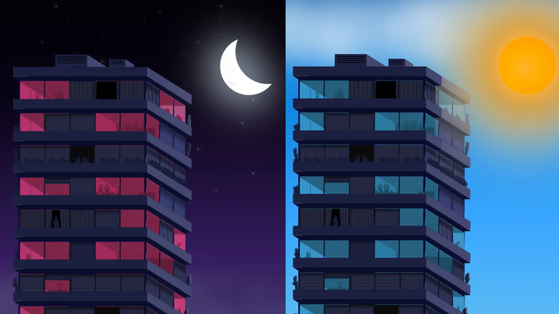
CSS Life – Day and Night Transaction With Pure CSS
CSS is amazing. Using CSS we can create many creative things. In this article, we will see how to create a day and night transaction with pure CSS.
Of course we will create the structure using HTML. And using CSS will will create the stylings. For more HTML & CSS Project check our website.
Source Code:
HTML:
<input type="checkbox" id="day-night"><label for="day-night"></label>

<div class="content">

	<div class="moon-sun"></div>

	<div class="cuboid floor one">
		<div class="side"></div>
		<div class="side"></div>
		<div class="side"></div>
		<div class="side"></div>
		<div class="side"></div>
		<div class="side"></div>
	</div>
	<div class="cuboid roof one">
		<div class="side"><i class="cactus"></i></div>
		<div class="side"></div>
		<div class="side"></div>
		<div class="side"></div>
		<div class="side"></div>
		<div class="side"></div>
	</div>
	<div class="cuboid floor two">
		<div class="side"><span><i class="flowers"></i></span></div>
		<div class="side"></div>
		<div class="side"><span></span></div>
		<div class="side"></div>
		<div class="side"></div>
		<div class="side"></div>
	</div>
	<div class="cuboid roof two">
		<div class="side"><i class="bush"></i></div>
		<div class="side"></div>
		<div class="side"><i class="bush"></i></div>
		<div class="side"></div>
		<div class="side"></div>
		<div class="side"></div>
	</div>
	<div class="cuboid floor three">
		<div class="side"></div>
		<div class="side"></div>
		<div class="side"><span></span></div>
		<div class="side"></div>
		<div class="side"></div>
		<div class="side"></div>
	</div>
	<div class="cuboid roof three">
		<div class="side"></div>
		<div class="side"></div>
		<div class="side"></div>
		<div class="side"></div>
		<div class="side"></div>
		<div class="side"></div>
	</div>
	<div class="cuboid floor four">
		<div class="side"><i class="man"></i></div>
		<div class="side"></div>
		<div class="side"><span></span></div>
		<div class="side"></div>
		<div class="side"></div>
		<div class="side"></div>
	</div>
	<div class="cuboid roof four">
		<div class="side"><i class="bush"></i></div>
		<div class="side"></div>
		<div class="side"></div>
		<div class="side"></div>
		<div class="side"></div>
		<div class="side"></div>
	</div>
	<div class="cuboid floor five">
		<div class="side"><i class="cactus2"></i><i class="cactus2"></i><span></span></div>
		<div class="side"></div>
		<div class="side"><span></span></div>
		<div class="side"></div>
		<div class="side"></div>
		<div class="side"></div>
	</div>
	<div class="cuboid roof five">
		<div class="side"><i class="cactus"></i></div>
		<div class="side"></div>
		<div class="side"></div>
		<div class="side"></div>
		<div class="side"></div>
		<div class="side"></div>
	</div>
	<div class="cuboid floor six">
		<div class="side"><span><i class="cat"></i><i class="cat"></i></span></div>
		<div class="side"></div>
		<div class="side"></div>
		<div class="side"></div>
		<div class="side"></div>
		<div class="side"></div>
	</div>
	<div class="cuboid roof six">
		<div class="side"><i class="bush"></i></div>
		<div class="side"></div>
		<div class="side"><i class="cactus"></i></div>
		<div class="side"></div>
		<div class="side"></div>
		<div class="side"></div>
	</div>
	<div class="cuboid floor seven">
		<div class="side"><i class="plant"></i></div>
		<div class="side"></div>
		<div class="side"><span></span></div>
		<div class="side"></div>
		<div class="side"></div>
		<div class="side"></div>
	</div>
	<div class="cuboid roof seven">
		<div class="side"></div>
		<div class="side"></div>
		<div class="side"></div>
		<div class="side"></div>
		<div class="side"></div>
		<div class="side"></div>
	</div>
	<div class="cuboid floor eight">
		<div class="side"><i class="plant"></i><i class="man"></i></div>
		<div class="side"></div>
		<div class="side"><span></span></div>
		<div class="side"></div>
		<div class="side"></div>
		<div class="side"></div>
	</div>
	<div class="cuboid roof eight">
		<div class="side"></div>
		<div class="side"></div>
		<div class="side"></div>
		<div class="side"></div>
		<div class="side"></div>
		<div class="side"></div>
	</div>
	<div class="cuboid air-cooler">
		<div class="side"></div>
		<div class="side"></div>
		<div class="side"></div>
		<div class="side"></div>
		<div class="side"></div>
		<div class="side"></div>
	</div>
	<div class="cuboid air-cooler">
		<div class="side"></div>
		<div class="side"></div>
		<div class="side"></div>
		<div class="side"></div>
		<div class="side"></div>
		<div class="side"></div>
	</div>
	<div class="lights"></div>
	<div class="clouds"></div>

</div>
——————————
📂 Important Links:
——————————
>> Learn Graphics Design & Make A Successful Profession.
>> Canva Makes Graphics Design Easy.
>> Start Freelancing Today & Earn Money.
>> Make Video Editing As Your Profession.
Another CSS Project For You.
CSS:
@property --glass {
	syntax: "<angle>";
	inherits: false;
	initial-value: 337deg;
}

* {
	transform-style: preserve-3d;
	box-sizing: border-box;
}

body {
	margin: 0;
	padding: 0;
	width: 100vw;
	height: 100vh;
	overflow: hidden;
	display: flex;
	align-items: flex-end;
	justify-content: center;
	--cbz: cubic-bezier(0.68, -0.55, 0.27, 1.55);
}

.content {
	--frame: #070b32;
	--bush: #181b38;
	--dot1: radial-gradient(
		circle at 50% 50%,
		var(--bush) 0 0.25vmin,
		#fff0 calc(0.25vmin + 1px) 100%
	);
	--dot2: radial-gradient(
		circle at 50% 50%,
		var(--bush) 0 0.5vmin,
		#fff0 calc(0.5vmin + 1px) 100%
	);
	--dot3: radial-gradient(
		circle at 50% 50%,
		var(--bush) 0 1.15vmin,
		#fff0 calc(1.15vmin + 1px) 100%
	);
	--glass: 337deg;
	--luz1: hsl(var(--glass) 60% 50% / 60%);
	--luz2: hsl(var(--glass) 54% 32%);
	--luz3: hsl(var(--glass) 54% 25%);
	transition: --glass 3s;
	width: 80vmin;
	height: 100vh;
	display: flex;
	align-items: flex-end;
	justify-content: center;
	animation: start-glass 3s var(--cbz) 0s 1;
}

@keyframes start-glass {
	0% {
		--glass: 200deg;
	}
	100% {
		--glass: 337deg;
	}
}

.content:before {
	content: "";
	position: absolute;
	width: 100vw;
	height: 100%;
	background: linear-gradient(
		180deg,
		#000,
		#080212,
		#341c5e,
		#50587e,
		#0079d9,
		#39a7ff,
		#70c6ed 100%
	);
	background-repeat: no-repeat;
	background-size: 100% 300%;
	background-position: 0% 10%;
	transform: translateZ(-100vmin);
	transition: all 3s var(--cbz) 0s;
	animation: start-bg 3s var(--cbz) 0s 1;
}

.content:after {
	content: "";
	position: absolute;
	width: 100vw;
	height: 200%;
	--s1: radial-gradient(0.1vmin 0.1vmin at 50% 50%, #ffffff, #fff0);
	--s2: radial-gradient(0.2vmin 0.2vmin at 50% 50%, #ffffff, #fff0);
	background-image: var(--s1), var(--s1), var(--s1), var(--s2), var(--s2),
		var(--s1), var(--s2), var(--s1), var(--s2), var(--s1), var(--s2), var(--s1),
		var(--s2), var(--s1), var(--s1), var(--s2), var(--s2), var(--s1), var(--s1),
		var(--s2), var(--s1), var(--s1);
	background-repeat: repeat-x;
	background-size: 26% 25%, 43.33% 33.33%, 50% 80%, 20% 20%, 33.33% 75.33%,
		26% 73%, 39.33% 22%, 33.33% 26%, 31% 32%, 14.33% 35.33%, 18.33% 62.33%,
		39.33% 86.33%, 29.33% 69%, 12.33% 30.33%, 29.33% 41.33%, 22.33% 46.33%,
		35.33% 27.33%, 22.33% 39.33%, 20.33% 44.33%, 33.33% 56.33%;
	filter: drop-shadow(0px 0px 2px #fff) drop-shadow(0px 0px 5px #fff);
	background-position: -8% -10%;
	transform: translateZ(-100vmin);
	transition: all 3s var(--cbz) 0s;
	top: -16vmin;
	animation: start-stars 3s var(--cbz) 0s 1;
}

input#day-night:checked ~ .content:before {
	background-position: 0% 90%;
	transition: all 3s var(--cbz) 0s;
}

input#day-night:checked ~ .content:after {
	top: -100%;
	transition: all 3s var(--cbz) 0s;
}

@keyframes start-stars {
	0% {
		top: -100%;
	}
	100% {
		top: 0%;
	}
}

@keyframes start-bg {
	0% {
		background-position: 0% 90%;
	}
	100% {
		background-position: 0% 10%;
	}
}

.moon-sun {
	position: absolute;
	width: 18vmin;
	height: 18vmin;
	bottom: 70vmin;
	margin-left: 90vmin;
	border-radius: 100%;
	background-repeat: no-repeat;
	animation: change-sm 3s var(--cbz) 0s 1;
	animation-fill-mode: forwards;
	background: radial-gradient(
		circle at 45% 55%,
		#fff -13%,
		yellow 35%,
		orange 90%,
		#fff0 90%
	);
	box-shadow: 0 0 6em 3em #ff9800, 0 0 8em 0 #ff9800 inset, 0 0 20px 5px #fdfdfd;
	--moon: radial-gradient(circle at 26% 71%, #ffffff 8%, #fff0 12%),
		radial-gradient(circle at 23% 75%, #ccc 0% 1%, #fff0 10%),
		radial-gradient(circle at 14% 42%, #fdfdfd 7%, #fff0 11%),
		radial-gradient(circle at 12% 45%, #ccc 0%, #fff0 7%),
		radial-gradient(circle at 23% 57%, #f9f9f9 2%, #fff0 6%),
		radial-gradient(circle at 22% 58%, #ccc -2%, #fff0 4%),
		radial-gradient(circle at 83% 25%, #fff0 10vmin, #fff calc(10vmin + 1px));
	filter: drop-shadow(0px 1px 6vmin #6493a9) drop-shadow(0px 1px 6vmin #fdfdfd);
}

input#day-night:checked ~ .content .moon-sun {
	animation: change-ms 3s var(--cbz) 0s 1 reverse;
	animation-fill-mode: forwards;
}

@keyframes change-sm {
	0% {
		bottom: 70vmin;
	}
	45%,
	55% {
		bottom: -35vmin;
	}
	49% {
		background: #ffeb3b;
		filter: drop-shadow(0px 1px 6vmin #ff9800) drop-shadow(0px 1px 6vmin #fdfdfd);
	}
	50% {
		background: var(--moon);
	}
	100% {
		bottom: 70vmin;
		background: var(--moon);
		filter: drop-shadow(0px 1px 6vmin #6493a9) drop-shadow(0px 1px 6vmin #fdfdfd);
		box-shadow: none;
	}
}

@keyframes change-ms {
	0% {
		bottom: 70vmin;
	}
	45%,
	55% {
		bottom: -35vmin;
	}
	49% {
		background: #ffeb3b;
		filter: drop-shadow(0px 1px 6vmin #ff9800) drop-shadow(0px 1px 6vmin #fdfdfd);
	}
	50% {
		background: var(--moon);
	}
	100% {
		bottom: 70vmin;
		background: var(--moon);
		filter: drop-shadow(0px 1px 6vmin #6493a9) drop-shadow(0px 1px 6vmin #fdfdfd);
		box-shadow: none;
	}
}

/*** CUBOID ***/

.cuboid {
	--width: 20;
	--depth: 20;
	--height: 20;
	--hue: 235;
	--sat: 25%;
	height: calc(var(--height) * 1vmin);
	width: calc(var(--width) * 1vmin);
	position: absolute;
	transform: rotateY(-8deg) rotateX(5deg) translateZ(-24vmin);
}

.cuboid .side {
	position: absolute;
	top: 50%;
	left: 50%;
	height: 100%;
	width: 100%;
	border-radius: 1px;
}

.cuboid .side:nth-of-type(1) {
	--sat: 40%;
	transform: translate3d(-50%, -50%, calc(var(--depth) * 0.5vmin));
	background: hsl(var(--hue), var(--sat), 18%);
}
.cuboid .side:nth-of-type(2) {
	transform: translate3d(-50%, -50%, calc(var(--depth) * -0.5vmin))
		rotateY(180deg);
	background: hsl(var(--hue), var(--sat), 35%);
}
.cuboid .side:nth-of-type(3) {
	width: calc(var(--depth) * 1vmin);
	transform: translate(-50%, -50%) rotateY(90deg)
		translate3d(0, 0, calc(var(--width) * 0.5vmin));
	background: hsl(var(--hue), var(--sat), 35%);
}
.cuboid .side:nth-of-type(4) {
	width: calc(var(--depth) * 1vmin);
	transform: translate(-50%, -50%) rotateY(-90deg)
		translate3d(0, 0, calc(var(--width) * 0.5vmin));
	background: hsl(var(--hue), var(--sat), 40%);
}
.cuboid .side:nth-of-type(5) {
	--sat: 60%;
	height: calc(var(--depth) * 1vmin);
	transform: translate(-50%, -50%) rotateX(90deg)
		translate3d(0, 0, calc(var(--height) * 0.5vmin));
	background: hsl(var(--hue), var(--sat), 10%);
}
.cuboid .side:nth-of-type(6) {
	--sat: 60%;
	height: calc(var(--depth) * 1vmin);
	transform: translate(-50%, -50%) rotateX(-90deg)
		translate3d(0, 0, calc(var(--height) * 0.5vmin));
	background: hsl(var(--hue), var(--sat), 10%);
}

/*** FLOOR ***/

.floor {
	--width: 40;
	--depth: 89;
	--height: 8;
	bottom: -5vmin;
	left: 16vmin;
	--lines-front: repeating-linear-gradient(
		90deg,
		var(--luz1) 0% calc(100% - 0.275vmin),
		var(--frame) calc(100% - 0.275vmin) 100%
	);
	--lines-side: repeating-linear-gradient(
		90deg,
		var(--luz1) 0% calc(100% - 1.5vmin),
		var(--frame) calc(100% - 1.5vmin) 100%
	);
}

.floor .side {
	border: 3px solid var(--frame);
}

.floor.two {
	bottom: 5vmin;
}
.floor.three {
	bottom: 15vmin;
}
.floor.four {
	bottom: 25vmin;
}
.floor.five {
	bottom: 35vmin;
}
.floor.six {
	bottom: 45vmin;
}
.floor.seven {
	bottom: 55vmin;
}
.floor.eight {
	bottom: 65vmin;
}

.floor .side:nth-of-type(1) {
	background: conic-gradient(from 116deg at 0 0, var(--luz2) 0 25%, #fff0 0 100%),
		linear-gradient(31deg, #fff0 60%, var(--luz2) 61%),
		linear-gradient(31deg, #fff0 20%, var(--luz2) 21%),
		linear-gradient(31deg, var(--luz1) 65%, var(--luz2) 21%),
		linear-gradient(
			90deg,
			var(--luz1) 19.5%,
			#fff0 19.5% 20%,
			var(--luz1) 20.5% 39.5%,
			#fff0 40% 61%,
			var(--luz3) 61% 80.25%,
			#fff0 80% 81%,
			var(--luz2) 81% 100%
		);
	background-size: 2.5% 51%, 19.5% 100%, 19.5% 100%, 19.5% 100%, 100% 100%;
	background-repeat: no-repeat;
	background-position: 79.75% 100%, 0 0, 25% 0, 75.4% 0, 0 0;
}

.floor .side:nth-of-type(3) {
	background: var(--lines-side), hsl(var(--hue) var(--sat) 75% / 0.5);
	background-size: 35.45% 100%;
}

.floor .side:nth-of-type(4) {
	background: var(--lines-side), hsl(var(--hue) var(--sat) 40% / 0.5);
	background-size: 35.45% 100%;
}

/*** ROOF ***/

.roof {
	--height: 3;
	--width: 42;
	--depth: 100;
	bottom: 3vmin;
	left: 16vmin;
	transform: rotateY(-8deg) rotateX(5deg) translateZ(-18vmin);
}

.roof.two {
	bottom: 13vmin;
}
.roof.three {
	bottom: 23vmin;
}
.roof.four {
	bottom: 33vmin;
}
.roof.five {
	bottom: 43vmin;
}
.roof.six {
	bottom: 53vmin;
}
.roof.seven {
	bottom: 63vmin;
}
.roof.eight {
	bottom: 73vmin;
}

/*** AIR COOLER ***/

.air-cooler {
	--height: 3.9;
	--width: 10;
	--depth: 52;
	bottom: 78.5vmin;
	left: 25vmin;
}

.air-cooler + .air-cooler {
	--height: 2.4;
	--width: 5;
	--depth: 20;
	bottom: 78.5vmin;
	left: 42vmin;
	transform: rotateY(-8deg) rotateX(5deg) translateZ(-7vmin);
}

.air-cooler .side:nth-of-type(1) {
	border: 1px solid #0002;
}

.air-cooler .side:nth-of-type(1):before {
	content: "";
	width: calc(100% - 1vmin);
	height: calc(100% - 1vmin);
	position: absolute;
	background: repeating-linear-gradient(180deg, #000, #0a0d29, #434770cc);
	margin: 0.5vmin;
	background-size: 100% 25%;
}

/*** WINDOWS ***/

span {
	background: linear-gradient(32deg, #fff0 17%, var(--luz2) 19%), var(--luz1);
	position: absolute;
	width: 20%;
	height: 100%;
	left: 20%;
}

/* F 2 */
.floor.two .side span:before,
.floor.five .side span:before {
	content: "";
	position: absolute;
	width: calc(100% + 2px);
	height: 30%;
	top: -1px;
	left: -1px;
	background: repeating-linear-gradient(180deg, black, #383e70);
	background-size: 100% 0.35vmin;
	box-shadow: 0.01vmin 0.75vmin 0.15vmin 0.125vmin #0005 inset;
}

/*** BLINDS ***/

.floor .side:nth-of-type(1):before,
.floor .side:nth-of-type(1):after,
.floor .side:nth-of-type(3):before,
.floor .side:nth-of-type(3):after {
	position: absolute;
	content: "";
	width: 40%;
	height: 100%;
	left: 20%;
	background: repeating-linear-gradient(180deg, #101010, transparent),
		repeating-linear-gradient(
			90deg,
			#383e70 0 calc(100% - 0.25vmin),
			var(--frame) calc(100% - 0.25vmin) 100%
		);
	background-size: 100% 0.365vmin, 8vmin 100%;
}

.floor .side:nth-of-type(1):after {
	width: 20%;
	left: 80.25%;
}

/* F 1 */
.floor.one .side:nth-of-type(1):before,
.floor.one .side:nth-of-type(1):after {
	box-shadow: 0vmin 0.65vmin 0.25vmin 0.25vmin #0006 inset;
}
.floor.one .side:nth-of-type(1):after {
	box-shadow: 0vmin 0.65vmin 0.25vmin 0.25vmin #0006 inset,
		-7.75vmin 0 0 0 #0a0a0a;
}

/* F 2 */
.floor.two .side:nth-of-type(1):before {
	width: 59.5%;
	left: 40.75%;
	box-shadow: 0.2vmin 0.5vmin 0.25vmin 0.25vmin #0006 inset;
}
.floor.two .side:nth-of-type(1):after {
	width: 20%;
	left: -1px;
	box-shadow: none;
	box-shadow: 0vmin 0.65vmin 0.25vmin 0.25vmin #0006 inset;
	background-color: #3d4176;
}

/* F 3 */
.floor.three .side:nth-of-type(1):after {
	background: #1c1f3e;
	left: 40.25%;
	width: 19.75%;
	box-shadow: 0.2vmin 0.525vmin 0.5vmin 0.125vmin #0006 inset;
}

.floor.three .side:nth-of-type(1):before {
	display: none;
}

/* F 4 */
.floor.four .side:nth-of-type(1):before,
.floor.eight .side:nth-of-type(1):before {
	position: absolute;
	content: "";
	width: 60%;
	height: 100%;
	left: 40%;
	--luz1: #434770;
	--lines-front: repeating-linear-gradient(
		90deg,
		var(--luz1) 0% calc(100% - 0.275vmin),
		var(--frame) calc(100% - 0.275vmin) 100%
	);
	background: repeating-linear-gradient(90deg, black, transparent),
		linear-gradient(91deg, #fff0 35%, #000 calc(36% + 1px) 52%, #fff0 52%),
		linear-gradient(-91deg, #fff0 36%, #000 calc(37% + 1px) 55%, #fff0 55%),
		var(--lines-front), repeating-linear-gradient(90deg, #364e69, #141f59);
	background-size: 0.35vmin 100%, 100% 100%, 100% 100%, 33.6% 100%, 4% 100%;
	z-index: 1;
}

.floor.four .side:nth-child(1):after {
	box-shadow: 0.05vmin 0.7vmin 0.25vmin 0.125vmin #0006 inset,
		7.5vmin -7.3vmin 0 0 #0a0d29;
	left: -1px;
	width: 81%;
}

.floor.four .side:nth-of-type(1):before {
	background: repeating-linear-gradient(90deg, black, transparent),
		linear-gradient(94deg, #fff0 41%, #000 calc(42% + 1px) 52%, #fff0 52%),
		linear-gradient(-95deg, #fff0 45%, #000 calc(46% + 1px) 55%, #fff0 55%),
		var(--lines-front), repeating-linear-gradient(90deg, #364e69, #141f59);
	background-size: 0.375vmin 100%, 100% 100%, 100% 100%, 33.6% 100%, 4% 100%;
	left: 0;
}

.roof.four .side:nth-child(1):before {
	content: "";
	position: absolute;
	width: 25%;
	height: 3vmin;
	top: -3vmin;
	left: 25vmin;
	background: radial-gradient(
			circle at 13% 98%,
			var(--luz3) 0.5vmin,
			#fff0 calc(0.5vmin + 1px)
		),
		radial-gradient(
			circle at 11% 79%,
			var(--luz3) 0.25vmin,
			#fff0 calc(0.25vmin + 1px)
		),
		radial-gradient(
			circle at 16% 84%,
			var(--luz3) 0.125vmin,
			#fff0 calc(0.125vmin + 1px)
		),
		radial-gradient(
			circle at 21% 95%,
			var(--luz3) 0.25vmin,
			#fff0 calc(0.25vmin + 1px)
		),
		radial-gradient(
			circle at 25% 98%,
			var(--luz3) 0.25vmin,
			#fff0 calc(0.25vmin + 1px)
		),
		radial-gradient(
			circle at 28% 91%,
			var(--luz3) 0.175vmin,
			#fff0 calc(0.175vmin + 1px)
		),
		radial-gradient(
			circle at 30% 84%,
			var(--luz3) 0.175vmin,
			#fff0 calc(0.175vmin + 1px)
		),
		radial-gradient(
			circle at 10% 70%,
			var(--luz3) 0.175vmin,
			#fff0 calc(0.175vmin + 1px)
		);
	background-repeat: no-repeat;
	filter: drop-shadow(2vmin 0vmin 0px var(--luz3))
		drop-shadow(3vmin 0vmin 0px var(--luz3));
}

/* F 5 */
.floor.five .side:nth-of-type(1):before {
	width: 19.25%;
	left: 40.75%;
}

.floor.five .side:nth-child(1) span:after {
	content: "";
	position: absolute;
	width: 2vmin;
	height: 2vmin;
	top: 4.85vmin;
	left: 29.7vmin;
	background: var(--luz3);
	background-size: 100% 0.35vmin;
	box-shadow: -2px -20.1vmin 0 0 var(--luz3);
	color: #601d44;
	z-index: 3;
	transform: translateZ(1.8vmin);
}

.floor.five .side:nth-of-type(1):after {
	display: none;
}

.roof.five .side:nth-child(-n + 4):before {
	content: "";
	position: absolute;
	width: 100%;
	height: 3vmin;
	top: -3vmin;
	background: var(--dot3), var(--dot2), var(--dot1), var(--dot1), var(--dot1),
		var(--dot1), var(--dot1), var(--dot1);
	background-position: -16.2vmin 1.825vmin, -16.7vmin 0.5vmin,
		-15.72vmin 0.65vmin, -17.57vmin 0.5vmin, -17.2vmin 0.25vmin, -16.5vmin 0.1vmin,
		-17.4vmin 0.95vmin, -15.175vmin 0.95vmin;
	background-repeat: no-repeat;
	filter: drop-shadow(16px 0px 0px var(--bush))
		drop-shadow(24vmin 0px 0px var(--bush)) drop-shadow(8vmin 0px 0px var(--bush));
}

/* F 6 */
.floor.six .side:nth-of-type(1):before {
	left: -0.1vmin;
	box-shadow: 0.025vmin 0.7vmin 0.25vmin 0.125vmin #0006 inset;
	width: 40.25%;
	background: repeating-linear-gradient(90deg, #101010, transparent),
		repeating-linear-gradient(
			90deg,
			#383e70 0 calc(100% - 0.25vmin),
			var(--frame) calc(100% - 0.25vmin) 100%
		);
	background-size: 0.25vmin 100%, 8vmin 100%;
}

.floor.six .side:nth-of-type(1):after {
	left: 60%;
	width: 40%;
	background: repeating-linear-gradient(90deg, #101010, transparent),
		repeating-linear-gradient(
			90deg,
			#383e70 0 calc(100% - 0.25vmin),
			var(--frame) calc(100% - 0.25vmin) 100%
		);
	background-size: 0.25vmin 100%, 8vmin 100%;
}

.floor.six .side span {
	left: 40.5%;
	width: 19%;
	background: #0a0a0a;
}

/* F 7 */
.floor.seven .side:nth-of-type(1):after {
	display: none;
}

.floor.seven .side:nth-of-type(1):before {
	box-shadow: 0.15vmin 0.65vmin 0.25vmin 0.125vmin #0006 inset;
}

/* F 8 */
.floor.eight .side:nth-of-type(1):after {
	width: 60%;
	left: 40%;
	box-shadow: 0.025vmin 0.65vmin 0.5vmin 0.25vmin #0006 inset;
	background: repeating-linear-gradient(180deg, black, transparent);
	background-size: 100% 4%;
}

/***  RIGHT SIDE  ***/

.floor .side:nth-of-type(3):before,
.floor .side:nth-of-type(3):after {
	width: 33.95%;
	box-shadow: 0.025vmin 1.75vmin 0.4vmin 0.125vmin #0006 inset;
	background-size: 100% 0.365vmin, 33vmin 100%;
	filter: brightness(1.25);
}

/* F 1 */
.floor.one .side:nth-of-type(3):before,
.floor.two .side:nth-of-type(3):before {
	left: 0;
}
.floor.one .side:nth-of-type(3):after,
.floor.two .side:nth-of-type(3):after {
	left: 35.25%;
}

/* F 2 */
.floor.two .side:nth-of-type(3) span,
.floor.four .side:nth-of-type(3) span {
	left: 71%;
	width: 29%;
	background: linear-gradient(-5deg, #fff0 76%, var(--luz2) calc(76% + 1px)),
		var(--luz1);
}
.floor.two .side:nth-of-type(3) span:before {
	width: 5vmin;
	bottom: 0.8vmin;
	top: inherit;
	background: var(--luz2);
	box-shadow: none;
	left: 10vmin;
}

/* F 3 */
.floor.three .side:nth-of-type(3):before,
.floor.three .side:nth-of-type(3):after {
	left: 70.75%;
	width: 29.25%;
}

.floor.three .side:nth-of-type(3) span {
	width: 69.5%;
	left: 0;
	background: #fff0;
}

.floor.three .side:nth-of-type(3) span:before,
.floor.three .side:nth-of-type(3) span:after {
	content: "";
	position: absolute;
	width: 48.5%;
	height: 100%;
	left: 0;
	background: linear-gradient(
			175.25deg,
			var(--luz2) 51.5%,
			var(--luz3) calc(51.5% + 1px)
		),
		var(--luz1);
}

.floor.three .side:nth-of-type(3) span:after {
	left: 51%;
	background: linear-gradient(
			175.25deg,
			var(--luz2) 25%,
			var(--luz3) calc(25% + 1px)
		),
		var(--luz1);
}

/* F 4 */
.floor.four .side:nth-of-type(3):before,
.floor.four .side:nth-of-type(3):after {
	left: 35.25%;
	background: repeating-linear-gradient(90deg, #1d1e26, transparent),
		repeating-linear-gradient(
			90deg,
			#383e70 0 calc(100% - 0.25vmin),
			var(--frame) calc(100% - 0.25vmin) 100%
		);
	background-size: 2.5vmin 100%, 33vmin 100%;
}

.floor.four .side:nth-of-type(3):after {
	left: 0%;
	background: var(--luz3);
	box-shadow: none;
}

.floor.four .side:nth-of-type(3) span:before {
	content: "";
	position: absolute;
	width: 2vmin;
	bottom: -0.85vmin;
	border: 2.25vmin solid #fff0;
	border-left: 5.5vmin solid var(--luz2);
	border-top: 0.5vmin solid #fff0;
	left: 6.5vmin;
	height: 1vmin;
	border-radius: 100%;
	transform: rotate(-9deg);
	filter: drop-shadow(0px 2px 0px var(--luz2));
}

.floor.four .side:nth-of-type(3) span:after {
	content: "";
	position: absolute;
	width: 3.5vmin;
	bottom: 2.55vmin;
	background: var(--luz2);
	left: 12.02vmin;
	height: 0.65vmin;
	border-radius: 100%;
}

/* F 5 */
.floor.five .side:nth-of-type(3):before,
.floor.seven .side:nth-of-type(3):before {
	left: 35.25%;
	width: 34.25%;
	top: -1px;
	background: #2c315a;
	box-shadow: -1.975vmin 1.75vmin 1.5vmin 0.125vmin #0005 inset,
		0.025vmin 1.75vmin 0.4vmin 0.125vmin #0002 inset;
}

.floor.five .side:nth-of-type(3):after,
.floor.seven .side:nth-of-type(3):after {
	left: 70.75%;
	width: 29.25%;
	top: -1px;
	background: #2c315a;
	box-shadow: -1.975vmin 1.75vmin 1.5vmin 0.125vmin #0005 inset,
		0.025vmin 1.75vmin 0.4vmin 0.125vmin #0002 inset;
}

.roof.five .side:nth-child(3):before {
	filter: drop-shadow(3vmin 0px 0px var(--bush))
		drop-shadow(6vmin 0px 0px var(--bush)) drop-shadow(10vmin 0px 0px var(--bush))
		drop-shadow(-30vmin 0px 0px var(--bush))
		drop-shadow(30vmin 1px 0px var(--bush)) drop-shadow(25px -2px 0px var(--bush))
		drop-shadow(25px 0px 0px var(--bush));
}

.floor.five .side:nth-of-type(3) span,
.floor.seven .side:nth-of-type(3) span {
	left: 0%;
	width: 33.5%;
	background: conic-gradient(
		from 180deg at 70% 40%,
		var(--luz3) 0 23.65%,
		var(--luz2) 0 100%
	);
}

.floor.five .side:nth-of-type(3) span:before {
	display: none;
	left: 0%;
	bottom: 2vmin;
	top: inherit;
	width: 66%;
	background: var(--luz3);
	box-shadow: none;
}

/* F 6 */
.floor.six .side:nth-of-type(3):before,
.floor.six .side:nth-of-type(3):after {
	left: 0;
	background: repeating-linear-gradient(90deg, #1d1e26, transparent),
		repeating-linear-gradient(
			90deg,
			#383e70 0 calc(100% - 0.25vmin),
			var(--frame) calc(100% - 0.25vmin) 100%
		);
	background-size: 1.85vmin 100%, 33vmin 100%;
}

.floor.six .side:nth-of-type(3):after {
	left: 35.25%;
}

/* F 8 */
.floor.eight .side:nth-of-type(3):before {
	left: 0;
	background: repeating-linear-gradient(90deg, #101010, transparent),
		repeating-linear-gradient(
			90deg,
			#383e70 0 calc(100% - 0.25vmin),
			var(--frame) calc(100% - 0.25vmin) 100%
		);
	background-size: 2.55vmin 100%, 33vmin 100%;
}

.floor.eight .side:nth-of-type(3):after {
	left: 64vmin;
	bottom: -19.85vmin;
	width: 29.65%;
	background: repeating-linear-gradient(90deg, #1d1e26, transparent),
		repeating-linear-gradient(
			90deg,
			#383e70 0 calc(100% - 0.25vmin),
			var(--frame) calc(100% - 0.25vmin) 100%
		);
	background-size: 1.85vmin 100%, 33vmin 100%;
}

.floor.eight .side:nth-of-type(3) span {
	width: 66%;
	left: 36%;
	background: linear-gradient(32deg, #fff0 17%, var(--luz2) 19%), var(--luz1);
	background: #fff0;
	background: radial-gradient(
			ellipse at 30% 72%,
			var(--luz2) 2.5vmin,
			#fff0 3.5vmin
		),
		radial-gradient(circle at 30% 72%, var(--luz2) 1vmin, #fff0 1vmin),
		radial-gradient(circle at 34% 73%, var(--luz2) 1vmin, #fff0 1vmin),
		radial-gradient(circle at 32% 75%, var(--luz2) 1vmin, #fff0 1vmin),
		radial-gradient(circle at 25% 75%, var(--luz2) 1vmin, #fff0 1vmin),
		radial-gradient(circle at 21% 80%, var(--luz2) 1vmin, #fff0 1vmin),
		radial-gradient(ellipse at 73% 72%, var(--luz2) 3.5vmin, #fff0 4.5vmin),
		radial-gradient(circle at 69% 70%, var(--luz2) 1vmin, #fff0 1vmin),
		radial-gradient(circle at 75% 73%, var(--luz2) 1vmin, #fff0 1vmin),
		radial-gradient(circle at 65% 75%, var(--luz2) 1vmin, #fff0 1vmin),
		radial-gradient(circle at 82% 75%, var(--luz2) 1vmin, #fff0 1vmin),
		radial-gradient(circle at 78% 74%, var(--luz2) 1vmin, #fff0 1vmin);
	background-repeat: no-repeat;
}

.floor.eight .side:nth-of-type(3) span:before,
.floor.eight .side:nth-of-type(3) span:after {
	content: "";
	position: absolute;
	width: 50.75%;
	height: 100%;
	left: -5px;
	background: linear-gradient(-5deg, #fff0 48.5%, var(--luz2) calc(48.5% + 1px));
}

.floor.eight .side:nth-of-type(3) span:after {
	content: "";
	position: absolute;
	width: 43%;
	height: 100%;
	left: 53%;
	background: linear-gradient(-5deg, #fff0 75%, var(--luz2) calc(75% + 1px));
}

/*** MAN ***/
i.man {
	background: radial-gradient(
			circle at 50% 0.4vmin,
			var(--bush) 0 0.35vmin,
			#fff0 calc(0.35vmin + 1px) 100%
		),
		radial-gradient(
			circle at 50% 0.35vmin,
			#0c0d1c 0 0.35vmin,
			#fff0 calc(0.35vmin + 1px) 100%
		),
		conic-gradient(from 137deg at 50% 0.51vmin, var(--bush) 0 25%, #fff0 0 100%);
	width: 1.5vmin;
	height: 3.5vmin;
	position: absolute;
	bottom: 1.25vmin;
	left: 10.5vmin;
	z-index: 1;
	transform: rotate(-1deg);
	border-radius: 1vmin 100% 0 0;
}

i.man:before {
	content: "";
	background: var(--bush);
	width: 1vmin;
	height: 1vmin;
	border-radius: 0.3vmin;
	position: absolute;
	bottom: 1.25vmin;
	left: -0.25vmin;
	transform: rotate(55deg);
}

i.man:after {
	content: "";
}

.eight .side i.man {
	left: 39.75vmin;
	bottom: 0vmin;
	--bush: #363a5c;
	transform: translateZ(-90vmin);
	filter: drop-shadow(1.2px 0px 0px #7d83bfcc);
	color: #7d83bfcc;
	background: radial-gradient(
			circle at 55% 0.9vmin,
			var(--bush) 0 0.35vmin,
			#fff0 calc(0.375vmin + 1px) 100%
		),
		radial-gradient(
			circle at 35% 0.8vmin,
			#0a0d29 0 0.5vmin,
			#fff0 calc(0.5vmin + 1px) 100%
		),
		conic-gradient(from 145deg at 50% 1.2vmin, var(--bush) 0 25%, #fff0 0 100%);
	height: 4.5vmin;
	width: 1.125vmin;
}

.eight .side i.man:before {
	transform: rotate(-19deg);
	border-right: 1px solid #ffffffab;
	left: 0.125vmin;
	width: 0.45vmin;
	height: 1.85vmin;
	background: var(--frame);
	opacity: 0.5;
	bottom: 1.125vmin;
}

/*** CAT ***/
i.cat {
	background: radial-gradient(
			circle at 50% 26%,
			var(--bush) 0 0.35vmin,
			#fff0 calc(0.35vmin + 1px) 100%
		),
		conic-gradient(from 125deg at 100% 0, var(--bush) 0 25%, #fff0 0 100%),
		conic-gradient(from 136deg at 0 0, var(--bush) 0 25%, #fff0 0 100%);
	width: 0.75vmin;
	height: 2.5vmin;
	position: absolute;
	bottom: 1.25vmin;
	left: 2.3vmin;
	transform: scale(0.85);
}

i.cat:before {
	content: "";
	background: var(--bush);
	width: 1.8vmin;
	height: 1.95vmin;
	border-radius: 100% 39% 0 0;
	position: absolute;
	bottom: -0.35vmin;
	left: -1vmin;
}

i.cat:after {
	content: "";
	background: #fff0;
	width: 1.65vmin;
	height: 1.75vmin;
	border-radius: 100%;
	border-left: 0.35vmin solid var(--bush);
	border-bottom: 0.35vmin solid #fff0;
	border-top: 0.15vmin solid #fff0;
	position: absolute;
	bottom: 0.15vmin;
	left: -1.25vmin;
	transform: rotate(-20deg);
}

i.cat + i.cat {
	transform: rotateY(180deg) scale(0.9);
	left: 4vmin;
}

i.cat + i.cat:after {
	transform: rotate(-27deg) rotateY(180deg);
	left: -2.6vmin;
	bottom: -0.2vmin;
}

/*** FLOWERS ***/
i.flowers {
	background: var(--luz3);
	width: 70%;
	height: 1vmin;
	position: absolute;
	bottom: 1vmin;
	left: 15%;
}

i.flowers:before {
	content: "";
	position: absolute;
	background: var(--luz3);
	width: 0.75vmin;
	height: 2vmin;
	bottom: 0;
	left: 60%;
}

i.flowers:after {
	content: "";
	position: absolute;
	background: conic-gradient(
			from -22deg at 50% 100%,
			var(--luz3) 0 2%,
			#fff0 0 5%,
			var(--luz3) 0 7%,
			#fff0 0 10%,
			var(--luz3) 0 12%,
			#fff0 0 100%
		),
		radial-gradient(circle at 50% 0.25vmin, var(--luz3) 0 0.25vmin, #fff0 0 100%),
		radial-gradient(circle at 25% 0.45vmin, var(--luz3) 0 0.25vmin, #fff0 0 100%),
		radial-gradient(circle at 80% 0.4vmin, var(--luz3) 0 0.25vmin, #fff0 0 100%);
	width: 1.5vmin;
	height: 1.5vmin;
	bottom: 1.5vmin;
	left: 52%;
}

/*** CACTUS ***/
i.cactus {
	background: var(--bush);
	width: 0.85vmin;
	height: 2vmin;
	position: absolute;
	bottom: 3vmin;
	left: 3px;
	border-radius: 100% 100% 10% 45%;
	transform: rotate(-2deg);
}

i.cactus:before {
	content: "";
	position: absolute;
	background: var(--bush);
	width: 0.75vmin;
	height: 2vmin;
	bottom: 1.4vmin;
	left: -0.35vmin;
	border-radius: 100%;
}

i.cactus:after {
	content: "";
	position: absolute;
	background: var(--bush);
	width: 0.5vmin;
	height: 1.5vmin;
	bottom: 3vmin;
	left: 0.075vmin;
	border-radius: 100%;
	box-shadow: -0.6vmin 0.2vmin 0 -0.075vmin var(--bush),
		0.4vmin 1.5vmin 0 -0.075vmin var(--bush);
}

.roof.six .cactus {
	left: 90%;
	transform: rotateY(60deg) rotate(-1deg);
	border-radius: 0% 100%;
	filter: drop-shadow(-2px 1px 0px #434770cc);
}

/*** CACTUS 2 ***/
i.cactus2 {
	background: var(--luz3);
	width: 0.45vmin;
	height: 4vmin;
	position: absolute;
	bottom: 1vmin;
	left: 27vmin;
	border-radius: 100% 100% 0 0;
	transform: rotate(-7deg);
}

i.cactus2:before {
	content: "";
	position: absolute;
	background: #fff0;
	width: 0.75vmin;
	height: 1vmin;
	bottom: 1vmin;
	left: -0.5vmin;
	border-radius: 0 0 100% 100%;
	border: 0.5vmin solid var(--luz3);
	border-top-color: #fff0;
	border-left-width: 0.35vmin;
}

i.cactus2:after {
	content: "";
	position: absolute;
	background: var(--luz3);
	width: 0.4vmin;
	height: 0.75vmin;
	bottom: 3.2vmin;
	left: -0.05vmin;
	border-radius: 100%;
	box-shadow: -0.555vmin 0.75vmin 0 0 var(--luz3),
		0.75vmin 0.65vmin 0 0 var(--luz3);
}

i.cactus2 + i.cactus2 {
	transform: scale(0.85) translate(-2.25vmin, -0.1vmin) rotate(-5deg)
		rotateY(180deg);
}

/*** BUSH ***/
i.bush {
	background: var(--bush);
	width: 0.95vmin;
	height: 2vmin;
	position: absolute;
	bottom: 3vmin;
	left: 3px;
	border-radius: 100% 100% 10% 45%;
	transform: rotate(-2deg);
}

i.bush:before {
	content: "";
	position: absolute;
	background: var(--bush);
	width: 0.5vmin;
	height: 1.25vmin;
	bottom: 0.4vmin;
	left: -0.3vmin;
	border-radius: 100%;
	transform: rotate(-24deg);
}

i.bush:after {
	content: "";
	position: absolute;
	background: var(--bush);
	width: 0.5vmin;
	height: 1.5vmin;
	bottom: 1.7vmin;
	left: -0.075vmin;
	border-radius: 100%;
	box-shadow: -0.36vmin 0.5vmin 0 -0.075vmin var(--bush),
		0.4vmin 0.75vmin 0 -0.025vmin var(--bush),
		0.3vmin 0.25vmin 0 -0.025vmin var(--bush);
	transform: rotate(-16deg);
}

.roof.two .side:nth-child(1) i.bush {
	filter: drop-shadow(19px 6px 0px var(--luz2));
	transform: translateZ(-1vmin);
}

.roof.two .side:nth-child(3) i.bush {
	left: 91%;
	bottom: 2.95vmin;
	transform: rotateY(128deg);
	border-radius: 100% 100% 10% 40%;
	filter: drop-shadow(0.85vmin 11vmin 0px var(--bush))
		drop-shadow(-2px -1px 0px #5a5d85);
}

.roof.four .side:nth-child(1) i.bush {
	transform: rotateY(180deg) scale(0.85) scaleX(0.65) rotate(92deg);
	border-radius: 100% 100% 10% 40%;
	bottom: 2.35vmin;
	left: 4px;
	filter: drop-shadow(45.55vmin -7px 0px var(--bush))
		drop-shadow(-11.75vmin 2px 0px var(--bush));
}

.roof.six .side:nth-child(1) i.bush {
	transform: rotateY(180deg) scaleY(1.5) scaleX(0.65) rotate(92deg);
	border-radius: 100% 100% 10% 40%;
	bottom: 2.75vmin;
	left: 5px;
	filter: drop-shadow(40vmin 0 0px var(--bush))
		drop-shadow(12.95vmin -1px 0px var(--bush));
}

/*** PLANTS ***/
i.plant {
	position: absolute;
	background: linear-gradient(90deg, #fff0 38%, var(--luz2) 38% 61%, #fff0 61%),
		linear-gradient(180deg, #fff0 40%, var(--luz2) 45%);
	width: 1vmin;
	height: 3.5vmin;
	bottom: 0vmin;
	left: 5vmin;
	filter: drop-shadow(6vmin 0.5vmin 0px var(--luz3))
		drop-shadow(8vmin 0.25vmin 0vmin var(--luz3))
		drop-shadow(7vmin -0.25vmin 0vmin var(--luz3));
}

i.plant:before,
i.plant:after {
	content: "";
	position: absolute;
	background: var(--luz2);
	width: 0.275vmin;
	height: 1vmin;
	transform: rotate(-45deg);
	border-radius: 100% 100% 0 0;
	box-shadow: 4px -4px 0 -0.05vmin var(--luz2);
	bottom: 2.25vmin;
}

i.plant:after {
	transform: rotateY(180deg) rotate(-45deg) translate(-0.65vmin, -0.35vmin);
}

.seven i.plant {
	left: 77%;
	--luz2: var(--luz3);
	filter: drop-shadow(-1.95vmin 0.5vmin 0px var(--luz3))
		drop-shadow(-4vmin -0.75vmin 0vmin var(--luz3))
		drop-shadow(-3vmin 0.25vmin 0vmin var(--luz3));
	transform: rotateY(180deg) scale(0.85);
}

.seven i.plant:after {
	--luz2: var(--luz3);
	box-shadow: 4px -4px 0 -0.05vmin var(--luz2), 8px -3px 0 -0.05vmin var(--luz2);
}

/*** LIGHTS ***/
.lights {
	position: absolute;
	width: 52vmin;
	height: 75vmin;
	--foco: radial-gradient(
		circle at 50% 50%,
		var(--luz1) 0 0.1vmin,
		#fff0 calc(0.1vmin + 1px) 100%
	);
	transform: rotateY(-8deg) rotateX(0deg) translateZ(22vmin) translateX(3vmin);
	background: var(--foco), var(--foco), var(--foco), var(--foco), var(--foco),
		var(--foco), var(--foco), var(--foco), var(--foco), var(--foco), var(--foco),
		var(--foco), var(--foco), var(--foco), var(--foco), var(--foco), var(--foco),
		var(--foco), var(--foco), var(--foco), var(--foco), var(--foco), var(--foco),
		var(--foco), var(--foco), var(--foco), var(--foco), var(--foco), var(--foco),
		var(--foco), var(--foco), var(--foco), var(--foco), var(--foco), var(--foco),
		var(--foco);
	background-position: 6% 1%, 21% 1%, 11.5% 3.5%, 26% 3.5%, 90% 8%, 17% 6%,
		6% 15%, 11.5% 17%, 53.5% 15%, 58.5% 17%, 72.5% 17%, 67.5% 15%, 6% 42%,
		53.5% 42%, 67.5% 42%, 11.5% 44.25%, 26% 44%, 58.5% 44%, 72.5% 44%, 17% 46.5%,
		63.5% 46.25%, 67.6% 55%, 73% 57%, 6% 68.5%, 21% 68.5%, 54% 68.5%, 68% 68.5%,
		11.5% 71%, 27% 71%, 58.5% 71%, 73% 71%, 18% 73.5%, 64.5% 73.5%, 16.5% 86%,
		6% 95.5%, 11.5% 98%;
	background-repeat: no-repeat;
	background-size: 1vmin 1vmin;
}

/*** BUTTON ***/
input {
	display: none;
}

label {
	position: absolute;
	right: 3vmin;
	bottom: 3vmin;
	width: 13vmin;
	height: 5vmin;
	background: #0008;
	border-bottom: 1px solid #fff8;
	border-top: 1px solid #000;
	border-radius: 4vmin;
	cursor: pointer;
	z-index: 3;
}

label:before {
	content: "";
	position: absolute;
	width: 12vmin;
	height: 4vmin;
	background: radial-gradient(
			circle at 50% 48%,
			#ffbf00 calc(2vmin - 1px),
			#fff0 2vmin
		),
		radial-gradient(circle at 90% 42%, #fff0 2.5vmin, #e6e6e6 calc(2.5vmin + 1px));
	border-radius: 2vmin;
	left: 0.6vmin;
	top: 0.325vmin;
	transition: all 0.4s ease 1s;
	background-repeat: no-repeat;
	background-size: 4.25vmin 4.25vmin, 4.15vmin 4.15vmin;
	background-position: 7.85vmin 0, 0vmin 0vmin;
}

label:after {
	content: "";
	position: absolute;
	width: 6vmin;
	height: 6vmin;
	border-radius: 100%;
	left: -0.95vmin;
	top: -1.1vmin;
	transition: all 1s var(--cbz) 0s;
	border: 0.5vmin solid #fffc;
	box-shadow: 0 0 1vmin 0 #fffc, 0 0 1vmin 0 #fffc inset;
}

input#day-night:checked + label:after {
	border-color: #ffc71e;
	box-shadow: 0 0 1vmin 0.25vmin #ffc71e, 0 0 1vmin 0.25vmin #ffc71e inset;
}

input#day-night:checked + label:after {
	left: 6.95vmin;
	transition: all 1s var(--cbz) 0s;
}

.clouds {
	position: absolute;
	top: 75vh;
	width: 100vw;
	height: 100%;
	background: radial-gradient(ellipse at 10% 23%, #fff1 4vmin, #fff0 15vmin),
		radial-gradient(ellipse at 0% 15%, #fff1 4vmin, #fff0 8vmin),
		radial-gradient(circle at 6% 17%, #fff1 4vmin, #fff0 8vmin),
		radial-gradient(ellipse at 4% 16%, #fff1 1vmin, #fff0 5vmin),
		radial-gradient(circle at 9% 16%, #fff1 1vmin, #fff0 5vmin),
		radial-gradient(ellipse at 12% 18%, #fff1 1vmin, #fff0 5vmin),
		radial-gradient(circle at 17% 19%, #fff1 2vmin, #fff0 6vmin),
		radial-gradient(ellipse at 13% 13%, #fff1 1vmin, #fff0 6vmin),
		radial-gradient(ellipse at 22% 20%, #fff1 2vmin, #fff0 8vmin),
		radial-gradient(circle at 4% 22%, #fff1 0vmin, #fff0 4vmin),
		radial-gradient(circle at 7% 24%, #fff1 0vmin, #fff0 4vmin),
		radial-gradient(ellipse at 10% 22%, #fff1 0vmin, #fff0 4vmin),
		radial-gradient(circle at 30% 19%, #fff2 0vmin, #fff0 13vmin),
		radial-gradient(circle at 26% 13%, #fff1 0vmin, #fff0 4vmin),
		radial-gradient(circle at 33% 15%, #fff1 -3vmin, #fff0 7vmin),
		radial-gradient(circle at 45% 19%, #fff1 4vmin, #fff0 14vmin),
		radial-gradient(circle at 38% 20%, #fff1 -3vmin, #fff0 7vmin),
		radial-gradient(circle at 52% 20%, #fff1 0vmin, #fff0 6vmin),
		radial-gradient(circle at 56% 15%, #fff1 0vmin, #fff0 7vmin),
		radial-gradient(circle at 58% 18%, #fff1 0vmin, #fff0 7vmin),
		radial-gradient(circle at 41% 26%, #fff1 2vmin, #fff0 8vmin),
		radial-gradient(circle at 60% 15%, #fff1 0vmin, #fff0 7vmin),
		radial-gradient(circle at 63% 12%, #fff1 0vmin, #fff0 7vmin),
		radial-gradient(circle at 63% 21%, #fff1 4vmin, #fff0 15vmin),
		radial-gradient(circle at 60% 25%, #fff1 2vmin, #fff0 7vmin),
		radial-gradient(ellipse at 63% 20%, #fff1 0vmin, #fff0 7vmin),
		radial-gradient(circle at 71% 25%, #fff1 2vmin, #fff0 9vmin),
		radial-gradient(ellipse at 84% 22%, #fff1 -1vmin, #fff0 8vmin),
		radial-gradient(ellipse at 78% 25%, #fff1 -1vmin, #fff0 10vmin),
		radial-gradient(ellipse at 90% 18%, #fff1 -1vmin, #fff0 10vmin),
		radial-gradient(ellipse at 93% 17%, #fff1 2vmin, #fff0 11vmin),
		radial-gradient(circle at 79% 17%, #fff1 -3vmin, #fff0 7vmin),
		radial-gradient(ellipse at 73% 12%, #fff1 -3vmin, #fff0 6vmin),
		radial-gradient(ellipse at 68% 15%, #fff1 -2vmin, #fff0 9vmin),
		radial-gradient(ellipse at 95% 25%, #fff1 -2vmin, #fff0 9vmin),
		radial-gradient(ellipse at 98% 26%, #fff1 -2vmin, #fff0 9vmin),
		radial-gradient(ellipse at 90% 23%, #fff1 -2vmin, #fff0 9vmin);
	transform: translateZ(-100vmin);
	transition: all 3s var(--cbz) 0s;
	opacity: 0.6;
}

.clouds span {
	opacity: 0;
}

input#day-night:checked ~ .content .clouds {
	top: -10vh;
	transition: all 3s var(--cbz) 0s;
	opacity: 1;
	filter: drop-shadow(1vmin -1vmin 1vmin #fff)
		drop-shadow(-1vmin 1vmin 5vmin #fff) drop-shadow(20vmin 5vmin 5vmin #fff)
		drop-shadow(-10vmin -1vmin 3vmin #fff);
}

input#day-night:checked ~ .content {
	transition: --glass 3s;
	--glass: 200deg;
}