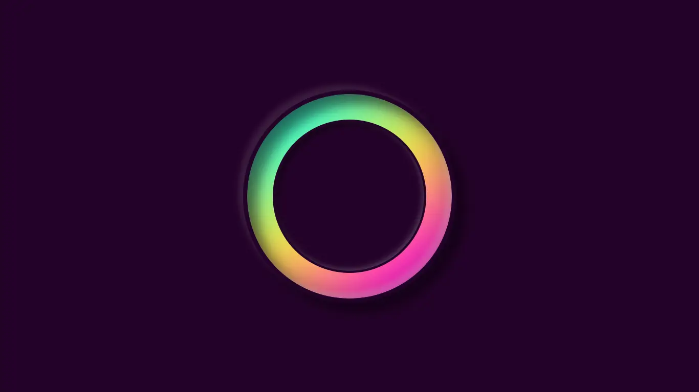
CSS Neumorphism Gradient Loader Animation Effects
Add a modern and stylish touch to your website’s loading experience with Neumorphism gradient loader animations! In this blog, we’ll guide you through the process of creating stunning gradient animations using HTML, CSS, and JavaScript.
For additional HTML, CSS, and JavaScript projects, see our website.
Whether you’re a beginner or a seasoned developer, this tutorial is perfect for anyone looking to add a unique and visually appealing touch to their website. From design concepts to implementation, this blog covers all the essential steps to create a CSS Neumorphism gradient loader animation effect. So why wait? Start learning today and give your website the professional touch it deserves!
Source Code:
HTML:
<!DOCTYPE html>
<html lang="en" >
<head>
  <meta charset="UTF-8">
  <title>CSS Neumorphism Gradient Loader Animation Effects</title>
  <link rel="stylesheet" href="./style.css">

</head>
<body>

<div class="loader">
	<span></span>
	<span></span>
</div>

  <script  src="./script.js"></script>

</body>
</html>
——————————
📂 Important Links:
——————————
>> Learn Graphics Design & Make A Successful Profession.
>> Canva Makes Graphics Design Easy.
>> Start Freelancing Today & Earn Money.
>> Make Video Editing As Your Profession.
CSS:
* {
  margin: 0;
  padding: 0;
}

body {
  display: flex;
  justify-content: center;
  align-items: center;
  height: 100vh;
  background: #240229;
}

.loader {
  position: relative;
  width: 200px;
  height: 200px;
  border-radius: 50%;
  border: 4px solid #240229;
  overflow: hidden;
  box-shadow: -5px -5px 5px rgba(255, 255, 255, 0.1), 10px 10px 10px rgba(0, 0, 0, 0.4), inset -5px -5px 5px rgba(255, 255, 255, 0.2), inset 10px 10px 10px rgba(0, 0, 0, 0.4);
}
.loader:before {
  content: "";
  position: absolute;
  top: 25px;
  left: 25px;
  right: 25px;
  bottom: 25px;
  z-index: 10;
  background: #240229;
  border-radius: 50%;
  border: 2px solid #240229;
  box-shadow: inset -2px -2px 5px rgba(255, 255, 255, 0.2), inset 3px 3px 5px rgba(0, 0, 0, 0.5);
}
.loader span {
  position: absolute;
  width: 100%;
  height: 100%;
  border-radius: 50%;
  z-index: -1;
  background: linear-gradient(#14ffe9, #ffeb3b, #ff00e0);
  filter: blur(20px);
  animation: animate 0.5s linear infinite;
}

@keyframes animate {
  0% {
    transform: rotate(0deg);
  }
  100% {
    transform: rotate(360deg);
  }
}
Another article for you.