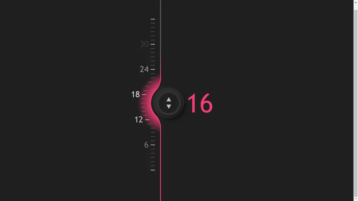
CSS-only fluid slider with input Using HTML CSS
Fluid Slider with Input Range is an amazing user interface design element that enhances the user experience by allowing users to interact with sliders seamlessly. In this tutorial, we will learn how to create a fluid slider with input range using HTML, CSS, and JavaScript.
For additional HTML, CSS, and JavaScript projects, see our website.
The slider is a popular interface design element used in many web applications, and by using fluid effects, we can make it even more dynamic and engaging. In this blog post, we will explore the step-by-step process of creating a fluid slider with input range using simple HTML, CSS, and JavaScript. Follow along with our tutorial and learn how to create an impressive fluid slider with input range that is sure to take your web design skills to the next level!
Source Code:
HTML:
<!-- put all in a wrapper:-->
<div class="wrap" role="group" aria-label="slider with ruler" style="--min: 0; --val: 18; --max: 36">
  <!-- slider:-->
  <input id="r" type="range" list="l" max="36"/>
  <!-- value display:-->
  <output for="r"></output>
  <!-- ruler:-->
  <datalist id="l">
    <option value="0" style="--idx: 0" label="0"></option>
    <option value="1" style="--idx: 1"></option>
    <option value="2" style="--idx: 2"></option>
    <option value="3" style="--idx: 3"></option>
    <option value="4" style="--idx: 4"></option>
    <option value="5" style="--idx: 5"></option>
    <option value="6" style="--idx: 6" label="6"></option>
    <option value="7" style="--idx: 7"></option>
    <option value="8" style="--idx: 8"></option>
    <option value="9" style="--idx: 9"></option>
    <option value="10" style="--idx: 10"></option>
    <option value="11" style="--idx: 11"></option>
    <option value="12" style="--idx: 12" label="12"></option>
    <option value="13" style="--idx: 13"></option>
    <option value="14" style="--idx: 14"></option>
    <option value="15" style="--idx: 15"></option>
    <option value="16" style="--idx: 16"></option>
    <option value="17" style="--idx: 17"></option>
    <option value="18" style="--idx: 18" label="18"></option>
    <option value="19" style="--idx: 19"></option>
    <option value="20" style="--idx: 20"></option>
    <option value="21" style="--idx: 21"></option>
    <option value="22" style="--idx: 22"></option>
    <option value="23" style="--idx: 23"></option>
    <option value="24" style="--idx: 24" label="24"></option>
    <option value="25" style="--idx: 25"></option>
    <option value="26" style="--idx: 26"></option>
    <option value="27" style="--idx: 27"></option>
    <option value="28" style="--idx: 28"></option>
    <option value="29" style="--idx: 29"></option>
    <option value="30" style="--idx: 30" label="30"></option>
    <option value="31" style="--idx: 31"></option>
    <option value="32" style="--idx: 32"></option>
    <option value="33" style="--idx: 33"></option>
    <option value="34" style="--idx: 34"></option>
    <option value="35" style="--idx: 35"></option>
    <option value="36" style="--idx: 36" label="36"></option>
  </datalist>
</div>
<!-- support info boxes-->
<section>
  <p class="box box--fail box--list">Sorry, it appears your browser has failed displaying the slider ruler. Currently, recent versions of Firefox and Chromium browsers should be able to display it.</p>
  <p class="box box--warn box--trig">Sorry, it appears your browser does not support trigonometric functions in CSS, so the slider ruler offset won't look ideal. Currently, trigonometric functions are supported in Safari, Firefox and Chromium browsers starting with version 111 when enabling the<strong>Experimental Web Platform features</strong>
    flag in<kbd>chrome://flags</kbd>.
  </p>
  <p class="box box--fail box--cmix">Sorry, it appears your browser does not support<code>color-mix</code>. No support or this features prevents the slider's highlight from responding to changes in value. Currently,<code>color-mix</code>
    is supported in Safari, Chromium browsers starting with version 111 (version 109 when enabling the<strong>Experimental Web Platform features</strong>
    flag in<kbd>chrome://flags</kbd>) and Firefox starting with version 111 (version 88 when setting the<kbd>layout.css.color-mix.enabled</kbd>
    flag to<code>true</code>
    in<kbd>about:config</kbd>).
  </p>
</section>
——————————
📂 Important Links:
——————————
>> Learn Graphics Design & Make A Successful Profession.
>> Canva Makes Graphics Design Easy.
>> Start Freelancing Today & Earn Money.
>> Make Video Editing As Your Profession.
CSS:
@charset "UTF-8";
/* ===== MIXINS FOR SLIDER TRACK & THUMB ===== */
/* fix track height */
/* ===== GENERIC STYLES ===== */
html,
body,
div,
datalist,
output,
section {
  display: grid;
}

html {
  height: 100%;
}

body {
  overflow-x: hidden;
  /* because range input takes up space horizontally before rotation */
  background: #1f1f1f;
}
@supports (line-height: tan(45deg)) {
  body {
    --trig: none;
  }
}
@supports (color: color-mix(in lch, red 1%, tan)) {
  body {
    --cmix: none;
  }
}

/* ===== SLIDER WRAPPER WITH VISUAL TRACK & GLOW ===== */
.wrap {
  --rng: calc(var(--max) - var(--min));
  /* range between max and min values */
  --prg: calc((var(--val) - var(--min)) / var(--rng));
  /* decimal progress */
  --prc: calc(var(--prg) * 100%);
  /* percentage progress */
  --pos: calc(
  	var(--val) *1rem
  );
  /* position from 1st ruler line (from val = min) */
  grid-gap: 1.25rem;
  /* space out ruler, track, thumb, output value */
  grid-template-columns: -webkit-max-content 0.1875rem 1.25rem -webkit-max-content;
  grid-template-columns: max-content 0.1875rem 1.25rem max-content;
  place-self: center;
  /* put in the middle of body grid cell along both axes */
  color: #f43e75;
  /*fallback  */
  font: 1em trebuchet ms, ubuntu, verdana, arial, sans-serif;
  transition: 0.35s;
  /* focus/ hover transition */
  /* make sepia only when range input not focused */
  /* making up visual track & glow */
  /* ----- Glow ----- */
  /* ----- Visual track ----- */
}
@supports (color: color-mix(in lch, red 1%, tan)) {
  .wrap {
    /* if color-mix is supported */
    color: color-mix(in lch, #f43e75 var(--prc), #daff47);
  }
}
.wrap:not(:focus-within):not(:hover) {
  filter: sepia(1);
}
.wrap::before, .wrap::after {
  --pos-x: calc(
  	100% + 1.875rem
  );
  /* x position of middle rounding circle centre */
  --pos-y: calc(
  	var(--pos) + 7.4375rem
  );
  /* y position considering vertical overflow  */
  grid-area: 1/1/span 1/span 2;
  /* cover first two columns */
  place-self: center end;
  /* attach to middle right of rightmost cell they cover */
  z-index: 1;
  /* both on top of ruler */
  width: 5.5625rem;
  /* make it wide enough to contain the glow */
  height: calc( 			100% + 2 *7.4375rem 		);
  /* long enough to contain the glow at min/ max */
  transform: scaley(-1);
  /* ugh... maybe I could have flipped the gradients instead */
  content: "";
}
.wrap::before {
  --sl: transparent calc(100% + -0.5px), red calc(100% + 0.5px);
  /* mask gradient stop list */
  background: radial-gradient(circle 7.4375rem at var(--pos-x) var(--pos-y), currentcolor 4.0625rem, transparent);
  /* how mask compositing works:
   * https://css-tricks.com/mask-compositing-the-crash-course/ */
  -webkit-mask: radial-gradient(circle 4.25rem at var(--pos-x) var(--pos-y), var(--sl)), radial-gradient(circle 4.4375rem at 0 0, var(--sl)) 100% calc(var(--pos-y) + -1 *5.9686681932rem)/4.4375rem 2.9199240082rem no-repeat, radial-gradient(circle 4.4375rem at 0 100%, var(--sl)) 100% calc(var(--pos-y) + 3.048744185rem)/4.4375rem 2.9199240082rem no-repeat;
  -webkit-mask-composite: source-out, source-over;
          mask: radial-gradient(circle 4.25rem at var(--pos-x) var(--pos-y), var(--sl)) subtract, radial-gradient(circle 4.4375rem at 0 0, var(--sl)) 100% calc(var(--pos-y) + -1 *5.9686681932rem)/4.4375rem 2.9199240082rem no-repeat add, radial-gradient(circle 4.4375rem at 0 100%, var(--sl)) 100% calc(var(--pos-y) + 3.048744185rem)/4.4375rem 2.9199240082rem no-repeat;
}
.wrap::after {
  --sl: /* mask gradient stop list */ transparent calc(4.25rem + -0.5px),
  	red calc(4.25rem + 0.5px) calc(100% + -0.5px),
  	transparent calc(100% + 0.5px);
  background: linear-gradient(currentcolor calc(var(--pos-y) + 6rem), transparent calc(var(--pos-y) + 2 *6rem)) #666;
  -webkit-mask: linear-gradient(red calc(var(--pos-y) + -1 *5.9686681932rem + 0.5px), transparent 0 calc(var(--pos-y) + 5.9686681932rem + -0.5px), red 0) 100%/0.1875rem 100%, radial-gradient(circle 4.4375rem at var(--pos-x), var(--sl)) 100% calc(var(--pos-y) + -1 *3.048744185rem + -0.5px)/100% calc(2 *3.048744185rem + 1px), radial-gradient(circle 4.4375rem at 0 0, var(--sl)) 100% calc(var(--pos-y) + -1 *5.9686681932rem)/4.4375rem 2.9199240082rem, radial-gradient(circle 4.4375rem at 0 100%, var(--sl)) 100% calc(var(--pos-y) + 3.048744185rem)/4.4375rem 2.9199240082rem;
          mask: linear-gradient(red calc(var(--pos-y) + -1 *5.9686681932rem + 0.5px), transparent 0 calc(var(--pos-y) + 5.9686681932rem + -0.5px), red 0) 100%/0.1875rem 100%, radial-gradient(circle 4.4375rem at var(--pos-x), var(--sl)) 100% calc(var(--pos-y) + -1 *3.048744185rem + -0.5px)/100% calc(2 *3.048744185rem + 1px), radial-gradient(circle 4.4375rem at 0 0, var(--sl)) 100% calc(var(--pos-y) + -1 *5.9686681932rem)/4.4375rem 2.9199240082rem, radial-gradient(circle 4.4375rem at 0 100%, var(--sl)) 100% calc(var(--pos-y) + 3.048744185rem)/4.4375rem 2.9199240082rem;
  -webkit-mask-repeat: no-repeat;
          mask-repeat: no-repeat;
  /* easier if taking this out of shorthand */
}

/* ===== SLIDER WITH VALUE ===== */
[type=range] {
  --sel: 0;
  /* initial selection status: false (0) */
  place-self: center;
  /* put it in middle of grid cell along both directions */
  /* length based on ruler & thumb dimensions */
  width: calc(var(--max) *1rem + 6rem);
  height: 1.25rem;
  transform: rotate(-90deg);
  /* we have no better options for vertical sliders */
  background: transparent;
  /* get rid of default white in WebKit */
  font: inherit;
  /* override default 13.333px, ugh */
  cursor: pointer;
  /* make it obvious it's interactive */
  /* looks ugly AND ***we've already set focus styles*** */
  /* change selection status to true (1) */
  /* set track & thumb styles */
  /* ----- Value display ----- */
}
[type=range], [type=range]::-webkit-slider-runnable-track, [type=range]::-webkit-slider-thumb {
  -webkit-appearance: none;
}
[type=range]:focus {
  outline: none;
}
[type=range]:hover, [type=range]:focus {
  --sel: 1;
}
[type=range]::-webkit-slider-runnable-track {
  height: 100%;
}
[type=range]::-moz-range-track {
  height: 100%;
}
[type=range]::-webkit-slider-thumb {
  /* only add a top margin if the m flag is non-zero */
  margin-top: -2.375rem;
  /* we use --sel to flip between normal & hover/ focus styles
   * detailed explanation
   * https://css-tricks.com/dry-switching-with-css-variables-the-difference-of-one-declaration/ */
  --shl: 0 0 0 calc((1 - 0.375 * var(--sel)) * 1rem)
  	/* slightly decrease spread in hover/ focus case */
  	hsla(0, 0%, 19%, var(--sel))
  	/* non-zero shadow alpha only in hover/ focus case */;
  box-sizing: border-box;
  border: none;
  /* get rid of Firefox border */
  padding: 0.625rem;
  /* to add space around bg limited to content-box */
  width: 6rem;
  height: 6rem;
  /* aspect-ratio: 1 doesn't work here in Firefox */
  border-radius: 50%;
  box-shadow: 0 0 0.5px black, inset 0 0 1px 1px rgba(255, 255, 255, 0.05), inset var(--shl), inset 0 0 0 calc(0.5 *0.42* (6rem + -2 *0.625rem) + 0.625rem) #1f1f1f, 0.25rem -0.25rem 0.25rem #2a2a2a, -0.25rem 0.25rem 0.75rem #090909, var(--shl), 0.75rem -0.75rem 0.75rem #2a2a2a, -0.75rem 0.75rem 1.25rem #090909;
  background: repeating-conic-gradient(from 60deg, transparent 0%, silver 1deg 59deg, transparent 60deg 50%) 0/42% 100% space content-box #1f1f1f;
  -webkit-transition: box-shadow 0.35s;
  transition: box-shadow 0.35s;
  cursor: ns-resize;
  /* take into account 90° rotation */
}
[type=range]::-moz-range-thumb {
  /* only add a top margin if the m flag is non-zero */
  /* we use --sel to flip between normal & hover/ focus styles
   * detailed explanation
   * https://css-tricks.com/dry-switching-with-css-variables-the-difference-of-one-declaration/ */
  --shl: 0 0 0 calc((1 - 0.375 * var(--sel)) * 1rem)
  	/* slightly decrease spread in hover/ focus case */
  	hsla(0, 0%, 19%, var(--sel))
  	/* non-zero shadow alpha only in hover/ focus case */;
  box-sizing: border-box;
  border: none;
  /* get rid of Firefox border */
  padding: 0.625rem;
  /* to add space around bg limited to content-box */
  width: 6rem;
  height: 6rem;
  /* aspect-ratio: 1 doesn't work here in Firefox */
  border-radius: 50%;
  box-shadow: 0 0 0.5px black, inset 0 0 1px 1px rgba(255, 255, 255, 0.05), inset var(--shl), inset 0 0 0 calc(0.5 *0.42* (6rem + -2 *0.625rem) + 0.625rem) #1f1f1f, 0.25rem -0.25rem 0.25rem #2a2a2a, -0.25rem 0.25rem 0.75rem #090909, var(--shl), 0.75rem -0.75rem 0.75rem #2a2a2a, -0.75rem 0.75rem 1.25rem #090909;
  background: repeating-conic-gradient(from 60deg, transparent 0%, silver 1deg 59deg, transparent 60deg 50%) 0/42% 100% space content-box #1f1f1f;
  -moz-transition: box-shadow 0.35s;
  transition: box-shadow 0.35s;
  cursor: ns-resize;
  /* take into account 90° rotation */
}
[type=range] + output {
  place-self: end;
  /* put it in bottom right corner of grid cell it's in */
  place-content: center;
  /* place its content in the middle along both directions */
  margin-left: 0.25em;
  /* space it out a bit from oversized thumb on its left */
  width: 1.25em;
  /* make it wide enough to accommodate all possible values */
  aspect-ratio: 1;
  /* make it square */
  transform: translatey(calc(50% - var(--pos)));
  /* move vertically with slider value */
  font-size: 6.25rem;
  /* blow up font size */
  font-weight: 100;
  /* ends up too thick, make it thinner */
  line-height: 1.25;
  /* now why the fuck didn't I just use the shorthand here */
  counter-reset: val var(--val);
  /* set counter to slider value */
  /* in order to be able to use its (numeric integer) value for the ::after */
  /* content: var(--val) works only if --val is string */
}
[type=range] + output::after {
  content: counter(val);
}

/* ===== RULER ===== */
datalist {
  grid-area: 1/1;
  /* occupy cell at intersection between 1st row & 1st column */
  /* make its gri have max value + 1 rows (because 1st value is 0) of unit height */
  grid-template-rows: repeat(calc(var(--max) + 1), 1rem);
  margin: -0.5rem 0;
  /* align horizontal middle of top cell with parent top edge */
}

option {
  /* absolute value of difference between the option index idx & current slider value val
   * https://css-tricks.com/using-absolute-value-sign-rounding-and-modulo-in-css-today/ */
  --abs: max(var(--val) - var(--idx), var(--idx) - var(--val));
  --rel: calc(
  	var(--abs) /6
  );
  /* relative value to number of ruler marks affected */
  --sel: max(
  	0,
  	1 - var(--rel) * var(--rel)
  );
  /* try to compensate for no trig with circular dist */
  --off: calc(var(--sel) *-2.375rem);
  /* thumb-caused offset */
  grid-row: calc(var(--max) + 1 - var(--idx));
  /* visually reverse row order */
  align-self: center;
  /* ensure big text is vertically in the middle of containing cells */
  padding-right: 0.75em;
  /* leave space for ruler marks */
  transform: translate(var(--off));
  /* apply thumb caused offset via transform */
  background: linear-gradient(hsl(0, 0%, var(--lum, 32%)) 0 0) 100%/0.5em 2px no-repeat;
  /* text alpha depends on distance from thumb */
  color: hsla(0, 0%, 93%, calc(1 - 0.0625 * var(--abs)));
  font-size: 2rem;
  text-align: right;
  transition: 0.2s ease-out;
  /* make major ruler markings brighter */
}
@supports (top: calc(sin(5deg) * 1px)) {
  option {
    /* if we have trigonometry in CSS */
    --sel: max(0, 1 - var(--rel));
    /* linear selection value */
    /* make the ruler mark distribution around thumb follow a cos wave */
    --off: calc(0.5 * (1 - cos(var(--sel) * 180deg)) *-2.375rem);
  }
}
option[label] {
  --lum: 90%;
}

/* ===== SUPPORT INFO BOXES ===== */
section {
  grid-gap: 0.625rem;
  /* some space between boxes if there are more */
  position: fixed;
  /* take out of document flow */
  z-index: 2;
  /* on top of everything else */
  inset: auto 0 0;
  /* attach to parent's padind-box edges except top */
  padding: 0.625rem;
  /* set padding equal to gap */
  font: clamp(0.625em, 2.5vw, 1.25em)/1.25 trebuchet ms, ubuntu, verdana, arial, sans-serif;
}

.box {
  margin: 0;
  /* override browser default */
  border-left: solid 5px var(--c0, #dc3055);
  padding: inherit;
  /* pad info boxes as well */
  background: var(--c1, #851d40);
  color: white;
  /* modify palette for warn */
}
.box--warn {
  --c0: #fd8721;
  --c1: #c34915;
}
.box--list {
  display: var(--list);
}
.box--trig {
  display: var(--trig);
}
.box--cmix {
  display: var(--cmix);
}

code,
kbd {
  padding: 2px;
  background: rgba(0, 0, 0, 0.2);
  font: 1.1em/1.2 ubuntu mono, consolas, monaco, monospace;
}
JavaScript
/* This is all the JS used and it does only 2 things: */

/* 1. datalist option render support test (for support info box) */
if (+document.querySelector("option").getBoundingClientRect().width)
	document.body.style.setProperty("--list", "none");

/* 2. update the --val custom property on dragging slider thumb */
addEventListener("input", (e) => {
	let _t = e.target;
	_t.parentNode.style.setProperty("--val", +_t.value);
});

/* Absolutely no JS is needed for creating the look of the slider. */