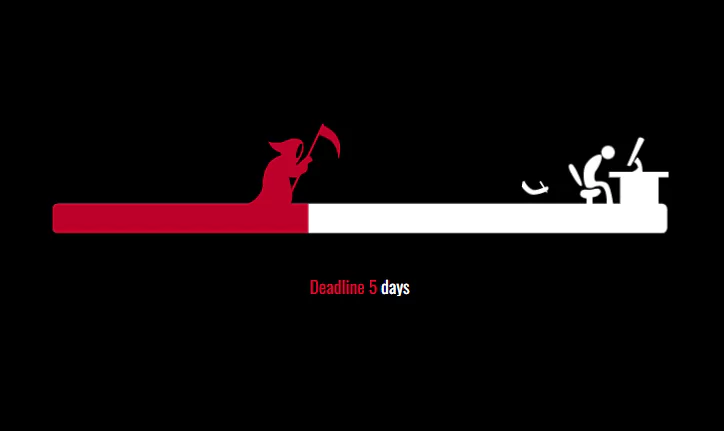
Project Deadline CSS Animation – SVG animation with CSS3
Project Deadline CSS Animation – SVG animation with CSS3. We create create the animation structure with HTML. For styling our animation, we will use CSS. And for making our animation working, we will use JavaScript.
Source Code:
HTML
<div id="deadline">
  <svg preserveAspectRatio="none" id="line" viewBox="0 0 581 158" enable-background="new 0 0 581 158">
    <g id="fire">
      <rect id="mask-fire-black" x="511" y="41" width="38" height="34"/>
      <g>
        <defs>
          <rect id="mask_fire" x="511" y="41" width="38" height="34"/>
        </defs>
        <clipPath id="mask-fire_1_">
          <use xlink:href="#mask_fire"  overflow="visible"/>
        </clipPath>
        <g id="group-fire" clip-path="url(#mask-fire_1_)">
          <path id="red-flame" fill="#B71342" d="M528.377,100.291c6.207,0,10.947-3.272,10.834-8.576 c-0.112-5.305-2.934-8.803-8.237-10.383c-5.306-1.581-3.838-7.9-0.79-9.707c-7.337,2.032-7.581,5.891-7.11,8.238 c0.789,3.951,7.56,4.402,5.077,9.48c-2.482,5.079-8.012,1.129-6.319-2.257c-2.843,2.233-4.78,6.681-2.259,9.703 C521.256,98.809,524.175,100.291,528.377,100.291z"/>
          <path id="yellow-flame" opacity="0.71" fill="#F7B523" d="M528.837,100.291c4.197,0,5.108-1.854,5.974-5.417 c0.902-3.724-1.129-6.207-5.305-9.931c-2.396-2.137-1.581-4.176-0.565-6.32c-4.401,1.918-3.384,5.304-2.482,6.658 c1.511,2.267,2.099,2.364,0.42,5.8c-1.679,3.435-5.42,0.764-4.275-1.527c-1.921,1.512-2.373,4.04-1.528,6.563 C522.057,99.051,525.994,100.291,528.837,100.291z"/>
          <path id="white-flame" opacity="0.81" fill="#FFFFFF" d="M529.461,100.291c-2.364,0-4.174-1.322-4.129-3.469 c0.04-2.145,1.117-3.56,3.141-4.198c2.022-0.638,1.463-3.195,0.302-3.925c2.798,0.821,2.89,2.382,2.711,3.332 c-0.301,1.597-2.883,1.779-1.938,3.834c0.912,1.975,3.286,0.938,2.409-0.913c1.086,0.903,1.826,2.701,0.864,3.924 C532.18,99.691,531.064,100.291,529.461,100.291z"/>
        </g>
      </g>
    </g>
    <g id="progress-trail">
      <path fill="#FFFFFF" d="M491.979,83.878c1.215-0.73-0.62-5.404-3.229-11.044c-2.583-5.584-5.034-10.066-7.229-8.878
                              c-2.854,1.544-0.192,6.286,2.979,11.628C487.667,80.917,490.667,84.667,491.979,83.878z"/>
      <path fill="#FFFFFF" d="M571,76v-5h-23.608c0.476-9.951-4.642-13.25-4.642-13.25l-3.125,4c0,0,3.726,2.7,3.625,5.125
                              c-0.071,1.714-2.711,3.18-4.962,4.125H517v5h10v24h-25v-5.666c0,0,0.839,0,2.839-0.667s6.172-3.667,4.005-6.333
                              s-7.49,0.333-9.656,0.166s-6.479-1.5-8.146,1.917c-1.551,3.178,0.791,5.25,5.541,6.083l-0.065,4.5H16c-2.761,0-5,2.238-5,5v17
                              c0,2.762,2.239,5,5,5h549c2.762,0,5-2.238,5-5v-17c0-2.762-2.238-5-5-5h-3V76H571z"/>
      <path fill="#FFFFFF" d="M535,65.625c1.125,0.625,2.25-1.125,2.25-1.125l11.625-22.375c0,0,0.75-0.875-1.75-2.125
                              s-3.375,0.25-3.375,0.25s-8.75,21.625-9.875,23.5S533.875,65,535,65.625z"/>
    </g>
    <g>
      <defs>
        <path id="SVGID_1_" d="M484.5,75.584c-3.172-5.342-5.833-10.084-2.979-11.628c2.195-1.188,4.646,3.294,7.229,8.878
                               c2.609,5.64,4.444,10.313,3.229,11.044C490.667,84.667,487.667,80.917,484.5,75.584z M571,76v-5h-23.608
                               c0.476-9.951-4.642-13.25-4.642-13.25l-3.125,4c0,0,3.726,2.7,3.625,5.125c-0.071,1.714-2.711,3.18-4.962,4.125H517v5h10v24h-25
                               v-5.666c0,0,0.839,0,2.839-0.667s6.172-3.667,4.005-6.333s-7.49,0.333-9.656,0.166s-6.479-1.5-8.146,1.917
                               c-1.551,3.178,0.791,5.25,5.541,6.083l-0.065,4.5H16c-2.761,0-5,2.238-5,5v17c0,2.762,2.239,5,5,5h549c2.762,0,5-2.238,5-5v-17
                               c0-2.762-2.238-5-5-5h-3V76H571z M535,65.625c1.125,0.625,2.25-1.125,2.25-1.125l11.625-22.375c0,0,0.75-0.875-1.75-2.125
                               s-3.375,0.25-3.375,0.25s-8.75,21.625-9.875,23.5S533.875,65,535,65.625z"/>
      </defs>
      <clipPath id="SVGID_2_">
        <use xlink:href="#SVGID_1_"  overflow="visible"/>
      </clipPath>
      <rect id="progress-time-fill" x="-100%" y="34" clip-path="url(#SVGID_2_)" fill="#BE002A" width="586" height="103"/>
    </g>

    <g id="death-group">
      <path id="death" fill="#BE002A" d="M-46.25,40.416c-5.42-0.281-8.349,3.17-13.25,3.918c-5.716,0.871-10.583-0.918-10.583-0.918
                                         C-67.5,49-65.175,50.6-62.083,52c5.333,2.416,4.083,3.5,2.084,4.5c-16.5,4.833-15.417,27.917-15.417,27.917L-75.5,84.75
                                         c-1,12.25-20.25,18.75-20.25,18.75s39.447,13.471,46.25-4.25c3.583-9.333-1.553-16.869-1.667-22.75
                                         c-0.076-3.871,2.842-8.529,6.084-12.334c3.596-4.22,6.958-10.374,6.958-15.416C-38.125,43.186-39.833,40.75-46.25,40.416z
                                         M-40,51.959c-0.882,3.004-2.779,6.906-4.154,6.537s-0.939-4.32,0.112-7.704c0.82-2.64,2.672-5.96,3.959-5.583
                                         C-39.005,45.523-39.073,48.8-40,51.959z"/>
      <path id="death-arm" fill="#BE002A" d="M-53.375,75.25c0,0,9.375,2.25,11.25,0.25s2.313-2.342,3.375-2.791
                                             c1.083-0.459,4.375-1.75,4.292-4.75c-0.101-3.627,0.271-4.594,1.333-5.043c1.083-0.457,2.75-1.666,2.75-1.666
                                             s0.708-0.291,0.5-0.875s-0.791-2.125-1.583-2.959c-0.792-0.832-2.375-1.874-2.917-1.332c-0.542,0.541-7.875,7.166-7.875,7.166
                                             s-2.667,2.791-3.417,0.125S-49.833,61-49.833,61s-3.417,1.416-3.417,1.541s-1.25,5.834-1.25,5.834l-0.583,5.833L-53.375,75.25z"/>
      <path id="death-tool" fill="#BE002A" d="M-20.996,26.839l-42.819,91.475l1.812,0.848l38.342-81.909c0,0,8.833,2.643,12.412,7.414
                                              c5,6.668,4.75,14.084,4.75,14.084s4.354-7.732,0.083-17.666C-10,32.75-19.647,28.676-19.647,28.676l0.463-0.988L-20.996,26.839z"/>
    </g>
    <path id="designer-body" fill="#FEFFFE" d="M514.75,100.334c0,0,1.25-16.834-6.75-16.5c-5.501,0.229-5.583,3-10.833,1.666
                                               c-3.251-0.826-5.084-15.75-0.834-22c4.948-7.277,12.086-9.266,13.334-7.833c2.25,2.583-2,10.833-4.5,14.167
                                               c-2.5,3.333-1.833,10.416,0.5,9.916s8.026-0.141,10,2.25c3.166,3.834,4.916,17.667,4.916,17.667l0.917,2.5l-4,0.167L514.75,100.334z
                                               "/>

    <circle id="designer-head" fill="#FEFFFE" cx="516.083" cy="53.25" r="6.083"/>

    <g id="designer-arm-grop">
      <path id="designer-arm" fill="#FEFFFE" d="M505.875,64.875c0,0,5.875,7.5,13.042,6.791c6.419-0.635,11.833-2.791,13.458-4.041s2-3.5,0.25-3.875
                                                s-11.375,5.125-16,3.25c-5.963-2.418-8.25-7.625-8.25-7.625l-2,1.125L505.875,64.875z"/>
      <path id="designer-pen" fill="#FEFFFE" d="M525.75,59.084c0,0-0.423-0.262-0.969,0.088c-0.586,0.375-0.547,0.891-0.547,0.891l7.172,8.984l1.261,0.453
                                                l-0.104-1.328L525.75,59.084z"/>
    </g>
  </svg>

  <div class="deadline-days">
    Deadline <span class="day">7</span> <span class="days">days</span>
  </div>

</div>
——————————
📂 Important Links:
——————————
>> Learn Graphics Design & Make A Successful Profession.
>> Canva Makes Graphics Design Easy.
>> Start Freelancing Today & Earn Money.
>> Make Video Editing As Your Profession.
CSS:
html {
    font-size: 1em;
    line-height: 1.4;
}

html,
body {
    height: 100%;
}

body {
    margin: 0;
    padding: 0;
    background: #000;
}


#deadline {
    width:581px;
    max-width: 100%;
    height:158px;
    position: absolute;
    top: 50%;
    left: 50%;
    z-index: 1;
    -webkit-transform: translate(-50%, -50%);
    transform: translate(-50%, -50%);
}

#deadline svg {
    width: 100%;
}

#progress-time-fill {
    animation-name: progress-fill;
    animation-timing-function: linear;
    animation-iteration-count: infinite;
}

/* Death */
#death-group {
    animation-name: walk;
    animation-timing-function: ease;
    animation-iteration-count: infinite;
    transform: translateX(0);
}

#death-arm {
    animation: move-arm 3s ease infinite;
    transform-origin: left center;
}

#death-tool {
    animation: move-tool 3s ease infinite;
    transform-origin: -48px center;
}

/* Designer */

#designer-arm-grop {
    animation: write 1.5s ease infinite;
    transform: translate(0, 0) rotate(0deg) scale(1, 1);
    transform-origin: left top;
}

.deadline-days {
    color: #fff;
    text-align: center;
    width: 100px;
    margin: 0 auto;
    position: relative;
    height: 20px;
    font-family: 'Oswald', sans-serif;
}

.deadline-days .inner {
    width: 100px;
    position: relative;
    top: 0;
    left: 0;
}

.mask-red,
.mask-white {
    position: absolute;
    top: 0;
    width: 100%;
    overflow: hidden;
    height: 100%;
}

.mask-red {
    left: 0;
    width: 0;
    color: #BE002A;
    animation: text-red 20s ease infinite;
    z-index: 2;
    background: #000;
}
.mask-white {
    right: 0;
}

/* Flames */

#red-flame {
    opacity: 0;
    animation: show-flames 20s ease infinite, red-flame 120ms ease infinite;
    transform-origin: center bottom;
}

#yellow-flame {
    opacity: 0;
    animation: show-flames 20s ease infinite, yellow-flame 120ms ease infinite;
    transform-origin: center bottom;
}

#white-flame {
    opacity: 0;
    animation: show-flames 20s ease infinite, red-flame 100ms ease infinite;
    transform-origin: center bottom;
}

@keyframes progress-fill {
    0% {
        x: -100%;
    }

    100% {
        x: -3%;
    }
}

@keyframes walk {
    0% {
        transform: translateX(0);
    }
    6% {
        transform: translateX(0);
    }
    10% {
        transform: translateX(100px);
    },

    15% {
        transform: translateX(140px);
    }

    25% {
        transform: translateX(170px);
    }

    35% {
        transform: translateX(220px);
    }

    45% {
        transform: translateX(280px);
    }

    55% {
        transform: translateX(340px);
    }

    65% {
        transform: translateX(370px);
    }

    75% {
        transform: translateX(430px);
    }

    85% {
        transform: translateX(460px);
    }

    100% {
        transform: translateX(520px);
    }
}

@keyframes move-arm {
    0% {
        transform: rotate(0);
    }

    5% {
        transform: rotate(0);
    }

    9% {
        transform: rotate(40deg);
    }

    80% {
        transform: rotate(0);
    }
}

@keyframes move-tool {
    0% {
        transform: rotate(0);
    }

    5% {
        transform: rotate(0);
    }

    9% {
        transform: rotate(50deg);
    }

    80% {
        transform: rotate(0);
    }
}

/* Design animations */

@keyframes write {
    0% {
        transform: translate(0, 0) rotate(0deg) scale(1, 1);
    }

    16% {
        transform: translate(0px, 0px) rotate(5deg) scale(0.8, 1);
    }

    32% {
        transform: translate(0px, 0px) rotate(0deg) scale(1, 1);
    }

    48% {
        transform: translate(0px, 0px) rotate(6deg) scale(0.8, 1);
    }

    65% {
        transform: translate(0px, 0px) rotate(0deg) scale(1, 1);
    }

    83% {
        transform: translate(0px, 0px) rotate(4deg) scale(0.8, 1);
    }
}

@keyframes text-red {
    0% {
        width: 0%;
    }

    100% {
        width: 98%;
    }
}

/* Flames */

/* @keyframes show-flames {
    0% {
        transform:  translateY(0);
    }
    74% {
        transform:  translateY(0);
    }
    80% {
        transform:  translateY(-30px);
    }
    97% {
        transform:  translateY(-30px);
    }
    100% {
        transform: translateY(0px);
    }
} */

@keyframes show-flames {
    0% {
        opacity: 0;
    }
    74% {
        opacity: 0;
    }
    80% {
        opacity: 1;
    }
    99% {
        opacity: 1;
    }
    100% {
        opacity: 0;
    }
}

@keyframes red-flame {
    0% {
        transform: translateY(-30px) scale(1, 1);
    }

    25% {
        transform: translateY(-30px) scale(1.1, 1.1);
    }

    75% {
        transform: translateY(-30px) scale(0.8, 0.7);
    }

    100% {
        transform: translateY(-30px) scale(1, 1);
    }
}

@keyframes yellow-flame {
    0% {
        transform: translateY(-30px) scale(0.8, 0.7);
    }

    50% {
        transform: translateY(-30px) scale(1.1, 1.2);
    }

    100% {
        transform: translateY(-30px) scale(1, 1);
    }
}
Another article for you 👇

JavaScript
// Init
var $ = jQuery;
var animationTime = 20,
    days = 7;

$(document).ready(function(){

    // timer arguments:
    //   #1 - time of animation in mileseconds,
    //   #2 - days to deadline

    $('#progress-time-fill, #death-group').css({'animation-duration': animationTime+'s'});

    var deadlineAnimation = function () {
        setTimeout(function(){
            $('#designer-arm-grop').css({'animation-duration': '1.5s'});
        },0);

        setTimeout(function(){
            $('#designer-arm-grop').css({'animation-duration': '1s'});
        },4000);

        setTimeout(function(){
            $('#designer-arm-grop').css({'animation-duration': '0.7s'});
        },8000);

        setTimeout(function(){
            $('#designer-arm-grop').css({'animation-duration': '0.3s'});
        },12000);

        setTimeout(function(){
            $('#designer-arm-grop').css({'animation-duration': '0.2s'});
        },15000);
    };

    function timer(totalTime, deadline) {
        var time = totalTime * 1000;
        var dayDuration = time / deadline;
        var actualDay = deadline;

        var timer = setInterval(countTime, dayDuration);

        function countTime() {
            --actualDay;
            $('.deadline-days .day').text(actualDay);

            if (actualDay == 0) {
                clearInterval(timer);
                $('.deadline-days .day').text(deadline);
            }
        }
    }

    var deadlineText = function () {
        var $el = $('.deadline-days');
        var html = '<div class="mask-red"><div class="inner">' + $el.html() + '</div></div><div class="mask-white"><div class="inner">' + $el.html() + '</div></div>';
        $el.html(html);
    }

    deadlineText();

    deadlineAnimation();
    timer(animationTime, days);

    setInterval(function(){
        timer(animationTime, days);
        deadlineAnimation();

        console.log('begin interval', animationTime * 1000);

    }, animationTime * 1000);

});