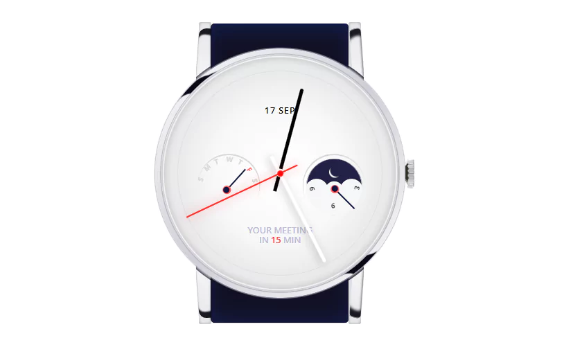
Pure CSS watch animation
In this article, we will create a pure CSS animation. Yes we are going to create Pure CSS watch animation.
We will create the layout with HTML and animation with CSS.
Source code:
HTML:
<div class="wrapper">
  <div class="watch-strap">
    <div class="strap-circle"></div>
    <div class="strap"></div>
    <div class="watch-strap-holder left-up"></div>
    <div class="watch-strap-holder left-bottom"></div>
    <div class="watch-strap-holder right-up"></div>
    <div class="watch-strap-holder right-bottom"></div>
    <div class="watch-lace">
      <div></div>
      <div></div>
      <div></div>
      <div></div>
      <div></div>
      <div></div>
      <div></div>
      <span class="top"></span>
      <span class="bottom"></span>
    </div>
  </div>
  <div class="watch-case">
    <div class="reflection"></div>
    <div class="reflection bottom"></div>
    <div class="watch-center">
      <div class="watch-points"><i></i><i></i><i></i><i></i><i></i><i></i><i></i><i></i><i></i><i></i><i></i><i></i><i></i><i></i><i></i><i></i><i></i><i></i><i></i><i></i><i></i><i></i><i></i><i></i><i></i><i></i><i></i><i></i><i></i><i></i><i></i><i></i><i></i><i></i><i></i><i></i><i></i><i></i><i></i><i></i><i></i><i></i><i></i><i></i><i></i><i></i><i></i><i></i><i></i><i></i><i></i><i></i><i></i><i></i><i></i><i></i><i></i><i></i><i></i><i></i></div>
      <div class="watch-tips">
        <span class="hours"></span>
        <span class="minutes"></span>
        <span class="seconds"></span>
      </div>
      <div class="watch-date">17 SEP</div>
      <div class="watch-alert">Your meeting <br>in <strong>15</strong> min</div>
      <div class="watch-week">
        <span class="week-arrow"></span>
        <ul>
          <div>S</div>
          <div>M</div>
          <div>T</div>
          <div>W</div>
          <div>T</div>
          <div>F</div>
          <div>S</div>
        </ul>
      </div>
      <div class="watch-day">
        <div class="sun">
          <div></div>
          <div></div>
          <div></div>
          <div></div>
          <div></div>
          <div></div>
          <div></div>
          <div></div>
          <div></div>
        </div>

      </div>
      <div class="watch-week days">
        <span class="week-arrow"></span>
        <ul>
          <div>3</div>
          <div>6</div>
          <div>9</div>
        </ul>
      </div>
    </div>
  </div>
</div>
——————————
📂 Important Links:
——————————
>> Learn Graphics Design & Make A Successful Profession.
>> Canva Makes Graphics Design Easy.
>> Start Freelancing Today & Earn Money.
>> Make Video Editing As Your Profession.
CSS(Stylus):
@import url('https://fonts.googleapis.com/css?family=Open+Sans:400,600,700')

body
  background-color: #fff
  min-height: 100vh
  display: flex
  align-items: center
  justify-content: center
  font-family: 'Open Sans', sans-serif

.wrapper
  position: relative

.watch
  &-case
    position: absolute
    z-index: 4
    top: 50%
    left: 50%
    transform: translate(-50%, -50%)
    height: 400px
    width: 400px
    overflow: hidden
    background-image: linear-gradient(-45deg, #fdfdfd, #ceced6, #fdfdfd)
    border-radius: 50%
    box-shadow: 0 0 1px 2px rgba(#b4b1c1, 0.7)

  &-center
    background-image: radial-gradient(#ffffff, #eeeeef)
    height: 380px
    width: 380px
    border-radius: 50%
    position: absolute
    z-index: 4
    left: 50%
    top: 50%
    transform: translate(-50%, -50%)
    box-shadow: -1px -1px 1px 0 #fdfdfd, 0 0 0 2px #b8b7c3, inset 0 0 0 2px #d1d1d6, inset 0 0 0 4px rgba(#fff, 0.7), inset 0 0 8px 8px rgba(#000, 0.1), inset 0 0 50px 50px rgba(#000, 0.05)

  &-strap
    position: absolute
    top: 50%
    left: 50%
    transform: translate(-50%, -50%)
    height: 480px
    width: 220px
    background-color: #101022
    border-radius: 6px
    z-index: 2

    .strap-circle
      position: absolute
      height: 409px
      width: 409px
      background-color: transparent
      top: 50%
      left: 50%
      transform: translate(-50%, -50%)
      border-radius: 50%
      box-shadow: inset -1px 0 8px 3px #151427, 0 0 2px 1px rgba(#fff, 0.8)

      &:after
        content: ''
        display: block
        height: 100%
        width: 72px
        left: -2px
        position: absolute
        background-color: #fff

      &:before
        content: ''
        display: block
        height: 100%
        width: 72px
        background-color: #fff
        position: absolute
        right: -2px

    .strap
      position: absolute
      top: 50%
      left: 50%
      transform: translate(-50%, -50%)
      height: 480px
      width: 220px
      background-color: #101022
      border-radius: 6px
      z-index: 2
      box-shadow: -1px 0 1px 0 #000, inset 0 20px 40px -20px rgba(#172365, 1), inset 0 -20px 40px -20px rgba(#172365, 0.7)

    &-holder
      position: absolute
      background-color: #e7e7ea
      height: 150px
      width: 20px
      left: -20px
      border-radius: 3px
      top: -2px
      z-index: -1
      box-shadow: inset 0 0 4px 1px rgba(#000, 0.2)

      &.left-bottom
        transform: scaleY(-1)
        top: 332px
        left: -20px

      &.right-up
        transform: scaleX(-1)
        left: 220px
        box-shadow: inset 0 0 4px 1px rgba(#000, 0.2)

        &:after
          border-radius: 14px 70px 0 0
          box-shadow: inset 0px 3px 1px -2px rgba(#fff, 0.6), inset -10px -15px 1px 2px rgba(#dcdce4, 1), inset -2px 10px 4px 2px rgba(#181820, 1)

      &.right-bottom
        transform: scaleY(-1) scaleX(-1)
        top: 332px
        left: 220px

        &:after
          border-radius: 14px 70px 0 0
          box-shadow: inset 0px 3px 1px -2px rgba(#fff, 0.6), inset -10px -15px 1px 2px rgba(#dcdce4, 1), inset -2px 10px 4px 2px rgba(#181820, 1)

      &:before
        content: ''
        display: block
        position: absolute
        background-color: #e7e7ea
        height: 150px
        width: 10px
        border-radius: 3px 0
        transform: rotate(4deg)
        left: -5px
        box-shadow: inset 5px 5px 4px -5px rgba(#000, 0.2)

      &:after
        content: ''
        display: block
        position: absolute
        background-color: transparent
        background-image: linear-gradient(to bottom, transparent, #fff)
        height: 150px
        width: 30px
        border-radius: 12px
        transform: rotate(4deg)
        top: 10px
        left: -4px
        box-shadow: inset -3px 8px 2px 2px rgba(#181820, 1)

.reflection
  content: ''
  display: block
  height: 16px
  width: 30px
  position: absolute
  top: 50px
  left: 50px
  background-color: #080817
  filter: blur(1px)
  transform: rotate(-56deg) skewX(30deg) scale(0.6)

  &.bottom
    top: 337px
    left: 312px

    &:after
      height: 39px
      width: 43px
      left: -60px
      top: -14px
      transform: rotate(-44deg)
      box-shadow: 34px 17px 0 8px #080817

  &:after
    content: ''
    display: block
    background-color: transparent
    height: 40px
    width: 30px
    border-radius: 50%
    background-color: transparent
    position: absolute
    left: -48px
    top: -11px
    transform: rotate(-69deg)
    box-shadow: 34px 17px 0 20px #080817

  &:before
    content: ''
    display: block
    background-color: transparent
    height: 40px
    width: 30px
    border-radius: 50%
    background-color: transparent
    position: absolute
    right: 25px
    top: 32px
    transform: rotate(-69deg)
    box-shadow: 34px 17px 0 10px #080817, 14px 32px 0 20px #080817

.watch-points
  position: absolute
  z-index: 5
  top: calc(50% - 6px)
  left: calc(50% - 1px)
  transform: translate(-50%, -50%)

  &:after
    content: ''
    display: block
    height: 325px
    width: 325px
    position: absolute
    border: 2px solid #dededf
    top: calc(50% + 6px)
    left: calc(50% + 1px)
    transform: translate(-50%, -50%)
    border-radius: 50%

  i
    display: block
    height: 12px
    width: 2px
    background-image: linear-gradient(to bottom, #c6c6cb, #e0e0e1)
    position: absolute

i
  for num in 1 .. 60
    &:nth-child({num})
      transform: rotate(num * 360 / 60 -6 deg) translate(0, -172px)

.watch-week
  position: absolute
  top: calc(50% - 6px)
  left: calc(50% - 6px)
  transform: translate(-120px, 40px) rotate(-70deg)
  z-index: 10

  &.days
    transform: translate(50px, 40px) rotate(-70deg)

    &:after
      transform: rotate(256deg)

    ul
      transform: rotate(169deg) translate(-58px, -17px)

    div
      color: #1F1F21

      &:nth-child(1)
        transform: rotate(0) translate(0, -37px) scaleX(-1)

      &:nth-child(2)
        transform: rotate(80deg) translate(0, -37px) scaleX(-1) scaleY(-1)

      &:nth-child(3)
        transform: rotate(160deg) translate(0, -37px)

    .week-arrow
      transform: rotate(115deg) translate(35px, -8px)

  &:after
    content: ''
    display: block
    height: 100px
    width: 100px
    border-radius: 50%
    background-color: transparent
    transform: rotate(-64deg)
    box-shadow: 1px 2px 0 0px #d6d6d3
    position: absolute
    left: -2px
    top: -28px

  .week-arrow
    position: absolute
    top: 50%
    left: 50%
    transform: translate(19px, 21px) rotate(22deg)
    width: 45px
    height: 2px
    background-color: #0f1743
    z-index: 5

    &:after, &:before
      content: ''
      position: absolute
      display: block
      height: 14px
      width: 14px
      background-color: #ff5456
      border-radius: 50%
      left: -6px
      top: -6px
      z-index: -1

    &:after
      background-color: #0f1743
      height: 10px
      width: 10px
      top: -4px
      left: -4px
      z-index: -1

  div
    font-weight: bold
    font-size: 11px
    position: absolute
    z-index: 10
    height: 12px
    width: 12px
    display: block
    color: #d6d6d3

    &:nth-child(1)
      transform: rotate(0) translate(0, -45px)

    &:nth-child(2)
      transform: rotate(25deg) translate(0, -45px)

    &:nth-child(3)
      transform: rotate(50deg) translate(0, -45px)

    &:nth-child(4)
      transform: rotate(75deg) translate(0, -45px)

    &:nth-child(5)
      transform: rotate(100deg) translate(0, -45px)

    &:nth-child(6)
      transform: rotate(125deg) translate(0, -45px)
      color: #ff5456

    &:nth-child(7)
      transform: rotate(150deg) translate(0, -45px)

.watch-date
  position: absolute
  top: calc(50% - 100px)
  left: 50%
  font-size: 14px
  font-weight: 600
  letter-spacing: 1px
  transform: translate(-50%, -50%)

.watch-alert
  position: absolute
  top: calc(50% + 100px)
  text-transform: uppercase
  text-align: center
  left: 50%
  font-size: 14px
  color: #BFBCD8
  font-weight: 600
  transform: translate(-50%, -50%)

  strong
    color: #FF0000
    font-weight: 600

.watch-tips
  height: 300px
  width: 300px
  position: absolute
  top: 50%
  left: 50%
  transform: translate(-50%, -50%) rotate(-90deg)
  z-index: 11

.hours
  width: 190px
  height: 6px
  position: absolute
  top: calc(50% - 3px)
  left: calc(50% - 30px)
  transform: rotate(153deg)
  background-color: #fff
  transform-origin: 30px center
  box-shadow: 0 4px 12px 2px rgba(#000, 0.15)
  border-radius: 0 20px 20px 0
  z-index: 12

  &:after
    content: ''
    display: block
    position: absolute
    left: 23px
    top: -5px
    height: 14px
    width: 14px
    background-color: #fff
    border-radius: 50%

.seconds
  width: 197px
  height: 2px
  position: absolute
  top: 50%
  left: calc(50% - 30px)
  transform: rotate(0deg)
  animation: 10s seconds linear infinite
  background-color: #FE0806
  transform-origin: 30px center
  box-shadow: 0 0 16px 2px rgba(#FE0806, 0.2)
  border-radius: 0 20px 20px 0
  z-index: 15

  &:after
    content: ''
    display: block
    position: absolute
    left: 25px
    top: -4px
    height: 10px
    width: 10px
    background-color: #FE0806
    border-radius: 50%
    z-index: 15

.minutes
  width: 170px
  height: 6px
  position: absolute
  top: calc(50% - 3px)
  left: calc(50% - 30px)
  transform: rotate(15deg)
  background-color: #000004
  transform-origin: 30px center
  border-radius: 0 20px 20px 0
  z-index: 11

@keyframes seconds
  0%
    transform: rotate(0deg)

  100%
    transform: rotate(360deg)

.watch-lace
  width: 0
  height: 20px
  border-bottom: 10px solid transparent
  border-top: 10px solid transparent
  border-right: 8px solid #32322A
  position: absolute
  right: -98px
  top: calc(50% - 20px)
  border-radius: 6px
  z-index: 30
  transform: scaleX(0.9) scaleY(1.1)

  &:after
    content: ''
    display: block
    height: 40px
    width: 10px
    right: -16px
    top: -10px
    background-color: #DEDEDE 0
    border-radius: 3px
    position: absolute

  &:before
    content: ''
    display: block
    height: 40px
    width: 4px
    background-color: #C3C4CB
    background-image: linear-gradient(to left, transparent, rgba(#000, 0.1))
    z-index: 20
    position: absolute
    right: -17px
    border-radius: 4px
    top: -10px

  span
    display: block
    position: absolute
    background-image: linear-gradient(to left, #EAE9E9, transparent)
    height: 4px
    width: 20px
    top: -4px
    left: -10px
    transform: rotate(-45deg)

    box-shadow
      0 2px 2px 0 rgba(#fff, 0.2)

    &.bottom
      top: 18px
      transform: rotate(45deg)
      background-image: linear-gradient(to left, #EAE9E9, transparent)
      opacity: 0.7

  div
    height: 2px
    width: 7px
    background-color: #C4C4C4
    border: 1px solid #999891
    position: relative
    right: -7px
    z-index: 20
    top: 7px

    &:nth-child(2)
      top: -4px

    &:nth-child(3)
      top: 6px

    &:nth-child(4)
      top: -17px
      filter: brightness(110%)

    &:nth-child(5)
      top: 4px
      filter: brightness(110%)

    &:nth-child(6)
      top: -28px
      transform: rotate(-4deg)
      filter: brightness(115%)

      &:before
        transform: rotate(-8deg)

    &:nth-child(7)
      top: -1px
      transform: rotate(4deg)
      filter: brightness(115%)

      &:after
        transform: rotate(8deg)

    &:after, &:before
      content: ''
      position: relative
      background-color: #B8B8BB
      height: 3px
      width: 10px
      display: block
      top: 0px
      left: -3px
      border-radius: 3px

    &:before
      top: -3px

.watch-day
  height: 90px
  width: 90px
  display: block
  position: absolute
  top: 50%
  left: 50%
  transform: translate(42px, -23px)
  background-color: #1341D1
  animation: 8s day-bg infinite
  border-radius: 50%
  overflow: hidden
  box-shadow: inset 0 -1px 1px 1px #F6F6F6
  background-image: radial-gradient(#F6F6F6 18px, transparent 19px), radial-gradient(#F6F6F6 14px, transparent 15px), radial-gradient(#F6F6F6 18px, transparent 19px), radial-gradient(#F6F6F6 60px, transparent 61px)
  background-repeat: no-repeat
  background-position: -28px 6px, 0 6px, 28px 6px, 0 42px

.sun
  height: 10px
  width: 10px
  background-color: transparent
  position: absolute
  border: 3px solid #fff
  border-radius: 50%
  left: calc(50% - 8px)
  top: 12px
  animation: 8s sun infinite

  &:after
    content: ''
    display: block
    position: absolute
    height: 20px
    width: 20px
    background-color: #212045
    border-radius: 50%
    top: calc(50% - 10px)
    left: calc(50% - 10px)
    animation: 8s moon infinite

  div
    position: absolute
    height: 7px
    width: 1px
    background-color: #fff
    top: calc(50% - 7px / 2)
    left: calc(50% - 1px)
    border-radius: 10px
    animation: 8s sun-arms infinite

    &:after, &:before
      content: ''
      display: block
      height: 7px
      width: 2px
      background-color: #fff
      position: absolute
      left: 1px
      border-radius: 4px
      transform: rotate(-10deg)

    &:before
      transform: rotate(10deg)
      left: -1px

    &:nth-child(1)
      transform: rotate(0) translate(0, -9px)

    &:nth-child(2)
      transform: rotate(45deg) translate(0, -9px)

    &:nth-child(3)
      transform: rotate(90deg) translate(0, -9px)

    &:nth-child(4)
      transform: rotate(135deg) translate(0, -9px)

    &:nth-child(5)
      transform: rotate(180deg) translate(0, -9px)

    &:nth-child(6)
      transform: rotate(225deg) translate(0, -9px)

    &:nth-child(7)
      transform: rotate(270deg) translate(0, -9px)

    &:nth-child(8)
      transform: rotate(315deg) translate(0, -9px)

    &:nth-child(9)
      transform: rotate(360deg) translate(0, -9px)

@keyframes sun
  0%, 33%
    transform: rotate(0)
    height: 12px
    width: 12px

  33%
    background-color: #fff
    transform: rotate(180deg)
    height: 12px
    width: 12px

  66%
    transform: rotate(180deg)
    background-color: #fff
    height: 12px
    width: 12px

  100%
    background-color: transparent
    transform: rotate(360deg)
    height: 10px
    width: 10px

@keyframes sun-arms
  0%
    opacity: 1

  20%, 55%
    opacity: 0

  100%
    opacity: 1

@keyframes moon
  0%
    transform: translate(-14px, 14px)
    opacity: 0

  25%
    transform: translate(-14px, 14px)
    opacity: 1

  45%
    transform: translate(0px, 0px)
    opacity: 1

  50%
    transform: translate(14px, -14px)
    opacity: 0

  50%
    opacity: 0

  100%
    transform: translate(0, 0)
    opacity: 0

@keyframes day-bg
  0%
    background-color: #2b7edc

  8%, 50%
    background-color: #212045

  60%
    background-color: #1341D1

  100%
    background-color: #2b7edc