Smooth Text Animation With CSS & JavaScript
In this article we will create a simple text animation with CSS & JavaScript. Yes these two can create something individually. But imagine CSS & JavaScript together.
We will create the structure using HTML. And using CSS & JavaScript we will create the animation.
Source Code:
HTML:
<!-- Explanation in JS tab -->

<!-- The two texts -->
<div id="container">
	<span id="text1"></span>
	<span id="text2"></span>
</div>

<!-- The SVG filter used to create the merging effect -->
<svg id="filters">
	<defs>
		<filter id="threshold">
			<!-- Basically just a threshold effect - pixels with a high enough opacity are set to full opacity, and all other pixels are set to completely transparent. -->
			<feColorMatrix in="SourceGraphic" type="matrix" values="1 0 0 0 0
									0 1 0 0 0
									0 0 1 0 0
									0 0 0 255 -140" />
		</filter>
	</defs>
</svg>
——————————
📂 Important Links:
——————————
>> Learn Graphics Design & Make A Successful Profession.
>> Canva Makes Graphics Design Easy.
>> Start Freelancing Today & Earn Money.
>> Make Video Editing As Your Profession.
CSS:
/* Explanation in JS tab */

/* Cool font from Google Fonts! */
@import url("https://fonts.googleapis.com/css?family=Raleway:900&display=swap");

body {
	margin: 0px;
}

#container {
	/* Center the text in the viewport. */
	position: absolute;
	margin: auto;
	width: 100vw;
	height: 80pt;
	top: 0;
	bottom: 0;

	/* This filter is a lot of the magic, try commenting it out to see how the morphing works! */
	filter: url(#threshold) blur(0.6px);
}

/* Your average text styling */
#text1,
#text2 {
	position: absolute;
	width: 100%;
	display: inline-block;

	font-family: "Raleway", sans-serif;
	font-size: 80pt;

	text-align: center;

	user-select: none;
}
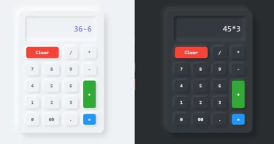
Another Article for you.
JavaScript(Babel):
/*
This pen cleverly utilizes SVG filters to create a "Morphing Text" effect. Essentially, it layers 2 text elements on top of each other, and blurs them depending on which text element should be more visible. Once the blurring is applied, both texts are fed through a threshold filter together, which produces the "gooey" effect. Check the CSS - Comment the #container rule's filter out to see how the blurring works!
*/
const elts = {
text1: document.getElementById("text1"),
text2: document.getElementById("text2")
};
// The strings to morph between. You can change these to anything you want!
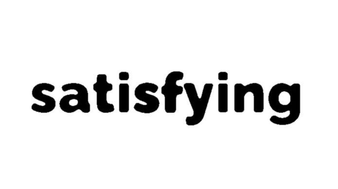
const texts = ["Why", "is", "this", "so", "satisfying", "to", "watch?"];
// Controls the speed of morphing.
const morphTime = 1;
const cooldownTime = 0.25;
let textIndex = texts.length - 1;
let time = new Date();
let morph = 0;
let cooldown = cooldownTime;
elts.text1.textContent = texts[textIndex % texts.length];
elts.text2.textContent = texts[(textIndex + 1) % texts.length];
function doMorph() {
morph -= cooldown;
cooldown = 0;
let fraction = morph / morphTime;
if (fraction > 1) {
cooldown = cooldownTime;
fraction = 1;
}
setMorph(fraction);
}
// A lot of the magic happens here, this is what applies the blur filter to the text.
function setMorph(fraction) {
// fraction = Math.cos(fraction * Math.PI) / -2 + .5;
elts.text2.style.filter = `blur(${Math.min(8 / fraction - 8, 100)}px)`;
elts.text2.style.opacity = `${Math.pow(fraction, 0.4) * 100}%`;
fraction = 1 - fraction;
elts.text1.style.filter = `blur(${Math.min(8 / fraction - 8, 100)}px)`;
elts.text1.style.opacity = `${Math.pow(fraction, 0.4) * 100}%`;
elts.text1.textContent = texts[textIndex % texts.length];
elts.text2.textContent = texts[(textIndex + 1) % texts.length];
}
function doCooldown() {
morph = 0;
elts.text2.style.filter = "";
elts.text2.style.opacity = "100%";
elts.text1.style.filter = "";
elts.text1.style.opacity = "0%";
}
// Animation loop, which is called every frame.
function animate() {
requestAnimationFrame(animate);
let newTime = new Date();
let shouldIncrementIndex = cooldown > 0;
let dt = (newTime - time) / 1000;
time = newTime;
cooldown -= dt;
if (cooldown <= 0) {
if (shouldIncrementIndex) {
textIndex++;
}
doMorph();
} else {
doCooldown();
}
}
// Start the animation.
animate();
More Queries: