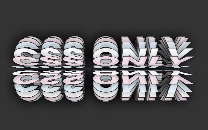
CSS Only 3D Text Rotation Animation Effects
CSS Only 3D Text Rotation Animation Effects. For creating 3D text rotation animation effect, we are using HTML & CSS.
Source Code:
HTML:
<!DOCTYPE html>
<html>
<head>
<title>CSS 3D Text Rotation</title>
<link rel="stylesheet" type="text/css" href="style.css">
</head>
<body>
	<div class="box">
		<div>
			<span style="--i:1;"></span>
			<span style="--i:2;"></span>
			<span style="--i:3;"></span>
			<span style="--i:4;"></span>
			<span style="--i:5;"></span>
			<span style="--i:6;"></span>
			<span style="--i:7;"></span>
			<span style="--i:8;"></span>
			<span style="--i:9;"></span>
			<span style="--i:10;"></span>
			<span style="--i:11;"></span>
			<span style="--i:12;"></span>
			<span style="--i:13;"></span>
			<span style="--i:14;"></span>
			<span style="--i:15;"></span>
			<span style="--i:16;"></span>
			<span style="--i:17;"></span>
			<span style="--i:18;"></span>
			<span style="--i:19;"></span>
			<span style="--i:20;"></span>
			<span style="--i:21;"></span>
			<span style="--i:22;"></span>
			<span style="--i:23;"></span>
			<span style="--i:24;"></span>
		</div>
	</div>
</body>
</html>
Another HTML CSS Project For You 👇

CSS:
@import url('https://fonts.googleapis.com/css2?family=Poppins:wght@300;400;500;600;700;800;900&display=swap');
*
{
	margin: 0;
	padding: 0;
	box-sizing: border-box;
  font-family: 'Poppins', sans-serif;
}
body
{
	background: #333;
	overflow: hidden;
	min-height: 100vh;
	display: flex;
	justify-content: center;
	align-items: center;
}
.box
{
	position: relative;
	width: 100%;
	height: 350px;
	transform-style: preserve-3d;
}
.box div
{
	position: absolute;
	width: 100%;
	height: 100%;
	transform-style: preserve-3d;
	animation: animate  24s linear infinite;
}

.box div span
{
	position: absolute;
	top: 0;
	left: 0;
	display: block;
	width: 100%;
	height: 100%;
  box-sizing: border-box;
	transform: rotateX(calc(var(--i) * 15deg));
}
.box div span:before
{
	content: 'CSS Only';
	position: absolute;
	width: 100%;
	color: #fffe;
	text-transform: uppercase;
	font-size: 8em;
	height: 100px;
	text-align: center;
	font-weight: 800;
	-webkit-text-stroke: 2px #000;
	text-shadow: 0 0 50px rgba(0,0,0,0.5);
}
.box div span:nth-child(3n+2)::before
{
	color: #e3f2fddd;
}
.box div span:nth-child(3n+3)::before
{
	color: #fce4ecdd;
}
@keyframes animate
{
	0%
	{
		transform: perspective(1000px) rotateX(0deg);
	}
	100%
	{
		transform: perspective(1000px) rotateX(360deg);
	}
}