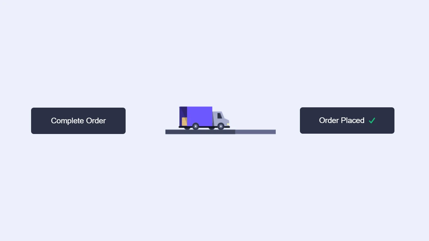
CSS Order Button Animation Using HTML CSS JavaScript
To create an order button animation with HTML, CSS, and JavaScript, you can follow these steps:
- Create an HTML button element and give it a unique ID or class.
- Use CSS to style the button, such as setting the background color, font size, and padding.
- Use JavaScript to create an animation effect when the button is clicked. This can be done using the transition or animation property in CSS, or by using JavaScript libraries such as jQuery or Greensock.
- To create the animation effect, you can use CSS transforms, such as scale, rotate, or translate, or you can use CSS keyframe animations to specify the changes to the button’s appearance over time.
- Use JavaScript to trigger the animation when the button is clicked, either by adding an event listener to the button element or by using a jQuery method such as .click().
- Test the animation to ensure that it is working as desired and make any necessary adjustments.
In conclusion, creating an order button animation with HTML, CSS, and JavaScript requires a combination of HTML and CSS skills to create the button element and style it, and JavaScript skills to create and trigger the animation effect. By following these steps and experimenting with different techniques and approaches, you can create a variety of eye-catching and engaging animation effects for your buttons.
The structure will be created using HTML. The styling will be added using CSS, and JavaScript will be used for specific features. For additional HTML, CSS, and JavaScript projects, see our website.
Source Code:
HTML:
<!DOCTYPE html>
<html lang="en" >
<head>
  <meta charset="UTF-8">
  <title>Order button animation</title>
  <link rel="stylesheet" href="https://cdnjs.cloudflare.com/ajax/libs/meyer-reset/2.0/reset.min.css">
<link rel='stylesheet' href='https://cdn.jsdelivr.net/npm/inter-ui@3.11.0/inter.min.css'><link rel="stylesheet" href="./style.css">

</head>
<body>
<!-- partial:index.partial.html -->
<button class="truck-button">
    <span class="default">Complete Order</span>
    <span class="success">
        Order Placed
        <svg viewbox="0 0 12 10">
            <polyline points="1.5 6 4.5 9 10.5 1"></polyline>
        </svg>
    </span>
    <div class="truck">
        <div class="wheel"></div>
        <div class="back"></div>
        <div class="front"></div>
        <div class="box"></div>
    </div>
</button>

  <script src='https://cdn.jsdelivr.net/npm/gsap@3.0.1/dist/gsap.min.js'>
</script><script  src="./script.js"></script>

</body>
</html>
——————————
📂 Important Links:
——————————
>> Learn Graphics Design & Make A Successful Profession.
>> Canva Makes Graphics Design Easy.
>> Start Freelancing Today & Earn Money.
>> Make Video Editing As Your Profession.
CSS:
.truck-button {
  --color: #fff;
  --background: #2B3044;
  --tick: #16BF78;
  --base: #0D0F18;
  --wheel: #2B3044;
  --wheel-inner: #646B8C;
  --wheel-dot: #fff;
  --back: #6D58FF;
  --back-inner: #362A89;
  --back-inner-shadow: #2D246B;
  --front: #A6ACCD;
  --front-shadow: #535A79;
  --front-light: #FFF8B1;
  --window: #2B3044;
  --window-shadow: #404660;
  --street: #646B8C;
  --street-fill: #404660;
  --box: #DCB97A;
  --box-shadow: #B89B66;
  padding: 12px 0;
  width: 172px;
  cursor: pointer;
  text-align: center;
  position: relative;
  border: none;
  outline: none;
  color: var(--color);
  background: var(--background);
  border-radius: var(--br, 5px);
  -webkit-appearance: none;
  -webkit-tap-highlight-color: transparent;
  transform-style: preserve-3d;
  transform: rotateX(var(--rx, 0deg)) translateZ(0);
  transition: transform 0.5s, border-radius 0.3s linear var(--br-d, 0s);
}
.truck-button:before, .truck-button:after {
  content: "";
  position: absolute;
  left: 0;
  top: 0;
  width: 100%;
  height: 6px;
  display: block;
  background: var(--b, var(--street));
  transform-origin: 0 100%;
  transform: rotateX(90deg) scaleX(var(--sy, 1));
}
.truck-button:after {
  --sy: var(--progress, 0);
  --b: var(--street-fill);
}
.truck-button .default,
.truck-button .success {
  display: block;
  font-weight: 500;
  font-size: 14px;
  line-height: 24px;
  opacity: var(--o, 1);
  transition: opacity 0.3s;
}
.truck-button .success {
  --o: 0;
  position: absolute;
  top: 12px;
  left: 0;
  right: 0;
}
.truck-button .success svg {
  width: 12px;
  height: 10px;
  display: inline-block;
  vertical-align: top;
  fill: none;
  margin: 7px 0 0 4px;
  stroke: var(--tick);
  stroke-width: 2;
  stroke-linecap: round;
  stroke-linejoin: round;
  stroke-dasharray: 16px;
  stroke-dashoffset: var(--offset, 16px);
  transition: stroke-dashoffset 0.4s ease 0.45s;
}
.truck-button .truck {
  position: absolute;
  width: 72px;
  height: 28px;
  transform: rotateX(90deg) translate3d(var(--truck-x, 4px), calc(var(--truck-y-n, -26) * 1px), 12px);
}
.truck-button .truck:before, .truck-button .truck:after {
  content: "";
  position: absolute;
  bottom: -6px;
  left: var(--l, 18px);
  width: 10px;
  height: 10px;
  border-radius: 50%;
  z-index: 2;
  box-shadow: inset 0 0 0 2px var(--wheel), inset 0 0 0 4px var(--wheel-inner);
  background: var(--wheel-dot);
  transform: translateY(calc(var(--truck-y) * -1px)) translateZ(0);
}
.truck-button .truck:after {
  --l: 54px;
}
.truck-button .truck .wheel,
.truck-button .truck .wheel:before {
  position: absolute;
  bottom: var(--b, -6px);
  left: var(--l, 6px);
  width: 10px;
  height: 10px;
  border-radius: 50%;
  background: var(--wheel);
  transform: translateZ(0);
}
.truck-button .truck .wheel {
  transform: translateY(calc(var(--truck-y) * -1px)) translateZ(0);
}
.truck-button .truck .wheel:before {
  --l: 35px;
  --b: 0;
  content: "";
}
.truck-button .truck .front,
.truck-button .truck .back,
.truck-button .truck .box {
  position: absolute;
}
.truck-button .truck .back {
  left: 0;
  bottom: 0;
  z-index: 1;
  width: 47px;
  height: 28px;
  border-radius: 1px 1px 0 0;
  background: linear-gradient(68deg, var(--back-inner) 0%, var(--back-inner) 22%, var(--back-inner-shadow) 22.1%, var(--back-inner-shadow) 100%);
}
.truck-button .truck .back:before, .truck-button .truck .back:after {
  content: "";
  position: absolute;
}
.truck-button .truck .back:before {
  left: 11px;
  top: 0;
  right: 0;
  bottom: 0;
  z-index: 2;
  border-radius: 0 1px 0 0;
  background: var(--back);
}
.truck-button .truck .back:after {
  border-radius: 1px;
  width: 73px;
  height: 2px;
  left: -1px;
  bottom: -2px;
  background: var(--base);
}
.truck-button .truck .front {
  left: 47px;
  bottom: -1px;
  height: 22px;
  width: 24px;
  -webkit-clip-path: polygon(55% 0, 72% 44%, 100% 58%, 100% 100%, 0 100%, 0 0);
  clip-path: polygon(55% 0, 72% 44%, 100% 58%, 100% 100%, 0 100%, 0 0);
  background: linear-gradient(84deg, var(--front-shadow) 0%, var(--front-shadow) 10%, var(--front) 12%, var(--front) 100%);
}
.truck-button .truck .front:before, .truck-button .truck .front:after {
  content: "";
  position: absolute;
}
.truck-button .truck .front:before {
  width: 7px;
  height: 8px;
  background: #fff;
  left: 7px;
  top: 2px;
  -webkit-clip-path: polygon(0 0, 60% 0%, 100% 100%, 0% 100%);
  clip-path: polygon(0 0, 60% 0%, 100% 100%, 0% 100%);
  background: linear-gradient(59deg, var(--window) 0%, var(--window) 57%, var(--window-shadow) 55%, var(--window-shadow) 100%);
}
.truck-button .truck .front:after {
  width: 3px;
  height: 2px;
  right: 0;
  bottom: 3px;
  background: var(--front-light);
}
.truck-button .truck .box {
  width: 13px;
  height: 13px;
  right: 56px;
  bottom: 0;
  z-index: 1;
  border-radius: 1px;
  overflow: hidden;
  transform: translate(calc(var(--box-x, -24) * 1px), calc(var(--box-y, -6) * 1px)) scale(var(--box-s, 0.5));
  opacity: var(--box-o, 0);
  background: linear-gradient(68deg, var(--box) 0%, var(--box) 50%, var(--box-shadow) 50.2%, var(--box-shadow) 100%);
  background-size: 250% 100%;
  background-position-x: calc(var(--bx, 0) * 1%);
}
.truck-button .truck .box:before, .truck-button .truck .box:after {
  content: "";
  position: absolute;
}
.truck-button .truck .box:before {
  content: "";
  background: rgba(255, 255, 255, 0.2);
  left: 0;
  right: 0;
  top: 6px;
  height: 1px;
}
.truck-button .truck .box:after {
  width: 6px;
  left: 100%;
  top: 0;
  bottom: 0;
  background: var(--back);
  transform: translateX(calc(var(--hx, 0) * 1px));
}
.truck-button.animation {
  --rx: -90deg;
  --br: 0;
}
.truck-button.animation .default {
  --o: 0;
}
.truck-button.animation.done {
  --rx: 0deg;
  --br: 5px;
  --br-d: .2s;
}
.truck-button.animation.done .success {
  --o: 1;
  --offset: 0;
}

html {
  box-sizing: border-box;
  -webkit-font-smoothing: antialiased;
}

* {
  box-sizing: inherit;
}
*:before, *:after {
  box-sizing: inherit;
}

body {
  min-height: 100vh;
  display: flex;
  font-family: "Inter UI", "Inter", Arial;
  justify-content: center;
  align-items: center;
  background: #ECEFFC;
}
JavaScript:
document.querySelectorAll('.truck-button').forEach(button => {
    button.addEventListener('click', e => {

        e.preventDefault();

        let box = button.querySelector('.box'),
            truck = button.querySelector('.truck');

        if(!button.classList.contains('done')) {

            if(!button.classList.contains('animation')) {

                button.classList.add('animation');

                gsap.to(button, {
                    '--box-s': 1,
                    '--box-o': 1,
                    duration: .3,
                    delay: .5
                });

                gsap.to(box, {
                    x: 0,
                    duration: .4,
                    delay: .7
                });

                gsap.to(button, {
                    '--hx': -5,
                    '--bx': 50,
                    duration: .18,
                    delay: .92
                });

                gsap.to(box, {
                    y: 0,
                    duration: .1,
                    delay: 1.15
                });

                gsap.set(button, {
                    '--truck-y': 0,
                    '--truck-y-n': -26
                });

                gsap.to(button, {
                    '--truck-y': 1,
                    '--truck-y-n': -25,
                    duration: .2,
                    delay: 1.25,
                    onComplete() {
                        gsap.timeline({
                            onComplete() {
                                button.classList.add('done');
                            }
                        }).to(truck, {
                            x: 0,
                            duration: .4
                        }).to(truck, {
                            x: 40,
                            duration: 1
                        }).to(truck, {
                            x: 20,
                            duration: .6
                        }).to(truck, {
                            x: 96,
                            duration: .4
                        });
                        gsap.to(button, {
                            '--progress': 1,
                            duration: 2.4,
                            ease: "power2.in"
                        });
                    }
                });

            }

        } else {
            button.classList.remove('animation', 'done');
            gsap.set(truck, {
                x: 4
            });
            gsap.set(button, {
                '--progress': 0,
                '--hx': 0,
                '--bx': 0,
                '--box-s': .5,
                '--box-o': 0,
                '--truck-y': 0,
                '--truck-y-n': -26
            });
            gsap.set(box, {
                x: -24,
                y: -6
            });
        }

    });
});