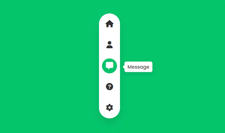
Animated Vertical Menu Indicator using HTML CSS
Animated Magic Menu Indicator using HTML & CSS. Vertical Tab Menu Design.
Source Code:
HTML:
<!DOCTYPE html>
<html>
<head>
<meta name="viewport" content="width=device-width, initial-scale=1.0">
<title>Creative CSS Navigation Indicator</title>
<link rel="stylesheet" href="https://cdnjs.cloudflare.com/ajax/libs/font-awesome/6.1.1/css/all.min.css" integrity="sha512-KfkfwYDsLkIlwQp6LFnl8zNdLGxu9YAA1QvwINks4PhcElQSvqcyVLLD9aMhXd13uQjoXtEKNosOWaZqXgel0g==" crossorigin="anonymous" referrerpolicy="no-referrer" />
<link rel="stylesheet" type="text/css" href="style.css">
</head>
<body>
	<div class="navigation">
		<ul>
			<li class="list active" data-color="#f53b57">
				<a href="#">
					<span class="icon"><i class="fa-solid fa-house"></i></span>
					<span class="title">Home</span>
				</a>
			</li>
			<li class="list" data-color="#3c40c6">
				<a href="#">
					<span class="icon"><i class="fa-solid fa-user"></i></span>
					<span class="title">Profile</span>
				</a>
			</li>
			<li class="list" data-color="#05c46b">
				<a href="#">
					<span class="icon"><i class="fa-solid fa-message"></i></span>
					<span class="title">Message</span>
				</a>
			</li>
			<li class="list" data-color="#0fbcf9">
				<a href="#">
					<span class="icon"><i class="fa-solid fa-circle-question"></i></span>
					<span class="title">Help</span>
				</a>
			</li>
			<li class="list" data-color="#ffa801">
				<a href="#">
					<span class="icon"><i class="fa-solid fa-gear"></i></span>
					<span class="title">Settings</span>
				</a>
			</li>
			<div class="indicator"></div>
		</ul>
	</div>

	<!-- add active class on hovered item -->
	<script>
		let list = document.querySelectorAll('li');
		for (let i=0; i<list.length; i++){
			list[i].onmouseover = function(){
				let j = 0;
				while (j < list.length){
					list[j++].className = 'list';
				}
				list[i].className = 'list active';
			}
		}

		// change body color according to indicator

		list.forEach(elements => {
			elements.addEventListener('mouseenter',function(event){
				let bg = document.querySelector('body');
				let color = event.target.getAttribute('data-color');
				bg.style.backgroundColor = color;
			})
		})
	</script>
</body>
</html>
Read this article & skill up your carrier 👇

CSS:
@import url('https://fonts.googleapis.com/css2?family=Poppins:wght@200;300;400;500;600;700;800;900&display=swap');
*
{
	margin: 0;
	padding: 0;
	box-sizing: border-box;
	font-family: 'Poppins', sans-serif;
}
body
{
	display: flex;
	justify-content: center;
	align-items: center;
	min-height: 100vh;
	background: #f53b57;
	transition: 0.5s;
}
.navigation
{
	position: relative;
	width: 70px;
	height: 350px;
	background: #fff;
	border-radius: 35px;
	box-shadow: 0 15px 25px rgba(0,0,0,0.1);
}
.navigation ul
{
	position: absolute;
	top: 0;
	left: 0;
	width: 100%;
	display: flex;
	flex-direction: column;
}
.navigation ul li
{
	position: relative;
	list-style: none;
	width: 70px;
	height: 70px;
	z-index: 1;
}
.navigation ul li a
{
	position: relative;
	display: flex;
	justify-content: center;
	align-items: center;
	width: 100%;
	text-align: center;
	color: #333;
	font-weight: 500;
}
.navigation ul li a .icon
{
	position: relative;
	display: block;
	line-height: 75px;
	text-align: center;
	transition: 0.5s;
}
.navigation ul li.active a .icon
{
	color: #fff;
}
.navigation ul li a .icon i
{
	font-size: 24px;
}
.navigation ul li a .title
{
	position: absolute;
	top: 50%;
	left: 110px;
	background: #fff;
	transform: translateY(-50%);
	padding: 5px 10px;
	border-radius: 6px;
	transition: 0.5s;
	box-shadow: 0 5px 15px rgba(0,0,0,0.1);
	opacity: 0;
	visibility: hidden;
}
.navigation ul li:hover a .title
{
	opacity: 1;
	visibility: visible;
	transform: translateX(-25px) translateY(-50%);
}
.navigation ul li a .title::before
{
	content: '';
	position: absolute;
	width: 12px;
	height: 12px;
	background: #fff;
	left: -8px;
	top: 46%;
	transition: 0.5s;
	transform: rotate(45deg) translateY(-50%);
	border-radius: 2px;
}
.navigation ul .indicator
{
	position: absolute;
	left: 0;
	width: 70px;
	height: 70px;
	transition: 0.5s;
}
.navigation ul .indicator::before
{
	content: '';
	position: absolute;
	top: 50%;
	left: 50%;
	transform: translate(-50%,-50%);
	width: 50px;
	height: 50px;
	background: #333;
	border-radius: 50%;
	transition: 0.5s;
}
.navigation ul li:nth-child(1).active ~ .indicator
{
	transform: translateY(calc(70px * 0));
}
.navigation ul li:nth-child(2).active ~ .indicator
{
	transform: translateY(calc(70px * 1));
}
.navigation ul li:nth-child(3).active ~ .indicator
{
	transform: translateY(calc(70px * 2));
}
.navigation ul li:nth-child(4).active ~ .indicator
{
	transform: translateY(calc(70px * 3));
}
.navigation ul li:nth-child(5).active ~ .indicator
{
	transform: translateY(calc(70px * 4));
}

.navigation ul li:nth-child(1).active ~ .indicator::before
{
	background: #f53b57;
}
.navigation ul li:nth-child(2).active ~ .indicator::before
{
	background: #3c40c6;
}
.navigation ul li:nth-child(3).active ~ .indicator::before
{
	background: #05c46b;
}
.navigation ul li:nth-child(4).active ~ .indicator::before
{
	background: #0fbcf9;
}
.navigation ul li:nth-child(5).active ~ .indicator::before
{
	background: #ffa801;
}