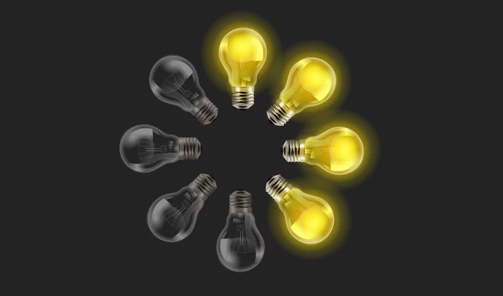
CSS Light Bulb Animation Effects | Html CSS (Source Code)
CSS Light Bulb Animation Effects using Html CSS (Source Code).
Source code
HTML:
Shortcuts simplify My Drive …
In the coming weeks, items in more than one folder will be replaced by shortcuts. Access to files and folders won't change.Learn more
<!doctype html>
<html>
<head>
	<meta charset="utf-8">
	<title>CSS Light Bulb Animation Effects</title>
	<link rel="stylesheet" href="style.css">
</head>
<body>
	<!-- Image Source : https://www.freepik.com/-->
	<!-- https://www.freepik.com/free-vector/realistic-light-bulbs-transparent-background_5914128.htm -->
	<div class="circle">
		<span style="--i:0;"></span>
		<span style="--i:1;"></span>
		<span style="--i:2;"></span>
		<span style="--i:3;"></span>
		<span style="--i:4;"></span>
		<span style="--i:5;"></span>
		<span style="--i:6;"></span>
		<span style="--i:7;"></span>
	</div>
</body>
</html>
——————————
📂 Important Links:
——————————
>> Learn Graphics Design & Make A Successful Profession.
>> Canva Makes Graphics Design Easy.
>> Start Freelancing Today & Earn Money.
>> Make Video Editing As Your Profession.
CSS:
Shortcuts simplify My Drive …
In the coming weeks, items in more than one folder will be replaced by shortcuts. Access to files and folders won't change.Learn more
*
{
	margin: 0;
	padding: 0;
	box-sizing: border-box;
}
body
{
  display: flex;
  justify-content: center;
  align-items: center;
  min-height: 100vh;
  background: #222;
}
.circle
{
  position: relative;
  width: 500px;
  height: 500px;
}
.circle span
{
  position: absolute;
  inset: 0;
  transform: rotate(calc(45deg * var(--i)));
}
.circle span:before
{
  content: '';
  position: absolute;
  left: 50%;
  transform: translateX(-50%) translateY(-100px) scale(0.75);
  width: 250px;
  height: 300px;
  background-size: cover;
  background-position: center;
  background: url(off.png);
  animation: animate 2s steps(1) infinite;
  animation-delay: calc(0.1s * var(--i));
}
@keyframes animate
{
  0%,100%
  {
    background: url(off.png);
  }
  50%
  {
    background: url(on.png);
  }
}
Images:


Another HTML CSS JavaScript Article For You 👇
More Queries: