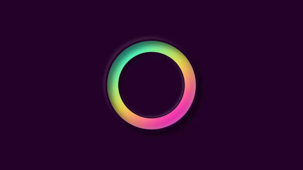
Infinite loop loading animation with html css
Are you looking for a way to add some eye-catching visual elements to your website or web application? Then, an infinite loop animation could be just what you need! With HTML and CSS, you can create mesmerizing animations that loop seamlessly, capturing your audience’s attention and keeping them engaged.
For additional HTML, CSS, and JavaScript projects, see our website.
In this blog post, we will dive into the world of infinite loop animations with HTML and CSS, exploring different techniques and styles to create stunning animations. Whether you are a beginner or an experienced developer, this guide will provide you with valuable insights and practical tips to help you create unique and captivating animations that will take your website or web application to the next level.
So, if you are ready to add some flair to your web design and make your website stand out, keep reading and discover the endless possibilities of infinite loop animations with HTML and CSS.
Source Code:
HTML:
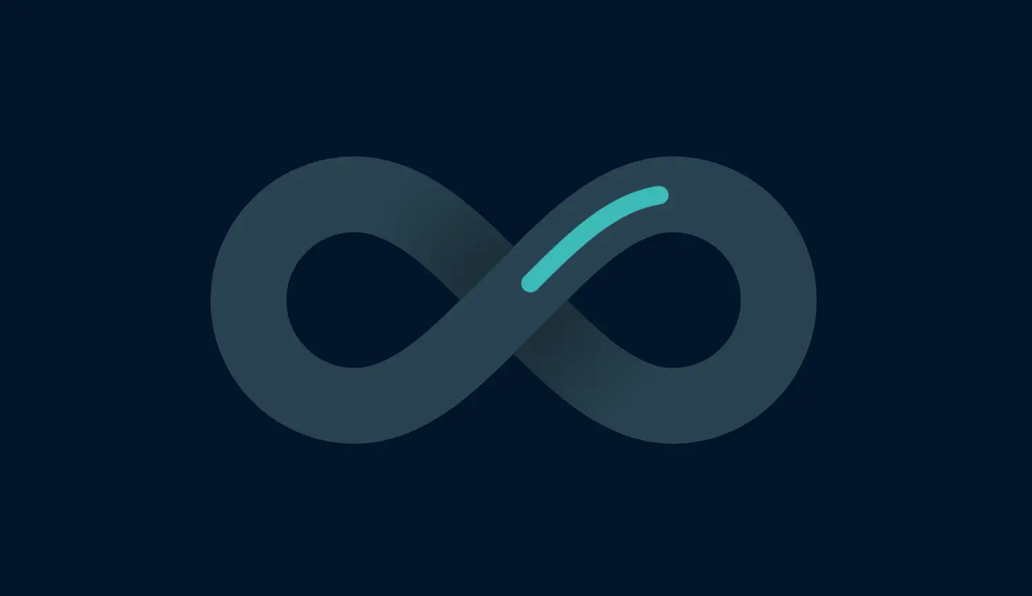
<svg class="finny scroll fade scrolled" viewBox="-1 -1 12 8">
  <defs>
    <path id="infinite" d="M5 3C4 2 3.1 1 2 1a2 2  0 000 4c1.1 0 2-1 3-2s1.9-2  3-2a2 2 0 010 4C6.9  5 6 4 5 3"></path>
    <radialGradient id="sgrad" gradientUnits="userSpaceOnUse" cx="5" cy="3" r="3.4">
      <stop offset=".25" stop-color="#000"></stop>
      <stop offset=".9" stop-color="#000" stop-opacity="0"></stop>
    </radialGradient>
    <path id="shad1" class="clip-shadow" d="M4.5 2.5C3.7 1.7 2.9 1 2 1m6 4c-1 0-1.7-.7-2.5-1.5"></path>
  </defs>
  <use href="#infinite" class="fbottom"></use>
  <use href="#shad1" class="shad even" />
  <g class="shad odd">
    <use href="#shad1" transform="translate(0 6) scale(1 , -1)" />
  </g>
  <use href="#infinite" class="ll"></use>
</svg>
——————————
📂 Important Links:
——————————
>> Learn Graphics Design & Make A Successful Profession.
>> Canva Makes Graphics Design Easy.
>> Start Freelancing Today & Earn Money.
>> Make Video Editing As Your Profession.
CSS:
/* Colors */
:root {
  --white: #ffffff;
  --turquoise: #3dbaba;
  --powder-blue: #87aeaf;
  --alice-blue: #d7eff7;
  --anti-flash-white: #f6f9fd;
  --oxford-blue: #011529;
  --aquamarine: #7fffd4;
  --payne-gray: #607080;
  --prussian-blue: #082e47;
  --rich-black: #03101c;
  --brand: var(--turquoise);
  --fg: var(--oxford-blue);
  --fg-1: var(--rich-black);
  --fg-2: var(--prussian-blue);
  --dark: var(--oxford-blue);
  --light: var(--white);
  --bg: var(--white);
  --bg-1: var(--alice-blue);
  --bg-2: var(--anti-flash-white);
  --neutral: var(--powder-blue);
  --tone-1: var(--turquoise);
  --tone-2: var(--aquamarine);
}

.fbottom,
.ll {
  fill: none;
}

.fbottom {
  stroke-width: inherit;
  stroke: var(--neutral);
  stroke-opacity: 0.3;
}

.ll {
  stroke: var(--brand);
  animation: loop 3s linear infinite;
  stroke-width: 0.35;
  stroke-dasharray: 3 24.5;
  stroke-linecap: round;
}

.finny {
  stroke-width: 1.43;
  animation: rot 36s linear infinite;
}

.shad {
  animation: raise 3s linear infinite;
}

.shad.odd {
  animation-delay: -1.5s;
}

@keyframes raise {
  0%, 20% {
    opacity: 1;
  }
  30%, 70% {
    opacity: 0;
  }
  80%, 100% {
    opacity: 1;
  }
}
.ll {
  animation-delay: -1.5s;
}

.finny {
  perspective: 500px;
}

@keyframes loop {
  0% {
    stroke-dashoffset: 0.5;
  }
  100% {
    stroke-dashoffset: 28;
  }
}
.clip-shadow {
  stroke-linecap: butt;
  fill: none;
  opacity: 0.3;
  stroke-width: inherit;
  stroke: url(#sgrad);
}

#sgrad stop {
  stop-color: var(--bg-3);
}

@media (prefers-color-scheme: light) {
  #sgrad stop {
    stop-color: #2345;
  }
}
/* just for demo */
body {
  background-color: var(--fg);
  display: grid;
  height: 100vh;
  place-content: center;
  width: 100vw;
  overflow: hidden;
  margin: 0;
}

svg {
  width: 90vw;
  height: 70vh;
  display: block;
}
Another article for you.