
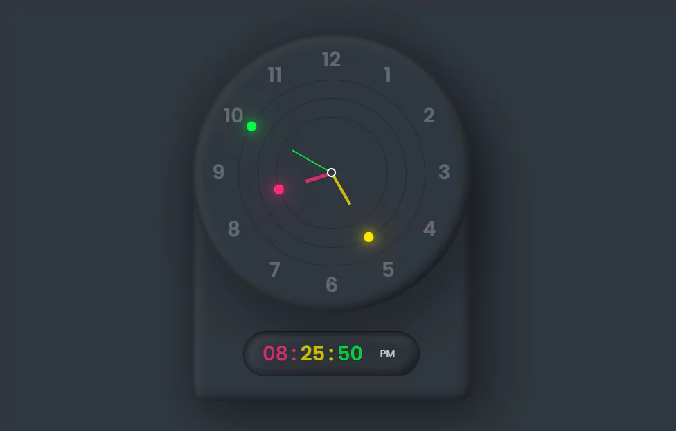
Amazing Working Analog and Digital Clock Design using Html CSS & Javascript
Amazing Working Analog and Digital Clock Design using Html CSS & Javascript (Source code).
Source Code:
HTML:
<!doctype html>
<html>
	<head>
		<meta charset="utf-8">
		<title>Clock</title>
		<link rel="stylesheet" href="style.css">
	</head>
	<body>
		<div class="container">
			<div class="clock">
				<div class="circle" style="--clr:#04fc43" id="sc"><i></i></div>
				<div class="circle circle2" style="--clr:#fee800" id="mn"><i></i></div>
				<div class="circle circle3" style="--clr:#ff2972" id="hr"><i></i></div>
				<span style="--i:1;"><b>1</b></span>
				<span style="--i:2;"><b>2</b></span>
				<span style="--i:3;"><b>3</b></span>
				<span style="--i:4;"><b>4</b></span>
				<span style="--i:5;"><b>5</b></span>
				<span style="--i:6;"><b>6</b></span>
				<span style="--i:7;"><b>7</b></span>
				<span style="--i:8;"><b>8</b></span>
				<span style="--i:9;"><b>9</b></span>
				<span style="--i:10;"><b>10</b></span>
				<span style="--i:11;"><b>11</b></span>
				<span style="--i:12;"><b>12</b></span>

			</div>
			<div id="time">
				<div id="hour" style="--clr:#ff2972"></div>
				<div id="minutes" style="--clr:#fee800"></div>
				<div id="seconds" style="--clr:#04fc43"></div>
				<div id="ampm" style="--clr:#fff"></div>
			</div>
		</div>
		<script>
		const hr = document.querySelector("#hr");
		const mn = document.querySelector("#mn");
		const sc = document.querySelector("#sc");
		setInterval(() => {
			let day = new Date();
			let hh = day.getHours() * 30;
			let mm = day.getMinutes() * 6;
			let ss = day.getSeconds() * 6;
			hr.style.transform = `rotateZ(${hh+(mm/12)}deg)`;
			mn.style.transform = `rotateZ(${mm}deg)`;
			sc.style.transform = `rotateZ(${ss}deg)`;


		// Digital Clock Code
			let hours = document.getElementById('hour');
			let minutes = document.getElementById('minutes');
			let seconds = document.getElementById('seconds');
			let ampm = document.getElementById('ampm');

			let h = new Date().getHours();
			let m = new Date().getMinutes();
			let s = new Date().getSeconds();

			var am = h >= 12 ? 'PM' : 'AM';

			//Convert 24 Hour Time To 12 Hour with AM PM Indicator
			if(h > 12){
					h = h - 12;
			}

		    // Add zero before Single Numbers
			h = (h < 10) ? "0" + h : h
			m = (m < 10) ? "0" + m : m
			s = (s < 10) ? "0" + s : s


			hours.innerHTML = h;
			minutes.innerHTML = m;
			seconds.innerHTML = s;
			ampm.innerHTML = am
		})
		</script>
	</body>
</html>
——————————
📂 Important Links:
——————————
>> Learn Graphics Design & Make A Successful Profession.
>> Canva Makes Graphics Design Easy.
>> Start Freelancing Today & Earn Money.
>> Make Video Editing As Your Profession.
CSS:
@import url('https://fonts.googleapis.com/css?family=Poppins:200,300,400,500,600,700,800,900&display=swap');
*
{
  margin: 0;
  padding: 0;
  box-sizing: border-box;
	font-family: 'Poppins', sans-serif;
}
body
{
	display: flex;
	justify-content: center;
	align-items: center;
	min-height: 100vh;
	background: #2f363e;
}
.container
{
	border-radius: 20px;
	border-top-left-radius: 225px;
	border-top-right-radius: 225px;
	background: #2f363e;
	box-shadow: 25px 25px 75px rgba(0,0,0,0.25),
	10px 10px 70px rgba(0,0,0,0.25),
	inset 5px 5px 10px rgba(0,0,0,0.5),
	inset 5px 5px 20px rgba(255,255,255,0.2),
	inset -5px -5px 15px rgba(0,0,0,0.75);
	display: flex;
	flex-direction: column;
	align-items: center;
}

.clock
{
	position: relative;
	width: 450px;
	border-radius: 50%;
	height: 450px;
	background: #2f363e;
	box-shadow: 10px 50px 70px rgba(0,0,0,0.25),
	inset 5px 5px 10px rgba(0,0,0,0.5),
	inset 5px 5px 20px rgba(255,255,255,0.2),
	inset -5px -5px 15px rgba(0,0,0,0.75);

	margin-bottom: 30px;
	display: flex;
	justify-content: center;
	align-items: center;
}
.clock::before
{
	content: '';
	position: absolute;
	width: 8px;
	height: 8px;
	background: #2f363e;
	border: 3px solid #fff;
	border-radius: 50%;
	z-index: 1000;
}
.clock span
{
	position: absolute;
	inset: 20px;
	text-align: center;
	color: #fff;
	transform: rotate(calc(30deg * var(--i)));
}
.clock span b
{
	font-size: 2em;
	opacity: 0.25;
	font-weight: 600;
	display: inline-block;
	transform: rotate(calc(-30deg * var(--i)));
}
.circle
{
	position: absolute;
	width: 300px;
	height: 300px;
	border: 2px solid rgba(0,0,0,0.25);
	border-radius: 50%;
	display: flex;
	justify-content: center;
	align-items: flex-start;
	z-index: 10;
}
.circle i
{
	position: absolute;
	width: 6px;
	background: #fff;
	height: 50%;
	background: var(--clr);
	opacity: 0.75;
	transform-origin: bottom;
	transform: scaleY(0.5);
}
.circle:nth-child(1) i
{
	width: 2px;
}
.circle:nth-child(2) i
{
	width: 4px;
}
.circle2
{
	width: 240px;
	height: 240px;
	z-index: 9;
}
.circle3
{
	width: 180px;
	height: 180px;
	z-index: 8;
}
.circle::before
{
	content: '';
	position: absolute;
	top: -8.5px;
	left: 50%;
	transform: translateX(-50%);
	width: 15px;
	height: 15px;
	background: var(--clr);
	border-radius: 50%;
	box-shadow: 0 0 20px var(--clr),
	0 0 60px var(--clr);
}

/* Digital  */
#time
{
	margin-bottom: 40px;
	display: flex;
	padding: 10px 20px;
	font-size: 2em;
	font-weight: 600;
	border-radius: 40px;
	border: 2px solid rgba(0,0,0,0.5);
	box-shadow: inset 5px 5px 10px rgba(0,0,0,0.5),
	inset 5px 5px 20px rgba(255,255,255,0.2),
	inset -5px -5px 15px rgba(0,0,0,0.75);
}
#time div
{
	position: relative;
	width: 60px;
	text-align: center;
	color: var(--clr);
	opacity: 0.75;
}
#time div:last-child
{
	font-size: 0.5em;
	display: flex;
	justify-content: center;
	align-items: center;
	font-weight: 500;
}
#time div:nth-child(1):after,
#time div:nth-child(2):after
{
	content: ':';
	position: absolute;
	right: -4px;
}
#time div:nth-child(2):after
{
	animation: animate 1s steps(1) infinite;
}
@keyframes animate
{
	0%
	{
		opacity: 1;
	}
	50%
	{
		opacity: 0;
	}
}Another HTML CSS JavaScript Article For You 👇

More queries:

